June 2011

You are currently browsing the monthly archive for June 2011.

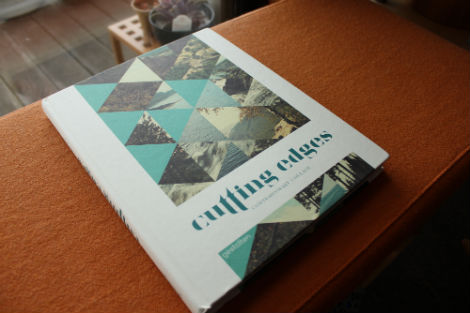
Cutting Edges: Contemporary Collage

Let’s face it. Some of us are image hoarders. With the wealth of images that can be found online and in print, it’s no wonder that collage is medium that many artists like to work in. The process of collecting images and carefully organizing them in a way to create and communicate fresh ideas is nothing new, yet there are many artists working in this medium today.

Cutting Edges, a hearty book published by Gestalten, successfully curates contemporary artists cutting and pasting their way out of vintage found imagery in order to produce innovative work. Featuring work by the likes of Jelle Martens, Anthony Zinonos, Eduardo Recife and more, the book is pure eye candy and totally worth adding to your own library.

Read the rest of this entry »

This Is Forest — Joel Speasmaker

Forest Joel Speasmaker

Joel Speasmaker, also known by his studio moniker Forest, just updated his website with a big pile of great design. You may know of Joel’s pursuits through the early 00s magazine The Drama, or through more recent work as Editor of Swindle, Art-Director of Anthem, or on a more personal level through his series of zine editions: Forest Small Books.  Joel continues to work hard and is always keeping it moving, so pay his new site a visit! Read the rest of this entry »

Heartwork: Art Benefit for Target House

heartwork

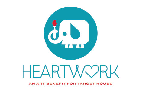
Heartwork is a project designed to raise money for art supplies within the art room at Target House—this wonderful home-away-from-home for the families of children facing long-term treatment at St. Jude’s Children’s Research Hospital.

The idea is simple. Every year, a group of talented artists will create a series of posters to raise money for the art room. Each of the posters will feature a different interpretation of the Target House elephant mascot, chosen because it represents family, long life, strength and playfulness—attributes with special meaning at a place designed for families to live, play and heal.

Read the rest of this entry »

Takenobu Igarashi: Early Design Work

Takenobu Igarashi

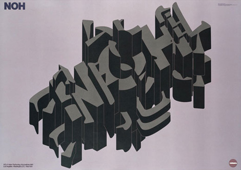
Contemporary Sculptor Takenobu Igarashi started his career in the early 1970s as an extremely talented Graphic Designer, quickly attaining international acclaim for his axonometric style of form and typography. Takenobu Igarashi has created identity systems, signage, products, packaging and graphics for notable instituions such as GRAPHIS Magazine and MoMa, and has work now rests in the permanent collections of museums all over the world. In 1994 he put his design talents to rest and moved to Los Angeles to pursue his career as a Sculptor. He is currently the President of Tama Art University, where he had originally helped to set up the first program for “computerized design” education in Japan.

Read the rest of this entry »

Paper Punk

paper punk

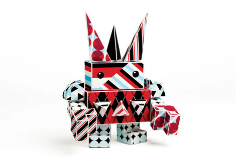
Paper Punk is a startup company that’s equal part hands-on toy, art piece and educational tool. Founded by Grace Hawthorne (ReadyMade magazine co-founder), Paper Punk is the result of her many years engaging people with design and encouraging them to create with their hands.

Punks are constructed out of foldable, brightly colored die-cut paper blocks — each kit comes with stickers and instructions for building and customizing your robot, dog, or car. I love the built-in ability to remix and customize your own creations. The systems uses simple shapes and a variety of patterns allowing you to build a wholly unique creation.

Read the rest of this entry »

Art for Joplin

Joplin posters

St.Louis Based Moosylvania and All Along Press have teamed up to put together a series of posters to benefit relief efforts in the tornado-stricken city of Joplin, Mo. Each poster is signed by the artist and screen printed by hand to order. All proceeds will be donated to the Southwest Missouri chapter of United Way to aid in the economic reconstruction.

Read the rest of this entry »

Keetra Dean Dixon

Keetra Dean Dixon

As a freshman in college, I was introduced to the intelligent and thoughtful work of Keetra Dean Dixon. As one of my earliest design influences, she helped me look at typography in a totally unique way. Whether it is using tactile materials (like wax) or lazer cutting or even just a regular pen, her playful take on type brings language to an entirely new level.

Read the rest of this entry »

Everything-Type-Company

everything-type-company

Everything-Type-Company is a new design studio collaboration between Geoff Halber (Brooklyn) and Kyle Blue (San Francisco). Their portfolio boasts a nice variety of work for clients such as Yale School of Art, Arkitip, Dwell magazine, and the Walker Art Center.

Read the rest of this entry »

Justin Harder

Justin Harder

Multi-media designer Justin Harder produces mainly motion graphics for music videos and commercials, but his online portfolio also boasts a rather nice collection of static images. From geometric throwback typography and thick black logotypes, to illustrations and more experimental computer graphics, this LA based creative has a lot of hard work under his belt.
Read the rest of this entry »

We Have Our Winners

house industries

Handshakes & shout-outs to everyone who took part in the House Industries Photo-Lettering Giveaway! The winners were announced via our twitter stream and facebook page earlier today.

Special thanks goes out to House Industries for sponsoring the giveaway.

About Photo-Lettering

Read the rest of this entry »

Not to Late to Enter, Giveaway Ends At 6PM (PST)

house industries

The Giveaway is now closed. We’ll be announcing our winners via the Grain Edit Facebook page and Twitter stream on Monday.

Poster Pick: Mara Piccione

Mara Piccione

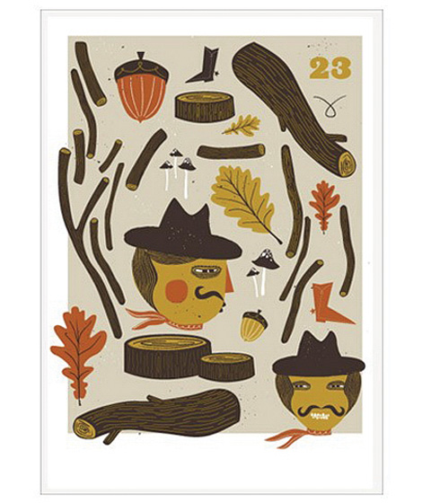
This week’s poster pick, Hack & Saw, is by the Dutch illustrator and designer Mara Piccione.  The piece appears to be an innocent Autumn medley. However after a closer inspection at the chopped wood and sinister-looking characters, a more devious image begins to surface. Is this the aftermath of a woodland massacre? are these guys constructing a giant slingshot? who knows, but I love how Mara’s work challenges the viewer and often requires a second glance.

You can pick up Hack & Saw at the Poster Cabaret.

Read the rest of this entry »

Colin Dunn

colin dunn

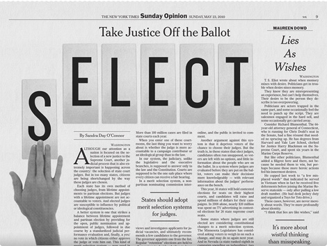
Great work from designer Colin Dunn. While still in the design program at MICA, Colin is designing work one would expect to see from someone with more experience. Also, in addition to being enrolled at MICA, Colin is a designer at Pentagram. I love the boldness and clarity of his portfolio — he makes good use of simple typography and a clean layout.

Read the rest of this entry »

Michiel Schuurman

Michiel Schuurman

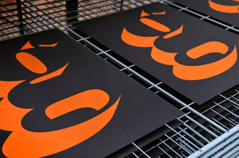
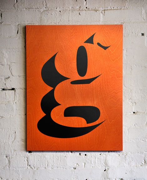
Michiel Schuurman is a Dutch graphic designer in working in Amsterdam. Schuurman’s personal work specializes in typography and poster design which often boasts a rather maximalistic approach. His practice of combining bright colors, warped glyphs, harsh perspectives, and acidic patterns creates some awfully intriguing eye-candy, which he often screen prints himself. Read the rest of this entry »

Will Staehle

Will Staehle

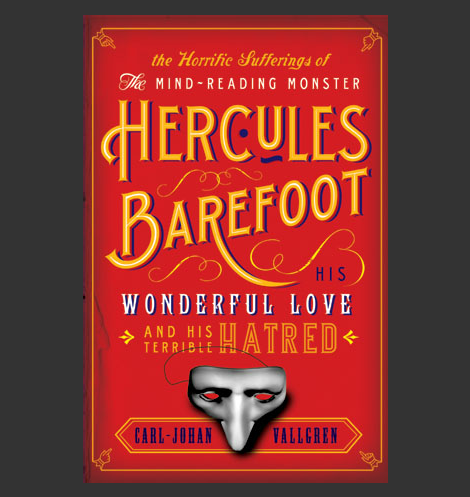
The work of Will Staehle is inventive with an incredible range of style and content. You might know of him because of his artwork aptly named the Silhouette Masterpiece Theatre, using silhouettes and some delightfully snarky text. Most of his design and type work is with his studio, Lone Wolf Black Sheep—producing iconic book covers, recognizable as some of the best selling books in recent years. He also has a really interesting blog of sorts, called the Dollar Dreadful Family Library, featuring amazing Victorian display type.

Read the rest of this entry »

Anorak Magazine Interview

Anorak Magazine

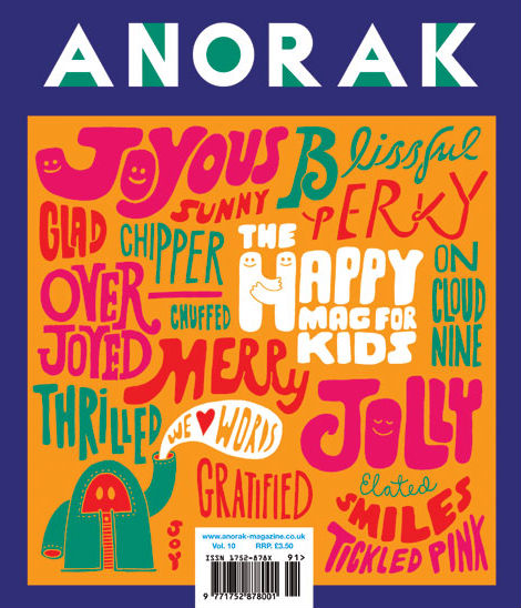
Our latest addition to the Grain Edit interview series takes us to London, home to the Mum and Dad of Anorak Magazine – Cathy Olmedillas and Rob Lowe (aka Supermundane). Anorak Magazine is “The Happy Mag for Kids” that features imaginative stories, engaging games, and activities illustrated by talented illustrators such as Adrian Johnson, Marcus Walters, Sasha Barr, Clayton Junior, even Grain Edit’s own Liam Devowski. In this interview, Cathy and Rob discuss the origins of Anorak magazine and take us behind the scenes of making the publication. They also drop some BIG news that you don’t want to miss!

Read the rest of this entry »

Jason Munn for Rolling Roadshow

jason munn

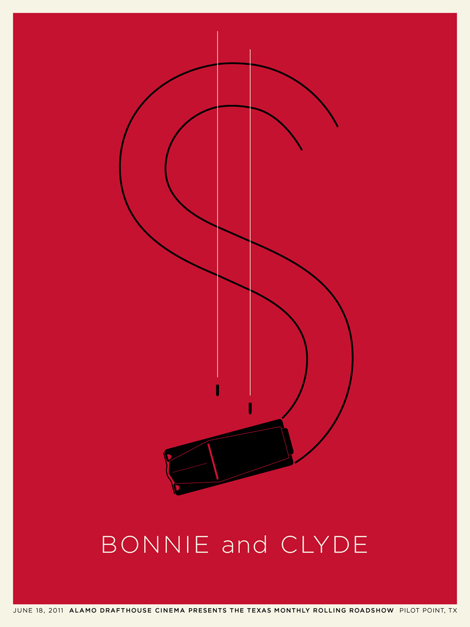
Bay Area designer and long time Grain Edit friend, Jason Munn, was recently commissioned by Alamo Drafthouse to design a series of posters for their cinematic Texas Monthly Rolling Roadshow. The series focuses on films that take place in Texas.

Read the rest of this entry »