


Chris Burnett
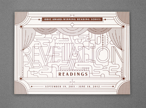
Nice design and lettering from Chris Burnett, a senior at Cal Arts. I love the mix of accessibility and exploration within his work. Looking forward to seeing more after he finishes up school.


Nice design and lettering from Chris Burnett, a senior at Cal Arts. I love the mix of accessibility and exploration within his work. Looking forward to seeing more after he finishes up school.
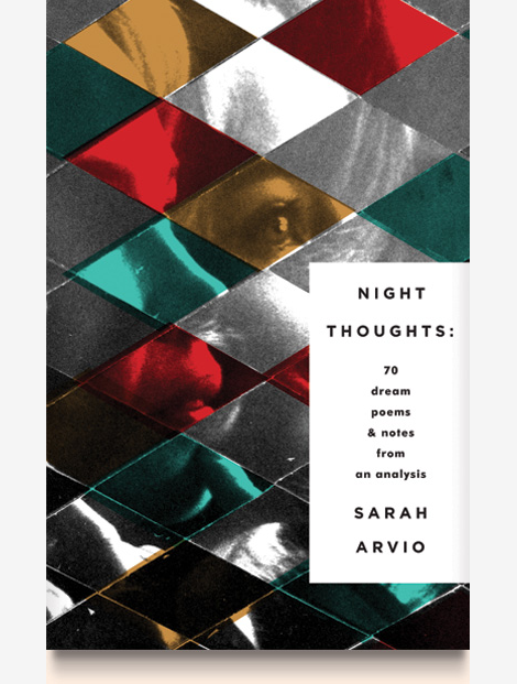
Talented designer and illustrator Elena Giavaldi really knows how to make judging a book by its cover easy. As a book cover designer, she creates very cool, contemporary compositions for some of the best publishing houses in the business. She also manages to put very personal touches on each project, and add a bit of extra interest with unique type choices and very modern, experimental lettering. Other than her expansive covers archive, her portfolio runs the gamut of graphic design, making her an incredibly versatile designer. To keep up with Elena, look for her work in a bookstore near you!
While most Grain Edit readers know Lotta Nieminen for her extraordinary illustration styles, but she also has an incredibly rich and beautiful design portfolio. Her keen eye for typography and layout design is relatively unmatched, and each project somehow manages to out-do the last. Together, her two portfolios create an exciting mix of work & almost a perfect dichotomy of truly minimal vs. extremely detailed.
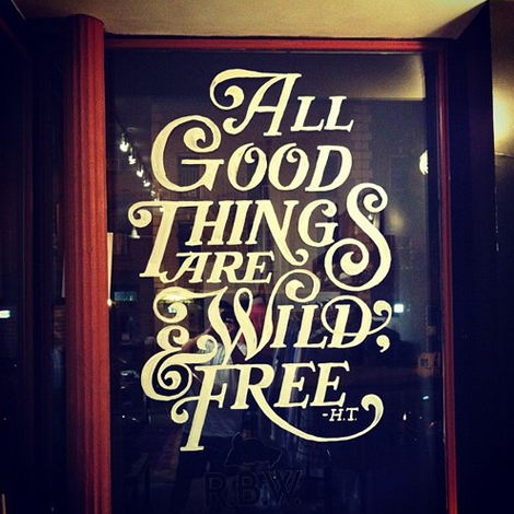
I was recently introduced to the work of lettering artist Matthew Tapia. He’s been an active figure in the skate and surf scene, but his elegant handiwork is incredibly well suited for all sorts of intricate lettering design. As a testament to his love for his craft, I witnessed him slaving away at 2am on the above mural, at a shop nearby my apartment (Raised by Wolves)—now that’s some dedication! To keep up with Matthew’s current work follow him on tumblr, and keep an eye out for his work hopefully soon in a shop (or on a store window) near you!
Type designer extraordinaire, Jesse Ragan, released the latest iteration of his website this past week. Chock full of new and meticulously designed work, Jesse’s type design gets more interesting with each project. His projects range from the current typeface of V Magazine, to the logotype for Glade, to working closely with Hoefler-Frere Jones on major typefaces like Gotham and Archer. Jesse, a self proclaimed designer of serious typefaces, is sure to continue to awe and inspire aspiring (and current!) type designers.
Lots of cool, crisp typographic work from Denmark-based Mads Burcharth. I love his clean, minimal approach to lettering and type design and his ability to add flourishes and interesting details to his work. His style is strong and bold, and has a great flair to it as well.
The sweet and quirky work of Mary Kate McDevitt never fails to delight. Her personality shows through in every brush stroke and chalk mark, and really accentuates her obviously love for her craft. With a quickly growing client list of industry big-timers like Chronicle Books, Lehigh University, Better Homes & Gardens and Rachael Ray Magazine, Mary Kate seems to be on a path to lettering success.
Laura Meseguer is a type designer, letterer and designer from Barcelona, Spain. I love the immediacy of her work and how ably she navigates between play, function, legibility and form.
Rumba (seen after the jump), especially, catches my eye as it has a wonderful calligraphic, hand-lettered quality to it. You can peruse more of Laura’s work on FontShop, House Industries, Type-Ø-Tones and MyFonts.
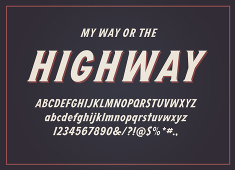
As users of an ever-changing internet, it’s amazing to see large project come together by someone that we’ve been following for years. In this case, I was lucky enough to get a sneak preview of a really great new typeface by Dan Cassaro, called Highway. Easily manipulated to create the look of lettering, but tight enough to use as ready-to-go typography, Highway fills the gap of versatility that many will find just perfect for their next project.
To get a bit more insight into the process and how the idea began to come together, I asked Dan a couple of questions.
Typographer extraordinaire Marta Cerdà Alimbau brings new meaning to the idea of decorating type. With her modern and elegant letterforms, she creates compositions that put her at the top of her game. I love her penchant for creating 3 dimensional forms with letters that allow the work to extend past their natural 2D state. Marta also often collaborates with another extraordinary typographer and friend of Grain Edit, Alex Trochut. With an amazing roster of clients, this young and talented designer is sure to be one to watch going into 2012.
