May 2010

You are currently browsing the monthly archive for May 2010.

Intelligence in Lifestyle

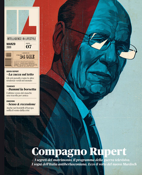
Grain Edit / Intelligence in Lifestyle Magazine

Intelligence in Lifestyle, an Italian magazine and supplement to the Il Sole 24 ORE newspaper, is one tasty piece of work. That striking cover above initially grabbed my attention, but inside is just as compelling.

Read the rest of this entry »

Expo 70 Japan

expo 70

Takara Beautilion Pavilion designed by Kisho Kurokawa

40 years ago, Osaka hosted the first world exposition to be held in Asia. Representing 76 countries and an array of international and domestic organizations, Osaka Expo ’70 was an exemplary platform of engineering and architectural finesse through its vast showcase of pavilions.

Expo ’70 boasted numerous temporary complexes designed by notables such as Canada’s Arthur Erickson and Renzo Piano. The event was also a fitting platform for these Japanese Metabolist architects, Kenzo Tange, Kisho Kurokawa and Kiyonori Kikutake to pursue their concepts characterized by large scale, flexible, highly-engineered structures that evoke the processes of organic growth.

Read the rest of this entry »

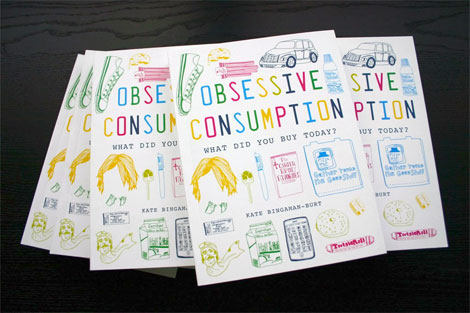
Obsessive Consumption by Kate Bingaman-Burt

kate bingaman-burt

Photo: Kate Bingaman-Burt

Did you buy something today? Do you remember things you’ve purchased within the last week, let alone within the last year?

For the past four years, Portland based illustrator and educator Kate Bingaman-Burt has documented all of her purchases with daily drawings. The end result of this documentation: a new book published by Princeton Architectural Press, entitled Obsessive Consumption: What Did You Buy Today?

Started as a break from drawing credit card statements, Kate’s ink drawings are entertaining and intimate as they put a face on ordinary objects that we consume on daily basis and often don’t think twice about. From sunglasses and snacks to wedding bands and a dog, these objects tell a personal story we can all connect with as members of consumer culture.

Read the rest of this entry »

Dan Stiles Interview

grain edit / dan stiles

For the latest Grain Edit interview, we head to the beautiful Pacific Northwest city of Portland, Oregon. While Portland is known for it’s drizzly rain, recent influx of people, and amazing food cart scene, it is also the home of many talented designers. We here at Grain Edit had the chance to visit PDX and catch up with one of it’s very accomplished residents, Dan Stiles.

Dan is a long time designer and contributor to the contemporary gig poster scene. His work is always very fresh, energetic, engaging and fun. Dan is very successful at creating dramatic work while using minimal colors and patterns. In this interview we chat with Dan about his history as a designer, his thoughts on running a solo studio, working in Portland, and much more.

Enjoy!

Read the rest of this entry »

Nuzzles: Wooden Name Puzzles

nuzzles

Really like these wooden typographic puzzles (Nuzzles) from designer John Christenson. Hopefully John will have a Nuzzles shop up soon!

Read the rest of this entry »

Dan Matutina: Design & Illustration

dan matutina, twisted fork, status and shapes, philippines, design,   illustration

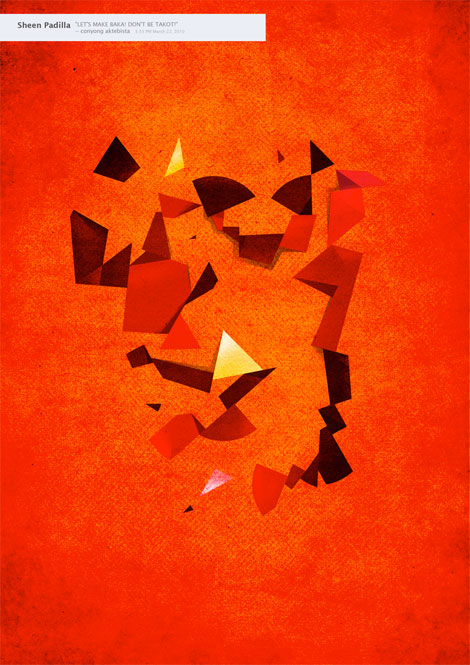
Philippines based artist, Dan Matutina, has a keen eye for rich textures and geometric shapes in his works. Dan started a poster series inspired by his friends Facebook statuses called Status and Shapes. This piece, titled (Sheena Padilla) “LET’S MAKE BAKA, DON’T BE TAKOT,” translates to “Let’s fight, don’t be afraid.” The hot hues clearly communicate the heated adrenaline in a fight, and the shapes are positioned in a way that looks like two fighters boxing.

Read the rest of this entry »

Rise & Fall: A Concertina of Life by Micah Lidberg

micah lidberg rise fall

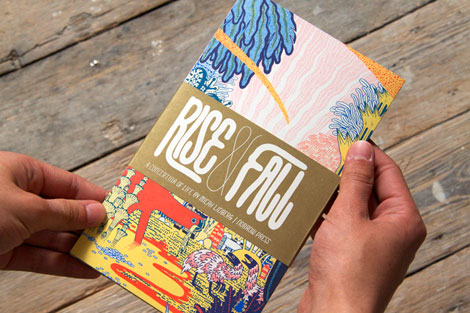
I got a surprise package in the mail the other day from Nobrow. Included in the package was Micah Lidberg’s Rise & Fall: A Concertina of Life. This might be my favorite Nobrow release to date. It’s an accordian style book that folds out to a stunning 53 inch panorama. Each panel is filled with prehistoric creatures dodging fire, climbing trees or sipping on slimey goop. His illustration style and composition for the piece remind me of traditional Japanese woodblock prints. Lovely stuff.

You can pick up a copy at Amazon.

Read the rest of this entry »

Yulia Brodskaya

Grain Edit / Yulia Brodskaya / Stern Grove poster

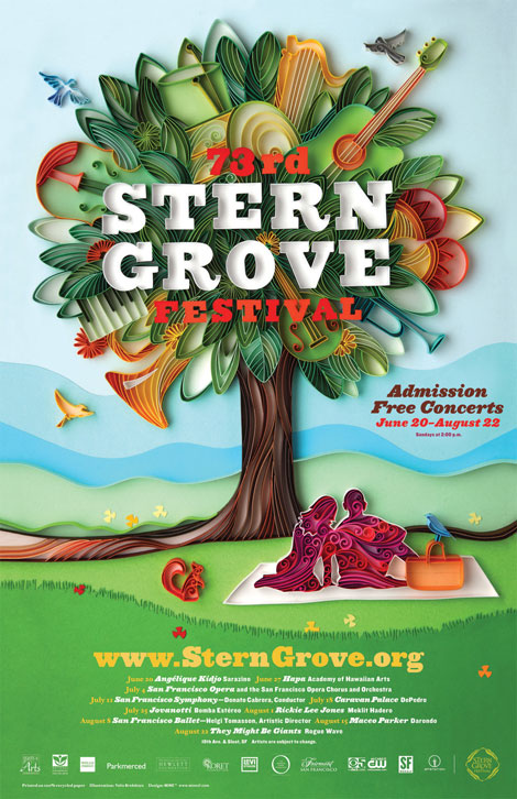
Long time Grain Edit friends and all-around swell studio, MINE™, has a sweet gig going. Each year, the city of San Francisco puts on a free music festival in Stern Grove — and MINE™ is given creative and curatorial license over the promotional poster. Over the years a visual language has been established; the poster contains repeating themes and elements (a tree, a grassy hill, etc). The catch is that each year a different artist or designer is hired to create the main image.

Read the rest of this entry »

Paul Ibou: Logos, Posters & Calendars

paul ibou

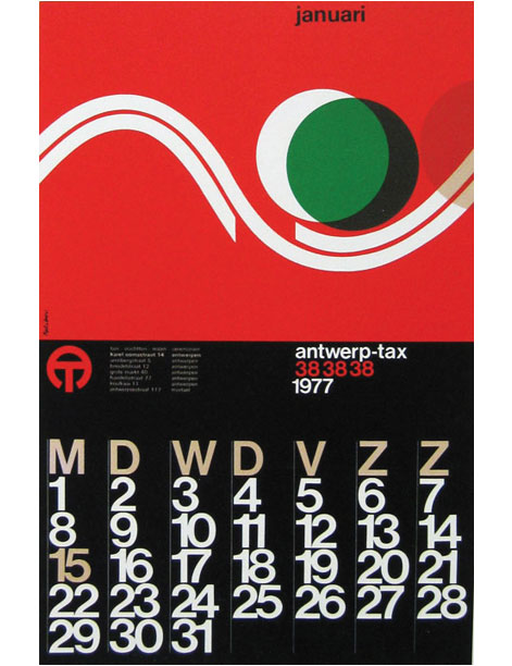
Calendar for Antwerp-tax designed by Paul Ibou

Iconofgraphics has a great post on the work of Belgian designer Paul Vermeersch (a.k.a. Paul Ibou).

Read the rest of this entry »

Celestial Navigations: The Short Films of Al Jarnow

As a kid, watching Sesame Street and 3-2-1 Contact was a daily ritual. Of course, there were particular animations from those shows that I could watch endlessly, such as three rocks squabbling about how cross a lake. With the advent of YouTube, these animations have resurfaced and offer a trip back to simpler times of wonder and discovery. But who made them?

Introducing Al Jarnow, the mastermind behind the short films embedded into our collective memory. Celestial Navigations: The Short Films of Al Jarnow compiles a retrospective of Jarnow’s familiar animations from CTW along with his more obscure shorts. Jarnow experiments with geometric shapes, color, scale, and proportion in his films, creating everlasting works that communicate changes through time and space to both young and old.

Read the rest of this entry »

The Sign Painter Movie

sign painter movie

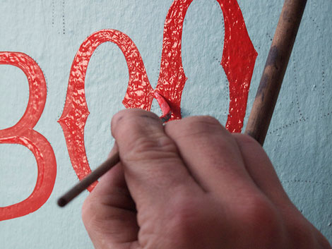
Production recently started on The Sign Painter. The new documentary on sign painting will include interviews with several of the artists that still practice this age-old craft. The directors, Sam Macon & Faythe Levine, were recently in San Francisco to capture footage of Jeff Canham, Bob Dewherst, New Bohemia Signs, and Jimmie “the saint” Collier. You can find more info on the film at the website and official Facebook fan page.

Read the rest of this entry »

Luke Bott

grain edit / luke bott

Fun work from Kansas-based designer/illustrator, Luke Bott. (And a cool last name!) Luke’s work has a playful/whimsical feel to it, as well as solid composition, typography and color choices.

Read the rest of this entry »

The Swell Season Concert Poster by The Small Stakes

the small stakes
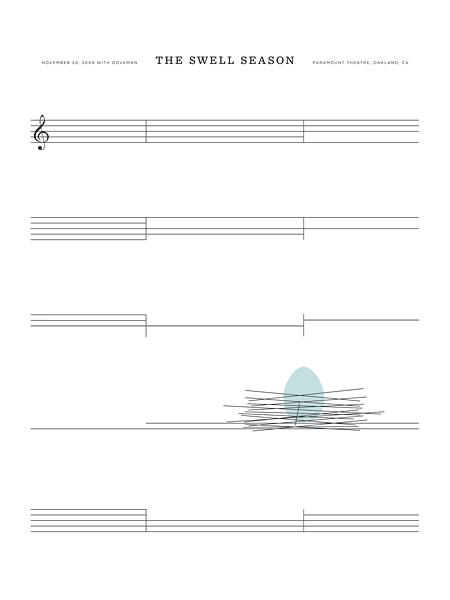
The Swell Season Concert Poster by The Small Stakes

This week’s poster pick was created by Jason Munn of The Small Stakes. It’s incredibly simple and yet so clever. I like how Jason used the the bars from the sheet music to form a bird’s nest. If you’re interested in purchasing this poster, you can pick up a copy here.

European Book Covers

Grain Edit book covers

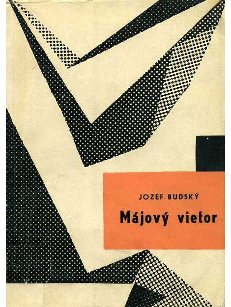
Wow! Great collection of European book covers from A Journey Round My Skull. So fun to look through. I love the balance of naiveté and compositional sophistication throughout these jackets. It’s amazing the depth that is achieved through simple illustrations and good color choices.

Read the rest of this entry »

Sasha Barr Interview

Sasha Barr, Grain Edit, illustration, design, This is the New Year

The latest installment to the Grain Edit interview series takes us to Seattle, birthplace of grunge music and home to illustrator and designer, Sasha Barr. I was first introduced to Sasha’s work a few years ago when I stumbled upon his website, positively titled “This is the New Year.” His work often employs rough textures, intricately drawn patterns featuring elements from nature and little creatures, and cool color palettes.

In this interview, Sasha discusses how he made the trek from Tennessee to Seattle, his influences and creative process, how he landed an awesome gig working at Sub Pop Records, and also shares incredible views of his awesome home.

Let’s dive on in!

Read the rest of this entry »

We Need Your Questions

jason munn

Chronicle books recently released a book on concert posters designed by Jason Munn of The Small Stakes. We’re working on an interview with Jason in regards to the book and we thought we would open up the questions to our readers.

Please send us any questions you might have about Jason’s work or his new book. Use the contact form on our site to email us your question by 2pm Friday, May 7th. After we receive all the questions, Jason will go through the emails and select a handful of questions to answer. We’ll post his answers the following week.

Submit a question here.

Page 1 of 198123...Last »