April 2010

You are currently browsing the monthly archive for April 2010.

ilovedust

ilovedust / grain edit

Great work from ilovedust, a UK-based design studio. The above work is a promo, which (I believe) references the fact one of their offices is located in a former butcher shop. (It sounds like they have the two coolest work spaces in all of graphic design.)

Read the rest of this entry »

Jan Feliks Kallwejt

jan kallwejt

Wonderful illustration from Barcelona and Warsaw based designer Jan Feliks Kallwejt. The piece was created for a Polish daily newspaper that is devoted to business and economic issues. The white buildings form a jumping gazelle. I’m not sure how the newspaper used the illustration. Could some of our Polish readers fill us in?  Can’t say I would want to live near the rear end, it would bring new meaning to living in the “ass end ” of town.

Read the rest of this entry »

Amsterdam (Formerly N. Tetterode) Type Catalog

amsterdam fonts

Schriftenkatalog der n.v. Lettergieterij Amsterdam voorheen N. Tetterode

I rarely find cool type catalogs, but this one is a real goldmine. The catalog seen above was produced by the Amsterdam Foundry (formerly N. Tetterode) and appears to date back to the mid-1960s. It’s filled with beautiful specimens including Nobel, Mercator and Aigrette all lovingly laid out in a simple yet elegant manner. If this sparks your interest, I suggest taking a quick glance at the Vette Annonce type specimen sheet we posted back in 2008 as well.

Read the rest of this entry »

Ingela P Arrhenius Illustration

Ingela P Arrhenius, illustration, Sweden

This illustration from Sweden based illustrator, Ingela P Arrhenius, is a real hoot! It features a earthy colored owl with a geometrically patterned body against the cool colored tree and background. The composition is neat and symmetrical and it makes me feel like hiding in a tree for the day. Who’s in?

Read the rest of this entry »

The Silent Giants

silent giants / grain edit

The Silent Giants, a two-man Michigan-based studio cooks up some sweet silent awesomeness. Although, given the fact that most of their work is music related, the name is more than a little ironic. If you’re like me, you’ve seen the Giants’ work before and not known it — in the form of the popular and stylish Ra Ra Riot album cover.

Read the rest of this entry »

Vinyl Documentary: To Have & To Hold

To Have & To Hold is a new documentary from Jony Lyle that celebrates and explores the phenomenon of collecting Vinyl. The documetary includes interviews with well known collectors like Bobbito Garcia, ?uestlove, Chuck D, Andre Torres (From Wax Poetics), Amir (of Kon & Amir) and Bruce Ludvall, the owner of Bluenote. Based on the trailer the film seems to be heavily focused on collectors in or around New York.

You can learn more about the film at the official Facebook page. Also there’s an interview with the director over at Mat Dolphin’s blog.

I’d love to hear from other record collectors out there. What are some of your favorite pieces of vinyl in your collection?

(via Dylan over at the excellent Hard Feelings blog.)

Read the rest of this entry »

Mark Shaw Photography

mark shaw

Photo for Chevrolet/”New Yorker” magazine c1960

Svenska Mobler has a beautiful collection of photos from famed photographer Mark Shaw. Mark is best known for his photographs of Jacqueline and John F. Kennedy and his work in capturing couture fashion from the middle of the century.  During the 1950s and early 1960s Mark shot the European fashion collections for LIFE magazine. It’s interesting to note that he was one of the first photographers to shoot fashion on the runways and backstage at shows.

Read the rest of this entry »

Aske/Sicksystems Design

sicksystems, graphic design, aske, russia

Typographics is where it’s at!

This illustration, designed for Computer Arts Projects, is by Moscow based artist Aske. Created for his personal art project titled Sicksystems, Aske playfully shows the various levels of typography…literally! He has a real knack for using interesting forms, bright colors, and celestial details in his work.

Read the rest of this entry »

Partisan Memorials in Former Yugoslavia

Makedonium

Makedonium monument in Krusevo

I recently stumbled upon a slideshow of modern memorials in former Yugoslavia over at Robert Burghardt’s FZZ Fanzine. The memorials date back to the early 1960s following Yugoslavia’s emancipation from the Soviet Union. In the preface to the slide show Robert mentions, “These monuments belong to the most important witnesses of Yugoslav memorial culture and stem from the most active period of Yugoslav modern art which has been described as socialist modernism or socialist aestheticism.  As War-monuments they are unique: They do not express the fighting and death, but life, resistance and the energy by which they were carried. They are directed forward while they mark the starting point for a new society, whose products they are.”

Read the rest of this entry »

Rabbit Print by Leandro Castelao

leandro castelao

This week we’re excited to feature this Rabbit print by Leandro Castelao as our poster pick. Castelao is based in Buenos Aires and has previously been featured on grain edit. Rabbit is presented in Castelao’s signature style and I must say that I am once again blown away. The lines look like wires creating some sort of robo bunny with a CD drive on steroids. Good stuff. You can pick up a Rabbit print here.

Read the rest of this entry »

Ty Wilkins Illustration

ty wilkins, illustratiaon, logo design

Kansas based illustrator and designer, Ty Wilkins, has a keen eye for illustrating animals in a neat and refreshing way. This fox, one of the first in a series of animals, uses minimal geometrical shapes and rich hand painted textures. As a nod to his typographic interests, each illustration incorporates an asterisk, which adds visual charm. I wish I had this little guy as a pet!

Read the rest of this entry »

Mike Perry Interview

Mike Perry / Grain Edit

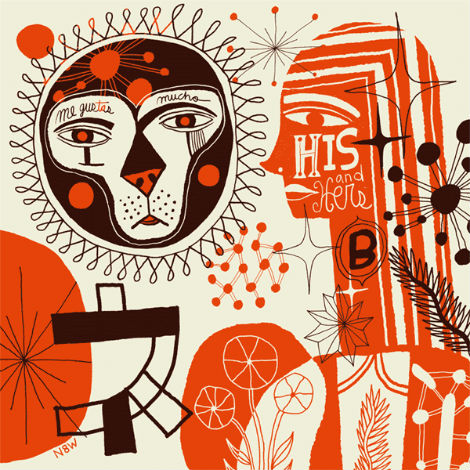
This Grain Edit interview takes us to New York’s largest burough—Brooklyn—and to the office of Mike Perry! I’m sure most here are quite familiar with his work. The style is very specific; you definitely know it when you see it. With the help of the fancy-shmancy Internet, Mike’s work seems often imitated, but never duplicated. There is only one Mike Perry, folks.

I became most familiar with Mike’s work with the publication of his first book, Hand Job: A Catalog of Type. While still in school I preordered it, as did many of my classmates. But I had my first real hands-on looks at it over at the studio where I was interning — they had an advance copy. I remember the smell, especially, as well as the general office ogling.

One of the things that strikes me the most about Mike’s work is that he can be making a zine or an object, putting on a show, or designing a typeface, or just doodling—all of his work feels consistent. With whatever he’s doing, you’re always entering the world of Mike Perry.

After the jump, Mike talks about various aspects of his work, his work history, and his favorite Brooklyn restaurant. Let’s get into it!

Read the rest of this entry »

Karl Oskar Blase

karl oskar blase

Deutsche Bundespost: Internationales Jahr Des Kindes stamp c1979  Karl Oskar Blase’s son is the boy in the image.

Karl Oskar Blase was born in the German city of Cologne (Koln) in 1925. At the age of 25 he attended the Wuppertal School of Industrial Art to study painting and graphic design. Around the same time he formed a design studio with Felix Muller. One of the studio’s more significant projects was to develop the layout for form magazine. Karl would go on to design almost all the covers through 1968. Karl also taught at the Kassel school of Industrial Art and designed many stamps for the Deutsche Bundespost.

Read the rest of this entry »

Julia Guther

Julia Guther / Grain Edit

Love these cutout illustrations and typography from Germany-based Julia Guther. Her work is minimal, colorful, and she uses a wide (and interesting) range of media.

Read the rest of this entry »

Pavel Fuksa Matchbox Designs for Navigators Video

pavel fuksa

If your a fan of vintage matchbox labels you will appreciate Czech illustrator & designer Pavel Fuksa’s latest project. Pavel created 178 matchbox covers for the Navigators “My Place” video,  many of which contain lyrics from the song. See the full video here

Read the rest of this entry »

Nate Williams Illustration

nate williams, n8w, illustration mundo, hola mi amiga, illustration

Buenos Aires based illustrator and artist, Nate Williams, is a force to be reckoned with! This illustration, entitled Lion and Molecules, uses an earthy palette reminiscent of A&W root beer; the chocolate brown layered over the orange and cream is a real treat! It’s choc full of organic shapes and patterns, including really lovely star bursts and variations in line texture and weights. Nate’s hand drawn type is also very fun and unique as it juxtaposes thick and thin, masculine and feminine.

Read the rest of this entry »

Matt Keers

Matt Keers, the UK-based designer responsible for the above design, has a portfolio full of the same: bold, colorful, and compelling.

Read the rest of this entry »

Page 1 of 198123...Last »