Toykyo

Toykyo

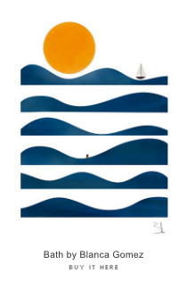
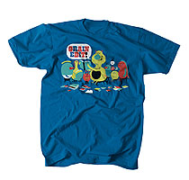
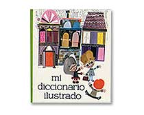
My first reaction upon being greeted by the above images was to smile. These are two pieces from Toykyo, the rad Belgian-based firm. They seem to wear many design-hats, and have work on an interesting variety of projects. Their personality definitely remains visible throughout their work. I love the the stylized shapes, simplicity, and bold use of color. Plus, major points for working in a Pacman ghost next to an elephant!

Read the rest of this entry »

Legistyles: Free Custom NetNewsWire Themes

netnewswire themes

I use NetNewsWire to read all my feeds. One of the great things about it is that you can use custom CSS styles. Antonio over Aisle One has put together a wonderful set of NetNewsWire styles that he calls Legistyles. As he mentions on the Legistyles site “Much attention has been paid to the design and typography of the styles to improve legibility and readability, and to enhance the overall reading experience.”

Currently there are 4 styles available.

Serif Black 1.0, Serif White 1.0 (Titles and body text are set in Baskerville)

Haaus (Titles are set in Futura and the body text is set in Lucida Grande)

and Brockmann (Titles and body text are set in Helvetica)

Check it out for yourself here.

Human Empire

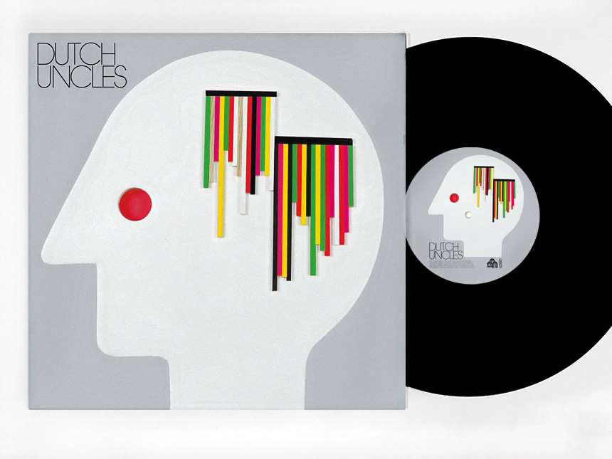
A simple, yet striking album cover designed by Human Empire. The head is constructed out of pure wood, and is reminiscent of the PBS logo from the early 1970s. The three dimensional strands of blocks on the side of the head look like stab wounds oozing with multicolored blood. If only our blood was that interesting!

Read the rest of this entry »

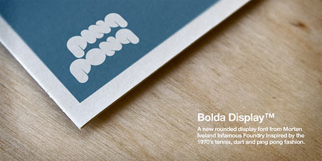
Bolda Display Font from The Infamous Foundry

bolda display font

The last time we mentioned Bolda Display on Grain Edit we were drooling over its eventual release. Well now its available for purchase. I gave it a test run and I have to say, I love this font.  I can’t get enough of those lowercase bubbly round slabs. Definitely one of my faves over the past year. It comes in two styles, regular and outline. This has to be the best (and only) font to be inspired by 1970s ping pong fashion.

Read the rest of this entry »

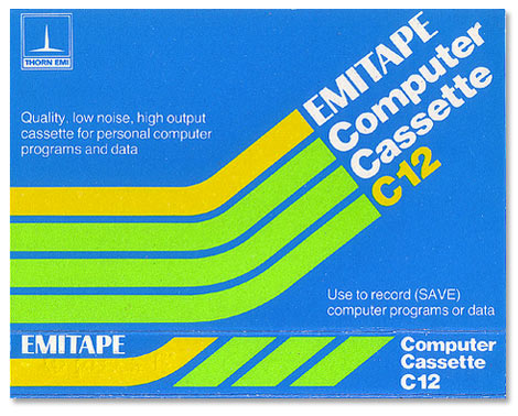
Vintage Cassette Tape Covers

vintage cassettes

Bruce Jamieson of the top notch design firm I Love Dust emailed me about this diamond mine of vintage cassette tape inserts he just uploaded to Flickr. The collection includes covers from Happy Sound, Bonsonic, Philips, BASF, WHSmith, Emitape, AGFA, TDK and a grip of others.  Lots of great material from the 1970s and 80s.

Read the rest of this entry »

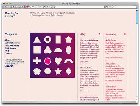
Duane King: BBDK & Thinking for a Living

thinking for a living

Duane King is the creator of Thinking for a Living. A well curated collection of recommended readings and online resources. The site is filled with links to top notch design blogs and firms. Many of the resources are available in a special zine that they put together. In addition to Thinking for a Living, Duane is the creative director of Santa Fe based studio BBDK. They recently completed a project for Italian glassware company Luigi Bormioli. We don’t usually cover web design on grain edit, but I think this site is worth checking out. Clean, minimal and elegant. Very nice.

Read the rest of this entry »

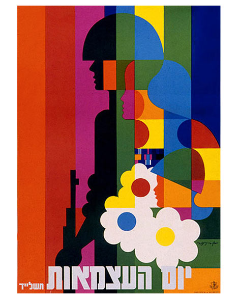
Dan Reisinger Design & Illustration

dan reisinger design

Dan Reisinger was born in Yugoslavia in 1934 to a family of painters. His early life was filled with adversity including losing most of his family to the Holocaust. In the 1940s he moved to Israel where he eventually joined the Air Force. It was here that he met his mentor and friend Abram Games. In the 1960s he set up a design studio in Tel Aviv where he helped to design the Israeli Pavilion at Expo’67 as well as create a body of work for El Al Airlines.

Read the rest of this entry »

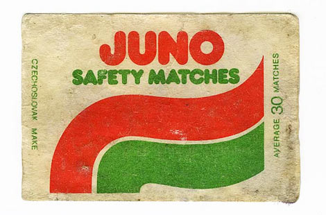
Juno Safety Matches

juno safety matches

Grain Edit reader Dan Chamberlain sent in this rad safety match label from the 1970s.  He discovered it on a recent trip back to his hometown in Essex where he stumbled upon his Grandfather’s collection of matchboxes.

You can see some of the other labels from his grandfather’s collection here.

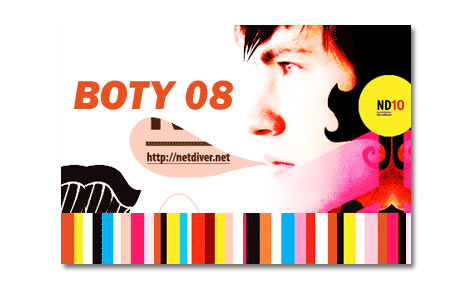
Netdiver Best of The Year 2008 (BOTY)

netdiver boty 2008

Netdiver now in its tenth year just put together one heck of a best of the year list. They aimed to list 100, but couldn’t do it. Check out all 110 solid picks here.

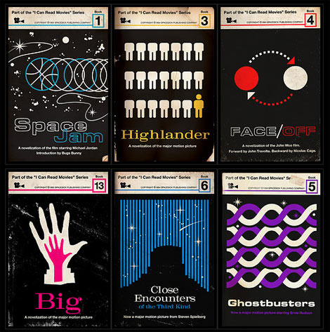
Spacesick’s Retro I Can Read Movie Series

I can read movies series

Spacesick absolutely nailed it with his I Can Read Movies Series. The series features cult movies redone as vintage paperback covers similiar to the Penguin book cover art of the 1950s + 60s.  Spacesick was partly inspired by Moss’s Movie Poster Remakes series, and all the musty old textbooks and digests that he used to love flipping through as a kid. I think my favorite is Highlander. Not only is the design great, but its absolutely hilarious.

(via neatorama)

Also worth checking:

Vintage Penguin book covers

Japanese book covers