Typ journal from Czechoslovakia

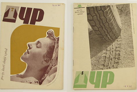
Typ journal from late 1940s in Czechosolvakia

Young people working in the printing industry in Czechoslovakia from 1920s to mid century were graced with a beautiful journal, Typ. The decision to use only a couple of colors, lots of negative space, play with alignment, and change the placement of the title kept the design on the forefront, in the late 40s and today.

Read the rest of this entry »

Matte Stephens Studio Visit

matte stephens

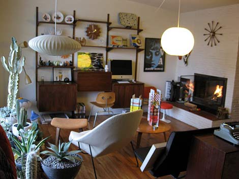
I’m excited to announce that I will be writing for Herman Miller’s Lifework blog from time to time. The blog which recently launched in December, explores issues that arise around working from home.  For my first contribution, I spoke with artist Matte Stephens about his inspiring workspace. You can see the full piece here.

Read the rest of this entry »

Ptarmak

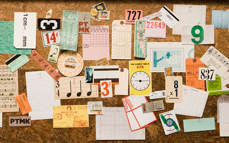
Wow! Fun, exciting work from Austin-based design collective Ptarmak. Their work is a refreshing example of design that looks great, and is also very usable. I love when design can do both of those things. It’s simple and clear, but equally as sophisticated. And that typography: whew!

Read the rest of this entry »

Jay Ryan

jay ryan

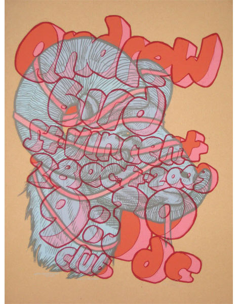
Andrew Bird @9:30 Club poster – Designed and Illustrated by Jay Ryan

The work of Jay Ryan was one of my first introductions to graphic design and gig posters — way back in the olden days. I spent many quality hours checking out his website and taking in his work at Flatstock. Screenprinted squirrels, eccentric characters, and hand lettered typography? It’s so interesting that these diverse objects can come together and say something so compelling about a band like Shellac, or Built to Spill, or Sebadoh.

Jay Ryan is this week’s poster pick — and you can purchase his work through Poster Cabaret.

Read the rest of this entry »

The Future is Today: 2010 Calendars

2010 calendar seesaw press

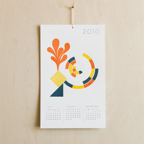
2010 Calendar by SeeSaw Designs.

Having trouble remembering what day it is? Still stuck on 2009? Well friends, the future is today!

This particular calendar, designed by SeeSaw Designs, nicely juxtaposes organic forms and geometric shapes. The pairing of the corals with the varied blue hues is pretty dandy too.

We’ve compiled a list of some of our favorite calendars of 2010 for all you procrastinators out there. Check it out!

Read the rest of this entry »

Jonny Wan Illustration

jonny wan

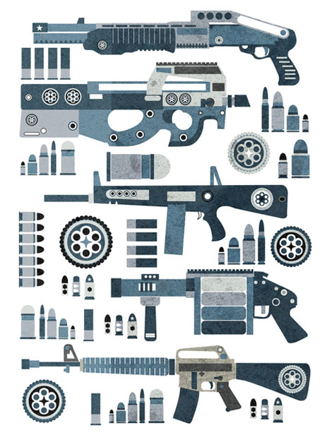
Guns Pattern 2 – 17″x22″ Designed and Illustrated by Jonny Wan

Really loving the work of Sheffield based illustrator Jonny Wan. His portfolio is filled with interesting explorations with shape and color, plus the dude can draw some guns! If I had cartoon hand, I would ask Jonny if I could take a few of these heaters out to the local hand-drawn gun range to squirt some rounds!

You can catch Jonny over at Twitter and for those interested in purchasing a print, you can pick one up in his shop.

Read the rest of this entry »

Map of Lucerne, Switzerland

luzern map

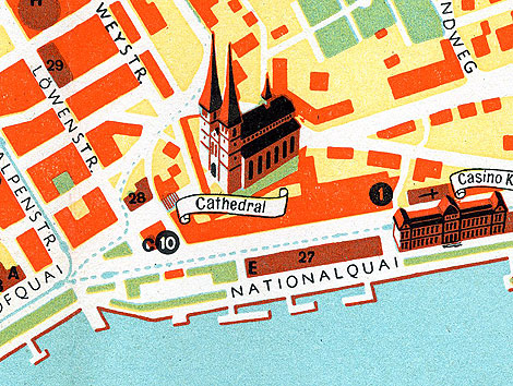
The Swiss are known for their well designed watches. Franck Muller, Rolex and Omega are just a few of the manufacturers with established roots in Switzerland. I’m sure more then a couple people visit this country each year just to check out luxury timepieces. Can’t say I fall into that crowd, but I’d be more then willing to go  if someone wants to front the bill! For those that can afford a watch buying trip and happen to have a time machine laying around, this map could prove very useful. The map, which dates back to the late 1940s(?) helped guide tourists visiting the Lucerne area in search of well respected watch merchants.  It includes recommendations from the Swiss Watchmakers Guild, so you know its golden. I think.

I love the teal, and the orange accents, but the pale yellow is a little too much for me. I have a feeling whoever designed this map has a hankering for crusty mustard, word up.

Read the rest of this entry »

The Catton House

catton house

The Catton house designed by Arthur Erickson and Geoffrey Massey in 1967

More amazing work from the late great Arthur Erickson.

Read the rest of this entry »

Chad Kouri

Chad Kouri / Grain Edit

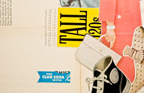
Grain Edit friend and design champ Chad Kouri, of Long Live Analog and The Post Family, has a wonderful solo show opening this Friday at Chicago’s Rotofugi Gallery. Chad’s work, like his moniker, is based in the analog. It’s a compelling collage of found images, hand drawn elements, and textures.

Read the rest of this entry »

Esther Aarts Illustration

Esther Aarts illustration

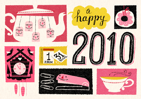
It’s out with the old, in with the new. Goodbye 2009, hello 2010!

Netherlands based illustrator, Esther Aarts, created this holiday greeting card for van Ditzhuijzen accountants. Its charm lies in its personified objects, such as the gleeful teabags and toothy stapler, set against coarsely textured backgrounds. I really like the color scheme with its varied pink hues in stark contrast to the grainy black, and the hand drawn type is also an added plus…making way for a fresh new year.

Read the rest of this entry »