Nikolay Saveliev

Nikolay Saveliev - Grain Edit

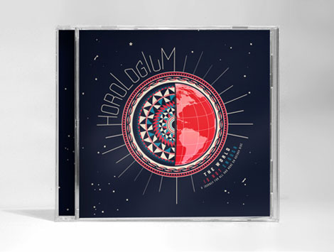
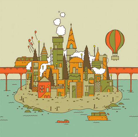
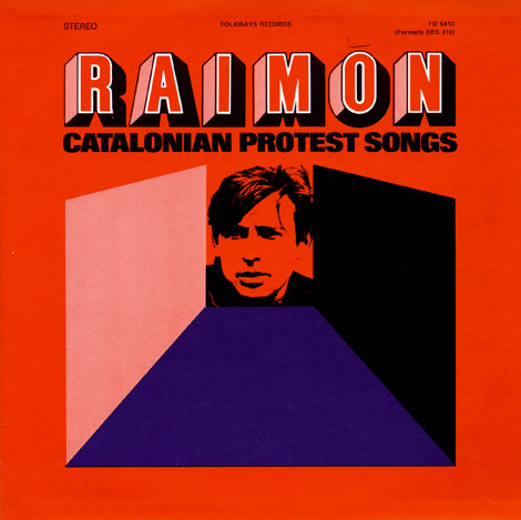
Great work from New York based designer Nikolay Saveliev. The album art shown above in one of my favorites from Nikolay’s portfolio; I love how the intricate patterns work with the map and space imagery. The graphics are fresh, but also speak to the genre and style of music.

Read the rest of this entry »

APAK

APAK, illustration, wood panel, Portland

Portland based illustrators, Aaron Piland and Ayumi Kajikawa Piland, are the dynamic husband-wife duo behind APAK. This particular work, created for Tinlark’s 3rd Anniversary Show, nicely juxtaposes a geometric structure against the lush organic blue and green forms. Their work is very much a fantasy, with mythical creatures and animals coexisting in a dreamy imaginative world.

Read the rest of this entry »

World of Logotypes

world of logotypes

Danish Giftparcels | Denmark |

Some of you might remember when World of Logotypes made the rounds on the design blog circuit last year. If you missed out, Amy over at the excellent Aqua-Velvet blog has highlighted a few of her favorite logos from the book. View Part 1, Part 2, Part 3.

You can pick up a copy of World of Logotypes at Alibris.

Read the rest of this entry »

Robert Sessler

robert sessler

Design work for Hagar -1969

Robert Sessler was born in the Swiss city of Bern in 1914. Robert first began experimenting with design during his late 20s at the Zurich School of Arts where he was trained under the Bauhaus instructor, Johannes Itten. In 1942 he left school to open his own studio and become a member of the Swiss Werkbund. He maintained his studio until 1953 when he was offered a position as the head of the graphic design department at the Saarbrucken School of Art in Germany. He continued to teach at Saarbrucken and later at the University of Saarland until his retirement in 1979.

Read the rest of this entry »

Shaun Lind

Shaun Lind / Grain Edit

Fun work and a new site from Shaun Lind, a designer, illustrator, Austin-living person, man, and member of the esteemed design/creative collective Public School. There’s a nice balance between the fun and the useful in Shaun’s work. For example, I love amount and quality of identity alongside his interesting self-initiated projects.

Read the rest of this entry »

Isle of This Town by Invisible Creature


Isle of This Town by Invisible Creature. Meas. 17″ x 17″

There is so much to enjoy in this week’s poster pick by Invisible Creature.  Everywhere your eyes go there is something to delight in. I want to live in this poster and I honestly can’t decide which element is my favorite.  The color scheme is perfect and really lets your imagination soar. There is a lot to be said for work like this that inspires you and takes you away to another world.  You can buy it here.

Noma Bar Interview

noma bar

Noma Bar is a man of few strokes. But don’t let the simplicity fool you. His talent lies in his efficiency in depicting characters and social issues. With bold colors, shapes and one or two icons he captures the spirit of a person. Other times he communicates a message on a social issue with amazing clarity while adding a bit of humor to everything. Whether the message is about violence or equality, his straight-forward visual approach is refreshing.

Read the rest of this entry »

Emily Forgot

emily forgot design, emily forgot illustration, emily forgot uk

London designer and illustrator Emily Alston, better known by her moniker Emily Forgot, takes us on quite the journey in this illustration for Design Week.

She features a cascade of chairs, lamps, and other household accessories layered upon each other to create a surreal environment. The colors in this piece play with light, with its soft tints of cyan and salmon juxtaposed against a dark chocolate background. The really sparse patterns hidden intermittently within the shapes are a real treat too!

Read the rest of this entry »

Ronald Clyne at Folkways

ronald clyne

ronald clyne

Being an avid collector of records, I’m looking forward to getting my hands on Unit Editions most recent release.

From the website:” Ronald Clyne at Folkways is a 64 page ‘newspaper’ devoted to designer Ronald Clyne’s record covers for the Folkways label. Ronald Clyne (1925 – 2006) designed over 500 album covers for Folkways and is largely responsible for the famous label’s striking visual appearance. His distinctive use of two-color printing on matte paper and his deft use of modernist design strategies, created a body of work that gave the Folkways label its distinctive aroma of integrity and purity.”

Read the rest of this entry »

Philippe Nicolas

Philippe Nicolas
Aerial wonder! These birds-eye illustrations from Philippe Nicolas are pretty fun. Simple, colorful, and oblique—I love how angular and well composed these pieces are.

Read the rest of this entry »