Deanne Cheuk

Deanne Cheuk

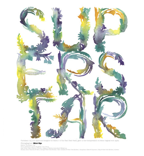
A renaissance woman of sorts, Deanne Cheuk has made a name for herself in the art world as a prolific illustrator. She quickly ventured into hand drawn & custom typography and has really created some amazing things since she began her journey into the world of type. While her work doesn’t always fit within a certain style, Deanne brings an distinct elegance to the art of the display type.

Read the rest of this entry »

Ryan Rhodes / Bigger than Giants

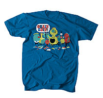
grain edit / ryan rhodes

I love the portfolio from Austin-based designer Ryan Rhodes (aka Bigger than Giants). His work represents an interesting range of styles and ideas, and he also possesses some superbly handy typographic skills. (See the inked type work for JBG Farms above and below.)

Read the rest of this entry »

Handbook of Pictorial Symbols

Handbook of Pictorial Symbols

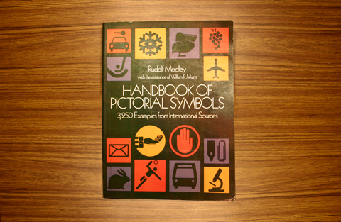
With a collection of 3,250 glorious icons, Handbook of Pictorial Symbols is great inspiration for any designer. Gathered from sources from around the world, these elegant yet minimal icons are a reminder that simplicity is truly key. Below is a small selection of my favorites from the book.

Read the rest of this entry »

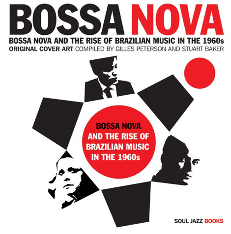
Bossa Nova And The Rise Of Brazilian Music In The 1960s

bossa nova book

Bossa Nova music arrived in Brazil at the end of the 1950s with an optimism and modernism that paralleled the arrival of the new Brazilian president, Juscelino Kubitschek, who promised ‘fifty years of progress in five’ in his election campaign and announced the building of a new capital city, Brasilia, deep in the heartland of Brazil. The city was designed by Oscar Niemeyer, a man who had just designed a new musical theatre production in Rio of a play written by Vinicius de Moraes and with music written by Antonio Carlos Jobim. These two, along with the singer João Gilberto were about to make Bossa Nova, the first modernist Brazilian art form, the most succesful Brazilian export since coffee.

Bossa Nova And The Rise Of Brazilian Music In The 1960s is a unique collection of the cover art of Brazilian Bossa Nova music, containing hundreds of record covers complete with a history of Bossa Nova, biographies and essays on many of the artists involved in the movement.

Read the rest of this entry »

C. S. Neal

cs neal

The work of Christopher Silas Neal is a lovely break from the chaotic mess that is the internet. It’s not often that you come across beautiful hand drawn type, mixed with completely original illustration, so it is a really great treat for the eyes. Also interesting is that his work always has a sense of movement to it. Even his typography, which is predominantly script, seems like it’s rushing across the page.

Read the rest of this entry »

Erik Marinovich

grain edit / erik marinovich

You need to take a gander at Erik Marinovich‘s work. It mirrors our current holiday climate quite well — bold and bright with a lot of busy hustle and bustle. Erik’s work defies any sort of specific style or set of rules (aside from the majority of it being typographic). The variety and amount of work contained within this portfolio is wonderful and exciting and void of plainness.

Read the rest of this entry »

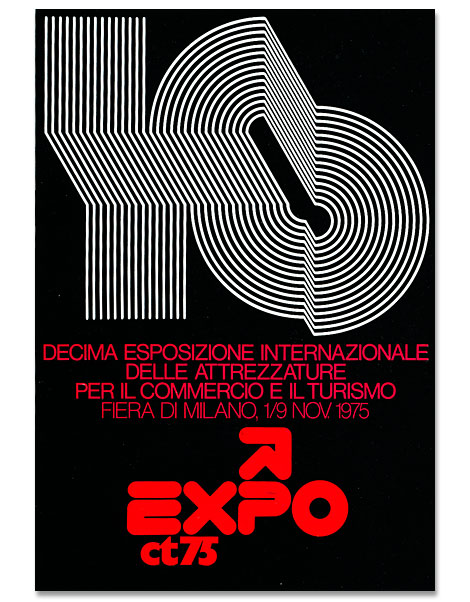
Mimmo Castellano: Posters and Packaging

Mimmo Castellano

Mimmo Castellano is an award-winning graphic designer and photographer who got his start in the port city of Bari located in the South-East corner of Italy. It was here that he landed a position with Laterza, a prominent publishing house, where he designed many of the book covers. This collaboration would last for over twenty years. In the late 60s he moved to Milan to further his career as a designer and taught at the European Institute of Design. In more recent years he has been researching digital imaging connected with photography and photomechanics.

Read the rest of this entry »

We Have Our Winners

Thanks to everyone who took part in the Grain Edit Holiday Giveaway Bash! It was great to see all your comments. We randomly selected our winners this weekend.

Our winners will be listed at the bottom of the Grain Edit Email Update and Grain Edit RSS Feed.  For those of you who subscribe to the email updates, the email should arrive tomorrow morning.

The winners were also announced via our twitter stream and facebook page earlier today.

——————————————————

Special thanks goes out to:

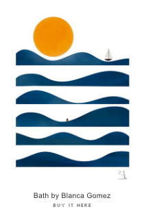
Poster Cabaret, YouWorkForThem, Chronicle Books, Soundscreen Design, Script & Seal, Rilla Alexander, Josh Brill/ LumadessaNo Brow Magazine, Blanca Gomez, Friends of Type, Ty Wilkins, Ingela P Arrhenius, Silnt, Dan Stiles, Jessica Hische, Scotty Reifsynder, enormouschampion, Marcus Walters, Invisible Creature, The Tree House Press, Jolby, Greg Pizzoli, Jason Munn, Brent Couchman, Paul Tebbott, Luke Bott, Esther Arts, and Dan Matutina.

Please take time to visit their sites.

——————————————————

Esteve Padilla

I was recently introduced to Esteve Padilla’s work and am really impressed with his ability to create interesting grids, while maintaining readable and clear type. Usually, I gravitate towards some crazy and/or experimental typography, but I have a very soft spot in my heart for a designer who knows how to use traditional typography to create beautiful layouts and publications. While Esteve seems to have conquered the difficult task of forming grids, his newest work (a font called “Nowadays”) has a touch of a old-style sign painting aesthetic.

I’m really interested to see where Esteve takes his work, he definitely seems to be a designer to watch for in the future. Read the rest of this entry »

New Items in the Grain Edit Shop

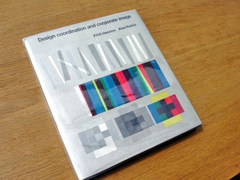
design coordination corporate image FHK henrion

Design Coordination and Corporate Image by FHK Henrion

New items have been added to the vintage kid’s books and graphic design sections of the grain edit shop.

Read the rest of this entry »