February 2013

You are currently browsing the monthly archive for February 2013.

Area 22

area 22

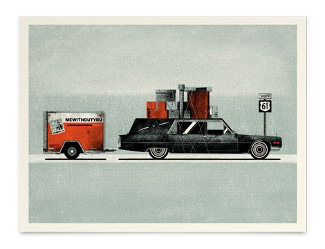
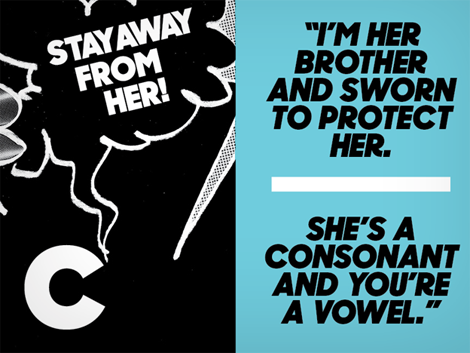
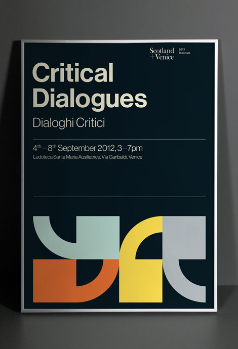
Area 22 is composed of the work of Sonia Chan, a UK transplant now making her living in San Francisco. Chan’s designs are a mix of identity and interactive projects, each one with its own unique character. Chan distinguishes herself by producing designs that are rustic but relevant.

Read the rest of this entry »

Shed Labs

Shed Labs
Lovely work from Shed Labs, the Greenville, SC-based design and screenprinting studio. Their aesthetic is bold and textural, and their work is very lively. The wit and sense of humor found in the work functions nicely with their colorful, playful style.

Read the rest of this entry »

Kendrick Kidd

kendrick kidd

Kendrick Kidd is a freelance designer out of Jacksonville, Florida, whose work spans type, identity, packaging and editorial. His work is playful and fun, yet skillfully executed.

Read the rest of this entry »

Flight Tag Prints

crayonfire

Inspired by vintage airline baggage tags, UK illustrator Neil Stevens (aka crayonefire) created these stunning posters. If they prove popular he will make them available in his online shop this Spring. Lets make that happen! Drop Neil a note here.

Read the rest of this entry »

/Sponsor/ Introducing Squarespace Commerce

Squarespace is a modern publishing platform that includes everything you need to create a professional website in minutes. This past week Squarespace introduced a truly integrated e-commerce solution that makes it dead simple to start selling products – digital or physical – directly from a Squarespace website.

With more than 20 new features, Squarespace Commerce lets you easily add products, process customer orders, and start accepting payments instantly – all from a single platform.

Try it for free today at Squarespace.com.

Commoner Inc.

commoner

Commoner, Inc. is a Boston based design studio consisting of Richie Stewart and Brook Towlson. They may be small, but their custom typography and branding have come together to produce multiple dynamic projects. Stewart’s ability to effectively mix vintage typography with modern design elements create works that are clean and memorable.

Read the rest of this entry »

Founded

founded

Founded is a Newcastle-based studio specializing in branding, packaging and environmental projects among other things. To me, their strong suit are their branding and identity projects. They do a great job of making subtle references and effectively using restrained typography while still managing to be witty — all within a very clean, minimal style.

Read the rest of this entry »

Greg Hubacek

Greg Hubacek

Greg Hubacek is a freelance designer and art director out of Los Angeles. His redesign of The Chronicle of Higher Education, a publication that delivers academic news in both physical and digital form, is straightforward and elegant while maintaining a sense of playfulness. By using grayscale images, Hubacek is able to use geometric shapes and bits of color for strategically placed emphasis.

Read the rest of this entry »

Recently Received

mati klarwein

From books on vintage record cover art to typographic notecards, here’s the latest batch of items to hit our shelves.

Read the rest of this entry »

Strohl for Lekerlee

strohl design

I have been an avid consumer of this German treat for years, but I can guarantee you that it was never the packaging that drew me in. SF Based Strohl took Lekerlee to the next level by creating packaging that is sleek and modern, a sharp contrast to the traditional gothic type and overly-illustrated german villages that usually adorn the cookies’ container.

Read the rest of this entry »

Poster Pick: Curtis Jinkins

Curtis Jinkins

Austin, Texas is a hotbed of design talent and Curtis Jinkins is one of our favorites to emerge from the scene. In this week’s poster pick, Curtis pays homage to home state with this bull print. Black and gold are prominently featured, which makes perfect sense given the history of this oil rich land. In the background, a blood red setting sun illuminates the derricks and windmills that dot the landscape.

This print as well as other works by Curtis are now available at the Poster Cabaret.

Read the rest of this entry »

Belinda Love Lee

Belinda Love Lee

Belinda Love Lee is a freelance designer out of Cardiff, UK, whose talents span print, web, and branding. Her business cards designed for prop stylist, Christina Yan, feature foiling, gold edging, and embossing that make for a beautiful presentation. Her attention to detail aids her in creating a design that is modern with a touch of whimsy.

Read the rest of this entry »

Albert + Marie

albert + marie

The work of SF based Will Ecke and Liz Doering a.k.a Albert + Marie can be described in one word – charming. The talented husband and wife team have a knack for creating bold and playful work that brightens up your day. Check out their Etsy store and add some sunshine to your life.

Read the rest of this entry »

Pagan and Sharp

One of the newest and most interesting typographic duos that has emerged lately, Pagan and Sharp—run by Carlos Pagan and Lucas Sharp—has released a new typeface called Sharp Sans. Based on the wonderfully simple vision of geometric styling, and a touch of humanism type theory, Sharp Sans does well in so many modern treatment situations that call for a bit of fun.

Along with Sharp Sans, they have produced Malleable Grotesque and the beautiful serif face, Hera Big. Pagan & Sharp are the creatives behind such notable work as the the latest Print 20 under 30 branding, Pinterest Logo, and recent New York Lottery campaign (Carlos’ work at DDB). With such lovely projects, they are well on their way to making a big splash in the typeface design world. Keep up with their latest news by following their twitter and keep an eye out for hopefully many more typefaces to come!

Read the rest of this entry »

Hannah Waldron

Hannah Waldron, art, design, London, Stockholm

Hannah Waldron is an artist and designer that shuffles her time between Stockholm and London. Her work is clean, bright, and filled with geometric forms juxtaposed against loose lines, and varied patterns and textures. The print above is just a taste of her work, and was commissioned by the Victoria and Albert museum in London.

Read the rest of this entry »

Graphical House

Graphical House

I love this Critical Dialogues pieces and the other work from the Glasgow-based Graphical House. I’m a fan of their bold, clean work and the nice balance between playful and smart.

Read the rest of this entry »

/Sponsor/ Squarespace

Squarespace is a beautiful and intuitive website publishing platform that allows anyone to easily create professional web pages, blogs, and galleries all in one place.

Simply start with one of Squarespace’s award-winning designs, add images and content, connect your social accounts, and you’ll have a website that looks great on every device.

All Squarespace accounts come with award-winning 24/7 support, as well as cloud hosting, real-time analytics, and a free domain.

Whether you’re a creative professional, business owner, or blogger, Squarespace makes it easy to bring your ideas to life.

Start your website for free today at Squarespace.com.

Cory Say

cory say

Cory Say is a typography designer, currently working out of Dallas, Texas as an art director for TracyLocke, a national design and marketing agency.

Cory’s most recent project for the Cattle Baron’s Ball showcases his gift for both branding and hand lettering, with his passion for typography coming across clearly in his work. His unique ability to create an intricate, multi-faceted design while not going over the top is also noteworthy.

Read the rest of this entry »