October 2010

You are currently browsing the monthly archive for October 2010.

Jon Contino

jon contino

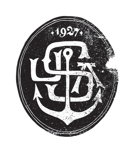
For my first post I am honored to bring to you Jon Contino. He is a designer, illustrator and a self-proclaimed ‘Alphastructuaesthetitologist’ (which sounds wonderful & incredibly hard to say) living in Brooklyn. His completely unique hand lettering style uses a rich mix of nostalgia and vaguely modern touches, making his particular brand of typography stand out. I particularly love his use of old sailor songs, sea life and of course the New York whaling-era ephemera. Along with his freelance career, Jon lives a crazy life as a partner at OneTwentySix design studio and owner of a men’s clothing line, CXXVI.

Read the rest of this entry »

Greg Pizzoli: Illustration

greg pizzoli, illustration, philadelphia, usa
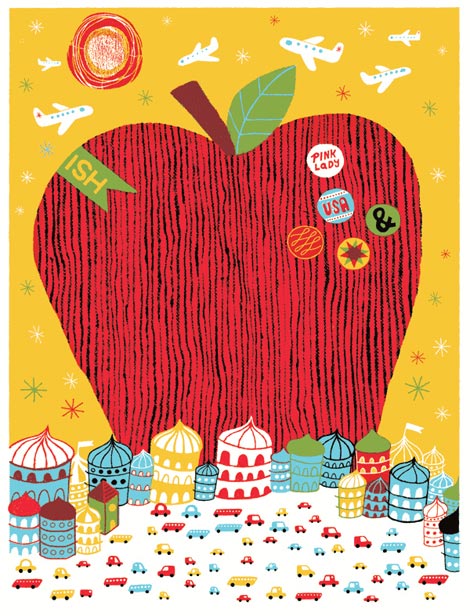
Take a look at that honkin’ apple! Philadelphia based illustrator Greg Pizzoli creates a fun whimsical environment in this illustration as he plays with the proportion of the massive textured fruit and the teeny tiny cars. There are so many neat colorful details to look at, such as the airplanes in the sky, buttons on the apple, and the varied shapes of buildings on the land.

Read the rest of this entry »

Postmammal

postmammal

Robert Murdock is Postmammal. As the pseudonym suggests, Robert’s work is sophisticated and evolved — illustrating the efforts of years of experience. Within the portfolio is variety, depth and style. There are large campaigns, small personal projects, identity systems, illustration, custom typography, and more.

Read the rest of this entry »

Vintage Citroen Ephemera

vintage citroen

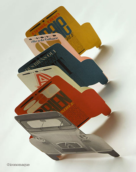
I love these Citroen pamphlets that Francois-Charles of iconomaque discovered while sorting through his father’s studio. The material was produced by his father while he was working as a designer at the French creative agency, Delpire, during the 1960s. More images after the jump.

Read the rest of this entry »

Recently Added to the Grain Edit Job Board

art of luggage label

Project Manager – Hybrid Design (San Francisco)
Web Graphics Productions Designer – MTV Networks(New York)
Motion Designer – American Greetings (Cleveland)
Interactive Developer – TBWA (Toronto)
Graphic Design Internship – Opportunity Green (Los Angeles)

You can subscribe to our job listings via RSS, Email or follow at Twitter and Facebook.

Read the rest of this entry »

Kyle Poff

 kyle poff

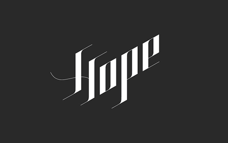
Sweet type! Kyle Poff‘s portfolio if full of similarly executed identity projects. He’s got a great way with the clean, crisp, stand-out typographic treatments. Hailing from the great city of Chicago, Kyle co-art directs the very cool Materiél Magazine (along with Michael Freimuth). The editorial and more complex design work contained within mirrors this tight, compelling simplicity.

Read the rest of this entry »

Stefan Glerum: Illustration

Stefan Glerum

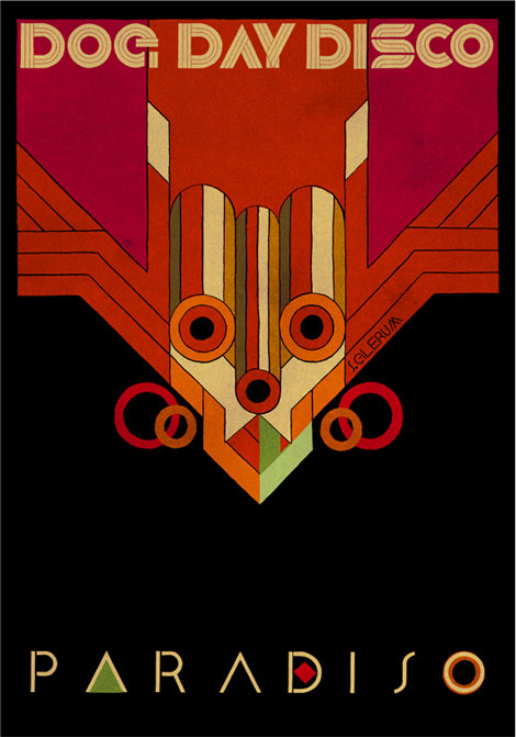
Amsterdam based illustrator Stefan Glerum has a unique style that I can’t get enough of. He uses rich colors, textures, and geometric shapes to create this abstracted totemic like figure for the flyer of music event Dog Day Disco. His use of typography is also thoughtfully executed in its shape and simplicity.

Read the rest of this entry »

Art of the Luggage Label

art of luggage label

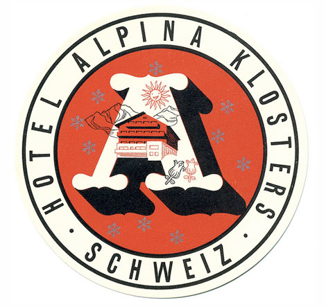
Tom Schifanella is Senior VP/Executive Creative Director for Shepherd Agency and a passionate collector of hotel luggage labels. I highly recommend his Flickr stream which is filled with amazing examples of these labels and other travel-related ephemera. Many of the labels from his collection are available for purchase here.
Read the rest of this entry »

Jim Flora Prints

Jim Flora

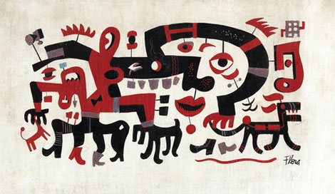
Untitled painting casually referred to as White Block Quadrupeds

Jim Flora was a fine artist/illustrator best known for his album cover art for RCA Victor and Columbia Records, as well as his illustrations for children’s books. In this uncirculated and untitled early 1940s painting, he presents us with a (literally) twisted cast of characters. As mentioned on the Jim Flora website, the work “depicts an inscrutable panorama of disconnected facial features, headless quadrupeds, and someone’s nightmare of a fanged horse”. This piece along with select paintings from the Jim Flora collection are now available as limited edition prints for purchase over at the Poster Cabaret.

Read the rest of this entry »

Dwell & Arktip at the Curiosity Shoppe

grain edit / dwell / arkitip / curiosity shoppe

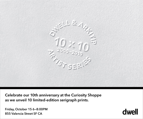
Dwell magazine is turning 10! To commemorate the event, they’ve produced a series of limited-edition serigraphs in collaboration Arkitip and some of their favorite artists. These posters will be on display at the Curiosity Shoppe in San Francisco, starting this Friday the 15th, and running through the end of the month.

If you’re in the area, stop by and say hello! The Curiosity Shoppe is located at 855 Valencia Street in San Francisco’s beautiful Mission District.

Read the rest of this entry »

Sparrow v. Swallow / Phillip Fivel Nessen

Sparrow v. Swallow, Phillip Fivel Nessen, illustration

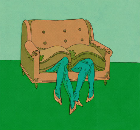
Check out the gams on that couch! Phillip Fivel Nessen, also known as Sparrow v. Swallow,  is a Brooklyn based illustrator with a flair for abstracted forms and thoughtful color palettes. Reminiscent of early work by Push Pin Studios and Milton Glaser, Phillip’s illustrations are conceptually thought provoking, smart, and often humorous.

Read the rest of this entry »

The Exquisite Book

The Exquisite Book

If you’re in San Francisco tomorrow night, I recommend stopping by The Exquisite Book Signing and & Live Drawing event. Artists in attendance will include Julia Rothman, Lisa Congdon, Caitlin Keegan, Susie Ghahremani, Kelly Lynn Jones, Tom Neely, Eunice Moyle and Lorena Siminovich.

Read the rest of this entry »

The Ultimate Swissair Fansite

swissair posters

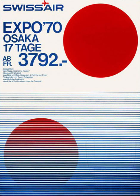
Patrick Eberhard has amassed an amazing collection of Swissair-related material. His website, Sr692 which is named after the flight number from Zürich to Lisbon, is filled with vintage posters, flyers, logos, stamps, route maps, tickets and books, as well as a detailed history of the airline. This is an absolute goldmine for those interested in Swiss design.

A hat tip to Shelby at Wanken for discovering this amazing resource.

Read the rest of this entry »

Darren Firth

grain edit / darren firth

Darren Firth is an extremeley talented designer, art director, and founder of Occupy, WIWP, and is currently working for Six.

Read the rest of this entry »

The Tree House Press: Illustration

tree house press

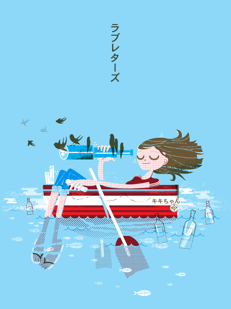
The Tree House Press is alias of UK based illustrator and designer Marc Aspinall. This illustration, aptly titled Love Letter, nicely blends rough textures and halftones with organic shapes and distinct line work to create a fun and endearing piece. Read the rest of this entry »

Gottschalk + Ash

Fritz Gottschalk

Poster for the Theatre Company at the St. Lawrence Centre

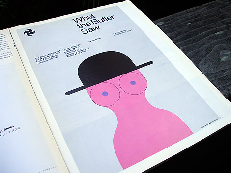
Gottschalk + Ash was founded in Montreal in 1966 by Swiss-born Fritz Gottschalk and Canadian native Stuart Ash. Independently and collaboratively, the two have racked up numerous design awards and honors over the last 40 years, with highlights that include identity work for Ciba and a re-design of the Swiss passport. Their work shown above is a great example of Swiss precision and a playful, more humanized take on design.

Read the rest of this entry »

Studio MPLS

grain edit studio MPLS

Plain and simple, Studio MPLS does great work. It seems like a lot of studios have that big, exciting, one-hit-wonder type piece in their portfolio, and the rest is less than compelling. Often times the client plays into the quality as well; bringing down work rather than elevating it.

It’s nice to see Studio MPLS working with a range of clients and still managing to create smart, fun, engaging design. I really appreciate those firms that can elevate and add meaning to the everyday business or idea, and not just make a flashy gig-poster.

Read the rest of this entry »

Adam Hancher

adam hancher

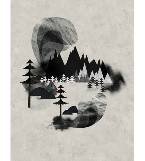
This week’s poster pick is a chilling landscape entitled Villages I by Adam Hancher. Adam is a talented illustrator based in Bristol, England whose work is often inspired by folk tales and legends. You can read about his process in this interview with Ape on the Moon where he explains his methods of layering scanned textures to create the look and mood he is aiming for. Villages I is available for purchase at the Poster Cabaret.

Read the rest of this entry »