November 2007

You are currently browsing the monthly archive for November 2007.

Hotel Infante Santo : luggage label

luggage_label_portugal-1.jpg
This is one of my favorite luggage labels out of portugal. Most likely from the late 1950s. I love the colors. Who wouldn’t want to stay in a hotel with bright orange panels as part of the facade? This hotel still exists and it really does have orange panels. At openline Portugal you can see a photo of the Hotel Infante Santo as it exists today (scroll halfway down the site).

Son of a gun its Peter Max !

peter_max_psychedelic_animation_video.jpg
Flying hot dogs, Cows turning into hamburgers and a 2000 pound stick of butter turning into the most disgustingly awesome popcorn you’ve ever seen. You’ll get it all in this animated psychedelic Pepsi commercial from Peter Max.

(via Made in England)

Viva la Bruno Bozzetto!

bruno_bozzetto_book_illustration.gif
Bruno Bozzetto : Viva Gli Abominevoli Sciatori
Cool cover for this obscure kids book by Mr. Bozzetto from the 1970s. Bruno is mostly know for his contributions to animated film. He has created hundreds of animated shorts and was nominated for an oscar in 1991 for a film entitled “grasshoppers”. You can read his complete biography at the official Bruno Bozzetto website.

Holy hot dog water! label sickness

czech_matchbox_label-astronaut.jpg
I go bananas for these Eastern European matchbox labels. I bought a complete run from 1958-1978 about a year ago and I still can’t get over how sick these things are. Most of these labels are 2-3 tones and some are completely off register. They look like little silkscreen posters (Most of these labels are 1.5 inches wide by 1.75 inches tall) . These labels make perfect posters for your kid’s doll house or inspirational art for your hamster to look at as he is jogging in his exercise wheel.

Plenty more of these little guys coming!

Otl Aicher 1972 Olympics soccer ticket

otl_aicher-1972_Munich_olympics-ticket.jpg
I don’t care what you call this sport (soccer, football, aggressive footsies), this ticket is sick! Stick figures rule!

(via cogtr1996)

70s Matchbox label from the Czech Republic

czech_label-stamp-club.jpg
Great match box label from Czechoslovakia. The label is from the late 1970s. We will be posting more labels from our collection over the next week.

10 years of Vendre design magazine covers

[pictobrowser 10159078@N03 72157603295091286]

10 years of Vendre design magazine covers (Best of 1952-1962)

Vendre was a monthly trade magazine for graphic designers in France. It was founded by Etienne Damour in the 1920s. The magazine’s chief editor was Roger-Louis Dupuy, who in addition established one of the first advertising agencies in France. Paul Nicolas would later become chief editor and guide the magazine through the 1950s and 60s. During this time period the magazine was mostly text-based. The articles dealt with the creative and technical challenges its readers would of faced.

The issues above are some of my favorite cover designs for Vendre between the years 1952 and 1962. Illustrators and designers for these issues include Rene Chag, Ducordeau, M. Legand, Paul Funken, Roger Troubat, Francois Szalay and Henriette Mayo.

If you are interested in Vendre or the history of French graphic design, I highly recommend you pick up a copy of Michel Wlassikoff’s The Story of Graphic Design in France. It is an excellent overview of the design work this country has produced in the last 100 years.

Saul Bass Case Study House # 20

saul_bass_case_study_house.jpg

2275 Santa Rosa Ave in Altadena, California. Here lies the house of an exceptional designer but also a house of an exceptional design. This is the address of Case study House #20 as well as the residence of Saul Bass. This remarkable example of modern residential architecture was designed by Buff, Straub and Hensman in 1958 for John Entenza’s Arts & Architecture magazine.
Read the rest of this entry »

Argentina 78′ FIFA World cup poster

argentina_world_cup_poster.jpg

The 1978 World Cup was held in Argentina between June 1 and June 25. Argentina would go on to beat the Netherlands 3-1. The men in this poster seem to be celebrating victory, but this seemingly innocent poster has a very dark story to tell.

Argentina had suffered a military coup only two years before the cup and was in the middle of a dirty war against left wing sympathizers. Up to 30,000 people “disappeared” during this time. These events coincided with a campaign of political repression involving dictators from other South American countries dubbed “operation condor“. Thousands of people were tortured and many lost their lives.

(via iso50)

Aesthetic Apparatus Updates!

aesthetic_apparatus_poster_design.jpg
Woot! Aesthetic Apparatus is a member of my weekly design web site “do they have any new work up yet?” visiting rituals. So I was happy to find not only new work, but a new web site too! There are plenty of new posters, some new test prints, and if you have not yet seen their “doom” series, it’s worth a look. Very fun.

You can scream along with Dan and Michael on YouTube as they show you how to silkscreen a poster.
Coudal has a nice interview with Aesthetic Apparatus as well.

Update on Hans Hartmann

The Hats off to Hans Hartmann post has been updated.
Thanks to Felix and Thierry for the additional information.

Giant albino bird gets stuck on the Toronto Needle

mod_bird_illustration_Bundesgartenschau_stuttgart.jpg
Sticker for Bundesgartenschau Stuttgart – 1961

The post earlier today was inspired by a sticker (seen above) I found over the weekend. I wasn’t sure what to make of this sticker when I first saw it. It looks like a giant albino bird sitting on top of the Toronto Needle. After researching the event (Bundesgartenschau) I now believe its an illustration of a weathervane. Since Bundesgartenschau is a garden/ landscaping show it would make sense that the bird’s tail feathers are flowers.

Visit the previous post (Get your Bundesgartenschau on!) for more information regarding this garden show and the graphics behind it.

Get your Bundesgartenschau on!

bundesgartenschau-logo_design_trees.jpg
Bundesgartenschau is a biannual Federal horticulture show in Germany. It has been in existence since 1951. Every 2 years they switch locations within Germany. So far the event has been held in Hamburg, Koln and Hannover amongst other cities. The logo above was created for the 1975 exhibition in Mannheim.

The DBG website contains photos and information of all the Bundesgatrenschau shows. Highlights include the Hamburg 1973 poster (Man with a slinky as a beard riding a tugboat across a sea of flowers..say what?) and the 1957 show poster designed by Herbert Leupin.

J.A. Grose : Designer

j_a_grose-standard_elektrik_lorenz_design-1.jpg
j_a_grose-standard_elektrik_lorenz_design-2.jpg
j_a_grose-standard_elektrik_lorenz_design-3.jpg
German designer J.A. Grose for Standard Elektrik Lorenz 1959

Ladislav Sutnar exhibition

ladislav_sutnar_exhibtion-1.jpg

The Czech center in New York is currently running an exhibition entitled, LADISLAV SUTNAR: MODERN, NATIONAL, INTERNATIONAL. The Exhibition feature’s 25 of Sutnar’s works and will run through Jan 8, 2008. For more information please visit the Czech Center’s website

Plakat Schriften – type specimens

[pictobrowser 10159078@N03 72157603235585141]
Plakat Schriften – Type specimen catalog -produced by by D stempel AG. foundry Frankfurt, Germany. This is one of the better catalogs I’ve come across. Huge Specimen samples and Bold color. Includes examples of Helvetica, Sistina, Schmalfette Binder style, Enge Fette Plak, Schmalfette Memphis, Kraftige Balzac, Halbfette Elan and Ziffern. Theres not date listed but it must be around the early 60s since Helvetica was created in 1957.

La Rinascente poster 1974

la_rinascente_poster.gif
Super rad skiing poster by E. Mariani for La Rinascente. Hundreds of colored vertical arrows make up the image.Year of creation 1974. Everytime I see this poster it makes me think of the White Stripes video with the legos.

Screw the train, I’m taking the funliner!

funliner_airline_ephemera_1960s.jpg

What did they feed these kids in the 60s? Their HUGE! They have no chance of riding the funliner considering their heads are bigger then the whole plane. I don’t think they want to ride in it though, I think they want to eat it.

Cool kids activity book from 1964 produced for United Airlines. Illustrations by Dick Flor. Includes a tragic tale of some campers getting their precious hamburger buns stolen by some juvenile chipmunks. Great stuff!

Hats off to Hans Hartmann

hans_hartmann_posters1.jpg
hans_hartmann_book-3.jpg
hans_hartmann_book-2.jpg

Update 11.21.07
I’d like to thank Felix of design book stories and Thierry Blancpain for tracking down some additional information on Hans Hartmann.

– He was born in 1913. Died in 1991.

– He originally came from the canton of Argovia, next to Zurich and studied at the Kunstgewerbeschule Zürich. He then went to Bern and among other things designed the (still in use) logo of the national train company SBB. In addition, he designed a fair amount of post stamps.

– The Hans Hartmann estate seems to be in the communal library in berne.

– Lastly, here is a short bio on Hans Hartmann (In german).

—————————————————————————————————————
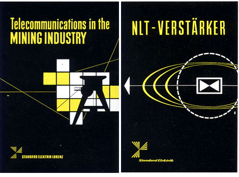
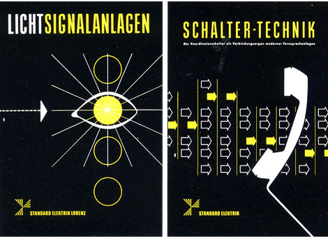
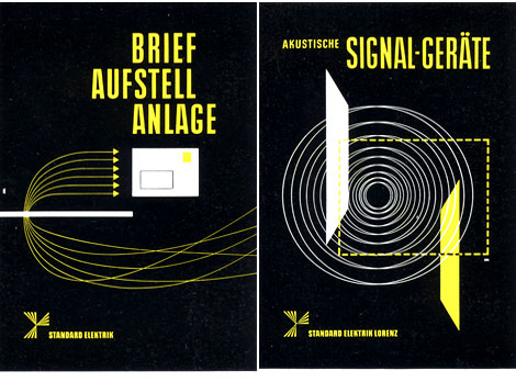
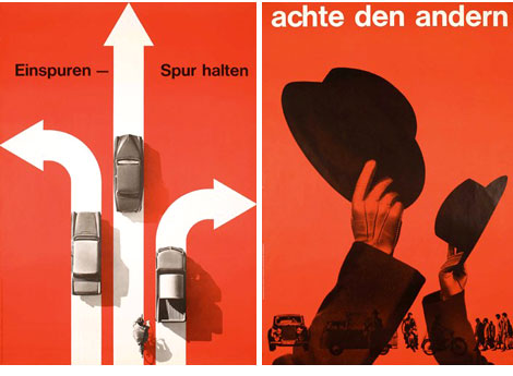
Hans Hartmann is one of the lesser known designers that lived in Switzerland during the 1950s. A google search of his name brings up almost nothing. Outside of his native country his work seems to be lost in obscurity. The only information I have on him comes from a small monograph produced in 1958.

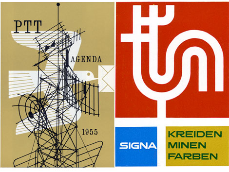
Most of his work centered around companies that were in or around Bern, Switzerland. This included designs for PTT, F. Gygi + Co. and Teppichhaus Bossart & Co. Most likely his contemporaries (Armin Hofmann, Emil Ruder in Basel , Josef Muller Brockann in Zurich) located to the North of Bern would of been aware of his work. However, I was unable to find any information that suggested any collaborations with these other designers.

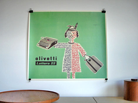
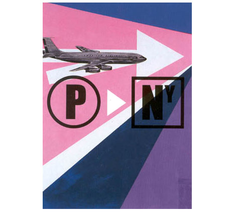
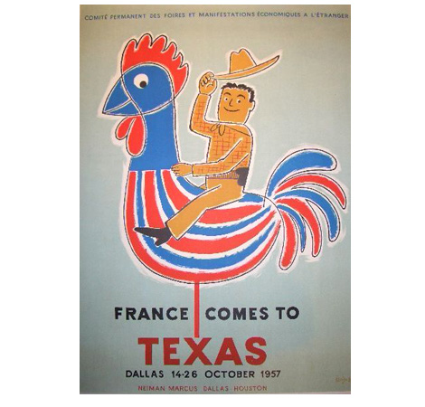
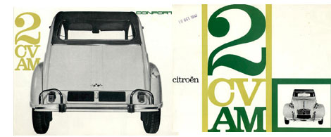
If anyone has any information related to Hans or his design work, please contact me. It would be great if we could build a more complete resource on this talented designer. Thanks to the poster connection for the top 2 images.

Top 50 graphic design blogs

Designer David Airey has posted a list of the top 50 graphic design blogs. The top positions were determined by Google page rank (PR). Were glad to say we made the list!

Jesse Kirsch : graphic designer

Jesse Kirsch graphic design

I’ve always been told that when designing a film festival poster to “NEVER use a camera!” in the imagery. Well, Jesse Kirsch just did it, and I’d say it turned out pretty awesome. While he was at it, he also designed a map of Manhattan as a leaf, and a Beatles poster using only hair! What a rule breaker!

60 years of finnish book design

aleksander_lindberg.jpg
finnish_book_design-2.jpg

Several years ago The Finnish Book Arts Committee produced a retrospective entitled 60 Years of Best Finnish Book Design. The online exhibition includes illustrations and layout by Tove Jansson, Erik Bruun, Jukka Pellinen, Timo Sarpaneva, Markku Reunanen, Aleksander Lindeberg and Oili Tanninen amongst others. It only takes a few minutes to click through the slide show and serves as a wonderful introduction to some of Finland’s finest designers.

The little polar bear : Rudolf Lukes

[pictobrowser 10159078@N03 72157603108657313]
The Little Polar Bear who didn’t want to learn to swim c1964. Text by George Theiner with illustrations by Rudolf Lukes. This is one of the tougher kids books to find with illustrations by Mr. lukes. The drawings of the Bears and seals are locked into the book by some sort of sliding paper system. As you you turn the pages the illustrations pop out of the page and bring the characters to life. This book was featured in The San Francisco Center For the Book’s exhibition entitled Show Me a Story: Children’s Books & the Technology of Enchantment.

Alexander Girard nativity poster

alexander_girard_nativity_poster.jpg
I was blown away when I saw this nativity poster by Alexander Girard. The poster is for an Exhibition at the Gallery of Art in Kansas City in 1962. The exhibition included 170 Nativity scenes from Girard’s personal collection. Imagine being in a room with 510 wise men and 170 Jesuses!

Thanks to Andy at Reference Library for posting this. If you haven’t been to his blog yet, Please go now! This is a really cool blog.

Map proves Zurich is pink

[pictobrowser 10159078@N03 72157603025615054]
Zurich never looked better in pink. Heres a promotional item produced by the Official tourists office of Zurich, Switzerland. I’m guessing it dates back to the early to mid 1950s. Layout and printing by Orell Fussli Arts Graphiques. I was able to find other projects designed by Orell Fussli but I couldn’t find any information on the firm itself. If anyone knows anything, please email me.

Rolf Harder but, before you drink

rolf_harder_graphic_design.jpg
This is a man that must have alot of stories to tell. For everyone that has seen the classic Noah Baumbach movie Kicking and Screaming; this man might of been the new leader of the cougars. Go cougars!

So now that we’ve established that Rolf Harder has the coolest name in graphic design, let’s get on to his work. I was blown away when I stumbled upon Rolf’s designs for International Paints Canada yesterday. I love his use of the paint brushes for the 1961 annual report. This design could of doubled as a poster for Krzysztof Kieslowski three colors trilogy. Like the Kieslowski films, I would guess that these colors represent the colors of the French flag considering International Paints was based out of Quebec.

The society of Graphic Designers of Canada has a bio on Rolf Harder for those interested in reading further.

Thanks to element kuuda for posting these great designs by Rolf Harder as well other Canadian designers on Flickr.

Hey Jose!

Jose Rodriguez graphic design

My favorite thing about Jose Rodriguez is not his great work, nice type, or his motion reels. It’s his URL: HeyJose.com! It’s probably the hottest domain name on the web right now. Anyway, the work is definitely on par with the URL. That’s right, solid gold! From the long-suited men of “beginning” to the technical-but-beautiful diagrammatic analysis of FF-Meta, this Sarasota, FL, designer is making some really great images. Go over and check out Hey Jose!

Corporate Identity vs logo lunch

lufthansa_logo.jpg
While I was doing some research on corporate identity and logos for a post, I kept finding all these Logo buffets. You know, the ones where you can get 13 web 2.0 logos for the price of a sandwich. It was frustrating because I just wanted to find a site that archived some of the better examples of branding. Well I finally found it. Heres a great list of corporate identity projects.

Each case study includes the Designer, year of creation, typefaces/ pantones used for the logo etc. Its a rather large list and includes many classic designs.

Sippin on Savignac

raymond_savignac_poster.jpg
I’m just waiting for the day when gangsta rappers start rapping about design nerd stuff. When that day comes, some one has to do a song called “Sippin on Savignac”. It would have to be a posse cut for sure. Each dude talking about how they were rolling through Japan looking for obscure French posters. No doubt in my mind this will be certified Ghetto Gold.

It might be a while before that day comes so in the meantime I’ll have to live with an internet trip to Japan’s own Guy antiques Raymond Savignac poster gallery. You can browse through the posters or drop some cash and buy an original.

Stig Lindberg dish : leaf pattern

stig_lindberg-leaf-dish.jpg
Great leaf pattern on this Stig Lindberg dish currently on Ebay. The dish is from 1950 and was created for Gustavsberg of Sweden. In addition to Stig’s ceramic work he was an accomplished childrens’ book illustrator. There is a great monograph on his work that came out in the 1960s. Sean flores was nice enough to include a photo of that book in our Designers Bookshelf series.

Citroen brochures

citroen-brochure-1.jpg

Jose B has put together a nice collection of Citroen brochures at his website citrobe.org. I’m not a huge fan of the actual car, but I do love these brochures.
citroen-brochure-2.jpg
citroen-brochure-4.jpg

Dimension abc : Wood type specimens

[pictobrowser 10159078@N03 72157602887945461]
Dimensions Abc – This is a promotional piece from 1966 for a new paper produced by Simpson Lee paper company called Talisman. They chose wood type to compliment the texture of the paper. I love the layout and the ink is laid on here thicker then maple syrup. Looks like its part of a series since its labeled volume #9 winter 1966-1967.

The paper companies during this time period (late 1940s-mid 1960s) were cranking out some incredible pieces. Just look at the work Bradbury Thompson was creating for Westvaco, Marquandt paper’s – Design and paper series (including Erik Nitsche and Ladislav Sutnar) as well as Champion papers’ Imagination series. I will be posting some of these in the weeks to come.

And we have a winner…

book_designers-1.jpg
Congratulations to Anne from Oakland! She is the lucky winner of our Book Design of Graphic Designers in Japan book giveaway. Last night we randomly pulled her name from a bright orange trash can. Thanks to everyone for entering our drawing.

Be on the look out for our next giveaway.

Say yes! to analog design

yes_studio_design_the_stands.jpg
Yes studio hooked up a sweet 12″ cover for the UK band the stand. The album is from 2005. Multiple designs were created, colors were mixed by hand and large format prints produced at K2 Screen, London. The resulting artwork was then re-photographed and used on the lp and poster design.

Looks like the length of this record was longer then the band’s career. The band broke up after 3 years and moved onto other projects and their website is now an internet parking lot. At least, we still have the lp jacket to look at.

Jason Munn interview

jason_munn-small_stakes_posters-interview.jpg

Our story with Jason Munn (The Small Stakes) begins in the summer of 2005. We had recently learned that his studio was located near our office so we decided for a little suprise visit. We arrived at his front door and rang his buzzer. When he opened the door we said something along the lines of..
Read the rest of this entry »