Non-Format update

non format

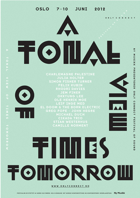
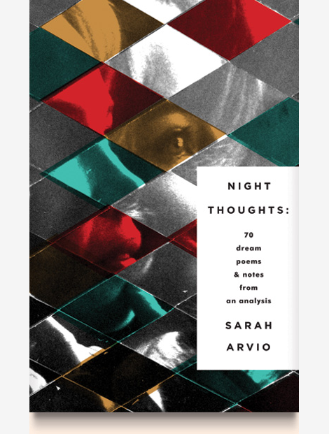
Non-Format, has recently updated their portfolio with really exciting new work. Their artful interpretation of typography is really interesting, it shows an extreme range of thinking beyond traditional forms. Working for the biggest international clients, Non-Format has made a name for themselves as being on the forefront of modern design. Keep up with their latest work by visiting their website, and to get the full Non-Format experience, check out all of their past work in their archive!

Read the rest of this entry »

João Filgueiras Lima: Edifício Morro Vermelho

edifício morro vermelho

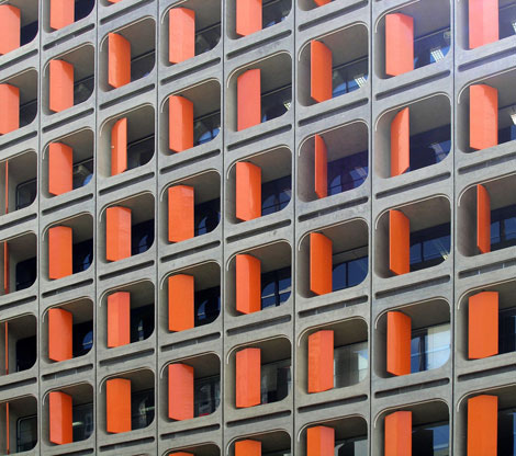
For fans of brutalist architecture, feast your eyes on this beautiful slice of Brasilian modernism conceived by architect João Filgueiras Lima. The Edifício Morro Vermelho complex, aka “Red Hill” housing. features a series of swiveling bright orange fiberglass panels that are not only pleasing to the eyes but also act as a functional shading device.

Read the rest of this entry »

Ze Cardoso

ze cardoso

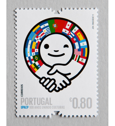
Ze Cardoso is a designer, illustrator and artist hailing from Oporto, Portugal. Recently graduated, Ze has a number of interesting self-initiated projects on his site. I really like the colors and personality in this stamp project, a collaborative effort for CTT, Portugal’s national postal service. They’re bold and playful, and would make sending letters much more enjoyable.

Read the rest of this entry »

Recently Received

ganesha's sweet tooth

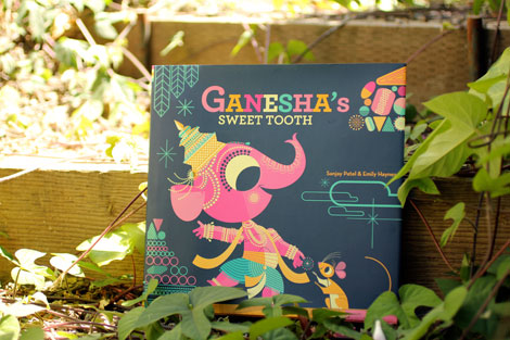
Here’s the latest batch of goodies to hit our shelves! Fresh picks from Chronicle Books, Neighbourgoods and Lumadessa.

Read the rest of this entry »

aMAZEme

aMAZEme

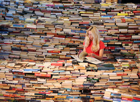
Created by Marcos Saboya and Gualter Pupo, aMAZEme immerses the audience in a labyrinth of books.

By participating in the installation, the audience discovers new textures, images and emotions. They become surrounded- hypnotized – by words and thoughts, designs and patterns. There appear to be secrets hidden in the installation’s walls; walls of up to 2.5 metres high, built from thousands of books, forming a large Maze of more than 500 square metres

Read the rest of this entry »

/Sponsor/ Penguin Group

A Huge thanks to the Penguin Group for sponsoring this week’s RSS Feed!

Tired of staring at a blank canvas? Need some inspiration? From acclaimed artist Keri SmithWreck This Journal encourages you to engage in “destructive” acts—poking holes in the page, making an ugly drawing, painting pages with coffee, and more—in order to engage more fully in the creative process. A new expanded edition of Wreck This Journal is available now, featuring 32 additional pages and four different covers to choose from. Check them out here! And from now through September 7, get a 15% discount on any and all of Keri Smith’s books by visiting us.penguingroup.com and entering the promo code GRAINEDIT at checkout.

Interested in sponsoring the Grain Edit Feed? Visit our sponsorship page for more info.

Elena Giavaldi

Talented designer and illustrator Elena Giavaldi really knows how to make judging a book by its cover easy. As a book cover designer, she creates very cool, contemporary compositions for some of the best publishing houses in the business. She also manages to put very personal touches on each project, and add a bit of extra interest with unique type choices and very modern, experimental lettering. Other than her expansive covers archive, her portfolio runs the gamut of graphic design, making her an incredibly versatile designer. To keep up with Elena, look for her work in a bookstore near you!

Read the rest of this entry »

Joohee Yoon

joohee yoon, illustration

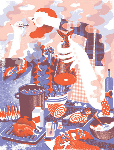
Joohee Yoon is an talented print maker with a fun colorful aesthetic. I was first introduced to her work a while ago through a friend that happened to have an amazing promo she created. Since then, I’ve been following her work closely and am always impressed by her meticulous eye for details. The textures she creates through layering are beautiful, as are the various patterns in her work. This illustration for NPR’s 2013 calendar captures everything I love about her work.

Read the rest of this entry »

Studio Patten

studio patten

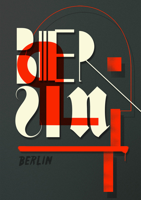
I always enjoys seeing studios diverse in clients and in style. Madrid’s Patten does this very well, with their hands in many different areas. Stylistically they are bold and minimal, clever and catchy. Their work in fashion and design spans photography, illustration, lettering and poster design.

Read the rest of this entry »

Type and Media 2012

type and media

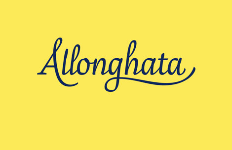
Allonghata by Christine Gertsch

Type and Media is an intensive one-year masters course in type design held at The Royal Academy of Art in Den Haag, The Netherlands. The course teaches a wide range of skills in the area of type design such as calligraphy, stone carving, non-latin scripts, typeface revivals, Python programming, modern font editing software as well as the creation of new letters. All of the final project typefaces created in the last four months of the 2011/2012 course are available to view here.

Read the rest of this entry »