Andrew Townsend

Andrew Townsend

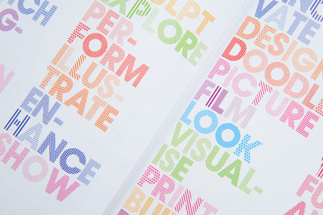
Really love this pattern-filled type by Andrew Townsend, done for Nottingham Trent University’s Art and Design book. Andrew is the art director over at Un.titled, and the purveyor of many fine typographic and design projects on his own site.

His Sports Brand type experiments are well worth checking out, as is Previous/Next.

Doublenaut

Doublenaut

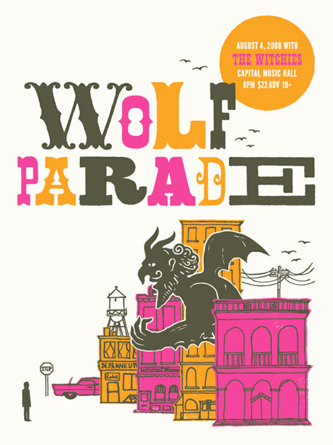
Toronto-based Doublenaut sent over some prints recently, including this Wolf Parade gem. I’m loving their type, texture, illustration, and color combinations. Bonus points for a great gargoyle as well!

Also, I believe that ‘R’ belongs in my personal collection.

Check out their shop, and blog.

Miroslav Sasek: This is the United Nations

Miroslav Sasek - This is the United Nations

Miroslav Sasek: This is the United Nations c1968

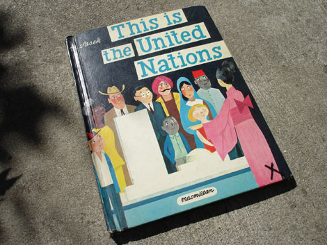
Its about time that we have a little Miroslav Sasek love up in here.The Czechoslovakian born illustrator is well known for his This Is Series of children’s books. Most of the books in the This is series are centered around a certain city, for example This is San Franscisco or This is Paris, but in this case it’s an international organization. Through Sasek’s playful ink and gouache illustrations, he guides us through the building. I wish I had books like these when I was a kid. I could stare at this for hours.

Read the rest of this entry »

Hotel Neboder, Rijeka, Croatia

hotel neboder rijeka croatia

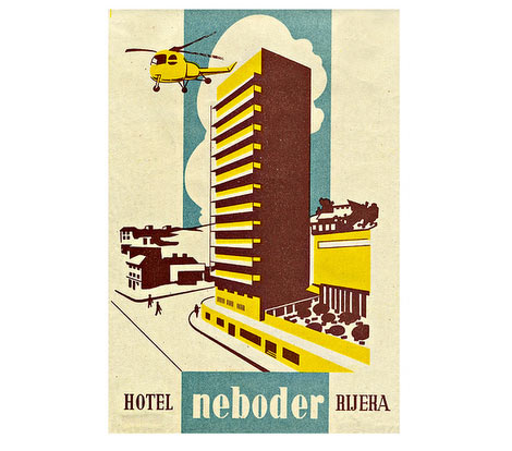
Beautiful hotel luggage label via the consistently good Inspiration Resource.

Cristóbal Schmal

Cristóbal Schmal

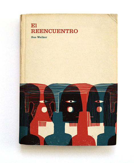
Love, love, love these cover illustrations by Cristóbal Schmal! So good. All of his work has this same great texture and quality to it. Makes me want to touch everything! His type is super snappy as well, and integrates nicely with the illustrations. Check his site out, he’s got lots interesting projects and experiments going on.

Blog, Flickr, fun!

Via the never-let-you-down Ffffound.

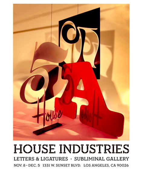
House Industries: Letters & Ligatures Show

House Industries letters and ligatures exhibition

For those of you in Los Angeles, Shepard Fairey’s Subliminal Gallery is hosting an exhibition of House Industries work.

From Subliminal Gallery’s website:

For Letters and Ligatures, House Industries conveys a single, yet complex philosophy: visual nomenclature fuels language, facilitates communication, and forms the basis of a civilized society.  The written language strings together letters, words, and sentences, conveying the innermost thoughts and ideas that human beings communicate to the outside world.  It is tied to our primitive nature, governing our individual choices and observations, our collective socio-anthropologic history.  At House Industries, the dedicated collective of artists figure if these symbols of syntax hold such an authority, “they might as well look good.”

OPENING RECEPTION
Saturday, November 8
8 p.m. – 11 p.m.

EXHIBITION DATES
November 8th – December 5th

SUBLIMINAL GALLERY
1331 W. Sunset Blvd
Los Angeles, CA 90026
P. 213.213.0078

For more details visit the Subliminal Projects Gallery website.

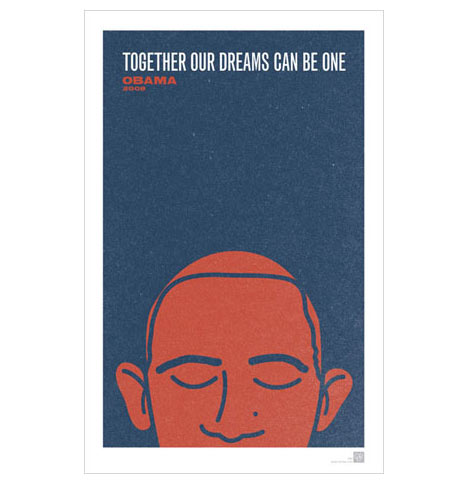
The new Mr. President

cd ryan obama poster

Poster by CD Ryan. Gets your free here

Its official and now two lucky girls are getting a new puppy.

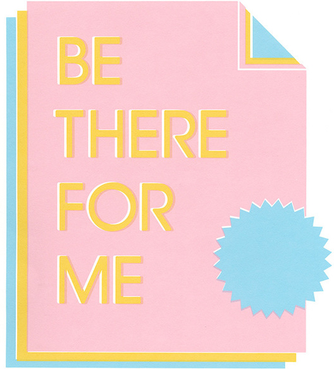
Liam Devowski

Liam Devowski

Pretty, bummed, and sad? No way! San Francisco based designer and illustrator, Liam Devowski, is anything but that! His work is heavily influenced by bold ’70s type, and he successfully juxtaposes bright cheerful colors with lonesome emotional phrases. Liam also contributes to the pop art and design blog Viewers Like You, which features posts by Rad Mountain’s own Damien Correll.

Read the rest of this entry »

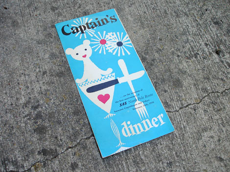
1950s SAS Airlines Menu

SAS airlines menu 1960s

SAS Airlines dinner menu 1958

Dinner Menu celebrating the 1st Anniversary of the Scandinavian Airlines North Pole Route from Copenhagen to Tokyo.

Read the rest of this entry »

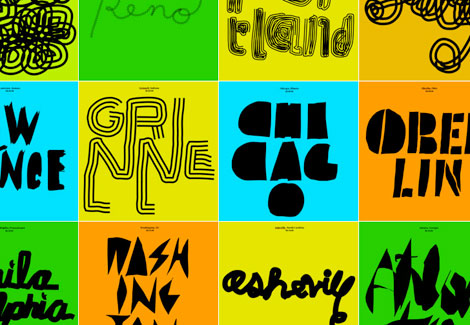
Hand Held Heart / Brian Roettinger

Hand Held Heart / Brian Roettinger

Brian Roettinger is the L.A. based designer and typographic song-and-dance man behind Hand Held Heart. He created the above work while traveling with Liars and No Age, making individual 7″ covers for each city on the tour.

A lot of Brian’s work has this same focus and attention to detail. Every little piece is thought-out and considered. The work feels experimental and unique, and at the same time deliberate, intentional, and confident.

Check out his Theremin Sans, a typeface made while playing the theramin.