Poster Pick: M83

invisible creature

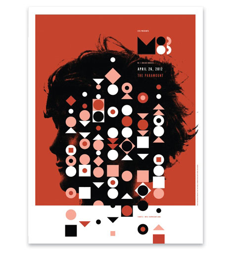
To the M83 fans that were unable to attend their show last week in Seattle, the gig poster is now available. The limited edition three color print was created by our good friends Don and Ryan Clark of Invisible Creature and includes a special dark metallic copper ink. Pick up a copy at the Poster Cabaret.

(more…)

Poster Pick: Diana Sudyka

diana sudyka

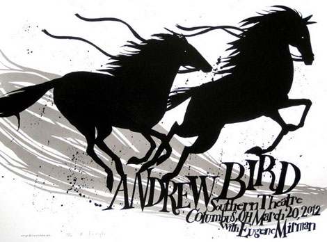
Diana Sudyka is a talented illustrator and printmaker from the Chicago area. She’s illustrated several books including The Mysterious Benedict Society and the Perilious Journey, and The Mysterious Benedict Society and the Prisoner’s Dilemma as well as created silkscreen posters for well-known bands such as Pearl Jam and the Decemberists. Her gig poster designs often employ her beautiful hand-drawn lettering skills. This is evident in the the Andrew Bird poster seen above, which also happens to is be this week’s poster pick.

(more…)

Poster Pick: Landland

landland

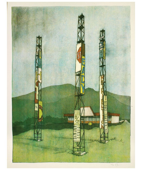
Dan Black is one-half of the Minneapolis-based design duo Landland. Besides his love of design, he has a real fondness for brown shirts and referring to himself in the third-person. With muted tones, his atmospheric landscapes often evoke a sense of nostalgia. This is evident in his work for The Hold Steady, which also happens to be this week’s poster pick.

(more…)

Andrew Vastagh

andrew vastagh

Andrew Vastagh is a Nashville based designer who is quite active in the gig poster scene. Over the last five years he’s created work for many well-known bands including the likes of She & Him, Vampire Weekend, Social Distortion and Band of Horses.

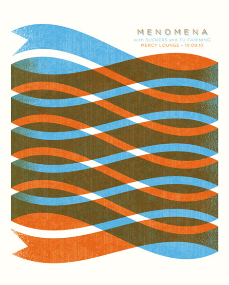
For this week’s poster pick we’ve selected Andrew’s design for the 2010 Menomena show at the Mercy Lounge. It features a two colored ribbon spiraling downward to form a cyclinder-esque shape. The combination of the ribbon’s wave-like movement and the transparency seen in the color overlay creates for a mesmerizing and memorable pattern. If you’re a fan of Menomena, ribbons, Andrew Vastagh or all of the above you can pick this piece up at the Poster Cabaret.

(more…)

Betsy Walton

betsy walton

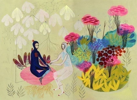
Portland,OR based painter and illustrator Betsy Walton has a knack for creating captivating and dreamy landscapes. Some of my favorite pieces include “Gold” and “Paradise” which also happens to be this week’s poster pick. These works explore the idea/ideal of paradise while working with an aesthetic rooted in American folk art and contemporary figurative illustration.

Giclee prints of the original paintings are available at the Poster Cabaret.

(more…)

Heartwork: Art Benefit for Target House

heartwork

Heartwork is a project designed to raise money for art supplies within the art room at Target House—this wonderful home-away-from-home for the families of children facing long-term treatment at St. Jude’s Children’s Research Hospital.

The idea is simple. Every year, a group of talented artists will create a series of posters to raise money for the art room. Each of the posters will feature a different interpretation of the Target House elephant mascot, chosen because it represents family, long life, strength and playfulness—attributes with special meaning at a place designed for families to live, play and heal.

(more…)

Poster Pick: Mara Piccione

Mara Piccione

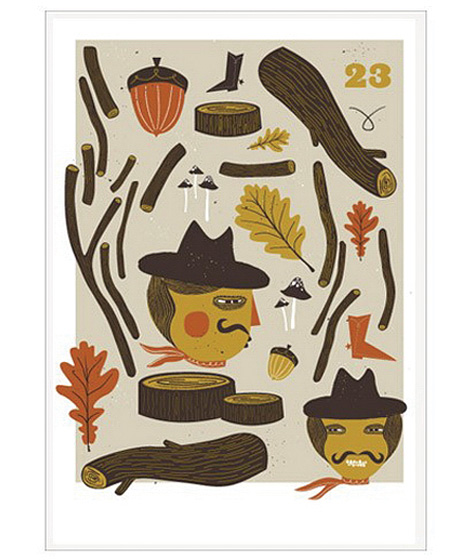
This week’s poster pick, Hack & Saw, is by the Dutch illustrator and designer Mara Piccione.  The piece appears to be an innocent Autumn medley. However after a closer inspection at the chopped wood and sinister-looking characters, a more devious image begins to surface. Is this the aftermath of a woodland massacre? are these guys constructing a giant slingshot? who knows, but I love how Mara’s work challenges the viewer and often requires a second glance.

You can pick up Hack & Saw at the Poster Cabaret.

(more…)

Poster Pick: Arcade Fire at the Key Arena

invisible creature

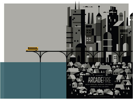
For this week’s poster pick, Invisible Creature presents us with a cold, ghost-like city, where it’s remaining inhabitants are fleeing in a school bus into an unknown suburban abyss. The artwork was inspired by the equally bleak lyrics of ‘City With No Children’, a song from Arcade Fire’s latest release, ‘The Suburbs‘. I appreciate the selective use of color and asymmetrical layout, which immediately caught my eye. This gets my vote as one of the Creature’s most impressive posters to date.

You can pick up a print at the Poster Cabaret or enter to win a copy in the Grain Edit Holiday Giveaway Bash.

(more…)

Nate Duval

nate duval

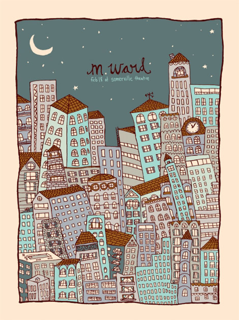
Massachusetts-based illustrator and designer Nate Duval is a busy man. Over the past year he has created concert posters for Phish, Spoon, Wilco, Tortoise and the Black Keys as well as a collaborated with Jen Skelley and Mother NYC on an re-branding campaign for Sweet ‘N Low.  Nate’s work often pairs playful imagery with hand-drawn type as seen in this city skyline poster for M. Ward.  I love how he’s able to present a potentially chaotic situation in a way that looks innocent and fun. This poster as well as others designed by Nate are available for purchase at the Poster Cabaret.

(more…)

Jim Flora Prints

Jim Flora

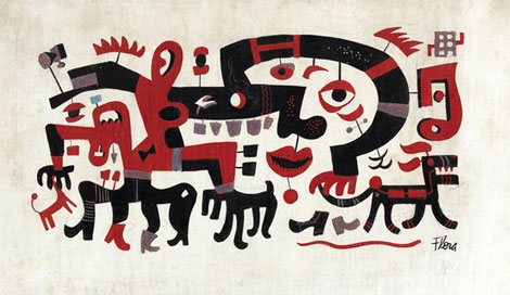
Untitled painting casually referred to as White Block Quadrupeds

Jim Flora was a fine artist/illustrator best known for his album cover art for RCA Victor and Columbia Records, as well as his illustrations for children’s books. In this uncirculated and untitled early 1940s painting, he presents us with a (literally) twisted cast of characters. As mentioned on the Jim Flora website, the work “depicts an inscrutable panorama of disconnected facial features, headless quadrupeds, and someone’s nightmare of a fanged horse”. This piece along with select paintings from the Jim Flora collection are now available as limited edition prints for purchase over at the Poster Cabaret.

(more…)

Page 1 of 4123...Last »