April 2012

You are currently browsing the monthly archive for April 2012.

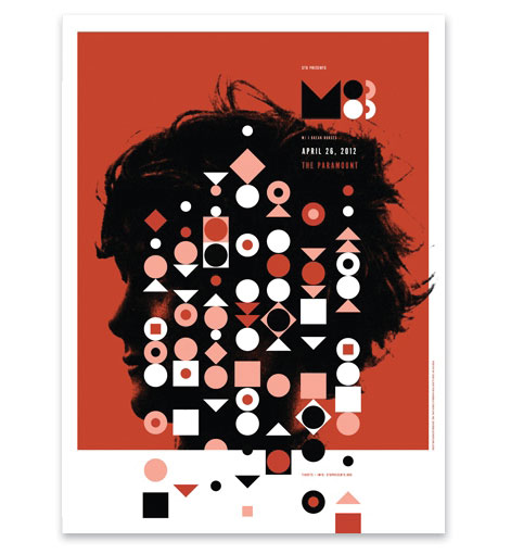
Poster Pick: M83

invisible creature

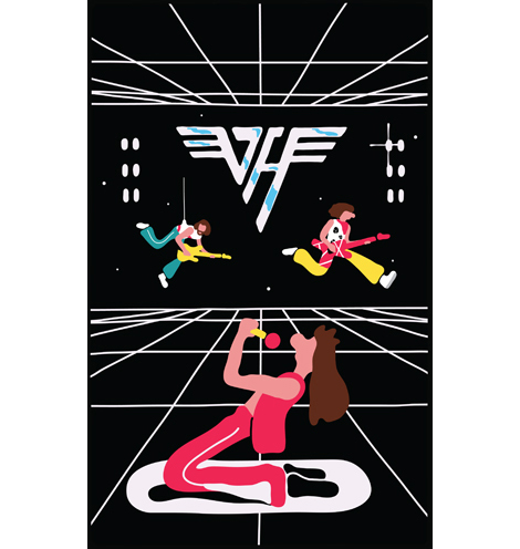
To the M83 fans that were unable to attend their show last week in Seattle, the gig poster is now available. The limited edition three color print was created by our good friends Don and Ryan Clark of Invisible Creature and includes a special dark metallic copper ink. Pick up a copy at the Poster Cabaret.

Read the rest of this entry »

RSS Sponsorship Now Available

Week-long exclusive sponsorships of the Grain Edit RSS feed are now available.

The sponsorship price is $350 and includes the following:

  • The ability to promote your product to Grain Edit’s estimated 38,000+ RSS Readers, 25,000+ Twitter Followers, 12,800+ Facebook fans and close to 200,000 monthly site visitors.
  • Exclusive week-long sponsorship.
  • A promotional post at the start of the week that links back to your website or product page. Since it’s a sponsored post and not an ad, it will be viewable by our on-site readers as well those who subscribe to our RSS, Twitter and Facebook feeds.
  • The promo will be added to sponsor category and reside permanently in our archives.

Grain Edit has received press mentions in the Guardian UK, Apartment Therapy, Design Sponge, Dwell online, Flavorpill, Josh Spear and was named #16 in the London Times top 50 of the world’s best design blogs.

To schedule an exclusive sponsorship/see available dates, please visit our sponsors page.

To our readers:
We know some of you will be unhappy with this decision, but in order to keep up with site costs and fund future projects we hope you understand. We’ll try to keep the posts as unobtrusive as possible and limit them to once a week. It won’t be all bad, some exciting things will transpire out of this including contests and ticket giveaways to really great design conferences.

Jonny Holmes / Bodoni

jonny holmes bodoni

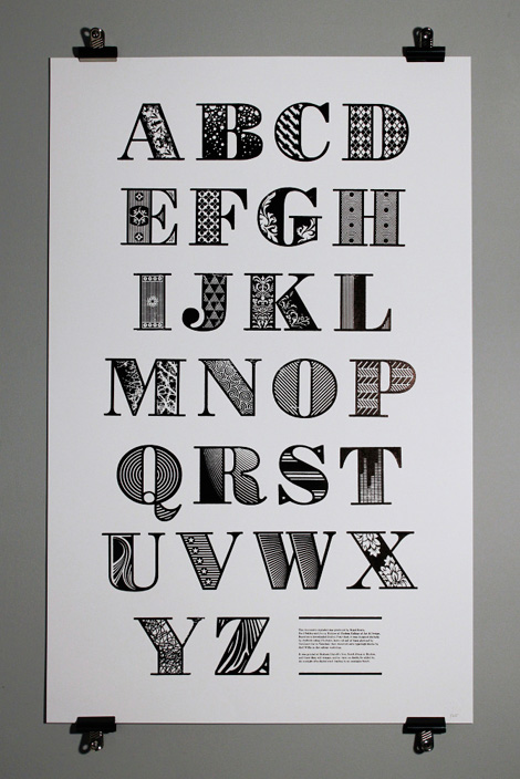
Wonderful decorative spin on Bodoni produced by classmates Nigel Bents, Paul Oakley and Jonny Holmes at the Chelsea College of Art & Design. I love the intersection of digital and analog in this project — ultimately arriving in the form of a printed piece.

Read the rest of this entry »

From the Job Board

Designer– PennyPop (San Francisco)
Freelance Print Finisher – The Ant Farm ( Los Angeles)

You can subscribe to our job listings via RSSEmail or follow at Twitter and Facebook.

Read the rest of this entry »

/Sponsor/ UPrinting

A Huge thanks to UPrinting for sponsoring this week’s RSS Feed!

UPrinting is a leading socially responsible online printing company. They’ve been online since 2000 and serve thousands with on-demand printing and a robust yet simple and easy-to-use online ordering system. UPrinting offers a wide variety of products from business cards, brochures, envelopes, greeting cards, posters, canvas prints and much more. They are specifically proud of their high-quality and eco-friendly prints which use recycled paper types and vegetable/soy-based inks with lower levels of VOCs than traditional petroleum-based inks. This helps to reduce harmful carbon emissions.

Interested in sponsoring the Grain Edit Feed? Visit our sponsorship page for more info.

James Edmondson

james edmondson

Amazingly talented letterer, James Edmondson has a portfolio to get completely jealous over. With a keen eye for beautiful forms, he creates type that is reminiscent of the old masters. He keeps his collection of typography modern by adding some interesting and original decorative elements in places like swashes and terminals. With such an exciting portfolio, I’m really interested to see what he does when he graduates from college—I see a very successful typographic career ahead!

Read the rest of this entry »

Quodlibet by Sebastian Gievery & Katja Spitzer

Quodlibet, No Brow, Katja Spitzer

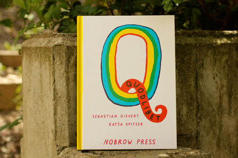
Of the twenty-six letters in the English alphabet, the letter “Q” seems to be to be the quirkiest as it masquerades as a “K” sound, squiggly tail and all. To gain a better understanding and appreciation of all things “Q” related, Berlin based illustrator Katja Spitzer and writer Sebastian Gievert have teamed up to create Quodlibet – a carefully curated illustrated encyclopedia of Q-words inspired by French novelist Georges Perec, who made a book centered around letter “E”.


Read the rest of this entry »

Alex Perez

alex perez

Lovely work out of America’s heartland from designer/illustrator Alex Perez. The multi-talented Mr. Perez ably navigates between type, packaging, illustration and design.

Read the rest of this entry »

Børge Mogensen & House Industries

borge mogensen

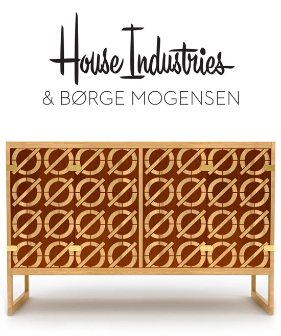
I’m a big fan of Danish furniture, so I was excited to hear about House Industries latest project. Originally designed by Borge Mogensen, House and Stellar Works have teamed up to put a fresh spin on a modern classic. Made of oak and sapelli, these cabinets have been inlaid with a Neutraface Slab slashed-o pattern. The cabinets are available in two sizes and will debut this week at the International Furniture Fair in Milan.

Read the rest of this entry »

/Sponsor/ Mag+

A Huge thanks to Mag+ for sponsoring this week’s RSS Feed!

Designers! If you know InDesign, you can publish to the iPad or Android tablet…without a programmer. Mag+ is the brains behind the InDesign plug-in that lets you design and publish your app with no coding. From now until June 1, 2012, Mag+ is hosting Magnify Your World – a contest to show off your tablet app with the chance to win up to $6,000USD. There are six categories judged by design leaders and a People’s Choice Award. Did I mention it’s free to enter? Go here for more details.

Interested in sponsoring the Grain Edit Feed? Visit our sponsorship page for more info.

Robert Hunter

robert hunter

Robert Hunter is an extremely talented young illustrator based in the UK. His work centers around an untraditional notion of color and negative space, thus creating a style & feeling all his own. His creations tell such intricate and beautiful stories, all without having any text to lead the viewer towards any conclusions. Robert just completed a limited edition comic and artwork for the band Young Colossus, which turned out beautifully.

Read the rest of this entry »

Laura Meseguer

laura meseguer

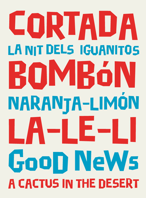
Laura Meseguer is a type designer, letterer and designer from Barcelona, Spain. I love the immediacy of her work and how ably she navigates between play, function, legibility and form.

Rumba (seen after the jump), especially, catches my eye as it has a wonderful calligraphic, hand-lettered quality to it. You can peruse more of Laura’s work on FontShopHouse IndustriesType-Ø-Tones and MyFonts.

Read the rest of this entry »

From The Job Board: Jonathan Adler

graphic design jobs

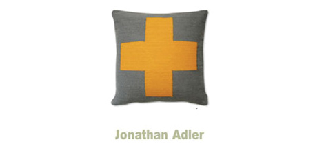
Product Designer – Jonathan Adler Design Studio (New York)

Jonathan Adler is looking for a versatile designer with strong graphic capabilities to work with the Head Design Manager and himself on full extensions of the Jonathan Adler hard good product line. This position will offer the opportunity to design and develop a wide range of product from decorative accessories, hard tabletop, gift and games to lighting and decorative objects.

You can subscribe to our job listings via RSS, Email or follow at Twitter and Facebook.

Read the rest of this entry »

Oscar Bolton Green

oscar bolton green

The portfolio of Oscar Bolton Green is sort of a wonderland of strange and dreamy imagery. I love the simple forms that he works with, but how he manages to create complex scenes and stories out of beautiful bright shapes. He also experiments with lettering, that fits his style of illustration perfectly—slightly amorphous and experimental. If you find yourself loving Oscar’s work as much as I do, he has a book that has just come out, Bird Beak Book, as well as a shop so that you can buy some of his lovely goods.

Read the rest of this entry »

Santtu Mustonen

Santtu Mustonen illustration

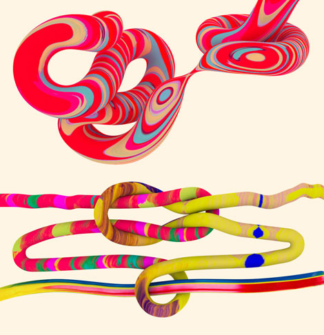
Santtu Mustonen is a Finnish illustrator currently based in New York. He creates sophisticated and colorful works using three-dimensional techniques. The results are quite stunning and captivating, as you can see from these illustrations created for Flow Festival last year. The marbled patterns in these works are vibrant and lovely, as are the rest of the pieces in his portfolio.

Read the rest of this entry »

Triboro

triboro design

Really digging the layout, lettering and sharp conceptual work from Triboro. Propelled by an endlessly impressive client list, Triboro’s work is thoughtful, engaging and never dull.

Read the rest of this entry »

The People’s Pennant

The peoples pennant

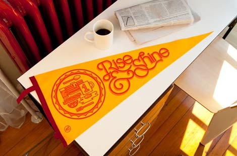
Designers Jessica Karle Heltzel, Tim Hoover and Eric R. Mortensen have joined forces to produce a series of limited-edition felt pennants that “commemorate the everyday.” With a new pennant releasing each month the series already includes solid contributions from The Heads of State, Richard Perez and Ken Barber of House Industries fame. All the pennants are hand-printed and hand-sewn in the good ole’ U.S.A by folks who’ve helped shape the tradition since the early 1900s. Check out the collection at The People’s Pennant.

Read the rest of this entry »