


- Olle Eksell Site & Shop
- This Is Forest — Joel Speasmaker
- MVM — Magnus Voll Mathiasson
- Art School Cliche Spotting
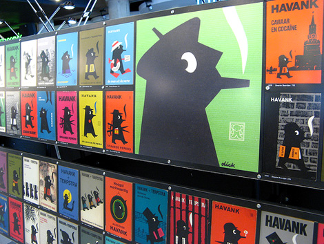
- Posters Discovered in Notting Hill Gate Tube Station
- Vinyl Documentary: To Have & To Hold
- Partisan Memorials in Former Yugoslavia
- Up in the Air- Opening sequence
- Geoff Mcfetridge: Where the Wild Things Are Title Design
- Nikkatsu – Japanese actions films


You are currently browsing the monthly archive for January 2008.
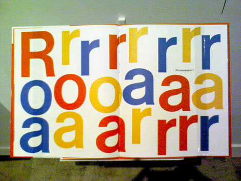
Wink interview

My first introduction to Wink was four or five years ago when their packaging for Sunmilk was making the rounds in the design magazines and annuals. Since then, I’ve tried to keep an eye on their work. What has impressed me the most about Wink has been their ability to consistently produce top notch work.
01.30.08 | Dave | Features |  25 comments
Penguin books – Book cover design
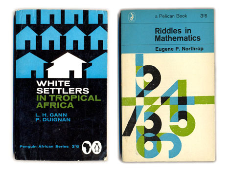
1960s penguin book covers
Things magazine..wheew sweet mother! They have put together a kick butt gallery of penguin book covers. Includes beautiful covers overseen by Jan Tschichold as well as the late typographer Hans Schmoller. My favorite years are between 1961-1972 when Italian art director Germano Facetti was in charge of design. Facetti enlisted Polish graphic designer Romek Marber to redesign the look of the Penguin series and the rest is history.
Side note: Watched Jules Dassin’s Brute force last night. Great Flick. I also recommend Riffifi which was directed by Dassin as well.
(via Ace jet 170)
01.29.08 | Dave | Seen Elsewhere | 11 comments
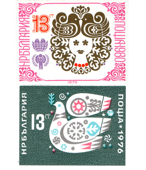
Israel : Psychedelic Vintage stamp design
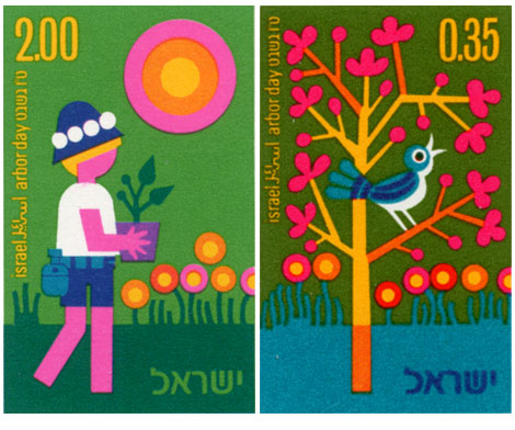
Vintage modern stamps from Israel – 1975 Arbor day collection
Ok we’re back. I hope everyone had a great weekend. Pretty chill one here. Watched Dial M for murder by Hitchcock. Tonight it’s either Stray Dog by Akira Kurosawa or Brute force by Jules Dassin.
Now onto the stamps….
Great stuff going on here. Johnny blue bird is eating cherry nugs off a psychedelic tree. Meanwhile on the left, rectangle legs is rolling deep in lollipop marsh.
01.28.08 | Dave | Off Our Bookshelves | 5 comments
See ya on monday
I’m taking the day off. I’ll see everyone on monday.. Have a great weekend!
01.25.08 | Dave | Grain Edit News | Comments closed
Quarteto em Cy : Lp cover design
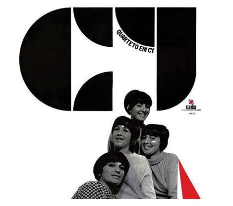
Quarteto em Cy – Quarteto em Cy (1966), for Elenco
Dynamite record cover for this female vocal group from Brazil. This is a great album. I highly recommend their 1972 Self titled lp as well.
Heres a video of Quarteto em Cy on the Andy Williams show with Marcos Valle. You might recognize the vocals at the beginning of the song. I believe Nicola Conte sampled it.
(via the excellent Loronix)
01.24.08 | Dave | Found design | 5 comments
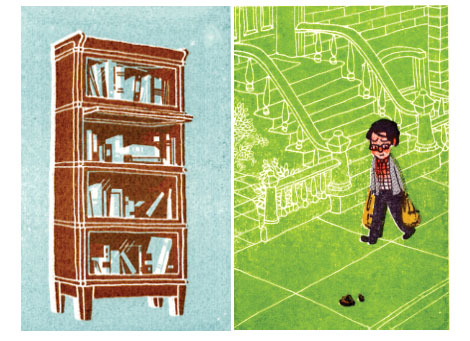
Alain Gree : childrens book illustrator
[pictobrowser 10159078@N03 72157603779034066]
Alain Gree – l’electricitie c1969 vintage kids book
Published by Casterman as part of the Cadet-Rama Collection
Woah! Pastel overload! Someone went crazy with the pink crayons. I love it though. Alain Gree’s illustrations are great. I can’t get enough of the bubble heads, mod clothes, pop colors and psychedelic scenery. In this book, Alain looks at electricity and how its used. It’s filled with teal buses, pink trolleys and mustard colored sewing machines.
On a related note, I have to give a birthday shout out to my friend Sean. Sean introduced me to Alain’s work so this post seemed fitting for today.
01.23.08 | Dave | Off Our Bookshelves | 13 comments
Color wheels and information design
I found this great example of information design in ilusiones_design’s flickr photostream. Can anyone translate the text?
01.22.08 | Dave | Found design | 15 comments
Swiss modern graphic design meets Hotel Astoria Lucerne
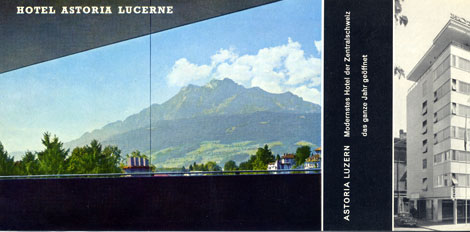
Hotel Astoria Lucerne was located in Luzern, Switzerland. As they claim in their promotional material, they were the “most modern Hotel of Central Switzerland”. After looking at this I brochure, I believe them. I’m not sure if the hotel still exists. I was able to find some information on a Hotel Astoria Lucerne designed by Herzog & De Meuron but, I’m not sure if bears any relation. I realize Herzog & De Meuron are modern day architects, but possibly they renovated the existing structure? Anyone have any info on this?
01.21.08 | Dave | Off Our Bookshelves | 2 comments
Jonathan Bennett : design and comics
I love when people send me packages, especially when they contain cool design work. Comic artist and designer Jonathan Bennett recently sent me a fat package of goodies including not one, but TWO Gocco prints! In addition, he included several magazines that feature his cartoons. I enjoyed his work, I just wish he had a website so I could see more.
MOME Winter 2006 features one of Jon’s cartoons. You can pick up a copy at Fantagraphics Books.
01.18.08 | Dave | Off Our Bookshelves | 12 comments
Modern dutch paperback cover design
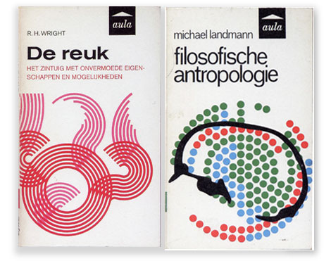
(L) designer: unknown ©1966 (R) designer: J. Venema ©1966
Published by Aula-Boeken in the Netherlands
The recent excitement over Penguin covers has resulted in a renewed interest in paperback book cover design. I’m starting to see discussion groups popping up as well as new books being published on the subject. Several titles come immediately to mind; Seven Hundred Penguins and World Paperback design. In future posts I’ll discuss both of these books as well the as the book covers of dutch designer Dick Bruna. For now enjoy the pieces above.
For further viewing on the subject I Highly recommend:
Ace Jet 170 : Loads of great material here and one of my favorite blogs
The Old timey paperback book covers group on Flickr
(pictures via) world paperback design
01.17.08 | Dave | Found design | 1 comment
Only 12 people like Paul Rand ?
We just started a Paul Rand fan group on Flickr. As of this writing we only have 12 members. Surely there are more then 12 people who appreciate one of the greatest graphic designers of all time! Its good wholesome fun! Bring your whole family. Show all the little ones why Mommy keeps stealing their copy of Sparkle and Spin.
Join now.. Paul needs you and our little egos need affirmation that people like our Flickr groups.
Click here and let the nerdery begin
(Thanks go to Bureau L’Imprimante for the pic)
01.17.08 | Dave | Grain Edit News | 4 comments
mr. mannun card and poster design
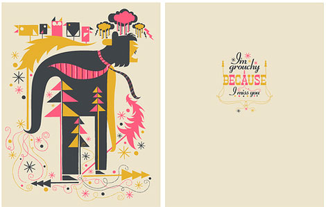
In this card designed by mr.mannun, business ties are flying in the wind as this beast rips down a small patch of Christmas trees all while holding a flock of fudgesicle shaped birds. This is great! One of my favorite finds on Flickr. My top pick in the genre of groucy card design.
You can browse the rest of mr.mannun’s design / illustration work on Flickr. He also has a few poster samples on Gig posters.com
01.16.08 | Dave | Uncategorized | 2 comments
mr. mannun card and poster design
In this card designed by mr.mannun, business ties are flying in the wind as this beast rips down a small patch of Christmas trees all while holding a flock of fudgesicle shaped birds. This is great! One of my favorite finds on Flickr. My top pick in the genre of groucy card design.
You can browse the rest of mr.mannun’s design / illustration work on Flickr. He also has a few poster samples on Gig posters.com
01.16.08 | Dave | Found design | 2 comments
German poster design : Kieler Woche
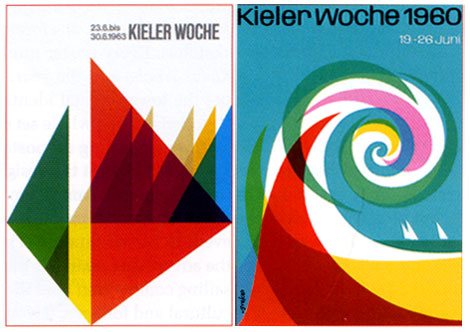
Kieler Woche is a festival that takes place each year in Kiel, Germany. The festival includes nautical competitions as well as cultural events. Each year 5 designers are invited to submit 3 sketches for the event’s poster. The rules are simple. The text on the poster must be limited to only Kieler Woche and the year. The type for Kieler Woche must be set in Adrian Frutiger’s Univers. Lastly the the image must give equal weight to the sailing competition as to the cultural aspects of the festival.
Designers that have contributed to this event include: Wim Crouwel, Michael Engelmann, Celestino Piatti, Anton Stankowski, Waldemar Swierzy, Otto Treumann, Hans Schweiss, Jean Widmer, Ruedi Baur, Ben Bos, Siegfried Odermatt and Rosemarie Tissi. For those interested, I uploaded the Otto Treumann poster to the grain edit flickr account.
( via Etapes)
01.15.08 | Dave | Found design | Comments closed
Ladislav Sutnar : Sweets Catalog promo design
[pictobrowser 10159078@N03 72157603707692202]
What? Why? How? Essential Product Information – Sweet’s Catalogue Service
©1942 Design by Ladislav Sutnar
Sweet’s Catalog Service provided catalogs of building and plumbing supplies to architects and contractors. Ladislav along with Knud Lönberg-Holm were responsible for presenting the information within these catalogs in a clear, concise manner.
The promotional, folded sheet above explains the need for easily accessible product information especially during times of war (this was written in the midst of World War 2). As Sweets maintained, providing essential product information in an effecient way could eliminate waste and speed production:
The increasing need for speed in war production is reflected in increasing demand for product information.
In order to be useful such product information should be comprehensive, concise, coordinated
Prefiling of catalogs has been developed as a means for controlling the flow of essential product information
Beautiful layout, far ahead of its time.
For further reading, I suggest Steven Heller’s article Ladislav Sutnar and Knud Lönberg-Holm
01.14.08 | Dave | Off Our Bookshelves | 4 comments
Eames presents Saul Bass solar energy film
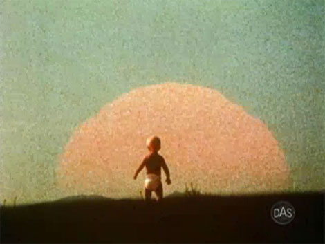
Eames demetrios, grandson of Charles and Ray Eames presents a rare glimpse of the Solar Film produced by graphic designer Saul Bass. The film was commissioned in 1980 by Robert Redford. If you listen at the end of the film you can hear Saul Bass speak for a few seconds. He mentions something about pumping hot water to the house.
I’m not sure if the illustrations/ animations in the film were created by Saul Bass or Art Goodman. The film credits Goodman, but it is unclear if he was just involved in the animation process or if he created the illustrations as well.
Cool film and as one person mentions in the later half “If you stop and think about it, the Sun doesn’t send you a bill each month”. So true my friend.
Can’t get enough of Saul?
check these out:
Henri’s Walk to Paris – children’s book illustrated by Saul Bass
San Francisco International Film Festival poster
Saul Bass’s Case study house
01.11.08 | Dave | Seen Elsewhere | 4 comments
Mid Century modern stamp and label group
Grain Edit is proud to introduce the Mid Century Modern Sticker, Label and Stamp club.
This group features Stickers, Labels and Stamps from the mid 1950s to the mid 1970s.
This would include: vintage matchbox labels, buvards / blotters, luggage Labels, airline labels and stickers, first day covers and stamps.
We are particularly interested in Eastern European match box labels ( czech republic, hungary, yugoslavia, russia etc.) Airline labels + stickers from Swiss Air, Boac, Braniff, Air France, Air India, SAS, CSA , Sabena and Varig and French Buvards ( especially ones by Herve Morvan, Raymond Savignac and Lefor Openo).
Special thanks go out to David McFarline for submitting the stamps shown above.
01.10.08 | Dave | Seen Elsewhere | 5 comments
New House Industries kids t shirts
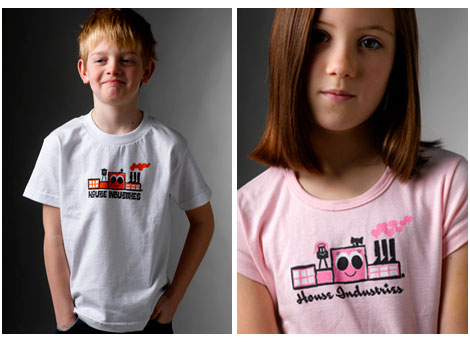
From the makers of Neutra Face, the Alexander Girard Alphabet blocks and the upcoming Tim Biskup fonts comes the kid friendly House Industries factory t-shirt. Click the link to the left to get some of this goodness.
01.10.08 | Dave | Found design | Comments closed
Otl Aicher design on Flickr
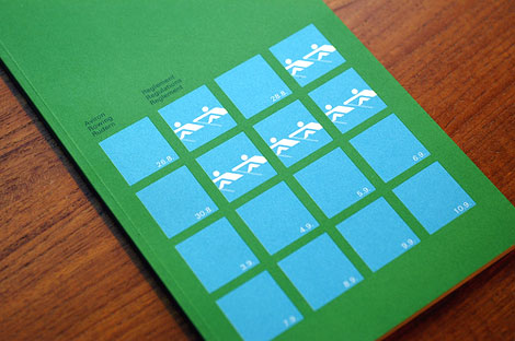
1972 Olympics rowing regulations booklet
Tons of great work in the Otl Aicher design group on Flickr. Includes posters, brochures, books, stamps, packaging, corporate reports, even a wooden version of Waldi the 1972 Munich Olympics mascot. Projects include the 1972 Olympics identity, Lufthansa and work from his days at HFG Ulm.
Clean, minimal, modern.. I love it. I could look at this stuff all day.
Many thanks to Adam for passing this link along.
Side note – got some cornbread today. Man I love this stuff. Is it even bread? Its like muffin cake.
01.09.08 | Dave | Seen Elsewhere | 5 comments
Finnish graphic design : annual report
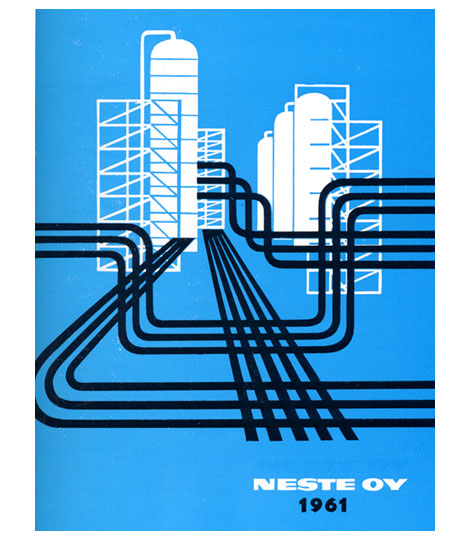
1961 Neste Oy Corporate annual report designed by Olli Stelander. Great use of limited color. This was when drilling for oil was hip, the indie rock (Get your shale on!) of the energy industries. This annual probably doubled as their tour poster.
For more design work from Finland check my post on Finnish book design.
01.08.08 | Dave | Off Our Bookshelves | 5 comments
Deberny & Peignot type specimens
[pictobrowser 10159078@N03 72157603653386438]
Deberny & Peignot – Types from Paris c1960s?
Deberny and Peignot Type specimen booklet imported and distrubuted by Amsterdam Continental.
Includes:
Peignot – created by A.M. Cassandre and Charles Peignot, issued in 1937 for the Paris International Exhibition.
Meridien – Introduced in Europe in 1958-1959, created by Swiss type designer Adrian Frutiger.
Cristal – Designed by Remy Peignot, issued in Europe in 1957.
Jacno – Issued in Europe in 1952, designed by Marcel Jacno.
Ondine – By Adrian Frutiger, issued in 1957.
01.07.08 | Dave | Grain Edit News | 1 comment
Deberny & Peignot type specimens
[pictobrowser 10159078@N03 72157603653386438]
Deberny & Peignot – Types from Paris c1960s?
Deberny and Peignot Type specimen booklet imported and distrubuted by Amsterdam Continental.
Includes:
Peignot – created by A.M. Cassandre and Charles Peignot, issued in 1937 for the Paris International Exhibition.
Meridien – Introduced in Europe in 1958-1959, created by Swiss type designer Adrian Frutiger.
Cristal – Designed by Remy Peignot, issued in Europe in 1957.
Jacno – Issued in Europe in 1952, designed by Marcel Jacno.
Ondine – By Adrian Frutiger, issued in 1957.
01.07.08 | Dave | Off Our Bookshelves | 1 comment
Rudolf Schucht cover design for Hoechst
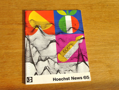
Cool cover by Rudolf Schucht for Hoechst News 65. I believe Hoechst News 65 was the in house magazine for the German life science company Hoechst AG (now Sanofi-Aventis). For the cover design Rudolf pulled elements from the articles contained within the magazine. The top two icons refer to Italian cuisine. The item below is an ampule of Salvarsan used in clinical testing against Syphilis. The background graph refers to work by Dr. Walter Seifried.
I couldn’t find much information on the graphic design work of Rudolf Schucht. If anyone knows anything about him, please send me an email or leave a comment.
01.04.08 | Dave | Off Our Bookshelves | 2 comments
Modern Polish maps and sharp stinkin teeth
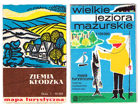
Just found this great polish blog called pantuniestal. They put together a small collection of polish maps from the 1950s, 60s and 70s. You can see a preview above. Check out the fish that guy in the yellow rain suit caught. That thing has some crazy sharp triangle teeth. Do they have Piranha in Poland or something?
Besides the maps they have some great examples of mid century modern ephemera. Browsing the site I found Czech matchbox labels, vintage cameras, hotel luggage labels etc. In addition to the Polish, there is an English version of the site so you can follow the conversation. Tons of eye candy here.
(via FFFFound!)
01.03.08 | Dave | Found design | 7 comments
New year, Old cigarette poster design
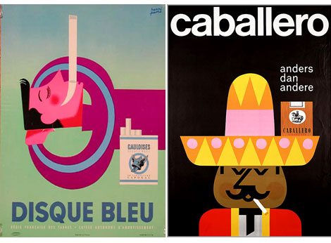
(L) Disque Bleu by Henri Favre c1950s (R) Caballero by Pedro Vargas c1960s
It’s the beginning of a brand new year, which means its time to compile the latest list of New Year’s resolutions. For some of you this might include a pledge to quit smoking (again). To kick the habit in style how about a farewell stroll down cigarette poster lane? Flickr user lamade has posted a kick butt (no pun intended) gallery of Tobacco related posters. Lamarde’s blog also features a ton of tobacco related advertising and design.
01.02.08 | Dave | Found design | Comments closed
Ringing in the new years with a hairy stamp
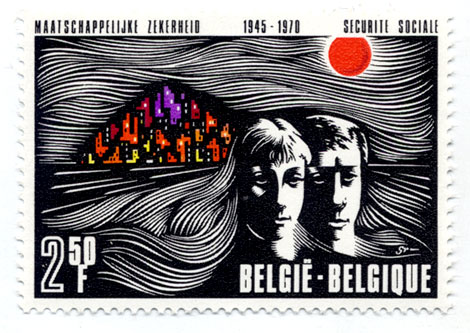
Belgium stamp – 1970s – Lots of hair!
Happy New Years!
I hope everyone had a good time last night. Unfortunately, it was a chill night at home for myself, since I picked up a cold over the weekend.
We have some exciting new interviews and features that we will be posting over the next few weeks and months. Stay Tuned!
01.01.08 | Dave | Off Our Bookshelves | 2 comments
