August 2008

You are currently browsing the monthly archive for August 2008.

Morten Iveland

Morten Iveland
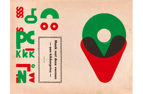
I love this image of Morten Iveland’s new typeface, Bolda. Apparently it’s inspired by 1970’s tennis, dart, and ping-pong fashion — a grossly under-represented field of design, in my opinion. Morten lives in Oslo, Norway, where he is a designer at Apt. I was immediately drawn to the design of his site, and his mad photo skills.

Check out Bolda in action.

Otl Aicher Munich 1972 Olympics Design Exhibition

otl aicher exhibition

The Natalie and James Thompson Art Gallery located within San Jose State University is hosting an amazing exhibition of graphic design by the office of Otl Aicher for the 1972 Munich Olympics. The exhibition features, posters, books, brochures and signage conceived for the 1972 Olympic identity program. Now you can get a close look at all those pretty isotypes, icons, pictograms, symbols and whatever else you might want to call them.

Read the rest of this entry »

The Raymond Savignac Olivetti Print giveaway, again!

Raymond savignac olivetti print

Last December we gave away a Raymond Savignac poster. Since then we’ve received emails from people interested in the poster, so we decided to give one more away.

poster details: This is not an original, but rather a reissue of the original poster Savignac created for Olivetti in 1953. We received this copy directly from the Olivetti Society in Italy.

Sounds great, but how do I enter to win?

Read the rest of this entry »

Sebastião Rodrigues: Graphic designer

sebastiao rodrigues book cover design

Beautiful work by Portuguese designer Sebastio Rodrigues (1929- 1997)

You can see a video of Sebastiao in action here.

Read the rest of this entry »

Steven Harrington & Justin Krietemeyer exhibition

steven harington-exhibition

For those of you in the L.A. area, Subliminal Projects Gallery has a new exhibition entitled Somehow We All Seem Connected which features new work from Steven Harrington and Justin Krietemeyer of National Forest Design. Two awesome designers with long last names. The exhibition marks their first show in Los Angeles in four years and runs August 23 through September 19.

Grain Edit Studio Tour

grain-edit-studio-tour-1

Leah Hennen of the excellent More Ways to Waste Time blog just posted a tour of my house/ studio. You can get a glimpse of the goodies here sans my dirty laundry and unwashed dishes. As you can see, books dominate the house. Any other book nerds out there?

See the full tour here. Stop by and say hello.

Read the rest of this entry »

Vintage Brazilian map

vintage brazil map

Brasil Mapa Geral – from 1969

I picked this up a couple of years ago and I flipped when I saw this cover. This puts to shame my US Texaco maps. Unfortunately, the map part is missing. All I have is the cover and a few bits of text that were inside. What secrets did that map hold? I bet it was a treasure map that led to a top secret cave filled with barrels of almond milk. Dang, I love that stuff.

Can anyone translate the text on the cover?

Also worth checking:

1960s Brazilian book cover designs by Gian Calvi

Read the rest of this entry »

Stan Van Steendam

Stan Van Steendam

Stan Van Steendam is a pretty rad designer out of Belgium, with a pretty cool name. His style is hard to pin down exactly, but I would say it’s bright, vivid, colorful, playful, and compelling. His typography skills are great; you get a good feel for the amount of typographic experimentation going on over there.

Check out his design-your-own-font game, too.

Able Animal Posters

able caesar lion poster

Seen above: Caesar the Friendly Lion, Dimensions 12.5 x 9

Able a design and branding firm outside of Philadelphia just put together a great animal poster series. The lion poster has a retro feel to it and reminds me of some the children’s book illustrations seen in the late 1970s to early 1980s.

You can see/ purchase the entire series at Able’s Etsy shop.

Also worth checking:

Petit Collage Animal Alphabet Poster

ISO 50 Terabyte 3 Poster

terrabyte iso50 poster

I’m a big fan of Scott Hansen’s (AKA ISO50) work and this new poster is a knockout. Love his use of Hellenic Wide for the type. The poster is for an upcoming show at the Los Angeles Arboretum.

So Much Pileup

so much pileup mike davis blog

o-grito-logo

O Grito logo seen on Brazil’s TV Globo circa 1977/1978

Mike Davis over at Burlesque of North America just dropped a gem on me. He just announced the launching of his new blog So Much Pileup which will feature design artifacts and inspiration from the 1960s-1980s. As you can tell from what I post on grain edit, that I’m love with the design of that era, so I’m really excited to see what Mike will be posting.

Head over to So Much Pileup and check out his first post on the graphics of TV Globo.

Also, if you haven’t already, check out Mike’s exclusive dj mix for grain edit.

Lettered: Typefaces and Alphabets by Clotilde Olyff

lettered jan middendorp book

Lettered: Clotilde Olyff by Jan Middendorp – published by Druk Editions 2000

Clotilde Olyff is a Belgian designer and typographer who teaches at the National Visual Art School of La Cambre and Art School’75’ in Brussels. In this book by Jan Middendorp, Clotilde shares her investigations into the essence of the letter. The book is filled with typographical games and experiments.

clotilde-olyff--book

The Pebble Alphabets: I’m amazed by her collection of letter shaped pebbles. Next time your at the beach look under your feet, you might be standing on the letter “M”.

clotilde olyff douff typeface

clotilde olyff pebble alphabets

Read the rest of this entry »

SMALL Studio: Office tour and posters

[pictobrowser 10159078@N03 72157606797020892]

Several weeks ago I posted this wonderful Buck 65 gig poster designed by the Lyon, France based design duo Small Studio. Since then, we’ve been trading emails and they’ve been kind of enough to allow grain edit readers a sneak peek into their design studio.

I love the hand drawn typography often found in their poster work. In the examples below you can see the development of the type work for several posters that were designed recently.

dj vadim small gig poster

Read the rest of this entry »

SLEEPY TIME! Do Not Disturb Hotel Door Hangers

do ot disturb hangers

Athens Hotel door hanger + El Al Airlines hanger for sleepy time

Woah, Michael Lebowitz just posted an awesome collection of hotel door hangers.

Read the rest of this entry »

A lil somethin’ for the players

players theatre booklet

Theatre arts at Western Illinois University Summer 1968

Yep, thats right I’m breaking out the vintage drama club dorkery.

Modern Vintage Stamps from Norway – First Day Cover 1966

vintage-stamps-norway

First day cover for Norway 1966 – Feat Sam Eyde 1866/1940 stamp and Kristian Birkeland 1867/1917 stamp.

Beautiful set of stamps dedicated to the Norwegian engineer Samuel Eyde and the scientist Kristian Olaf Birkeland. My copy (above) has a postmark on it, so I tracked down another version without the post mark at the excellent Postimerkki.

vintage-stamps-norway-2

also worth checking:

vintage modern stamps from Israel

Iain Follett’s stamp collection

The New Year / Sasha Barr

Sasha Barr

The New Year is the one man super-shop run by Sasha Barr. Sasha illustrates, designs, and prints lots and lots of posters (among other things). I’m really impressed by the amount of work, and the variety of ideas and execution. His work is a nice combination of rough textures, type, hand-drawn and found images, and fun, quirky ideas.

Postcode Typeface based off Gert Dumbar stamp available for download

postcode typeface

gert-dumbar-dutch-stamp

Top: Postcode typeface designed by Christophe Stoll 2008- Bottom: POSTCODE stamp designed by Gert Dumbar in 1978.

Christophe Stoll recently emailed to let me know of a cool typeface he designed called Postcode which is based off a stamp in the Iain Follett Stamp collection we featured. Check out Christophe’s website to hear the story behind Postcode and to download the typeface for FREE.

After you download the typeface, put some time aside to browse Iain Follett’s amazing stamp collection on Flickr.

Matte Stephens interview

matte stephens interview

I’m really excited to present today’s interview. Matte is one of my favorite artists and an all around rad guy. Matte makes amazing art and lives in a house with lots of cool modern furniture. In Matte’s conversation with us he shares some of the people/things that inspire his work, the characters that frequent his paintings as well as a glimpse into his studio and home.

Read the rest of this entry »

Doshi Levien – Base Patterns for Tefal Teflon cookware

doshi levien tefal cookware patterns

Bottom of Tefal pans designed by Doshi Levien

This makes me ashamed to look at my crappy IKEA pans.

(via the awesome orange you lucky!)

Page 1 of 198123...Last »