


Peak 21
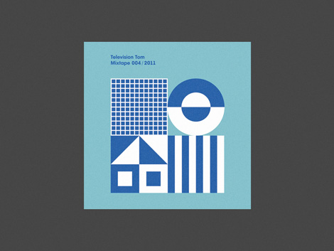
Peak 21 hails from the south-west of Poland, in Wrocław. Keeping in the Polish tradition, they do some very nice work. I’m a fan of their bold, geometric and minimal style.
08.31.11 | Ethan | Found design |  6 comments


Peak 21 hails from the south-west of Poland, in Wrocław. Keeping in the Polish tradition, they do some very nice work. I’m a fan of their bold, geometric and minimal style.
08.31.11 | Ethan | Found design | 6 comments

Fresh stamps from our good friend Wes, this time from Cuba commemorating the 1970 World Expo in Osaka, Japan.
08.30.11 | Dave | Found design | 6 comments
Chicago based film collective Scenic has launched a new film project on Kickstarter.com featuring photographers Tim Navis (LA), Kim Holtermand (Denmark), and electronic composer Deru. The group will create a series of short films at various locations throughout Iceland, inspired by moments of discovery and chance occurrence. Tim’s sun-drenched SoCal landscapes and Kim’s cold, architectural abstractions provide the visual foundation, and fans of their work can imagine how exciting a collaboration between the two will be. The end result, a beautifully packaged box set of the film and companion soundtrack, will be released to backers of the project as a physical artifact of the unique and awe-inspiring experience.
To learn more about this project, please visit the Kickstarter page.
08.29.11 | Dave | Found design | 1 comment
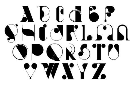
Graphic designer Andrew Woodhead takes from his Parisian surroundings by consistently managing to make each typographic project truly elegant. Whether it is a logo or a full typeface, there is a running theme of experimentation and sophisticated stylistic choices that create Andrew’s cohesive style. Designing type & typography for companies big and small, Andrew is sure to be one to watch in the world of design.
Read the rest of this entry »
08.26.11 | Liz Meyer | Found design | 6 comments

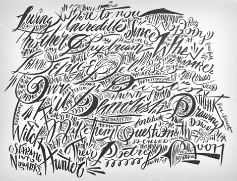
Numbers sure are powerful, and it’s evident in this print by Seattle based illustrator Matthew Hollister. This print, created for the Chicago Art Department’s Power in Numbers show, stacks magic, bad luck, and high times in a fresh and direct style. Matthew’s portfolio is chock full of editorial illustrations employing an array of grainy textures and straightforward imagery, reminiscent of vintage Czech matchbook labels and folk art. Read the rest of this entry »
08.25.11 | Grace Danico | Found design, Illustration | 9 comments
As a young design student at California College of the Arts I had the wonderful opportunity of interning for ReadyMade magazine — way back in its hip Berkeley headquarters heyday.
It was a fantastically unique experience and my first in a bustling design office. Under the guidance of art director George McCalman, the office’s art department was a lively, collaborative, ambitious and (extremely) entertaining place to work — and home to the best design office music jams I have had the pleasure to groove to (courtesy of Mr. McCalman himself).
George is a magazine veteran, having art-directed Mother Jones, ReadyMade and Afar to name a few. He is responsible for relevant, thoughtful editorial design as well as some very compelling branding, packaging and identity work. Recently, I was able to catch up with George and find out about his past, present and future. And of course, his opinions regarding his favorite magazines.
George, take it away:
08.24.11 | Ethan | Features, Interviews | 11 comments

I’m an avid fan and collector of architectural ephemera, so I was excited to discover David Liaudet’s inspiring blog Architectures de Cartes Postales. Since 2007 David has used the space to explore modern and contemporary architecture through its representation in postcards. The online archive is filled with amazing examples of sculptural elements, signage, memorial buildings and Brutalist architecture from the 1950s-70s. If you have a couple of hours to spare I highly recommend a visit.
08.23.11 | Dave | Found design | 2 comments

Portland,OR based painter and illustrator Betsy Walton has a knack for creating captivating and dreamy landscapes. Some of my favorite pieces include “Gold” and “Paradise” which also happens to be this week’s poster pick. These works explore the idea/ideal of paradise while working with an aesthetic rooted in American folk art and contemporary figurative illustration.
Giclee prints of the original paintings are available at the Poster Cabaret.
08.22.11 | Dave | Poster Picks | 2 comments
The work of Adam R. Garcia never fails to impress—from his intricate, detailed sketches to his polished final vector work. By day, Adam works for Nike as a designer, but also has a flourishing freelance life, in which he is predominantly a letterer. I love seeing the process of his projects, as chronicled in his blog, and it’s clear that he doesn’t have to rely on the computer to make his work look beautiful.
08.19.11 | Liz Meyer | Found design | 4 comments
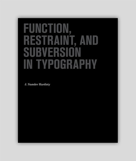
We recently received this title on contemporary typography from the friendly folks at Princeton Architectural Press. The book takes a look at the minimalistic typographic work of a variety of well-known and not-so-well-known designers.
08.17.11 | Ethan | Off Our Bookshelves, Uncategorized | 9 comments
