Abby Brewster

abby brewster

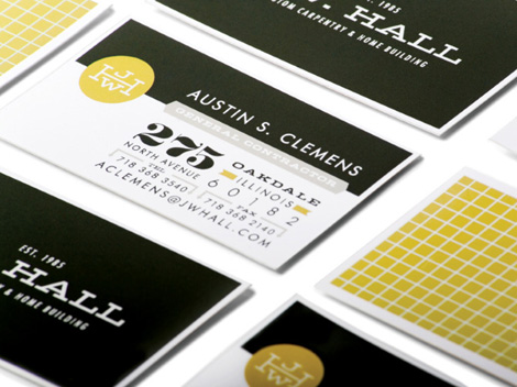
I love this wonderful identity and stationery system from Abby Brewster. Typographically interesting and well thought out — I want to touch and look and feel each little piece.

The patterns on the inner flap of the envelope are such nice details. How fun would it be to open that letter and be greeted with something so bold! Such a fun surprise.

Read the rest of this entry »

Kazumasa Nagai Posters

Kazumasa Nagai Posters

Pink Tentacle digs up an impressive collection of posters by Japanese artist and designer Kazumasa Nagai. Enjoy!
Read the rest of this entry »

Scotty Reifsnyder: The Heroes of Folk

Scotty Reifsnyder

Scotty Reifsnyder updates his portfolio & shop with the Heroes of Folk, a series of letterpress cards featuring illustrations of American Folk legends like Paul Bunyan and Johnny Appleseed. The cards are available for $30 a piece or $150 for the complete collection. Pick them up here.

Head nods and handshakes go out to Scott McClelland of Two Paper Dolls for doing such a wonderful job with the printing.

Read the rest of this entry »

Ill Studio

Ill Studio

Ill Studio is a Parisian design studio with an incredibly experimental edge. They have just released a massive update featuring some beautiful typography-based projects. I’ve been a fan of theirs for years, and love their effortless propensity for creating an inspiring and very new set of work. With each new iteration of their portfolio they get better & better at honing their craft, while maintaining a very specific nod to the past with classic styling and type choices.

Read the rest of this entry »

Kelli Anderson


In the era of the slick, white, one-dimensional portfolio site, one quickly glazes over after clicking through multiple nearly identical sites. The flip side being that tedious, overly constructed sites become more frustrating and conceptual than actually useful for seeing a designer’s portfolio.

Kelli Anderson has a great site on her hands. It’s unique, fun and easy to use, and it doesn’t get fussy. Her work is exceptional as well. I noticed a nice balance of smart thinking and great hand skills. Kelli has a letterpress in her apartment, so much of her work has a very hands-on, tactile, cared-for feel.

Read the rest of this entry »

Julia Rothman Interview

julia rothman

Today’s Grain Edit interview series takes us to Brooklyn, New York, home to illustrator Julia Rothman. I remember first being introduced to Julia’s work through her repeat pattern tutorial on Design*Sponge. The process blew me away, and caused me to fall in love with the multitudes of energetic inventive patterns and fresh illustrations she creates.

In this interview, Julia discusses being a native New Yorker, the influence of Sweet Pickles books (YES!), and the process behind the creation of her latest book, The Exquisite Book. She also reveals something that most people don’t know about her…find out more after the jump!

Read the rest of this entry »

Nate Duval

nate duval

Massachusetts-based illustrator and designer Nate Duval is a busy man. Over the past year he has created concert posters for Phish, Spoon, Wilco, Tortoise and the Black Keys as well as a collaborated with Jen Skelley and Mother NYC on an re-branding campaign for Sweet ‘N Low.  Nate’s work often pairs playful imagery with hand-drawn type as seen in this city skyline poster for M. Ward.  I love how he’s able to present a potentially chaotic situation in a way that looks innocent and fun. This poster as well as others designed by Nate are available for purchase at the Poster Cabaret.

Read the rest of this entry »

Cor Klaasen: Vintage Irish Graphic Design

cor klaasen

Opening in Dublin this week:

The Vintage Irish Book Covers blog is presenting an exhibition of Cor Klaasen’s wonderful book and record cover designs.

Cor Klaasen: Jackets, Covers & Sleeves
Venue: Adifferentkettleoffishaltogether, 18 Ormond Quay Upper
Times: Daily 11 – 5pm. Thurs 4 – Wed 10 November inclusive
Opening: Wednesday 3 November, 2010, 6 – 8 pm. Guest Speaker: Brian Lalor

Read the rest of this entry »

Jon Contino

jon contino

For my first post I am honored to bring to you Jon Contino. He is a designer, illustrator and a self-proclaimed ‘Alphastructuaesthetitologist’ (which sounds wonderful & incredibly hard to say) living in Brooklyn. His completely unique hand lettering style uses a rich mix of nostalgia and vaguely modern touches, making his particular brand of typography stand out. I particularly love his use of old sailor songs, sea life and of course the New York whaling-era ephemera. Along with his freelance career, Jon lives a crazy life as a partner at OneTwentySix design studio and owner of a men’s clothing line, CXXVI.

Read the rest of this entry »

Greg Pizzoli: Illustration

greg pizzoli, illustration, philadelphia, usa
Take a look at that honkin’ apple! Philadelphia based illustrator Greg Pizzoli creates a fun whimsical environment in this illustration as he plays with the proportion of the massive textured fruit and the teeny tiny cars. There are so many neat colorful details to look at, such as the airplanes in the sky, buttons on the apple, and the varied shapes of buildings on the land.

Read the rest of this entry »