Wall-E retro art posters – illustrations by Eric Tan

wall-e pixar poster by Eric Tan

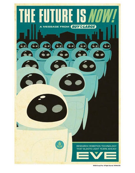
Eric Tan nailed it with his recent line of limited edition prints for Wall-E. The illustrations were inspired by vintage Disneyland attraction posters.

I saw Wall-E on friday. The theater was packed, as you might expect for the premier in Oakland. Pixar is only a few miles away from my house, so I’m sure there were illustrators who worked on the film in the audience. It was unlike any other Pixar film I’ve seen. Amazing in so many ways.

(image via Slash Film)

Also worth checking:
Exclusive look at the making of the Wall-E picture book.

STEP Inside Design business annual – cover design by Wink

wink step inside design cover

Finished Cover

The cover of the July/ August issue of STEP Inside Design magazine was designed by Wink. Scott Thares of Wink shares with grain edit some of the thoughts that went into the cover:

(more…)

Matthew Bowers

Matthew Bowers

German Shepherds and Ham Radio! My two favorite things together at last! Matthew Bowers, purveyor of such fine imagery and juicy type, is a Portland, OR based designer. In addition to his regular work, he also publishes the art book series, Downy Bird Art Kingdom.

Charles Goslin – graphic designer and illustrator

charles goslin graphic design

Bedside Nurse magazine design from 1968, 1969 and 1970

Charles Goslin (1932-2007) began his career at Lester Beall’s studio in 1954 and left to pursue work at corporate identity firm Lippincott & Margulies in 1958. Three years later he parted ways again, but this time to begin what would be a lengthy career as a freelance designer and illustrator. During this time he started teaching at Pratt Institute as well, where he became known for unique assignments.

For those interested in learning more about Charles Goslin, former student Scott Santoro has written a lovely piece about him here.

Also of interest:

Graphic designer Clarence Lee – He worked at Lester Beall’s studio in 1958, possibly at the same time as Charles Goslin.

Petit Collage animal alphabet poster

petit collage aninal alphabet poster

Animal Alphabet 18 x 24 poster. 3 color screen print

I first ran into San Francisco based Lorena Siminovich’s work at a local store that carries modern goods a few years ago. It was the Elephant collage seen on this page that caught my eye. Since then she has released a small zoo of colorful collages, posters and notecards.

The poster seen above is the latest addition to her collection. Check out that chocolate elephant! He’s hanging out with his mysterious friend that starts with a letter “i” and drinking some yummy camel leg. Lots of Fun!

You can see this poster and the rest of the collection at Lorena’s website: Petit Collage.

Philippe Apeloig

Philippe Apeloig

Philippe Apeloig runs his own studio, Apeloig, in Paris, France. Not only does Philippe have a lot of work his site, but it’s very well documented and photographed. You can get a sense of the amount of experimentation and playing that goes on in his work.

Modern book cover art – Creative America

creative america-cover

Creative America: Art director- Albert Squillace c1962

Thanks to Chad for sending this in. Looks very similar to the book cover design work of Paul Rand.

Also worth checking:
Modern Dutch book cover design
1960s Penguin books

Editor of Dwell Magazine reveals his modern home + his owls

sam grawe editor of dwell house

sam grawe editor of dwell house

Apartment Therapy posted photos of Sam Grawe’s apartment yesterday as part of their 2008 home tour series. Sam is the Editor-in-Chief at the San Francisco based Dwell Magazine. If you are unfamiliar with Dwell, it is a magazine that focuses on modern architecture and design.

Sam has lots of goodies in his house. The place is filled with Danish modern furniture, Bertoia chairs and Scandinavian nic nacs. What did me in was the record covers and the owls. This is a man that loves owls! He has a slew of these Edvard Lindahl looking ceramic miniature birds of prey. Too be fair, it looks he holds no Owl biases. I see examples of Strigidae (Heck yea, I’m name dropping) as well as the barn yard variety. I actually know nothing about Owls. I picked all this up in a two minute search at Wikipedia. Anyways, I’m getting off track. To sum up, just check out the house tour.

Elizabeth Shoes – Vintage shoebox – 1970s ?

vintage elizabeth shoes box

Elizabeth shoes shoebox possibly from the 1970s

I just about flipped when I found this image of an Elizabeth shoe box on flickr. I love the organic lines flowing inside the butterfly wings. Is it me or does it look like the body of the butterfly is rising from a lighter thats created when the letter “L” and letter”i” are placed next to each other? I doubt that was their intention, but its still looks cool. I can’t get enough of those branches that stem from the letters. Has anyone heard of this company? Is this a new company or is this from the 1960s or 1970s?

Many, Many thanks to Fountaineer for posting this.

1950s Alvin Lustig album cover design – Vivaldi

vivaldi album cover design

Classical album covers from 1954

Finnish illustrator Elina Minn captured these lovely record cover specimens designed for the Haydn Society by Alvin Lustig hiding in her Grandmother’s vinyl collection. I really like the colors of the album on the right. Every time I look at it, it reminds me of this Alexander Girard nativity poster.

After you check out the Vivaldi covers, wander down to Elina’s website. Plenty of great illustration and collage work to look at.

Many thanks to Gina Federico for sending this my way and Kind Company who designed the Alvin Lustig website, for alerting us that these album covers are the work of designer Alvin Lustig.

Other work by Alvin Lustig:

The Collected writings of Alvin Lustig
Alvin Lustig brochure design