November 2010

You are currently browsing the monthly archive for November 2010.

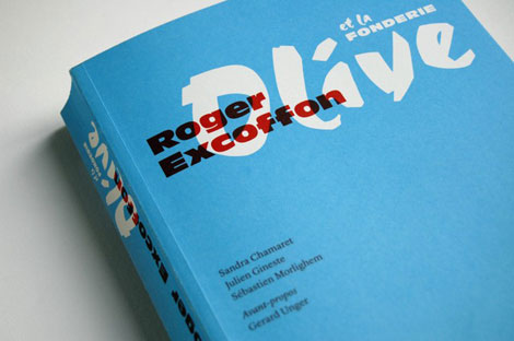
Roger Excoffon and the Olive foundry

roger excoffon

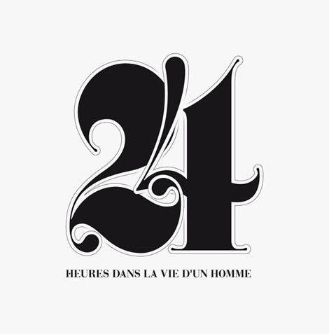
Roger Excoffon and the Olive foundry by Sandra Chamaret, Julien Gineste and Sébastien Morlighem

Roger Excoffon (1910-1983) was a significant figure in French typography, the graphic arts and visual communication. To mark the centenary of his birth, Paris based Ypsilon Editeur has just released the first book dedicated to his work. Included are little-known or previously unpublished photographs, drawings and type specimens. The book also presents the history of the Olive Foundry where Roger served as the design director for many years.

To get all the gritty details, visit Ypsilon Editeur.

Read the rest of this entry »

Blake Suárez

grain edit / blake suárez

I had a good time flipping through Blake Suárez’s portfolio – there’s quite a lot of fun, eye-catching work to be seen. There is a lot of enthusiasm in this work as well, which is refreshing and exciting to see.

Throughout his experience, Blake has had the opportunity to work with clients like Warner Music and Patagonia, as well as a variety of musicians.

Read the rest of this entry »

Mike Perry Pop-up Shop / Studio Sale!

Mike Perry, Jim Datz, New York

Prepare yourselves: Grain Edit pal Mike Perry is transforming his Brooklyn studio into a pop-up shop and open gallery from November 27 through December 1. This year’s sale will be overflowing with amazing prints, zines, books, tee shirts, original drawings, and so much more from good folks like Jim Datz, Josh Cochran, Jim Stoten, Hugo & Marie, and others.

If you happen to be in the New York area around this time, this is one event you cannot miss!

Read the rest of this entry »

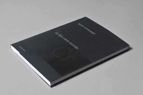
Wim Crouwel ‘in his own words’ by Toon Lauwen

wim crouwel

Here’s another book to add to the holiday wish list. Lauwen Books recently released Wim Crouwel ‘in his own words’, a selection of lectures and articles delivered by Wim Crouwel between 1973 and 2006. Considering Wim’s long and established history with design, I’m sure it’s a fascinating read full of inspiring stories and valuable insights. The book is currently sold out at typotheque, but it appears copies are still available directly through the publisher as well as Nijhof & Lee.

Read the rest of this entry »

Travis Stearns

Travis Stearns

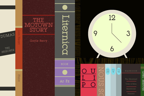
Travis Stearns is a force to be reckoned with. I really mean that. He’s been a source of inspiration for myself and other young type hopefuls since he entered the ‘internet scene’ in 2006 & subsequently began working at You Work For Them, designing typefaces. Since then he has worked with the likes of Dwell, Nylon, Ghostly International and Wired, among others, and won the Print Magazine New Visual Artist award for his amazing work.

Some of my favorite fonts that he has produced are YWFT Isanti, YWFT Hannah & YWFT Motown, all of which are unique and completely contemporary, but have strong roots in historical typefaces (calligraphic, handwriting & roman). Travis’s fonts have become somewhat prolific, spanning almost every inch of the internet and have made their way into major catalogs and publications.

Read the rest of this entry »

Hollie Chastain

Hollie Chastain, art, US

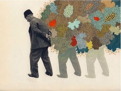
This fine fez wearing gentleman has a lot on his mind, and it’s evident in the trail of intricate patterns he’s leaving behind. Tennessee based artist Hollie Chastain nicely collages vintage paper with colorful painted elements in this piece entitled Afterthought. As the pondering man moves forward, his figure slowly fades into the background, nicely displaying lingering fleeting thoughts. A print of this piece as well as others by Hollie are available for purchase at Poster Cabaret.

Read the rest of this entry »

Áron Jancsó

grain edit - aron Jancso

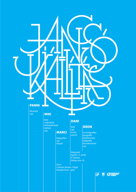
Hungary-based designer / illustrator Áron Jancsó has quite the way with letters. Viewing Áron’s work is a delightfully involved procedure. With such a large variety of typographic experimentation and work, it’s easy to become engrossed with the portfolio while inspecting the various details.

Read the rest of this entry »

U&lc Back Issues

U&lc Back Issues

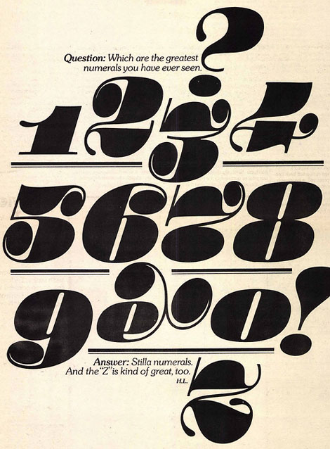
Design by Herb Lubalin

Wee hoo! U&lc back issues are now available for download at fonts.com.

Read the rest of this entry »

Jonathan Zawada

Jonathan Zawada

Jonathan Zawada is a graphic designer who lives & works in Australia. I first discovered Jonathan on flickr, and was completely taken by his collection of amazingly rendered pencil drawings. Over the years he has made his way into the world of hand-drawn typography, implementing his style into branding, editorial illustrations and major campaigns for incredible clients. His very polished but still whimsical style really stands out, and I’m excited to see how his art evolves in years to come.

Read the rest of this entry »

Abby Brewster

abby brewster

I love this wonderful identity and stationery system from Abby Brewster. Typographically interesting and well thought out — I want to touch and look and feel each little piece.

The patterns on the inner flap of the envelope are such nice details. How fun would it be to open that letter and be greeted with something so bold! Such a fun surprise.

Read the rest of this entry »

Kazumasa Nagai Posters

Kazumasa Nagai Posters

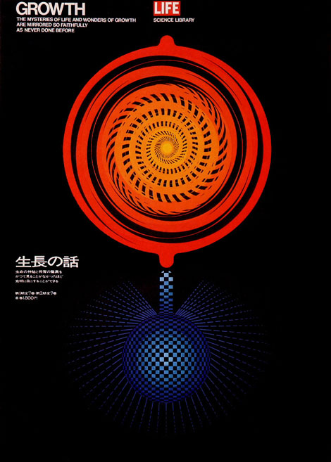
Pink Tentacle digs up an impressive collection of posters by Japanese artist and designer Kazumasa Nagai. Enjoy!
Read the rest of this entry »

Scotty Reifsnyder: The Heroes of Folk

Scotty Reifsnyder

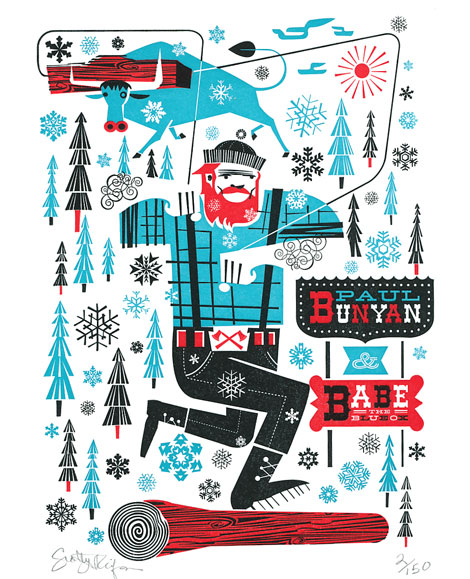
Scotty Reifsnyder updates his portfolio & shop with the Heroes of Folk, a series of letterpress cards featuring illustrations of American Folk legends like Paul Bunyan and Johnny Appleseed. The cards are available for $30 a piece or $150 for the complete collection. Pick them up here.

Head nods and handshakes go out to Scott McClelland of Two Paper Dolls for doing such a wonderful job with the printing.

Read the rest of this entry »

Ill Studio

Ill Studio

Ill Studio is a Parisian design studio with an incredibly experimental edge. They have just released a massive update featuring some beautiful typography-based projects. I’ve been a fan of theirs for years, and love their effortless propensity for creating an inspiring and very new set of work. With each new iteration of their portfolio they get better & better at honing their craft, while maintaining a very specific nod to the past with classic styling and type choices.

Read the rest of this entry »

Kelli Anderson


In the era of the slick, white, one-dimensional portfolio site, one quickly glazes over after clicking through multiple nearly identical sites. The flip side being that tedious, overly constructed sites become more frustrating and conceptual than actually useful for seeing a designer’s portfolio.

Kelli Anderson has a great site on her hands. It’s unique, fun and easy to use, and it doesn’t get fussy. Her work is exceptional as well. I noticed a nice balance of smart thinking and great hand skills. Kelli has a letterpress in her apartment, so much of her work has a very hands-on, tactile, cared-for feel.

Read the rest of this entry »

Julia Rothman Interview

julia rothman

Today’s Grain Edit interview series takes us to Brooklyn, New York, home to illustrator Julia Rothman. I remember first being introduced to Julia’s work through her repeat pattern tutorial on Design*Sponge. The process blew me away, and caused me to fall in love with the multitudes of energetic inventive patterns and fresh illustrations she creates.

In this interview, Julia discusses being a native New Yorker, the influence of Sweet Pickles books (YES!), and the process behind the creation of her latest book, The Exquisite Book. She also reveals something that most people don’t know about her…find out more after the jump!

Read the rest of this entry »

Nate Duval

nate duval

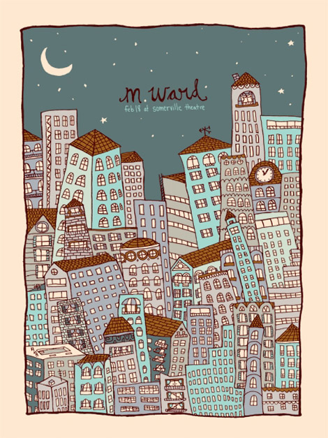
Massachusetts-based illustrator and designer Nate Duval is a busy man. Over the past year he has created concert posters for Phish, Spoon, Wilco, Tortoise and the Black Keys as well as a collaborated with Jen Skelley and Mother NYC on an re-branding campaign for Sweet ‘N Low.  Nate’s work often pairs playful imagery with hand-drawn type as seen in this city skyline poster for M. Ward.  I love how he’s able to present a potentially chaotic situation in a way that looks innocent and fun. This poster as well as others designed by Nate are available for purchase at the Poster Cabaret.

Read the rest of this entry »

Cor Klaasen: Vintage Irish Graphic Design

cor klaasen

Opening in Dublin this week:

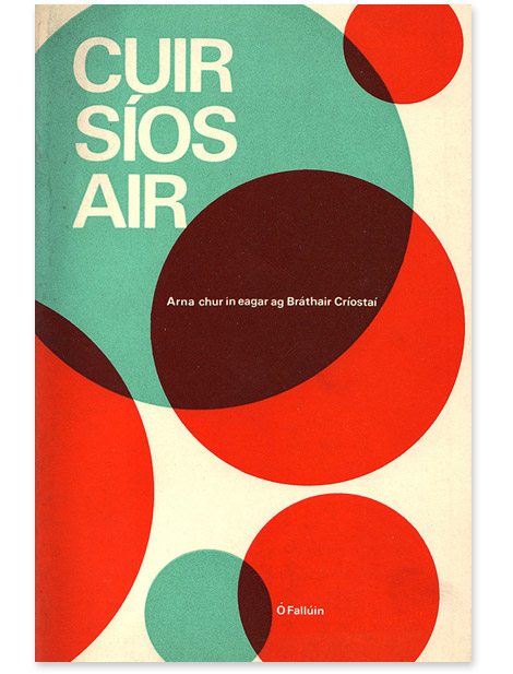
The Vintage Irish Book Covers blog is presenting an exhibition of Cor Klaasen’s wonderful book and record cover designs.

Cor Klaasen: Jackets, Covers & Sleeves
Venue: Adifferentkettleoffishaltogether, 18 Ormond Quay Upper
Times: Daily 11 – 5pm. Thurs 4 – Wed 10 November inclusive
Opening: Wednesday 3 November, 2010, 6 – 8 pm. Guest Speaker: Brian Lalor

Read the rest of this entry »

Page 1 of 198123...Last »