


Script and Seal posters
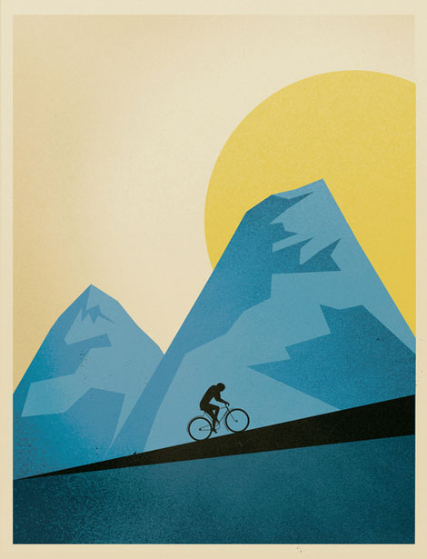
Script & Seal, the amazing Portland-based duo of Liz Meyer and Gavin Potenza, created these wonderful posters for a cycling feature in the Portland Mercury.
06.29.10 | Ethan | Found design |  5 comments


You are currently browsing the monthly archive for June 2010.
Script & Seal, the amazing Portland-based duo of Liz Meyer and Gavin Potenza, created these wonderful posters for a cycling feature in the Portland Mercury.
06.29.10 | Ethan | Found design | 5 comments
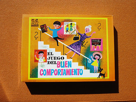
Obscure children’s game juego del buen comportamiento
New items such as vintage kid’s books & games from Spain and educational charts/prints from the U.S have been added to the shop.
06.29.10 | Dave | Off Our Bookshelves | Comments closed
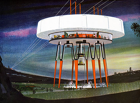
In 1964 United States Steel called upon the nation’s electric utility companies to reconsider the current look of our power stations and transmission towers to be both functional and beautiful. Two years later, Henry Dreyfuss and Associates were commissioned to investigate possible design alternatives, and I believe they were documented in a book entitled “Power Styling” which was produced by United States Steel in the mid-to-late 1960s. I discovered a copy not long ago, and the inside illustrations are absolutely amazing. Unfortunately, there is very little information listed, so I can’t say for sure if the concepts belong to Henry Dreyfuss and his team. I contacted the office of Syd Mead, who did several illustration projects for US Steel, to confirm the artwork, and sadly he was unfamiliar with this piece. If anyone has information on the Power Stylings project or the mysterious illustrator, please drop a note in the comments.
More images after the jump. Don’t miss this one!
06.28.10 | Dave | Off Our Bookshelves | 21 comments
Fantastic book covers from Isaac Tobin, a senior designer for Chicago Press. His work is striking and sophisticated, while maintaining a clean minimalism. The covers I think, are also successful in representing the message or idea of each piece.
06.25.10 | Ethan | Found design | 6 comments
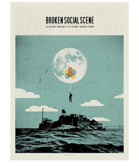
This week’s poster pick was designed by Concepcion Studios for a recent Broken Social Scene concert in San Francisco. The grainy dots used throughout this poster add a nice vintage feel. The fluffy clouds in the background are not as realistic as the rest of this scene, but happen to work well with the overall playfulness. I can’t think of a better way to escape from Alcatraz than with a fistful of brightly colored balloons. Get carried away here.
06.23.10 | Dave | Poster Picks | 2 comments
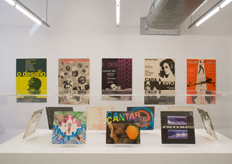
Recent exhibition of Rogerio Duarte’s work at the Narrows Gallery.
Rogerio Duarte is a Brazilian graphic designer, musician, poet and philosopher. He is also considered to be one of the founding fathers and the main intellectual force behind the Tropicalia movement in the late 1960s. During this period he designed album covers for many of the great names of Brazilian popular music, such as Caetano Veloso, Gilberto Gil, Gal Costa, João Gilberto and Jorge Ben. If you have access to idea magazine, I recommend picking up the March issue (#339). It features a 24 page article on Duarte and includes a nice selection of his work.
06.23.10 | Dave | Found design | 7 comments

Summer is officially here, and what better way to spend it than a day at the beach!
This illustration, created by French illustrator Aurélie Guillerey, depicts just that with its cast of characters enjoying a day of fun in the sun. The composition is balanced as it focuses on kids making a pretty awesome sand fort while having other people enjoying outdoor activities in the background. The use of color is cheerful with the perfect amount of textures to highlight small details. Let’s go fly a kite!
06.22.10 | Grace Danico | Found design | 5 comments
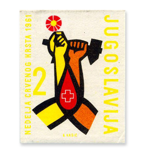
Yugoslavia (Jugoslavija) stamp -1961
A little stamp love to start off the week.
06.21.10 | Dave | Off Our Bookshelves | 3 comments
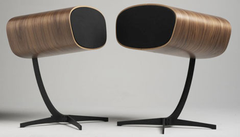
If you have $6000 just laying around you can pick yourself up a pair of these Davone Ray speakers. While your at it, pick me up a pair too (Hey, with $6000 on hand, you’re probably not worried about your cash flow). I have to admit, i’m a sucker for anything with a walnut veneer and this thing looks like an Eames chair with a woofer stuffed inside. I don’t know much about the high end audio market, but I hope for $6000 you’re getting more than something pretty to look at.
06.18.10 | Dave | Found design | 9 comments
I just stumbled upon this iphone app that contains a checklist you can bring to senior year critiques / design degree shows. I have to admit it’s a little cruel, but hopefully you’ll get a good chuckle along the way.
06.17.10 | Dave | Seen Elsewhere | 35 comments
Today Grain Edit is proud to present Blanca Gómez of Cosas Minimas. Blanca is a Graphic Designer and Illustrator based in Madrid, Spain. You may remember her work as featured on Grain Edit’s on-going poster pick series. We like her clean and simple style and took some time to talk to Blanca about her work and creative process. We hope you’ll enjoy it.
06.16.10 | Dave | Features | 55 comments
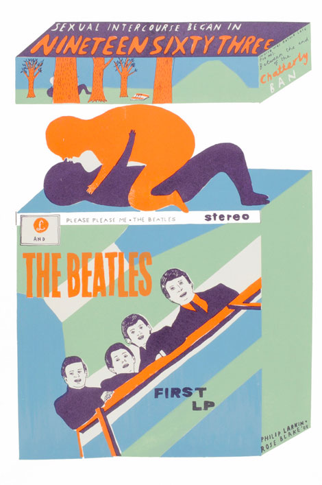
London Based illustrator, Rose Blake, is one of my favorite illustrators at the moment. This print, entitled Annus Mirabalis, playfully illustrates the first stanza of the poem “Annus Mirabalis” (Latin for “Wonderful Year”) by Philip Larkin. Rose successfully sandwiches two ambiguous love making figures between the Chatterly ban and the Beatles’ first LP, creating a striking and awkwardly funny image. Her use of color is delightful with the poppy orange as a nice contrast to the dark plum and light blue tones.
06.15.10 | Grace Danico | Found design | 2 comments
I’m absolutely in love with these photos by Berlin based photographer Matthias Heiderich.
06.10.10 | Dave | Found design | 20 comments
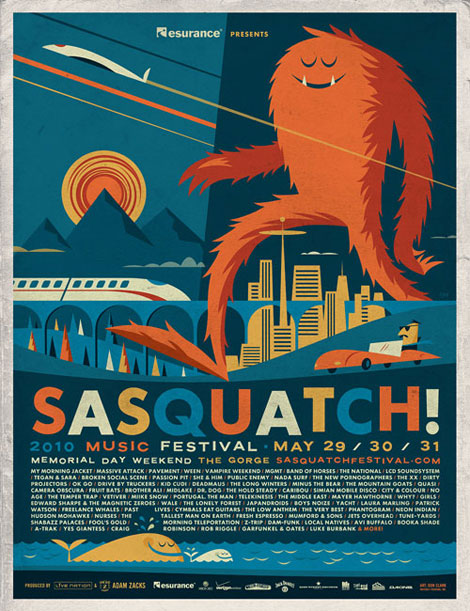
Every year at the end of May (since 2002) the Sasquatch! Music Festival rears it’s hairy head in a small town along the Columbia River in Central Washington. The three day bash features bands like Vampire Weekend, MGMT, Massive Attack, LCD Soundsystem, They Might Be Giants and Camera Obscura just to name a few. The promo poster for Sasquatch! 2010 (created by grain edit fave Invisible Creature) features a whale whose blow hole juice magically controls Abobe’s text wrap feature and a giant furry beast that can easily touch the esurance logo found floating in our atmosphere. If you were unable to make the show you can still pick up some of this poster sweetness right here.
06.09.10 | Dave | Poster Picks | 9 comments
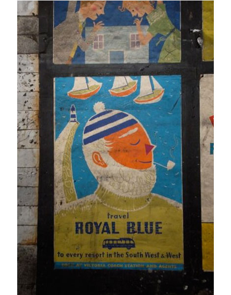
Original Royal Blue Coach Services poster illustrated by Daphne Padden
Recent renovations at the Notting Hill gate tube station have uncovered these mid-century posters. The posters were located in a non-public area and date from c1956 – 1959 when the station’s lifts were removed and replaced by escalators. Mike Ashworth, who is the ‘Design and Heritage Manager’ for London Underground, has more images at his Flickr account.
06.09.10 | Dave | Seen Elsewhere | 15 comments
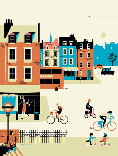
London based illustrator, Clayton Junior, has a keen eye for precision as shown here in this image from the “A View From London” exhibition at the London Transportation Museum. Here, he depicts the hustle bustle of the city in a delightful way by cohesively weaving the intricate details of buildings and people with an eye-catching color palette. If I had my choice, I’d want to be one of the kids on the scooter instead of the commuter with the briefcase.
06.08.10 | Grace Danico | Found design | 9 comments
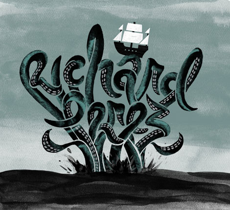
Great series of guest posts by Richard Perez over at Friends of Type.
06.07.10 | Dave | Found design | 7 comments
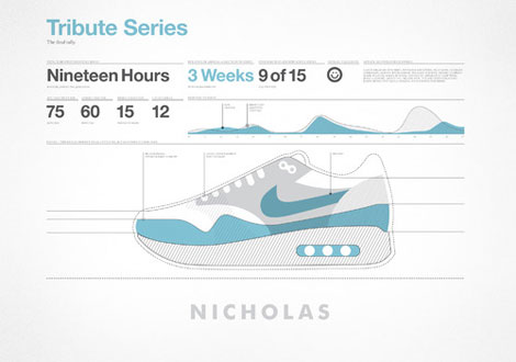
TRIBUTE SERIES: NICHOLAS FELTON (FELTRON) /
Charlotte based designer Matt Stevens recently started a personal project to reinterpret the classic Nike Air Max once a day for a whole month. Along the way he created a series that pays tribute to his favorite illustrators and designers including: Frank Chimero, Mikey Burton, Invisible Creature, Jessica Hische, Michael Schwab, Aaron Draplin and others. Matt absolutely nails it. Without looking at the title of the piece you can easily guess who’s design/ illustration style he’s attempting to capture. It’s Sole good Y’all! (sorry) See the the complete Air Max Gallery here.
06.04.10 | Dave | Found design | 7 comments
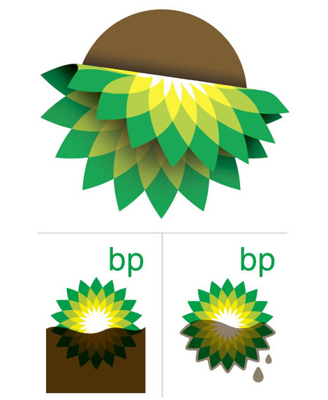
Draplin takes on the BP (British Petroleum) logo with some quick redesigns.
I can’t watch the news now. I’m in shock every time I see footage of the Gulf. When is BP going to contain this mess?
06.03.10 | Dave | Found design | 15 comments
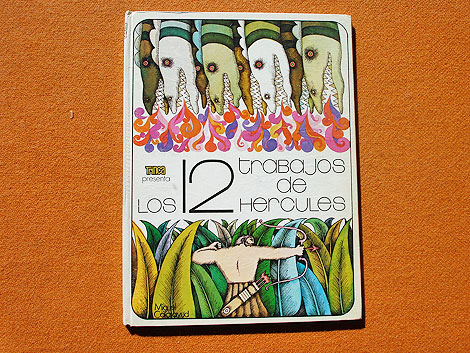
Los doce trabajos de Hercules – Illustrated by Miguel Calatayud c1973
Miguel Calatayud is a Spanish illustrator and is best known for his work in the world of comics. I dug up a couple of his books, both of which were published in the 70s by Editorial Doncel as part of their Trinca collection. If your a fan of the early work by Push Pin Studios and the bold styling of Peter Max, I think you will really dig Miguel.
I have a couple extra copies of each book. If you like what you see you can pick up a copy of either Los doce trabajos de Hercules or Peter Petrake in the grain edit shop.
06.02.10 | Dave | Off Our Bookshelves | 21 comments
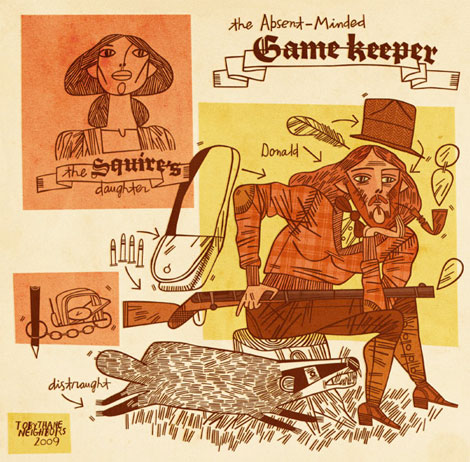
Every line counts for Texas based illustrator and artist Toby Thane Neighbors. Created as part of the Story Motel group show at the Owl & Lion Gallery, this illustration successfully weaves warm tones and detailed lines to transport us to the old frontier. Neighbors has a nice way of cataloging objects in his works, and this piece is no exception with its bag of bullets, feather, and hungry badger at the heels of the pensive gamekeeper. Read the rest of this entry »
06.01.10 | Grace Danico | Found design | 11 comments
