Frankenstyles – Illustration and design
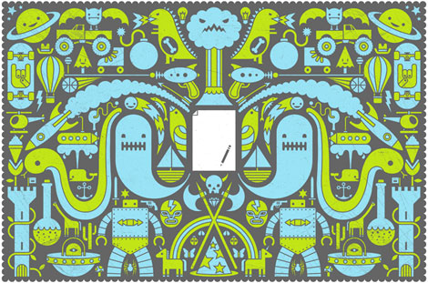
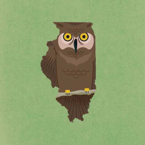
Cool work from Brooklyn based illustrator and designer Stephen Kelleher aka Frankenstyles.
04.30.08 | Dave | Found design |  2 comments


You are currently browsing the monthly archive for April 2008.

Cool work from Brooklyn based illustrator and designer Stephen Kelleher aka Frankenstyles.
04.30.08 | Dave | Found design |  2 comments
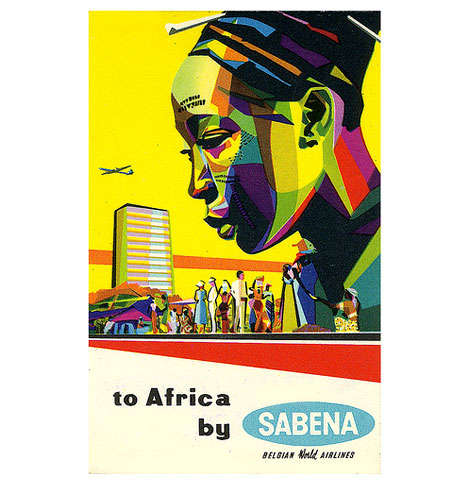
Sabena label from the late 1950s/ early 1960s
Wow, amazing luggage label from Belgian airlines Sabena. This label is promoting travel to Africa. Look at those colors! I love how the illustrator portrays the faceted shades of the girl’s face in bold “Fauvist” hues.
This is part of Art of the Luggage label’s amazing collection of luggage labels on flickr. Please check them out. They were nice enough to add the label to grain edit’s mid century modern sticker, label and stamp club as well.
Be sure to check these luggage labels we’ve posted in the past.
Modern Swiss label
Portuguese modern label
04.28.08 | Dave | Found design |  3 comments
[pictobrowser 10159078@N03 72157604770297324]
Richard Erdoes – Policemen around the world c1967
Richard Erdoes was an author and illustrator. He was born in Vienna, Austria in 1912 and later immigrated to the United States. The book above is one of a 3 part “around the world” series. The other two books were Musicians of the world and Peddlers and Vendors of the world. Both of which, were produced around the same time in the late 1960s.
It looks like Erdoes’ used a combination of Pen/ Ink and gouache to achieve the finished look found in the images above. This reminds me of the work of Miroslav Sasek who I believe used gouache as well.
Many thanks to grain edit reader Thorsten Schmidt for sending the following Richard Erdoes link in:
Richard Erdoes magazine illustration
You can pick up a copy of Policemen around the world at Amazon.
—–
Also available for your viewing pleasure: Ryohei Yanagihara
Enjoy this post? Sign up for our tasty free grain edit RSS feed.
—–
04.28.08 | Dave | Off Our Bookshelves |  10 comments
All this week I will be guest blogging at Julia Rothman’s wonderful Book By Its Cover blog. This is one of my favorite blogs, so please stop by! Today’s posting is a beautiful book by Tim Biskup.
04.28.08 | Dave | Grain Edit News |  Comments closed
Thanks to everyone who submitted their reason for wanting the Herbert Bayer Olivetti poster! After a week of voting, we closed the polls last friday. We’re proud to announce that Simon P. from the Sichuan Province of China reeled in the most votes. He won with his submission, “I live in china, my walls are bare, inspiration comes via a slow broadband connection.” Simon has a shiny new poster coming his way.
Keep an eye out for Simon’s upcoming T-shirt line at escape artist apparel.
04.28.08 | Dave | Contests and giveaways |  Comments closed
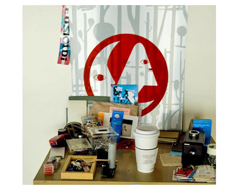
For those of you in the San Francisco/ Bay area, Geoff McFetridge has a show tonight at Mollusk surf shop.
Details
show 7-10pm
Address:
Mollusk Surf shop
4500 Irving st.
SF, CA 94122
(Big thanks to Nicole for passing this along)
04.25.08 | Dave | Design Events |  Comments closed
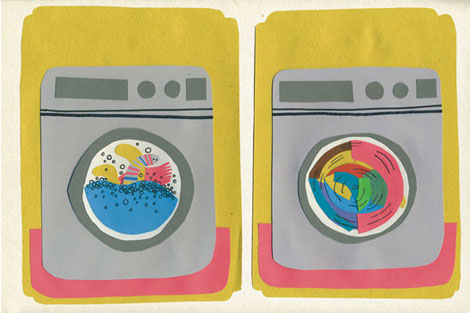
Marcus Walters, a designer and illustrator from the UK, loves washing machines. A lot of his work is similar to the above image — which reminds me of putting felt onto a feltboard as a kid. They have that very flat, semi-dimensional quality to them which I love.
Marcus is also a part of New Future Graphic, which is more graphic design-oriented (posters, ad’s, books, etc).
04.25.08 | Ethan | Found design |  Comments closed
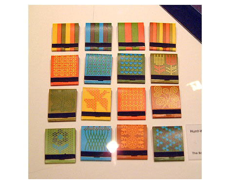
Matchbooks for Hunt-Wesson by Graphic designer Saul Bass
Jon (Insect54) posted this amazing set of matchbooks on flickr last night. I’ve never seen these before. I’m digging the pixelated flower in the lower left corner and the orange and yellow pattern on the 3rd down, 3rd to right is really nice. Saul designed the logo for Hunt-Wesson in 1964 so I’m guessing this work was produced right around the same time.
Can’t get enough of Saul?
check these out:
Henri’s Walk to Paris – children’s book illustrated by Saul Bass
San Francisco International Film Festival poster
Saul Bass’s Case study house
04.24.08 | Dave | Found design |  2 comments
[pictobrowser 10159078@N03 72157604685532108]
Vette Annonce type specimen sheet late – Netherlands 1950s/ early 60s
Happy Wednesday! It’s been a while since I’ve posted any type specimens, so I figured it was time to post this gem from Lettergieterij ‘Amsterdam’ (Amsterdam Type Foundry) which was founded by Nicolaas Tetterode. The specimen is a tri-fold that opens to reveal an 11 X 17 sheet. I’d love to know more about Tetterode, ATF, and this typeface. Can any of the typographers out there fill in the blanks? Has Vette Annonce been digitized? I believe “Vette Annonce” translates to “fat advertisement”. With that in mind, is “Vette Annonce” even the name of the typeface?
04.23.08 | Dave | Off Our Bookshelves |  16 comments
Sander from segd sent me a link to this cool font contest. Try your luck at What the Font?
04.22.08 | Dave | Contests and giveaways |  1 comment
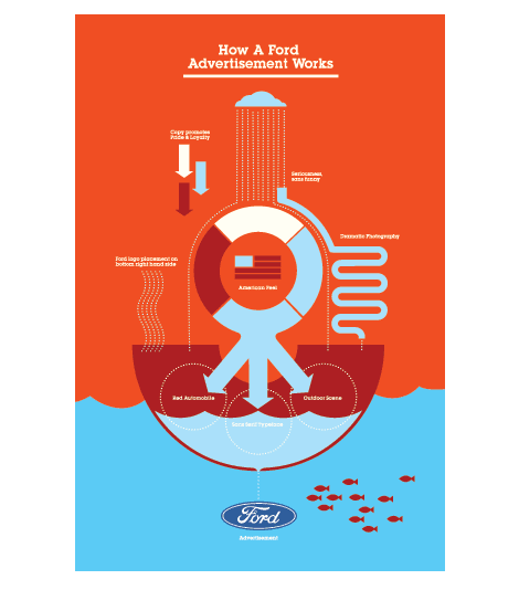
I’ve been meaning to post this for a while. I first came across Tyler Lang a few months ago when his Universal Demand poster for Ringling School of Art and Design was making the rounds on select blogs. His portfolio is filled with great work, I just wish I could see more. I especially like his logo system for the Sarasota Design Summit and the Ford piece seen above.
04.22.08 | Dave | Found design |  1 comment
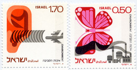
Israeli environment stamps – 1975 designed by Eliezer Weishoff
Beautiful stamps addressing both noise and industrial pollution.
Be sure to check out this modern stamp from Israel as well.
04.20.08 | Dave | Off Our Bookshelves |  19 comments

Its time to Vote! Round of thanks to everyone that submitted their reason of why they must have the Herbert Bayer Olivetti poster. We selected our 5 favorite entries last night. You can vote for your favorite and watch the results in the polls section in the far right column. Polls close at 11:30 AM next friday (25th of april). The person with the most votes wins!
Go for it, vote now! Just takes a few seconds.
04.18.08 | Dave | Grain Edit News |  1 comment
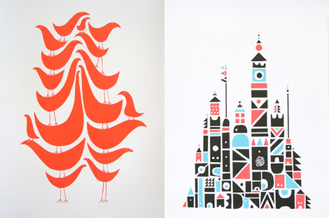
Wayne Pate runs GoodShapeDesign, a Brooklyn, NY based design shop and all around fun place. I’m really into his “Flock” series — if you’re a fan of our feathered friends, now you can have 18 on a single poster!
Also check out his artwork section for some really inspiring collages.
04.18.08 | Ethan | Found design |  1 comment
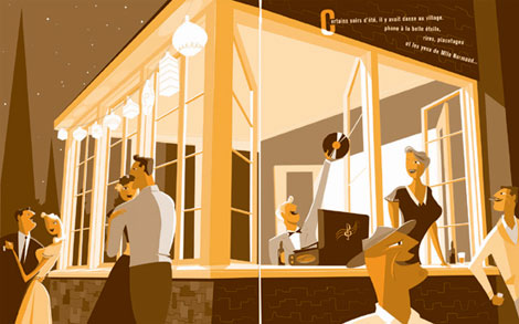
I’m just in awe of Canadian comic book creator and illustrator Pascal Blanchet’s work. It was tough to decide what image to post, everything is so good.
(Many thanks to Julia at Book by its cover for passing this along)
04.17.08 | Dave | Found design |  12 comments
[pictobrowser 10159078@N03 72157604562347640]
Concepts – Promotional book for US Steel c1961
Industrial designer / illustrator Syd Mead is well known for his vehicle designs and backgrounds for classic science fiction films like Blade Runner and Aliens during the 1980s. Long before these projects, he produced a series of conceptual illustrations and paintings for US Steel. The futuristic automobiles, diagrams and environments were published in several promotional books during the early 1960s.
These books are intense to look at. The full page spreads are over 2 feet wide and heavily detailed. Keep in mind when viewing the images above, that this work is very early on in his career, as he had recently finished his studies at Art Center in Pasadena.
04.16.08 | Dave | Off Our Bookshelves |  13 comments
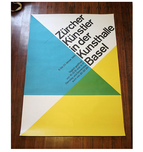
Zurcher Kunstler in der Kunsthalle Basel, Switzerland- c1966
Beautiful poster by Swiss graphic designer and author Hans Neuburg.
If you like this, check Publicity and graphic design in the chemical industry a book by Hans Neuburg.
04.14.08 | Dave | Found design |  10 comments
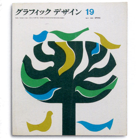
Graphic design magazine – japan 1965
Running with a Japanese theme today. Can’t stop thinking about those flicks I caught this past weekend. Great cover for a Japanese graphic design magazine from the sixties.
Also worth checking out, is this Japanese poster we posted.
04.14.08 | Dave | Off Our Bookshelves |  9 comments
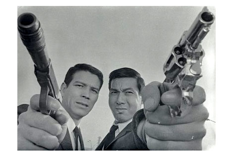
Jerry Fujio and Jo Shishido in A Colt is my Passport c1967
I had a chance to check out a few films from the No Borders, No Limits: 1960s Nikkatsu Action Cinema series this weekend. These super stylized films produced by the Nikkatsu film studio were heavily influenced by Hollywood and the French New Wave. The Seijun Suzuki films re-released by Criterion are part of the Nikkatsu catalog. If you’ve seen any of Suzuki’s films, it will give you an idea of the films featured in the No Borders, No Limits series.
The series focused on some of the more obscure films to come out of the Nikkatsu studio. All 3 films I saw were great. I just wish I could of seen the other 3. You can find out more about these films at Outcast Cinema.
04.14.08 | Dave | Seen Elsewhere |  3 comments
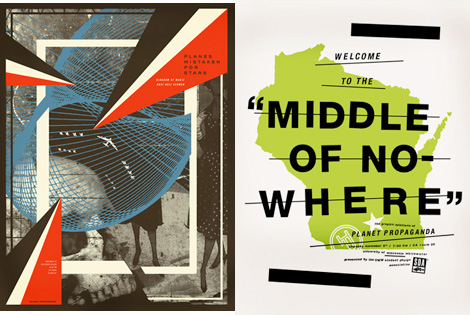
Mike Krol designs for musical bands, sandwiches, accordions, gorillas, light bulbs, and maple syrup, among many other things. He has a very good sense of humor, wit, and typography. I love finding work where the designer’s personality shines through. Especially if that includes heavy metal and Eskimos.
Check out the walking backwards to school video. I loved that!
04.11.08 | Ethan | Found design |  5 comments
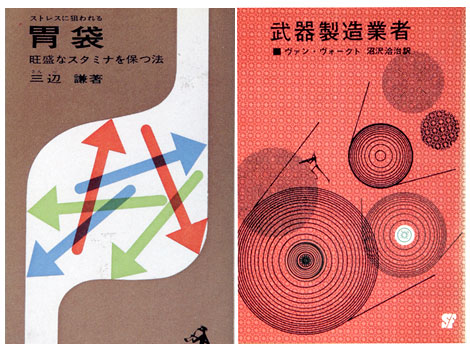
1960s Japanese book cover designs
I don’t know much about the company that published the book on the right, but the book on the left was published by Kappa in 1963. Keep your eyes out for Kappa, they have other cool covers.
04.10.08 | Dave | Off Our Bookshelves |  6 comments
[pictobrowser 10159078@N03 72157604453540681]
Issues of Icographic magazine 1971-1978 produced by ICOGRADA
Icographic (The review of International Visual Communication Design) was founded by John Halas in 1971. It was designed / edited by Patrick Wallis Burke and released quarterly, well atleast for the first year. The journal addressed the broader areas of visual communication such as semiotics, communication theory, ergonomics of visual communication and the psychology of perception. Of the four issues I have, two deal with Pictorgrams, Isotypes and symbols. I’m fascinated by the work of Otto Neurath and Otl Aicher (both of which are featured within the Journal) so it was a real pleasure to stumble unto these issues. In addition to Neurath and Aicher, there are sections on signing systems designed by Yugoslav architect Radomir Vukovoc and Pictograms by Ian McLaren and Claude Braunstein.
The layout and content remind me of another design journal produced during the same general time period titled Dot Zero. I will be covering Dot Zero in a future post but, for now enjoy the Icographic slideshow above.
04.09.08 | Dave | Off Our Bookshelves |  13 comments
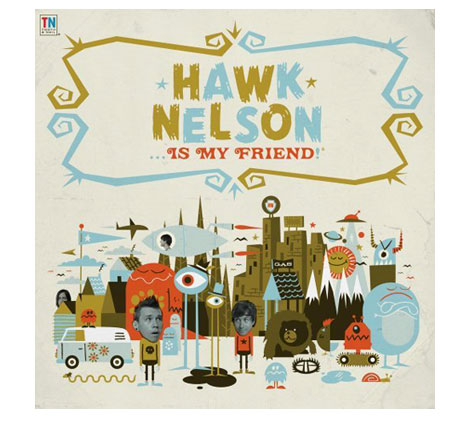
Invisible creature has a slew of great design and illustration work at their site including the album art for the latest Hawk Nelson record.
Be sure to check our interview with Invisible Creature.
04.08.08 | Dave | Found design |  4 comments
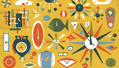
Design Studio/ gallery Wonderful Union have an upcoming exhibition of work from brothers Don and Ryan Clark (better known as Invisible Creature).
The Exhibition is entitled Haven: An Exploration of Domestic Life and opens on Saturday, April 12th, 2008. The art work highlights the tension between modernism’s smiley-faced rejection of things past and their own coming of age domesticity from an autodidactic, punk ethos point of view.
Details:
Saturday, April 12th, 2008, 6-10 PM
The Wonderful Union Gallery
2221 NW 56th St. Suite 201, Seattle WA 98107
For more details check out the Wonderful Union gallery.
Be sure to check our interview with Invisible Creature.
04.08.08 | Dave | Design Events |  1 comment
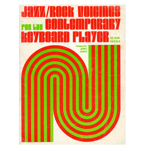
(t) Jazz/ Rock voicings for the contemporary keyboard player c1974
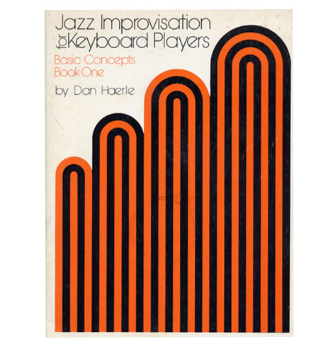
(b) Jazz Improvisation for keyboard players c1978
I picked up these two books over the weekend. They are part of an instructional jazz book series produced in the 1970s for Studio publications and recordings. I’m not sure who responsible for the cover design but, I like how he limited it to a few simple shapes and the type. Both books are written by Dan Haerle, but there are others in the series by Rufus Reid and Ramon Ricker.
04.07.08 | Dave | Off Our Bookshelves |  1 comment
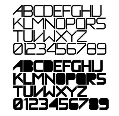
Antonio over at Aisleone just released a great new typeface called Enotmik. It’s a two weight display font that pays homage to Helvetica and Avant Garde.
You can buy the font here.
04.07.08 | Dave | Found design |  1 comment
Frank Chimero is having a great time, apparently. His portfolio is full of super fun, exciting work. As a design student, it’s always thrilling to see work that is equal parts vision, humor, inspiration, and a snappy idea.
04.04.08 | Ethan | Uncategorized |  4 comments

Frank Chimero is having a great time, apparently. His portfolio is full of super fun, exciting work. As a design student, it’s always thrilling to see work that is equal parts vision, humor, inspiration, and a snappy idea.
04.04.08 | Ethan | Found design |  6 comments
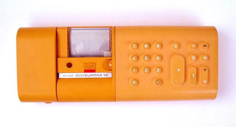
Grain edit reader Andreas Samuelsson sent in this sweet image of the Olivetti Divisumma 18 calculator. It was designed by Mario Bellini in 1973.
On a side note, be sure to check out Andreas wonderful illustration work here.
(image via Dentaku Museum)
04.03.08 | Dave | Found design |  4 comments
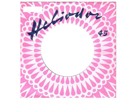
Slick 45 record sleeve with a nice modern pattern for the German label Heliodor. Anyone know what typeface that is?
(Via Kavel’s awesome record envelope)
04.02.08 | Dave | Found design |  5 comments
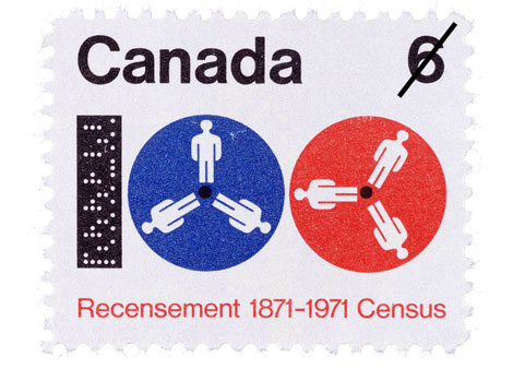
1871-1971 census stamp
Pretty bugged stamp from the Canadian Post.
Designed by Hans Kleefeld.
(via the great Canadian design resource)
04.02.08 | Dave | Found design |  1 comment