March 2008

You are currently browsing the monthly archive for March 2008.

Mick Marston / The Futile Vignette illustration

mick_marston graphic design and illustration

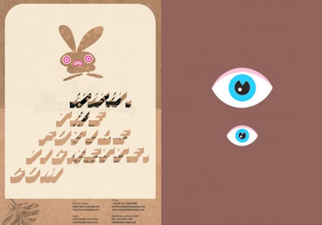
The Futile Vignette is a design studio run by Mick Marston, out of Sheffield, UK. Mick’s work is a fun combo of contemporary and vintage illustration styles. Lots of rabbits, cats, girls with pig noses, hands holding things, and 2 George Saunders book covers! (Anyone know if those are in print?)

Bonus points for an interesting website, too!

Win this Herbert Bayer Olivetti Poster !

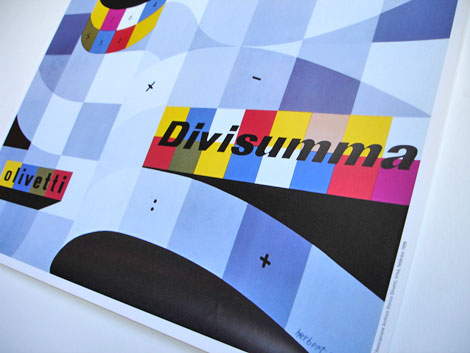
Herbert Bayer Olivetti Poster Divisumma calculator 1953

Win this Herbert Bayer Olivetti Poster !
———————————————————————————————————————
If you missed our last Olivetti Poster contest, it’s not too late to win on grain edit. On Friday April 25th, 2008 one lucky winner will be taking home the Herbert Bayer poster seen above. This is not an original, but rather a reissue of the original designed by Herbert Bayer for the Olivetti Divisumma calculator in 1953.

Read the rest of this entry »

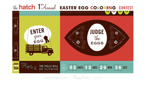
Hatch design egg coloring contest

Hatch sf design egg coloring contest

Check out this Easter egg coloring contest from Hatch design. Lots of great submissions. I think my favorite so far is the Sir Eyes Egg Newton entry. Funny stuff. Keep your eyes open for our entry which will be posting tomorrow.

Photo annual cover design

photo annual cover design
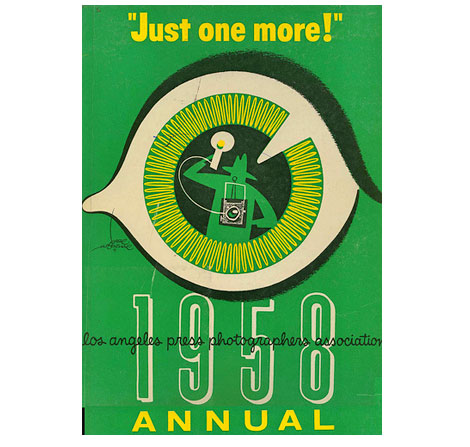
Los Angeles Press Photographers Annual 1958

Great cover.

(via Bradley J Gake)

Staffan Wiren book cover illustration

Staffan Wiren book cover illustration
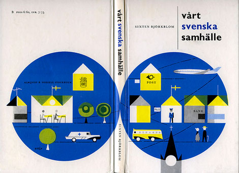
VÃ¥rt svenska samhälle – by Sixten Björkholm c1963

Cool book cover illustration by Staffan Wiren. Great example of swedish modern illustration from the 1960s.

On a sidenote, just talked to my friend Joe Beats and he’s got a killer mix online that he put together for designer vinyl toy store Munky King. Listen to the mix here.
HIGHLY RECOMMENDED!

(Staffan Wirén book cover via David at the Klockarp institute)

30 years of Jacqueline S Casey Posters

[pictobrowser 10159078@N03 72157604241328833]
From the book – Jacqueline S Casey Thirty years of design at MIT

Beautiful work from graphic designer Jacqueline Casey. It mentions in the book she was inspired by Karl Gerstner, Kurt Wirth and Anton Stankowski.

“In the early 1950s, John Matill, a writer and editor, founded the MIT office of publications. He was joined in 1952 by Muriel Cooper. Cooper was among the first designers ever hired by a university to represent it graphically. She and Matill hired Jacqueline Casey to design summer session materials in 1955.” Casey continued to work for MIT until her retirement in 1989. (Taken from the introduction of the book.)

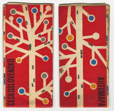
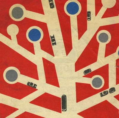
1960s modern Czech street map

czechoslovakia map mid century modern

czechoslovakia map mid century modern
road map of Czechoslovakia from 1962

Obviously the design work of a mad genius who is addicted to lollipop trees.

(Via the really good Kris’s color stripe blog)

Leonardo Hss

leonardo_hss graphic design illustration .jpg

Leonardo Hss comes to us all the way from Flickr. I couldn’t find any info on him other than what is on his Flickr page. Lots of different styles represented here. Corporate, logo, and some more playful graphic work (like the above image).

Be sure to check out his experimental work as well.

lab partners – design illustration + prints

lab partners - design illustration + prints
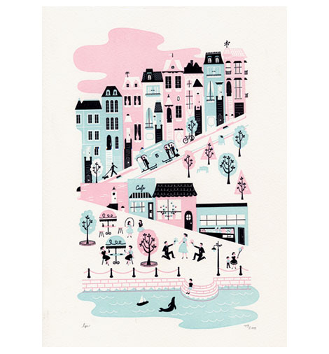
Letterpress cityscape print by lab partners

Ryan and Sarah aka lab partners sent me a sweet print. My wife and I have been wanting one of these, so we were super excited when the package arrived at the doorstep.  I didn’t realize it was letterpressed till I opened the mailer. That really blew me away. I can’t stop touching it! ha

If you like the print above, then you have to stop by the lab partners ETSY shop. Gocco prints and goodies for everyone. Also be sure to check out their wonderful design and illustration work as they post it from time to time on their blog.

Alvin Lustig – The Collected writings

[pictobrowser 10159078@N03 72157604156639786]

The images above are from the introduction to The collected writings of graphic designer Alvin Lustig (c1958). When I first found out about this book, I was going nuts trying to find a copy. I wasn’t able to find one, so I had to settle for a photocopy of the one presently in the RISD library. A couple of years ago, I finally tracked one down. It was worth the wait. It’s a short book (only 95 pages), but it has some real nuggets. It contains interviews and articles on Alvin from Interiors magazine, AIGA Journal, Design Quarterly, Type Talks and a few other sources. Wonderful insight into his design thinking and process.

Read the rest of this entry »

Mike Davis interview

Mike Davis - Burlesque design of North America

Mike Davis aka Mike the 2600 King is part of a design collaborative known as Burlesque of North Of America. In addition to their design work they are a full service screenprinting studio.

I first ran into Mike while on a cross country record digging trip in 2003. My friends and I were crashing with some of the cool cats at galapagos 4. They heard that Mike was spinning at one of the local clubs, so we decided to check it out. Mike was laying down some serious funk/ soul heat that night and the club was packed. Later I found out that in addition to be a great dj, he was an excellent designer creating posters for my friends at anticon.

Read the rest of this entry »

Mike the 2600 King Exclusive Dj Mix

Mike the 2600 king Exclusive grain edit Dj Mix

In the first part of our new Record Gallery Series Mike Davis (aka MIKE THE 2600 KING) – uber cool designer for Burlesque of North America has put together a gallery of some of his favorite record covers. This well rounded collection includes covers by design heavyweights like Milton Glaser to design unknowns, as in the case of the local/ private press lps.

In addition, he has created an exclusive dj mix for grain edit with songs taken from the records featured in the gallery. We hope you enjoy it.

Read the rest of this entry »

Sweet CAPAC logo nectar

CAPAC lp cover art design and logo

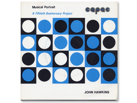
The Asian American Film Festival is in San Francisco now, so I had a chance to check out “Blood Brothers” which is one of the more recent films produced by John Woo. Anyone else seen this? Overall I thought it was pretty cheesy, but the ending wasn’t too bad. On the way to the theater I stopped by my friend Cool Chris’s record shop. Chris runs Groove Merchant which is notorious amongst beat diggers and record collectors as the place to go if you want to find rare jazz, funk and library lps. While I was there Chris hit me off with a copy of the record above.

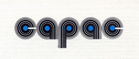
The John Hawkins lp seen above is part of a series of 45s (the little records..7″) initiated by CAPAC (Composers, Authors and Publishers Association of Canada Limited). I’m less concerned with the music on this album as I am with the design of the logo. The rounded letters take form as records with the lines of different weights creating the grooves. It wasn’t uncommon to see logo treatments like this in the 1970s and I think this is one of the better examples.

Hello Freaks!

Hello Freaks!

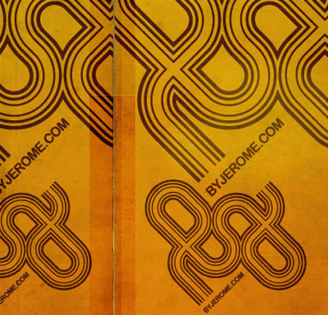
Hello Freaks are based in Paris, and led by one Jerome Castro (who has a cool blog, in French.) Their illustration work is really impressive, and includes lots of mouth-watering type. Be sure to check the motion work as well. It’s a nice departure from the standard motion reels we’re used to seeing all over.

Thanks to Sharon for the heads up on Hello Freaks.

Jacques Nathan Garamond poster update

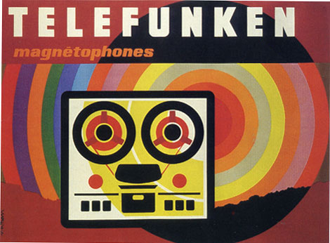
Jacques Nathan Garamond Telefunken poster
original version

Jacques Nathan Garamond Telefunken poster
upadated version by Daniel Knef

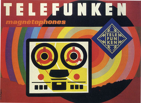
Several weeks ago I posted a Jacques Nathan Garamond Telefunken poster. One of my comments was the poster would look better if Jacques killed the telefunken logo located to the right of the reel to reel. Grain Edit reader Daniel Knef was nice enough to send us a modified version of the poster minus the logo (see above). I realize this poster would not of been possible without the client and obviously their branding is going to be part of the design. However, its nice to see the design without any distractions.

Many thanks to Daniel for sending us the updated version. Be sure to check out his electronic music compositions at gran où lée.

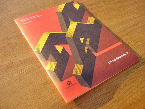
Edizioni Corraini – Un Sedicesimo magazine

Italo Lupi - Un Sedicesimo magazine - Edizioni Corraini
Un Sedicesimo issue #2 – Italo Lupi

Last week we looked at the first part of a package I received from Italian publisher Edizioni Corraini, which included a copy of the Pino Tovaglia book. Today we’ll look at the second part of the package.

Read the rest of this entry »

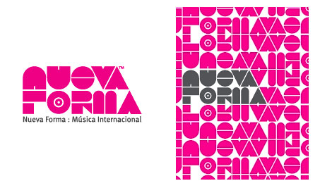
Colorcubic – Nueva Forma logo design

Colorcubic - Nueva Forma logo

I’m digging Colorcubic’s identity work for Nueva Forma. You can check the rest of their portfolio here

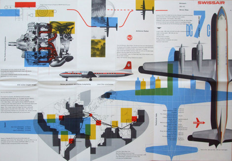
Swiss Air ephemera – design by Kurt Wirth

Swiss Air leaflet - design by Kurt Wirth

Swiss Air leaflet - design by Kurt Wirth
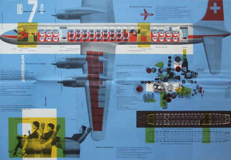
Swiss Air pamphlet – designer: Kurt wirth and Paul Beer c1950s

SwissAir has a rich history with some of Switzerland’s finest designers. Over the last 60 years the Airline has worked with Karl Gerstner, Kurt Wirth, Donald Brun, Fritz Buhler and Siegfried Odermatt just to name a few. The pamphlet above is one of many brilliant pieces to result from this relationship.

It appears to be some sort of promotional piece for the Douglas DC 7 which was produced in 1956. I love how Kurt Wirth laid out the information.

You can see the rest of the pamphlet at Ace Jet 170. Many thanks to Richard for posting this gem.

Be sure to check out our other posts related to SwissAir design.

Typographes d’Estienne – French Type Specimen book

[pictobrowser 10159078@N03 72157604082497636]

Typographes d’Estienne 1950

It’s been a while since I’ve posted any type-related goodness, so I figured it was time to post the slab of paper above. The book includes 40 – 50 pages of modern San Serif specimens worked into menus, advertisements and letterheads. In addition, there are several tipped in brochures and posters you can flip through. Given the title, I would assume this is an annual and that there are other years available.

Pino Tovaglia book – Exhibition of design work

[pictobrowser 10159078@N03 72157604060512778]

Pino Tovaglia book – The rule that corrects emotion

In addition to this blog, I own a small design bookstore. As a bookseller, I find it hard to find publishers that consistently produce quality titles. Italian publisher Edizioni Corraini is one of a few publishers that I look forward to their new releases each year. If you own or have seen any Bruno Munari books, you are most likely familiar with their work. They have reproduced dozens of Munari’s books, many of which I own in my personal collection. In addition to the Munari collection, they have produced books on or by Martí Guixé, Enzo Mari, Aoi Huber-Kono (Max Huber’s wife),Taro Miura, Albe Steiner and many others. With this in mind, I was delighted when I received an email from them mentioning that they had been reading Grain Edit and that they would like to send a package my way.

I will cover the contents of the package in several posts. The first being the Pino Tavaglia book seen above.

Read the rest of this entry »

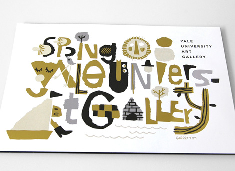
Garrett Morin illustration and graphic design

Garrett Morin-illustration-and-graphic-design
Cover illustration/typography for the Yale University Art Gallery spring catalog

Garrett Morin does great work. He draws lots of type and makes people happy. You may have seen his works in the likes of Mike Perry’s Hand Job book. If you click on over to his site, you’ll find lots of happy characters, t-shirt graphics, corn-cob pipes, animated GIFs, skateboard graphics, magazine covers, and a great animated spot for Death Cab for Cutie / MTV.

Garrett’s also a member of the Rad Mountain collective, which recently did some yummy illustrations for Good Magazine. Check it.

Stedelijk Museum Poster design – Wim Crouwel

Stedelijk Museum Poster design - Wim Crouwel
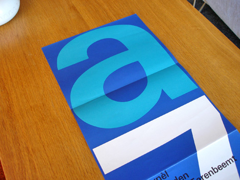
Stedelijk Museum program / poster c1970 – Wim Crouwel – designer

Total Design was responsible for designing many of the catalogs/ programs for the Stedelijk Museum in Amsterdam during the late 1960s and early 1970s. The program above was created by Wim Crouwel and Jolijn van de Wouw (of Total Design) for an exhibition in 1970. The program folds out to a full size poster that reveals a huge letter “A” and the number “7” which stands for Atelier 7. Atelier translates to “work shop” in English so, this might be referencing a gallery number or possibly the name of the exhibition. On the other side of the poster, it lists the artists and their artwork featured in the gallery.

Read the rest of this entry »

Clarence Lee IBM poster design

Clarence Lee IBM poster design
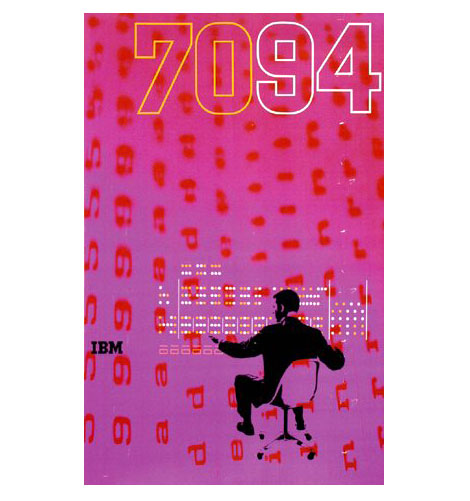
1960s IBM 7094 poster – Designed by Clarence Lee

Clarence Lee graduated from Yale in 1958 and went on to work for the uber graphic designer Lester Beall. In 1962 Clarence left Beall’s firm to work for IBM. During his time at IBM he designed the poster above for the IBM 7094 Data Processing System. The 7094 was released in 1962 and was built for large-scale scientific computing.

During the late 1950s – early 1960s, Paul Rand, Charles Eames ,Marcel Breuer and Eliot Noyes were involved in design work for IBM. It would be interesting to find out if Clarence had any interaction with these designers.

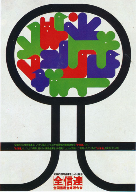
1970s Japanese poster design

1970s Japanese poster graphic design

I wish I could tell you more about this one. I pulled this out of a book I have on 70s + 80s Japanese graphic design. All the text is in Japanese so, I have no clue on who designed this. Anyone recognize this work? I have no idea why theres a gaggle of balloon animals chillin in a tree. If someone could translate the text below the animals, that would be great.

Page 1 of 198123...Last »