December 2007

You are currently browsing the monthly archive for December 2007.

Happy Holidays! we’ll be back tuesday

Happy Holidays!
Grain Edit will be back to the regular posting schedule on Tuesday Jan. 1st

Have a great New Years eve!

Happy Holidays! we’ll be back tuesday

Happy Holidays!
Grain Edit will be back to the regular posting schedule on Tuesday Jan. 1st

Have a great New Years eve!

Bo Lundberg interview

Bo Lundberg - graphic designer interview

One of the notable things that has come out of producing this blog has been the opportunity to speak with designers I respect and admire. Bo Lundberg is one of those designers. Several months ago we posted some of his work. Since then Bo and I have been exchanging emails which eventually led to this interview. Here he shares a few thoughts on inspiration, as well as his creative process.

Bo’s work has been featured in Old Type/ New Type by Steven Heller, Illustration Now! published by Taschen, Illusive: Contemporary Illustration and its Context by Hellige & Klanten, as well as other publications. His clients include Wallpaper magazine, Elle, Vogue, Neiman Marcus and Scandinavian Airlines.

Without further ado, I’m proud to present Bo Lundberg.

Read the rest of this entry »

Israel : Electronic computer stamp 1964

israel first day cover stamp electronic computer.jpg

Israeli first day cover stamp from 1964. Reel to reel electronic computer and punch card. This looks like some weird instrument that only Simeon from the Silver apples would know how to play or maybe Zamfir the pan flute guy. I bet he could play anything.

Damien Correll

Damien Correll illustration and design .gif

Damien Correll is a Brooklyn, NY based “designer/maker/illustrator.” I first came across his work in the fabulous book Hand Job, by Mike Perry. I really love seeing the intersection of graphic design with his DIY hand-drawn aesthetic. This work is difficult to pin down, but it’s quirky and full of personality.

Field Notes memo book

field_notes_memo_book-1.jpg
field_notes_memo_book-2.jpg

You ever have one of those moments when your postal carrier hands you a package and you can see a tear fall from his eye? He might be crying because of the joy he receives from delivering little packages but most likely its because he opened your package around the corner and is emotionally struggling to give it to you. Well I haven’t had this experience yet, but the delivery of my Field Notes memo books might of been a good place to start.

Thanks to the man behind Draplin design for sending me a fresh package of goodies, including a pack of Field Notes. Field notes memo books are the product of Draplin Design and Coudal Partners latest collaboration and were inspired by “agricultural memo books, ornate pocket ledgers and the simple, unassuming beauty of a well-crafted grocery list”. Each book contains 48 pages pages of lovely gridded paper and a list of practical applications including “escape routes” and “shoddy sketches”.

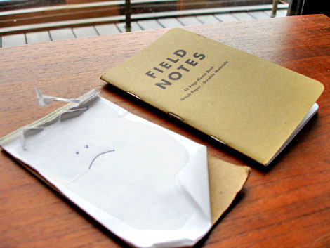
My previous economy class memo book is a pitiful sight (seen above) so, I was excited to upgrade to the stylish business class Field Notes. I’ve started to fill the book with random notes and silly thoughts. What I like most about Field Notes is the fact that it easily fits into my back pocket. Its pretty durable as well, so if you sit on it, it’s not going to fall apart.

If your still looking for stocking stuffers for Christmas, this makes for a great gift.

Now available at Field Notes Brand

Fred McNabb and the house of the future

mid_century_modern_house.jpg
Illustration by Fred Mcnabb c1956

Well here it is, the “house of the future”. Mom’s making oven fresh algae, grand pa is chilling in the living room in his chocolate love suit and grand ma is cleaning up the kitchen in her finest elf garb. For the house of the future it looks a lot like the house of 1956. I realize not every house in 1956 had steel beams and case study furniture or a garbage disposal unit that spits out freshly pressed Victorian lacies. I guess I was expecting something a little more “futuristic”, like some sort of flying magical orb.

(great illustration via Plan59)

Swiss Modern ski resort brochure

[pictobrowser 10159078@N03 72157603481288169]

Grisons is the largest canton (state) in Switzerland. It is home to some of the best ski resorts in the Swiss Alps. The promotional brochure seen above serves as a guide to the ski resorts in the area.

No date listed, but most likely from the early 1950s. Printed by Orell Fussli in Zurich. We posted a map of Zurich produced by Orell Fussli a month ago. If you haven’t seen it yet, it’s worth a look.

Modern Christmas cards

mid century modern christmas cards.jpg

Check out these super cool modern Christmas cards that Jo at design to inspire made. The deer and the type for the word “Christmas” came straight from our Holiday clip art gallery.

Raymond Savignac poster giveaway winner!

Raymond savignac_olivetti_poster.jpg

Congratulations to Jessica Taylor of the UK! We pulled her name out of a bright orange Ikea trash can just a few minutes ago. She is now the proud owner of the Raymond Savignac poster seen above!

Thanks to everyone for signing up for this giveaway. We received a ton of emails.

Stay tuned for the next giveaway!

Neither fish nor fowl : Jim Datz

james_datz_illustrations posters.jpg
I think I’ve found my new favorite illustrator and his name is James Datz. His portfolio of design work found at Neither Fish Nor Fowl is really impressive. Fun and playful material executed really well.

(Via the excellent – Here are things I like)

Update : Raymond Savignac poster giveaway

You have till 11:30 am (Pacific standard time) today to sign up for our Raymond Savignac poster giveaway.

The winner will be announced at 1pm (PST) so stay tuned!

Erik Nitsche Subway poster

erik nitsche subway poster.jpg

Hey everyone, I’ve been out all night gathering photos for an upcoming post. Ok, so maybe the whole night wasn’t dedicated to photos. There might of been some sushi and sake involved along the way. I’m pretty tired but I wanted to get this little design gem up before I went to bed.

If you like this be sure to check:
Erik Nitsche : General Dynamics 1958 annual report
Erik Nitsche : Design and paper #34

Bauer Alphabets : Fortuna Type Specimen

bauer fortuna-type-specimen-2.jpg
Fortuna or the typeface formerly known as Fortune also known as Volta first arrived on the scene in 1955. No wonder why the layout of the type specimen booklet seen above is yodeling with schizophrenia. This type face is having an identity crisis! Even if the name is confusing, the design is still beautiful.

Read the rest of this entry »

Tavis Coburn posters

tavis_coburn-posters.jpg
Seems like everyone has been talking about Tavis Coburn lately and why not? His work is great. A beautiful marriage of vintage illustrative styles and images with contemporary techniques. This makes perfect sense in light of a recent interview with Josh Spear where he admitted to being “obsessed with anything from the 1940s – 1960s”. I was excited to find out that limited edition prints are available at Tavis Coburn’s online shop. Each print is signed and numbered.

Erik Nitsche : General Dynamics annual report

[pictobrowser 10159078@N03 72157603417455746]

General Dynamics annual report 1958 designed by Erik Nitsche

The Small Stakes : a year in posters

Jason Munn small stakes poster gallery

For those of you in the bay area, be sure to check out The Small Stakes: a year in posters going on tonight at the The Curiosity Shoppe. Jason Munn will be there in person, so stop by and say hello!

Heres the details:
The Small Stakes: A Year in Posters
Opening Reception – Friday, December 7th, 6-9pm.
At The Curiosity Shoppe, 855 Valencia Street in San Francisco

(via Smarts and Crafts)

Swiss hotels and freshly shaven polar bears

 Swiss geneve hotel luggage label
Luggage label for hotel de l’ours – Geneva, Switzerland c1950s ?

This is exactly how I wanted to be greeted if I ever make it to some fancy Swiss hotel. I want freshly shaven polar bears with bow ties grabbing my luggage!

Robert Roser for Swissair

robert rosers wissair poster.jpg
Direct mail advertisement for Swissair designed by Robert Roser. Most likely from the late 1950s or early 1960s. Hoot!

Spike Press posters

Spike press posters
Spike Press is the moniker for one John Solimine, a Chicago based designer. In a world overrun by gig-poster designers, it’s refreshing to see someone with a little originality and illustration sense. These posters are fun, whimsical, and full of narrative — each poster has a very engaging mini-story that will pull you and your wallet right in. Enjoy!

Maria Keil : Infante Santo mural

maria keil infante santo mural

While I was researching information on the Hotel Infante Santo, I came across the mural seen above. It is entitled Paredao da Avenida Santo and was completed in 1958. It took artist Maria Keil two years to complete this piece and boy was it worth it. I’m not sure why, but the way she painted the main figure slightly reminds me of the work of Doze Green.

Read the rest of this entry »

Maria Keil : Please adopt me

maria keil mural Lisboa
Just found this mural. Sweet mother! This is good. I’m not sure if Maria Keil has grandchildren, but if not she can adopt me. She could teach me how to make murals and I could teach her how to throw sheep on Facebook.

(via amnesia)

Jim Brair – modern dutch poster

jim_brair_umbrella_poster.jpg

vrije tijd-blije tijd c1960

Modern dutch poster from graphic designer Jim Brair. Killer example of early sixties design. Wow, Thats all I can say.

(via VanSabben on ebay)

Hot girl with no nose poster

orchidee_swim_wear_poster.jpg

Beautiful Orchidee Swim Wear poster from 1960. This could be the hottest girl I’ve seen that doesn’t have a nose.

(via VanSabben on ebay)

Henri’s walk to Paris : Designed by Saul Bass

[pictobrowser 10159078@N03 72157600940947322]


* Update – The long-awaited reissue is now available. Pick up a copy at Amazon or your local book store.

As far as I know this is the only kids picture book illustrated by designer Saul Bass. Saul provides a 60s pop color backdrop for the text written by Leonore Klein. The book was published by Young Scott books in 1962.

Henri’s walk to Paris is the story of young boy who lives in Reboul, France that dreams of going to Paris. One day, after reading a book about Paris he decides to pack up a lunch and head for the city. Along the way he gets tired and falls asleep under a tree. This is when the story really gets good. I’m not sure if I should spoil the end for you, but lets just say it involves a pencil stealing bird with a band aid on its face.

Read the rest of this entry »

Alvin Lustig : Exposition brochure cover design

alvin lustig cover for world inventors exposition 1947
World inventors exposition 1947 : Cover design by Alvin Lustig

I found this brochure recently at a flea market near my house. I have never seen this Lustig design before. His use of simple organic shapes reminds me of the cover of Anatomy for interior designers ,which he created 2 years previous, as well as his work for the new classics series published by New Directions.

If you like the cover design above, I highly recommend you visit the official Alvin Lustig website.