Heartwork 2012

heartwork 2012

Heartwork is a project designed to raise money for art supplies at Target House—this wonderful home-away-from-home for the families of children facing long-term treatment at St. Jude’s Children’s Research Hospital. The idea is simple. Every year, a group of talented artists are selected to create a series of 11″ x 14″ giclee prints with a specified theme, this year being the word ‘HOPE’. Each edition is limited to only 10 pieces and signed/numbered by the artist.

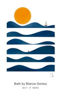
Here’s a sample of the prints available in this year’s Heartwork benefit.

Read the rest of this entry »

Julianna Brion

julianna brion, illustration

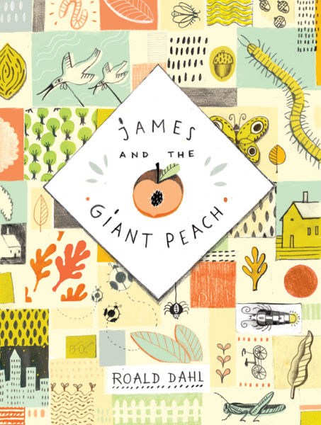
Julianna Brion is a Baltimore, MD based illustrator with a wonderful eye for details and beauty. She creates memorable images, such as this book cover illustration for Roald Dahl’s James and the Giant Peach. I love the way she uses pencil in all of her work, which has a nice textural quality that I can’t get enough of.

Read the rest of this entry »

Brad Woodard

brad woodard

brad woodard

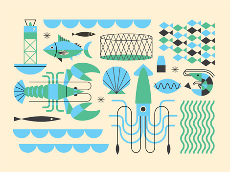
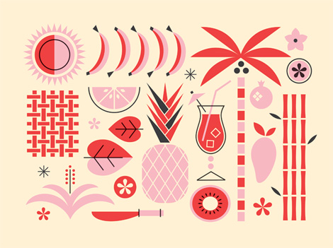
Fresh work coming from Mr. Brad Woodard in sunny Southern California. Brad’s an accomplished designer/illustrator and an info-graphics whiz to boot. I love his color palettes, form-making and how deliciously his illustration style bleeds into his information graphics. The two play very nicely together.

Read the rest of this entry »

Page 1: Great Expectations

great expectations

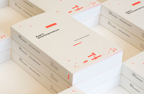
Page 1: Great Expectations is a typographic experiment designed to explore the relationship between graphic design, typography and the reading of a page. The book features contributions from 70 leading designers and typographers, all of whom have reinterpreted the first page of Charles Dickens’ novel. The text was chosen in part because it directly references lettering as Pip searches for clues about his family from the letterforms inscribed on their tombstone. The brief encouraged the contributors to explore, challenge or celebrate the conventions of book typography. Each layout is accompanied by a short rationale explaining the designer’s decision-making process.

Contributors include: William Drenttel and Jessica Helfand, Robin Kinross, Experimental Jetset, Erik Spiekermann, Sam Winston, Phil Baines, A Practice for Everyday life, Tony Chambers, Morag Myerscough and more.
Read the rest of this entry »

Herbie

herbie font

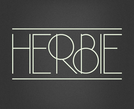
Meet Herbie, the latest display font from Morten Iveland at the Infamous Foundry. As the name might indicate, Herbie is inspired by Herb Lubalin’s work and the decorative style and kerning of his era.

Read the rest of this entry »

Matt Chase

Matt chase

I’ve been a fan of Washington D.C.’s Matt Chase for quite a while now. Matt has a lot of versatility as a designer/illustrator and I’m always impressed with his ability to work with a gamut of styles. He transitions so well between smart identity work, engaging, colorful illustration and on-point lettering.

Read the rest of this entry »

Ping Zhu

Ping Zhu, illustration

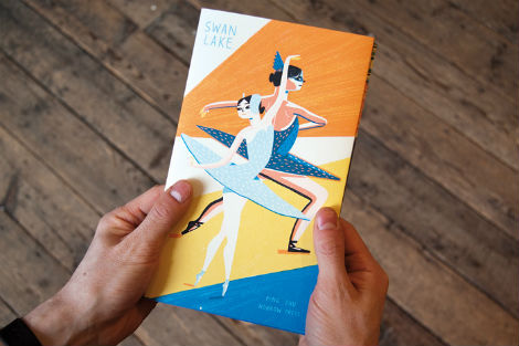
Photo: Nobrow Press

Ping Zhu is an illustrator from Los Angeles, now calling London her happy abode. Most recently, she released a beautiful Swan Lake concertina published by Nobrow Press, which features images of the performance and all the happenings behind the scenes as well.

The concertina is just one of the many wonderful projects Ping has worked on. Some of her other clients include the New York Times, Howard Hughes Medical Institute, The New Yorker, and Jamie Magazine. Her playful and colorful style shines through in everything she creates, especially in her defined dry brushstrokes and mark making. I can’t wait to see what she comes up with next!

Read the rest of this entry »

/Sponsor/ Weapons of Mass Creation Fest 2012

A Huge thanks to WMC Fest for sponsoring this week’s RSS Feed!

Now in its third year, the Weapons of Mass Creation Fest is a must-attend event for creatives in the Midwest. Its goal is to inspire and enable the creative mind and will feature 20 speakers, 20 designers, and nearly 30 bands over the weekend of June 8-10, 2012. Put on by the Cleveland-based creative agency Go Media and an army of volunteers, WMC Fest has a homegrown, indie vibe that sets it apart from other national-caliber creative conferences. It’s also a great value, with 3-Day All-Access passes starting at only $60! So come to WMC Fest to network, collaborate, get inspired, learn new tricks, and meet new friends! You can’t miss it! This year’s speakers include Johnny Cupcakes, Austin Kleon, Kate Bingaman Burt, and the Friends of Type. From now through May 21, enjoy 20% off on fest tickets by using promo code “grainedit” at checkout.

Interested in sponsoring the Grain Edit Feed? Visit our sponsorship page for more info.

Gratuitous Type / No. 2

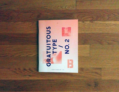
I was sent this really cool book—or “pamphlet”, as they call it—called Gratuitous Type / No. 2. A self proclaimed “pamphlet of typographic smut”, this small anthology of current interesting typography, lettering and fonts really runs the gamut of interesting new styles. With an advanced design and extremely impressive printing, the publisher/designer and editor (Elana Schlenker) has done a wonderful job putting everything together.

Read the rest of this entry »

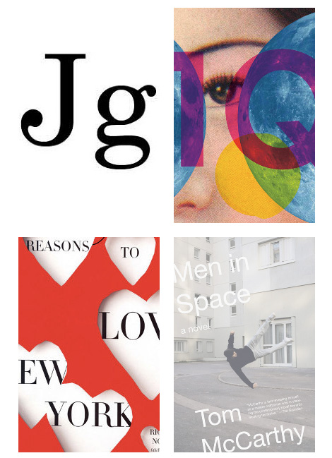
John Gall

john gall

One of my favorite book cover designers, John Gall, has a new site up and running. John is a designer with an incredible stylistic range — I love how he is so able to design for such a variety of titles and narratives.

Read the rest of this entry »