Citroen brochures
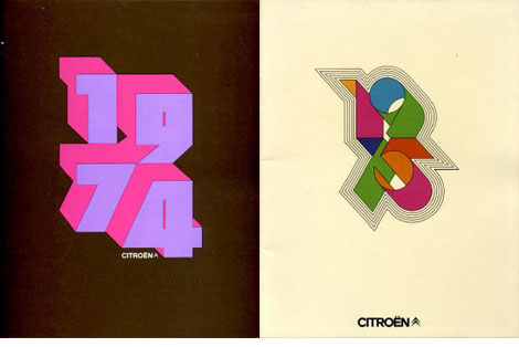
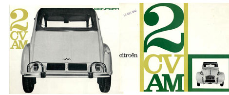
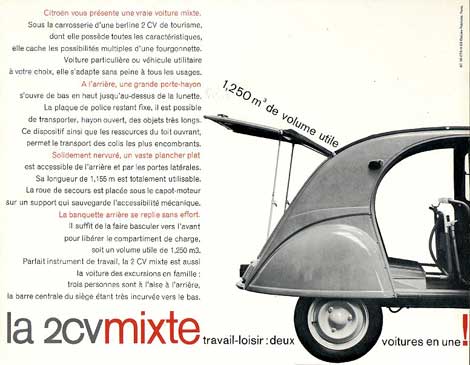
Jose B has put together a nice collection of Citroen brochures at his website citrobe.org. I’m not a huge fan of the actual car, but I do love these brochures.
11.05.07 | Dave | Seen Elsewhere |  1 comment


Jose B has put together a nice collection of Citroen brochures at his website citrobe.org. I’m not a huge fan of the actual car, but I do love these brochures.


11.05.07 | Dave | Seen Elsewhere |  1 comment
[pictobrowser 10159078@N03 72157602887945461]
Dimensions Abc – This is a promotional piece from 1966 for a new paper produced by Simpson Lee paper company called Talisman. They chose wood type to compliment the texture of the paper. I love the layout and the ink is laid on here thicker then maple syrup. Looks like its part of a series since its labeled volume #9 winter 1966-1967.
The paper companies during this time period (late 1940s-mid 1960s) were cranking out some incredible pieces. Just look at the work Bradbury Thompson was creating for Westvaco, Marquandt paper’s – Design and paper series (including Erik Nitsche and Ladislav Sutnar) as well as Champion papers’ Imagination series. I will be posting some of these in the weeks to come.
11.03.07 | Dave | Off Our Bookshelves |  8 comments
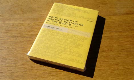
Congratulations to Anne from Oakland! She is the lucky winner of our Book Design of Graphic Designers in Japan book giveaway. Last night we randomly pulled her name from a bright orange trash can. Thanks to everyone for entering our drawing.
Be on the look out for our next giveaway.
11.02.07 | Dave | Found design, mid-century-modern, Typography |  Comments closed

Congratulations to Anne from Oakland! She is the lucky winner of our Book Design of Graphic Designers in Japan book giveaway. Last night we randomly pulled her name from a bright orange trash can. Thanks to everyone for entering our drawing.
Be on the look out for our next giveaway.
11.02.07 | Dave | Grain Edit News |  Comments closed
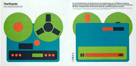
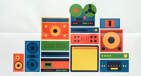
Yes studio hooked up a sweet 12″ cover for the UK band the stand. The album is from 2005. Multiple designs were created, colors were mixed by hand and large format prints produced at K2 Screen, London. The resulting artwork was then re-photographed and used on the lp and poster design.
Looks like the length of this record was longer then the band’s career. The band broke up after 3 years and moved onto other projects and their website is now an internet parking lot. At least, we still have the lp jacket to look at.
11.02.07 | Dave | Found design |  14 comments
Our story with Jason Munn (The Small Stakes) begins in the summer of 2005. We had recently learned that his studio was located near our office so we decided for a little suprise visit. We arrived at his front door and rang his buzzer. When he opened the door we said something along the lines of..
Read the rest of this entry »
11.01.07 | Dave | Features |  34 comments
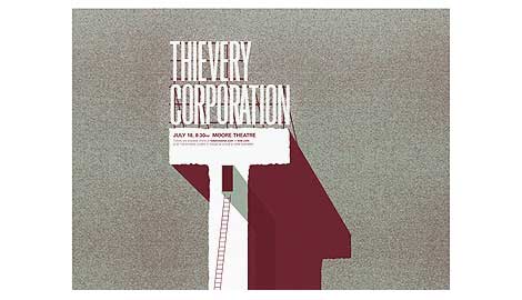
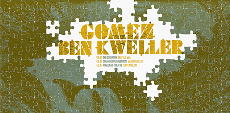
I have a very special place in my heart for poster design. Especially poster design that incorporates type in an interesting, fresh way. I mean, how do they do that? It looks too easy! Andrio Abero, the man behind the poster and design studio 33rpm, is a master at “type and image integration.” This is one of the first firms that kick started my obsession with the poster, way back in the early 2000’s.
10.31.07 | Ethan | Found design |  Comments closed
“A work of art is realized when form and content are indistinguishable. When form predominates, meaning is blunted; but when content predominates, interest flags. But the genius comes in when both of these things fuse.†– Paul Rand
Wise words from a design genius. The Paul Rand video above is filled with nice little quotes like this. The video also brings to life some of his well known logos and illustrations. Who wouldn’t want to see Sparkle and Spin animated? nuff said
10.30.07 | Dave | Seen Elsewhere |  2 comments
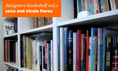
When grainedit asked us to show our book collection for their blog, we were pretty excited. Getting it done, however, was half the battle. Not that we were lazy, okay, we were a little lazy, but the hard part was figuring out what stuff we liked the most.
It’s not that easy, here’s how it went:
Sean: [Looking though first shelf] “Oh, I like this one, this one too, we should put this one in”
Nicole: [sighs] How many do you plan on doing? That’s too many.
So here you go, a look at our bookshelf and here are some of our favorites.
Read the rest of this entry »
10.28.07 | Dave | Designers Bookshelf |  12 comments
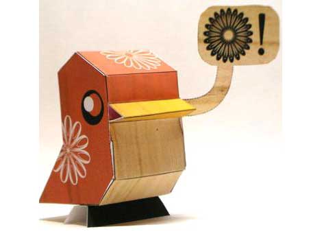
This is hot! Make your own paper bird. Theres several designs currently available on the site but my favorite is the one with the wood grain belly and the mid century modern tattoo. The website includes tips and tricks for putting your bird together plus you can design your own! Thanks to Mckibillo for putting this together.
10.26.07 | Dave | How to / DIY |  2 comments