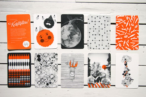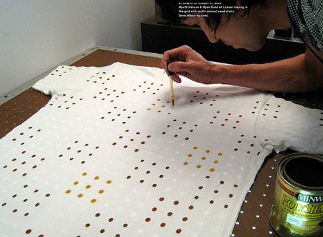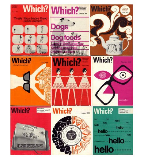
Thanks to Tim Barber and the rest of the gang at Odopod for inviting me to their studio last Friday. They regularly meet to discuss design and Tim asked if I would like to join them and bring in some of the things that inspire me.
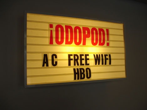
While I was there I was able to take a few photos of the studio. It’s a beautiful space filled with exposed brick, concrete floors and Eames Chairs. When I walked in the main entrance on the first floor, the first thing I noticed was an Odopod sign that looked like it was ripped straight off a Motel 6. It was hot in San Francisco on Friday so, I was lucky that Odopod came with AC, Free WIFI and HBO (I gotta get one of these signs). The rest of the first floor includes meeting rooms and the company parking lot (What is a design studio without atleast one vintage fixie?). The second floor houses the designers, the book collection and a big letter “O”.
Read the rest of this entry »
 Share on Facebook
 1 comment


