Steve Mehallo / Jeanne Modern typeface

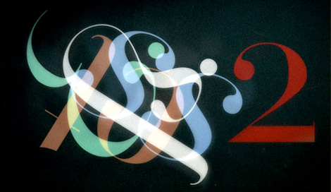
Steve Mehallo - Jeanne Modern typeface

Steve Mehallo - Jeanne Modern typeface

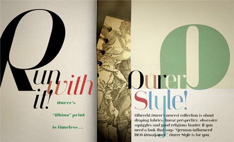
I’m really excited to show this new typeface from long time Grain Edit friend and design-champ Steve Mehallo. Jeanno Moderno consists of nine faces, and bridges over two centuries of type history. Plus, it has some of the spiciest italics you’ve ever seen.

MyFonts is having a great sale on the family right now: For a limited time, save 25% on any single font from the Jeanne Moderno family. This is going on until April 19th. (Perfect idea for my birthday on the 14th). Or you can pick up the entire family for $99.

Get more details here

Read the rest of this entry »

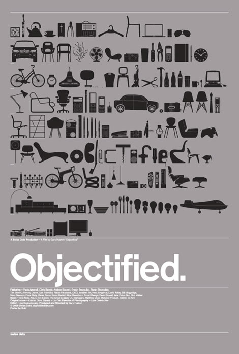
Objectified Film Poster Designed by Build

objectified poster

Objectified Movie poster 27″ x 39″, metallic silver and black, lithograph.

Beautiful poster design from Michael C. Place and his studiomates at Build for the upcoming Objectified documentary. The poster features drawings of dozens of objects from designers in the film and more. I like how the word “objectified” is subtly placed within the contents of the objects.  Clean, minimal and modern. I love it. Should be available in the shop soon.

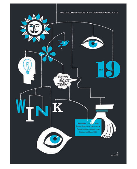
Wink lecture poster for CSCA

wink poster

I knew the sun had a mustache! Great new work from the guys at Wink for a recent lecture with the Columbus Society of Communicating Arts. If they ever recreated this mobile in real life it would be interesting to see if the bird poop gets its own string.

You can hear excerpts from the lecture here.

On a side note I love their signature. Wink script sometime soon?

Sanna Paananen: Illustration

Although it is raining, I’d love to join this golden man for a relaxing tranquil time at the beach. Finnish illustrator, Sanna Paananen, has a real knack for using rich saturated complementary colors and thoughtful line work. In this pleasingly orchestrated composition, we see a nice contrast between the golden sands of the beach and the blue details of the rain, umbrellas, and man’s speedo. Paananen plays with the positive and negative space, concentration, and shape of the rain drops, creating a rhythmically soothing effect to the piece. I especially like the simplistic details in the shell’s line work. Read the rest of this entry »

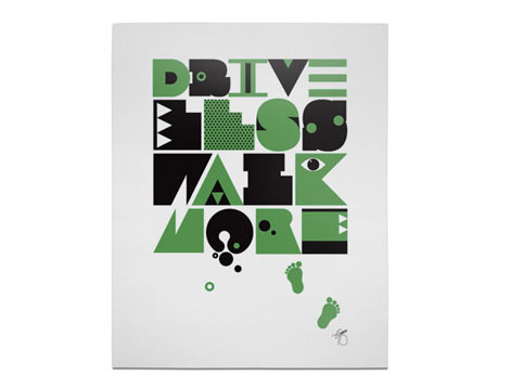
Quality Goods Inc – Drive Less Walk More

brian gossett

Drive Less Walk More by Brian Michael Gossett

Lots of fun work over at Quality Goods inc. The online shop features work from George Katz, Stephen Kelleher, Justin Blyth, Evan Di Leo, Bran Dougherty-Johnson and Brian Michael Gossett. These guys have some serious middle name action going on.

Read the rest of this entry »

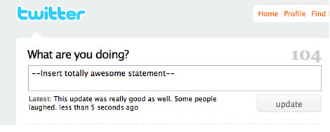
Grain Edit is on Twitter!?

twitter grain edit

Ok so we are twaddling, twapping, twerding, twoahbowing, whatever it is we’re on Twitter now! You’ll find random musings, extra credit links, and eventually even some giveaways just for our twitter homies.

Catch us on Twitter @grainedit

Sigrid + Hans Lammle

sigrid and hans lammle

Beautiful Cityscapes designed and illustrated by the German couple Sigrid and Hans Lammle. These illustrations were for a calendar published in 1957. Really amazing details and the colors are super bright and saturated. I need more of this! Any guesses as to what city this might be?

Read the rest of this entry »

Ben Barry / Design For Fun

Ben Barry

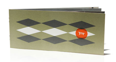
Loving this work from design-champ Ben Barry. The design and format of the piece work together nicely to capture that spirit of 1950’s residential.
Read the rest of this entry »

Akimoto vs Black Slabbath-Battle of the Slab Serif Typefaces

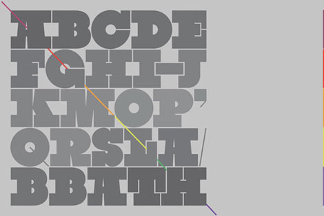
black slabbath font

Black Sabbath designed by Stefan Kjartansson

I’ve been receiving emails in regards to the similarities between the Akimoto typeface (featured in our previous post) and Black Slabbath. I think its only fair that we feature Black Sabbath here as well. You make the call.

Read the rest of this entry »

Akimoto: A Yummy Fat Slab Display Typeface

akimoto

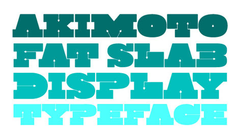
I’m so glad that Finnish based designer Ossi Gustafsson emailed me about his typeface Akimoto. I’m all about the fat slab typefaces and this is my new favorite. Thin spearheads jut into the characters and define the negative spaces. This makes for a nice contrast against the thick slabs. I gave it a test run and it looks great.  Akimoto comes in three flavors and is available for purchase at Myfonts.com.

Read the rest of this entry »