Edward McGowan Illustration

edward mcgowan

Illustration for Cottage Life Magazine

Edward McGowan is an Edinburgh based illustrator with a keen eye for bright colors and rough textures.

This particular illustration, created for Cottage Life Magazine, features a white house surrounded by tall cone shaped clusters of trees and various patches of green. The composition draws one’s eye to the tiny house and skinny path, which connects the earth to the sea. The textures within this piece are coarse, and the illustration itself is reminiscent of those found in my old Social Studies books from elementary school.

(more…)

Komboh Design & Illustration

komboh

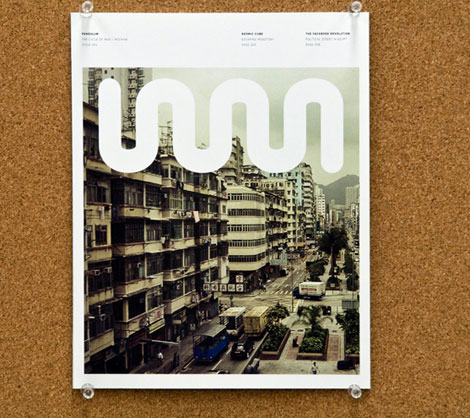
Editorial Design for Issue One of Pendulum Magazine (2009)

Ah, the bustling city. This magazine cover by Canadian dynamic design duo, Komboh, has it all: high-rises, cars, trucks, and busy people. Juxtaposing the grime of the city is a thick, clean white coil, which adds a simple graphic element to the crowded urban streets. The design is straightforward, clean, unpretentious, and nice to look at.

(more…)

A Quick Interview with Christopher Simmons

The Good Design Book

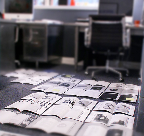
Examining some possible layouts.

We recently received news from long-time Grain Edit friends, MINE™, about their new book in the works, tentatively titled The Good Design Book. This book is aimed at those with a critical eye and an interest in how design can affect the greater good.

Combining essays from designers as well as showcasing approximately 70 projects, the book takes a current look this expanding movement, and offers resources for those looking to get involved.

(more…)

Herb Lubalin Archives

herb lubalin

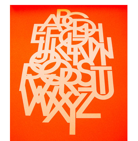
For the Herb Lubalin fans out there, Justin Thomas Kay has just uploaded a slick collection of images from a recent visit to Lubalin’s archive at the Cooper Union in NYC.

In addition to Justin’s Flickr account, you can find photos from the Lubalin collection at 12oz Prophet + So Much Pileup.

(more…)

Nobrow Issue 1: Gods & Monsters

Nobrow Gods & Monsters

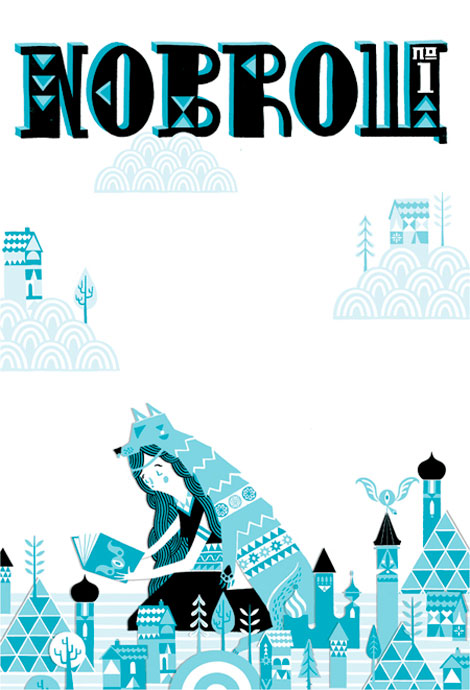
Cover illustration by Stuart Kolakovic

Nowbrow Press‘ recently sent over their spectacular first issue, Gods and Monsters. Twenty four talented illustrators and designers have been carefully selected to create work around a specific theme. I love all the pieces exhibited in the issue, and a few of my favorites come from Alex Spiro, Reuben Rude, Toby Leigh, Jordan Crane, and Sarah King.

(more…)

Always With Honor: Design & Illustration Part 2

Always With Honor

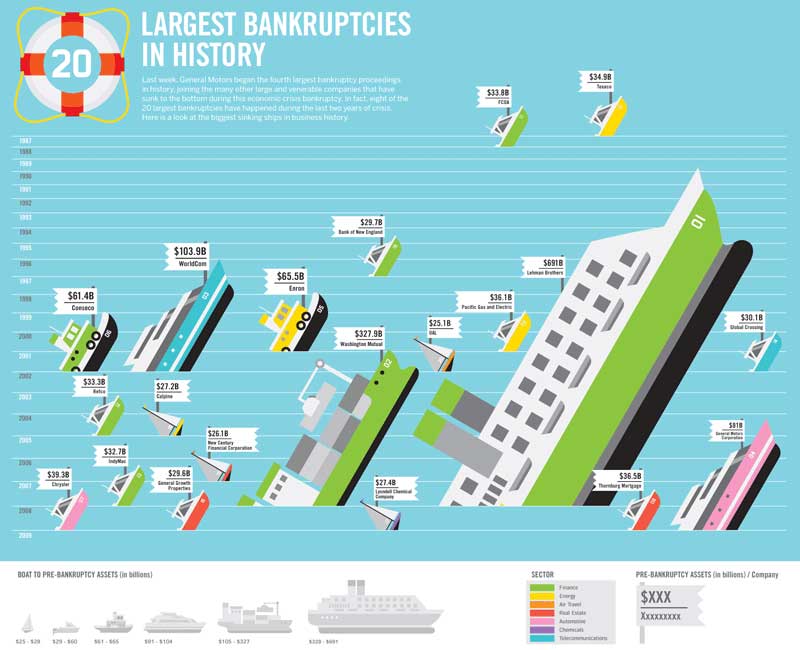
Illustrations for Good Magazine by Always With Honor

Let it be known! These are charted waters, literally!

Designed by Brooklyn based creative collective Always With Honor for GOOD Magazine’s June issue, this devastatingly entertaining info graphic depicts the “Largest Bankruptcies in History.” Its design is straightforward, simple, and fun as it uses bright colors and geometric shapes. Each boat appropriately corresponds with the data, with tiny sailboats depicting small money loss and huge cruise ships depicting major losses.

(more…)

Dirk Fowler / F2 Design

Dirk Fowler / F2 Design

Like many, gig-posters provided my first introduction to graphic design. The images seemed to perfectly articulate the ideas and spirit of the bands I was so obsessed with. During a recent “Best of the Best of Poster Designers” conversation, I was reminded of Dirk Fowler‘s work and it’s solid place in design history.

With the speed and ease of the Internet it’s easy to see design trendiness proliferate and to focus on the latest and greatest. In a time of gig-poster saturation, it can be nice to take a step back and see where a lot of current work gets it’s roots and inspirations.

(more…)

Abner Graboff

abner graboff

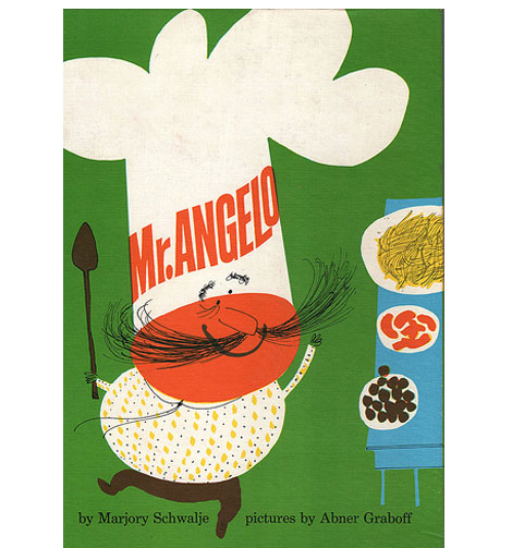
Mr. Angelo by Marjory Schwalje – Illustrations by Abner Graboff c1960

Ward Jenkins has an excellent interview with Jon Graboff over at the Ward-O-Matic.  Jon is the son of the uber talented Abner Graboff, an American artist who illustrated a slew of amazing children’s books during the 1950s and 60s.  In one part of the interview Jon mentions that his brother informed him that their dad had designed the CBS “eye” logo but didn’t receive credit for it. The credit went instead to the chief art director at the network. That art director would be William Golden. Is it possible that Abner Graboff designed the CBS eye logo?

(more…)

Marcus Walters Illustration & Design

Marcus Walters

After feeling around, I’ve come to this conclusion: I can afford a relaxing day in the sun and enjoying more work by UK based illustrator Marcus Walters.

Created for Barclays Bank, this illustration is bright and cheerful amidst a neighborhood of homes for sale. The clever type contained within the cloud nicely complements the analogously colored homes. I especially enjoy the intricate details that lie within the trees and the decoration of the homes. (more…)

Hermann Eidenbenz

mike cina mix

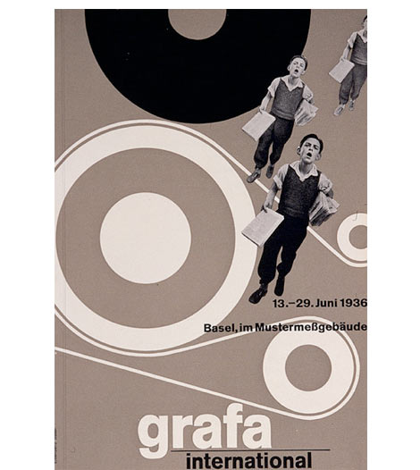
Hermann Eidenbenz – grafa international poster 1936

Beautiful poster from Swiss designer Hermann Eidenbenz. Hermann also designed the Clarendon typeface. Brings back memories of delivering newspapers as a kid.