Ronald Clyne at Folkways

ronald clyne

ronald clyne

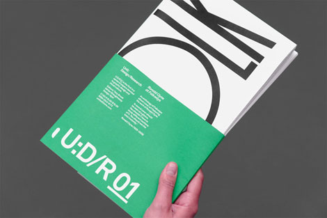
Being an avid collector of records, I’m looking forward to getting my hands on Unit Editions most recent release.

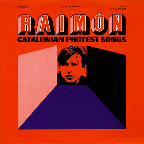
From the website:” Ronald Clyne at Folkways is a 64 page ‘newspaper’ devoted to designer Ronald Clyne’s record covers for the Folkways label. Ronald Clyne (1925 – 2006) designed over 500 album covers for Folkways and is largely responsible for the famous label’s striking visual appearance. His distinctive use of two-color printing on matte paper and his deft use of modernist design strategies, created a body of work that gave the Folkways label its distinctive aroma of integrity and purity.”

(more…)

Philippe Nicolas

Philippe Nicolas
Aerial wonder! These birds-eye illustrations from Philippe Nicolas are pretty fun. Simple, colorful, and oblique—I love how angular and well composed these pieces are.

(more…)

La Boca Design

la boca design, uk, west london, record covers

La Boca is a London based design firm specializing in transporting its viewers to places of the future by means of the past. This record sleeve, created for Arcadion, has a nice composition with the symmetry of the two magnetic looking objects on the edge of what seems like a portal into space. The warm gradient behind the bold text nicely juxtaposes the cool waves of the galactic landscape. This is where I’d like to be today.

(more…)

Go Faster: The Graphic Design of Racing Cars

grain edit go faster
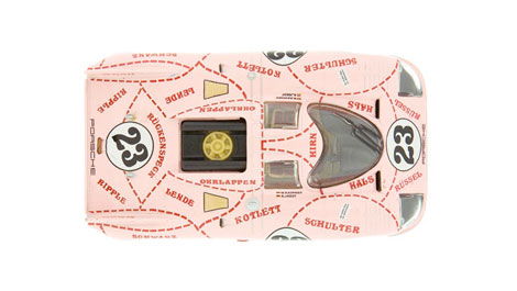
This video provides a very interesting look at the design of racing cars in 70s. The graphics on these care are incredible — very minimal and nothing at all like the logo-plastered cars of NASCAR.

(more…)

Homework: Modern Polish Poster Design

homework

If you are in the London area, Kemistry Gallery is currently showing works by the warsaw-based design studio homework (Joanna Górska and Jerzy Skakun). On display is a selection of over fifty of their prints including classic cinema and modern Polish theatre posters. The exhibition runs from March 5th through the 17th of April.

(more…)

Celyn Brazier

celyn brazier, 1960s, 1970s, illustration

London based illustrator and animator, Celyn Brazier, sure has a way with color! Reminiscent of George Dunning’s psychedelic Yellow Submarine, this particular image depicts the sea and earth with its abundance of creatures, homes, and people. The composition is positioned so that everything feels connected. The images of floating jellyfish, zooming cyclists, and carefree birds also provide a nice natural rhythm within the imagined landscape.

(more…)

Goodby for HP Retail Publishing

goodby silverstein

I love this set of ads put together by Goodby, Silverstein & Partners for the HP Retail Publishing group. The illustrations were created by Ryan Meis (also of Lab Partners fame) and later rendered in 3d by Australian design firm Electric Art.

(more…)

Studio EMMI

Studio EMMI

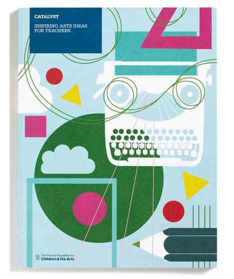
East London design group, Studio EMMI, has a fantastic selection of work. The work shown above was designed for The Prince’s Foundation for Children & the Arts, and was also a recipient for Sappi’s 2009 Ideas That Matter award. The illustrations by Lucy Vigrass are wonderful — I want to jump in to any classroom scene with a typewriter!

(more…)

Tom Eckersley

Tom Eckersley, Graphic Design, Illustration, 1960s, 1980s

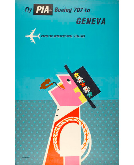
Pakistani International Airlines poster (1960)

English artist and designer, Tom Eckersley (1914-1997), created numerous posters from the 1940s to the 1980s. Eckersley’s work communicates strong messages by employing bold overlaid colors, simplified forms, and informative text.

This poster, created for Pakistan International Airlines, depicts a dapper looking gentleman in Swiss garb. His playful image is simple, clean, bright and colorful; a stark contrast from the dark turquoise background. The composition is pleasing to the eye; as the figure gazes at the distant aircraft, we too are gazing at his cheerful image. Let’s all go to Geneva!

(more…)

Johnny Kelly

johnny kelly the seed animation

Image from The Seed

London based animator and illustrator, Johnny Kelly, has an impressive body of work. This particular image, from his short animation The Seed, depicts the journey of an apple seed through its natural cycle of life. The Seed features stop motion and 2D animation, with faceted paper cut forms, vibrant colors, and a lot of attention to detail.

(more…)