Intelligence in Lifestyle
Intelligence in Lifestyle, an Italian magazine and supplement to the Il Sole 24 ORE newspaper, is one tasty piece of work. That striking cover above initially grabbed my attention, but inside is just as compelling.


Intelligence in Lifestyle, an Italian magazine and supplement to the Il Sole 24 ORE newspaper, is one tasty piece of work. That striking cover above initially grabbed my attention, but inside is just as compelling.
Takara Beautilion Pavilion designed by Kisho Kurokawa
40 years ago, Osaka hosted the first world exposition to be held in Asia. Representing 76 countries and an array of international and domestic organizations, Osaka Expo ’70 was an exemplary platform of engineering and architectural finesse through its vast showcase of pavilions.
Expo ’70 boasted numerous temporary complexes designed by notables such as Canada’s Arthur Erickson and Renzo Piano. The event was also a fitting platform for these Japanese Metabolist architects, Kenzo Tange, Kisho Kurokawa and Kiyonori Kikutake to pursue their concepts characterized by large scale, flexible, highly-engineered structures that evoke the processes of organic growth.
Really like these wooden typographic puzzles (Nuzzles) from designer John Christenson. Hopefully John will have a Nuzzles shop up soon!
Philippines based artist, Dan Matutina, has a keen eye for rich textures and geometric shapes in his works. Dan started a poster series inspired by his friends Facebook statuses called Status and Shapes. This piece, titled (Sheena Padilla) “LET’S MAKE BAKA, DON’T BE TAKOT,” translates to “Let’s fight, don’t be afraid.” The hot hues clearly communicate the heated adrenaline in a fight, and the shapes are positioned in a way that looks like two fighters boxing.
I got a surprise package in the mail the other day from Nobrow. Included in the package was Micah Lidberg’s Rise & Fall: A Concertina of Life. This might be my favorite Nobrow release to date. It’s an accordian style book that folds out to a stunning 53 inch panorama. Each panel is filled with prehistoric creatures dodging fire, climbing trees or sipping on slimey goop. His illustration style and composition for the piece remind me of traditional Japanese woodblock prints. Lovely stuff.
You can pick up a copy at Amazon.

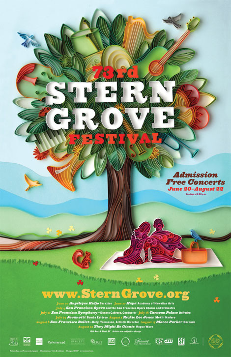
Long time Grain Edit friends and all-around swell studio, MINE™, has a sweet gig going. Each year, the city of San Francisco puts on a free music festival in Stern Grove — and MINE™ is given creative and curatorial license over the promotional poster. Over the years a visual language has been established; the poster contains repeating themes and elements (a tree, a grassy hill, etc). The catch is that each year a different artist or designer is hired to create the main image.
Calendar for Antwerp-tax designed by Paul Ibou
Iconofgraphics has a great post on the work of Belgian designer Paul Vermeersch (a.k.a. Paul Ibou).
Production recently started on The Sign Painter. The new documentary on sign painting will include interviews with several of the artists that still practice this age-old craft. The directors, Sam Macon & Faythe Levine, were recently in San Francisco to capture footage of Jeff Canham, Bob Dewherst, New Bohemia Signs, and Jimmie “the saint” Collier. You can find more info on the film at the website and official Facebook fan page.

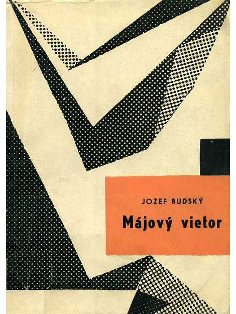
Wow! Great collection of European book covers from A Journey Round My Skull. So fun to look through. I love the balance of naiveté and compositional sophistication throughout these jackets. It’s amazing the depth that is achieved through simple illustrations and good color choices.