Wink interview
My first introduction to Wink was four or five years ago when their packaging for Sunmilk was making the rounds in the design magazines and annuals. Since then, I’ve tried to keep an eye on their work. What has impressed me the most about Wink has been their ability to consistently produce top notch work.
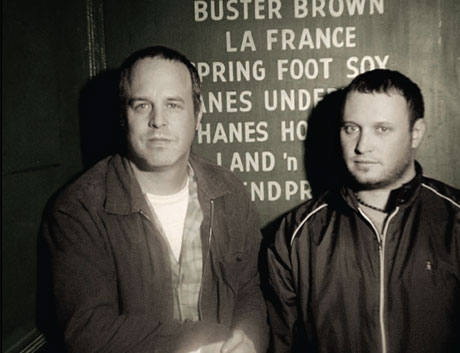
(L) Scott Thares (R) Richard Boynton
Wink consists of Scott Thares and Richard Boynton. Over the past month or so I’ve had the opportunity to exchange emails with Scott. This interview is the product of those emails.
Before we jump into the interview, I’ve put together a slideshow that highlights some of their design work over the past few years.
[pictobrowser 10159078@N03 72157603818820604]
Continuing with our designer interview series, grain edit is proud to present Scott Thares.
Let’s start off with some background info on Wink.
Where does the name “Wink” come from?
This probably does the best job of explaining how the name Wink came to be…enjoy!
Where the name Wink Comes from (a short film)
How did you and Richard meet?
I met Richard at a design firm that we both worked at here in Minneapolis 11 years ago. He left about 6 months after i started, but we struck up a solid friendship in the beginning and it carried over into Wink.
How do you and Richard work together? ( drum up ideas / delegate tasks )
Richard and I both approach new projects from our own perspective. Although we share very similar aesthetic beliefs in regards to design, we have our own individual ideas on each project. We present our ideas and which ever version that ultimately gets selected, then that person becomes the lead designer and client contact for the project.
Do you do all the illustration work or do you hire out ? (for example the America recycle day poster)
Wink does all it’s own illustrations…aside from the following examples. America Recycles Day, Art of Wit and the Hope “Tear†poster which were all done by my wife, Anna.
What is a typical day in the life of Wink?
It all depends on how busy we are in the office, I’m sure it’s typical of most design firms. We answer phones, replying to emails, concept ideas and design. Though for some reason when friends stop by, they are usually interrupting us from throwing the football around the office or catch us listening to comedy or watching a movie.
Current projects?
A packaging project for Target, internal branding & department store design for Macy’s, a branding project for The Limited and a couple of posters promoting upcoming speaking engagements.
What made you want to get into design as a profession?
I was always drawing as a kid, it was more of a way to occupy myself. It started out as sketching stuff I found around the house, then it evolved into copying comic strips and Mad magazine. In the 3rd grade I discovered KISS, well, then that was almost all that I drew. I’d have to say drawing the KISS logo over and over more then likely influenced my move into graphic design as I got older.
[pictobrowser 10159078@N03 72157603803274607]
An evolution of Kiss Drawings *Note – These were drawings from Scott’s youth and not commissioned work by the band KISS.
Where do you tend to find most of your resource material?
eBay, rummage sales, used book stores, and ephemera from places we visit in which we have bookcases and flat files filled with those unusual finds.
Any funny/ weird stories related to finding these resource materials? (weirdos at the dirt mall etc.)
Nothing really funny ha, ha, has happened. Occasionally we find some sweet looking letterhead that gets left in the pages of a used book or maybe a cool bookplate on the inside cover. We did pay $1 on eBay for 20 bound volumes of Graphic Arts Monthly from 1935-1961, they weighed over 200 lbs and it cost us $75 shipping, that was probably one of our better finds.
Who are some of your influences?
Man, there are so many. We both are generally drawn to work that’s understated, simple and has a sense of wit to it. Paul Rand is a classic, Saul Bass, Tibor Kalman, Eberto Carboni, Max Huber, Eames and Alvin Lustig to name a few.
When were you exposed to these designers?
Mostly college, others I’ve found and discovered throughout my career in design.
Do you have any personal favorites within these influences? For example a particular poster or advertisement, something that to this day continues to blow your mind every time you see it.
The latest Charley Harper book is great eye candy. It’s hard to pinpoint one piece of design that blew me away or has stuck in my mind, there is so much great design that has been produced. I find myself looking at the very first Graphis packaging annual from the 1950’s pretty often, each page is pure visual gold.
If you had to recommend 2 books to another designer what would they be?
Paul Rand by Steven Heller and Tibor Kalman, Perverse Optimist by Peter Hall and Michael Bierut
———————————————————————————————————————
I’ve asked Scott if he could highlight several projects for us. With the pictures he has provided you can see how each project progressed from the initial concept to the finished product.
Hurricane Poster Project
———————————————————————————————————————
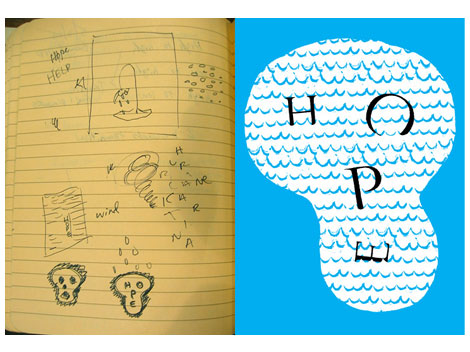
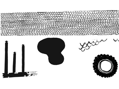
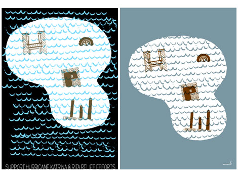
This was one of two non-profit projects that Wink was involved with during the Hurricane Katrina & Rita disasters. This one was for the Hurricane Poster Project..the other one was 25 Above Water.
For both projects it was a pretty quick turnaround from when they both contacted us. My thinking was that there was so much water…all of it contaminated, non-drinkable and very destructive. My first sketch was a skull with the words H O P E in it, from there the idea evolved.
OGI eyewear display
———————————————————————————————————————
[pictobrowser 10159078@N03 72157603803319613]
OGI is an eyewear manufacturer and they sell their eyewear frames at various optical stores across the country. They needed some stand alone shelf point of purchase displays that could be mailed in an 8.5″ x 11″ envelope. I knew I wanted to use bookboard material, it was inexpensive, sturdy and lightweight.
The 30 second design challenge
———————————————————————————————————————
Through years of scientific training and data we have concluded that “the world’s best design ever†will be created in 30 seconds. It will be a design so intense that a young designer’s mind will instantly blow up when he/she sees it. We are on a quest for that design. Well, thats not the full truth. In the 30 second design challenge we give our interviewee a concept. They then have thirty seconds to sketch out a rough thumbnail.
Scott’s been nice enough to join us for this session of the 30 second design challenge. In today’s challenge, we’ve come up with a fictious pizza company.
Ok here we go, Scott we’d like you to design a poster for Lumberjack pizza. Lumberjack Pizza serves up Frozen pizza cut from trees.
Let the 30 seconds begin..now!
30 seconds later
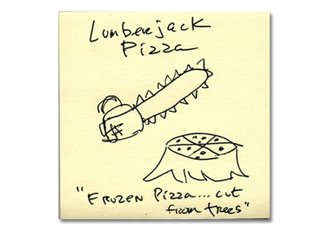
This is great! Thanks
Before we go, any advice for upcoming design newbies?
Concept is king and keep the solution simple.
We would like to thank Scott Thares for taking the time to share with us. You can see the rest of Scott and Richard’s work at Wink-Mpls.com
TagsART, branding, brochures, contemporary, graphic-design, Interviews, logos, Minneapolis, packaging, posters, Typography, USA


