March 2010

You are currently browsing the monthly archive for March 2010.

Wim Crouwel Archive

wim crouwel

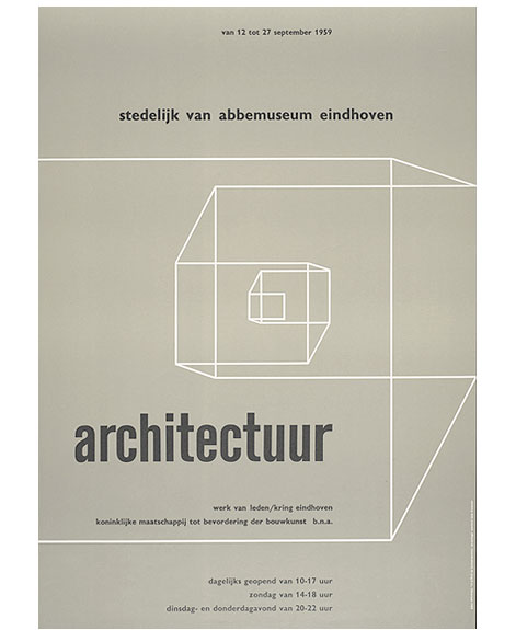
Architectuur werk van leden poster c1959

Wim Crouwel fans rejoice!

The Het Geheugen van Nederland (The Memory of the Netherlands) is a dutch website that contains an extensive collection of illustrations, photographs, texts, film and audio fragments, all of Dutch making. They have an impressive archive of work by Wim Crouwel. Over 500 original designs by Wim and his partners at Total Design lay in wait for your perusing pleasure. Enjoy!

Huge thanks to Antonio at Aisleone for sharing this gem.

Read the rest of this entry »

Nomono Illustration

Cristóbal Schmal, nomono, illustration, berlin

Berlin based illustrator and designer, Cristóbal Schmal, has an impressive collection of work under his moniker Nomono. This particular piece, created for INOPOLIS’s guided tour for the 90th anniversary of Bauhaus, celebrates Berlin as the modern city. The color palette is limited and the imagery is quite striking. I really love the rough textures and geometrical figures in this illustration, especially the red ray emanating from the foreseeing eye.

Read the rest of this entry »

6th Biennale of Graphic Design Brno 1974

brno biennale

While I was in Maine I discovered this book put together after the 1974 Biennale of Graphic Design in Brno, Czechoslovakia (now the Czech Republic and Slovakia). The book contains notes and essays from a symposium centered around corporate identity.

Wim Crouwel contributes an essay on the problems with house-style. In the essay he discusses the role of a designer in the creation of a corporate identity program and describes the difference between what he calls “information designers” and “advertising designers. He ends the essay off with a few thoughts on trademarks (abstract symbols vs type driven solutions).

Read the rest of this entry »

Nikolay Saveliev

Nikolay Saveliev - Grain Edit

Great work from New York based designer Nikolay Saveliev. The album art shown above in one of my favorites from Nikolay’s portfolio; I love how the intricate patterns work with the map and space imagery. The graphics are fresh, but also speak to the genre and style of music.

Read the rest of this entry »

APAK

APAK, illustration, wood panel, Portland

Portland based illustrators, Aaron Piland and Ayumi Kajikawa Piland, are the dynamic husband-wife duo behind APAK. This particular work, created for Tinlark’s 3rd Anniversary Show, nicely juxtaposes a geometric structure against the lush organic blue and green forms. Their work is very much a fantasy, with mythical creatures and animals coexisting in a dreamy imaginative world.

Read the rest of this entry »

World of Logotypes

world of logotypes

Danish Giftparcels | Denmark |

Some of you might remember when World of Logotypes made the rounds on the design blog circuit last year. If you missed out, Amy over at the excellent Aqua-Velvet blog has highlighted a few of her favorite logos from the book. View Part 1, Part 2, Part 3.

You can pick up a copy of World of Logotypes at Alibris.

Read the rest of this entry »

Robert Sessler

robert sessler

Design work for Hagar -1969

Robert Sessler was born in the Swiss city of Bern in 1914. Robert first began experimenting with design during his late 20s at the Zurich School of Arts where he was trained under the Bauhaus instructor, Johannes Itten. In 1942 he left school to open his own studio and become a member of the Swiss Werkbund. He maintained his studio until 1953 when he was offered a position as the head of the graphic design department at the Saarbrucken School of Art in Germany. He continued to teach at Saarbrucken and later at the University of Saarland until his retirement in 1979.

Read the rest of this entry »

Shaun Lind

Shaun Lind / Grain Edit

Fun work and a new site from Shaun Lind, a designer, illustrator, Austin-living person, man, and member of the esteemed design/creative collective Public School. There’s a nice balance between the fun and the useful in Shaun’s work. For example, I love amount and quality of identity alongside his interesting self-initiated projects.

Read the rest of this entry »

Isle of This Town by Invisible Creature


Isle of This Town by Invisible Creature. Meas. 17″ x 17″

There is so much to enjoy in this week’s poster pick by Invisible Creature.  Everywhere your eyes go there is something to delight in. I want to live in this poster and I honestly can’t decide which element is my favorite.  The color scheme is perfect and really lets your imagination soar. There is a lot to be said for work like this that inspires you and takes you away to another world.  You can buy it here.

Noma Bar Interview

noma bar

Noma Bar is a man of few strokes. But don’t let the simplicity fool you. His talent lies in his efficiency in depicting characters and social issues. With bold colors, shapes and one or two icons he captures the spirit of a person. Other times he communicates a message on a social issue with amazing clarity while adding a bit of humor to everything. Whether the message is about violence or equality, his straight-forward visual approach is refreshing.

Read the rest of this entry »

Emily Forgot

emily forgot design, emily forgot illustration, emily forgot uk

London designer and illustrator Emily Alston, better known by her moniker Emily Forgot, takes us on quite the journey in this illustration for Design Week.

She features a cascade of chairs, lamps, and other household accessories layered upon each other to create a surreal environment. The colors in this piece play with light, with its soft tints of cyan and salmon juxtaposed against a dark chocolate background. The really sparse patterns hidden intermittently within the shapes are a real treat too!

Read the rest of this entry »

Ronald Clyne at Folkways

ronald clyne

ronald clyne

Being an avid collector of records, I’m looking forward to getting my hands on Unit Editions most recent release.

From the website:” Ronald Clyne at Folkways is a 64 page ‘newspaper’ devoted to designer Ronald Clyne’s record covers for the Folkways label. Ronald Clyne (1925 – 2006) designed over 500 album covers for Folkways and is largely responsible for the famous label’s striking visual appearance. His distinctive use of two-color printing on matte paper and his deft use of modernist design strategies, created a body of work that gave the Folkways label its distinctive aroma of integrity and purity.”

Read the rest of this entry »

Philippe Nicolas

Philippe Nicolas
Aerial wonder! These birds-eye illustrations from Philippe Nicolas are pretty fun. Simple, colorful, and oblique—I love how angular and well composed these pieces are.

Read the rest of this entry »

Mi Diccionario Ilustrado in the Shop

mi diccionario ilustrado

Mi Diccionario Ilustrado – Illustrations by Acosta Moro

Mi Diccionario Ilustrado is a fun little dictionary for kids. Each page is filled with colorful illustrations of animals, musical instruments and various modes of transportation.  I was able to get my hands on a couple copies of this hard to find book from the 1970s. If your interested in purchasing a copy, stop by the grain edit shop.

Read the rest of this entry »

La Boca Design

la boca design, uk, west london, record covers

La Boca is a London based design firm specializing in transporting its viewers to places of the future by means of the past. This record sleeve, created for Arcadion, has a nice composition with the symmetry of the two magnetic looking objects on the edge of what seems like a portal into space. The warm gradient behind the bold text nicely juxtaposes the cool waves of the galactic landscape. This is where I’d like to be today.

Read the rest of this entry »

Frank Eidlitz Posters for Shell

frank eidlitz

Awesome collection of posters for Shell Oil Company dating back to 1964. The series was created by Australian designer Frank Eidlitz.

Read the rest of this entry »

Go Faster: The Graphic Design of Racing Cars

grain edit go faster
This video provides a very interesting look at the design of racing cars in 70s. The graphics on these care are incredible — very minimal and nothing at all like the logo-plastered cars of NASCAR.

Read the rest of this entry »

The Books Concert Poster by Sonnenzimmer


The Books Concert Poster by Sonnenzimmer. Measures 18″ x 24″

Our poster pick for the week was created by Sonnenzimmer. Sonnenzimmer is an art and screen print studio based in Chicago. The studio is owned and operated by artist’s Nadine Nakanishi and Nick Butcher. We’re certain you’ll find their work as appealing as we do.

The poster pictured above really puts the negative space to good use. The simple, colorful shapes balance the overall composition while the broken up landscape forms a a dynamic window to the world. You can purchase this poster here.

Read the rest of this entry »

Homework: Modern Polish Poster Design

homework

If you are in the London area, Kemistry Gallery is currently showing works by the warsaw-based design studio homework (Joanna Górska and Jerzy Skakun). On display is a selection of over fifty of their prints including classic cinema and modern Polish theatre posters. The exhibition runs from March 5th through the 17th of April.

Read the rest of this entry »

Celyn Brazier

celyn brazier, 1960s, 1970s, illustration

London based illustrator and animator, Celyn Brazier, sure has a way with color! Reminiscent of George Dunning’s psychedelic Yellow Submarine, this particular image depicts the sea and earth with its abundance of creatures, homes, and people. The composition is positioned so that everything feels connected. The images of floating jellyfish, zooming cyclists, and carefree birds also provide a nice natural rhythm within the imagined landscape.

Read the rest of this entry »

Goodby for HP Retail Publishing

goodby silverstein

I love this set of ads put together by Goodby, Silverstein & Partners for the HP Retail Publishing group. The illustrations were created by Ryan Meis (also of Lab Partners fame) and later rendered in 3d by Australian design firm Electric Art.

Read the rest of this entry »