May 2008

You are currently browsing the monthly archive for May 2008.

Evening Tweed

Evening Tweed

Evening Tweed is a Brighton based design collective, formed by four students at the University of Brighton. If the above image is any indication, all the work from these four is great. As a whole, the work is nicely varied and shows strong directions from each member. Lots of personality and experimentation going on.

Check out their class site. More talent there as well.

Sichuan Quake relief

Sichuan Quake Relief China

Simon Perrin who recently won the Herbert Bayer Olivetti poster contest, just notified me of a website he put together which offers news, info, links to the relief efforts/projects and some of the fundraising initiatives for the recent earthquake in China’s Sichuan province. Simon was living in Chengdu, the capital of Sichuan province, when the earthquake hit.

You can find more info about the relief efforts here.

Steven Harrington touring art show

steven harington art show

For those of you in Europe Steven Harrington has an artshow touring through Paris, Milan, Berlin and Barcelona. In conjuction with the tour Steven is releasing his first solo book.

In addition to the book, He is also releasing some custom shaped and designed limited edition element series decks, a paper toy and 10 new prints. You can check the tour dates, SH book info, day by day photo blog of the tour and in progress shots here at the Our Mountain website.

Tour kicks off June 5th in Paris.

Modern Czech matchbox label

1960s czech matchbox label

Solo Lipnik – UUZO Praha – Pronti Tetanu label – 1960s?

Super cool matchbox label from Czechoslovakia. Pretty intense colors. Nothing like taking a bike ride through a field of ketchup. Can anyone translate the text?

The Little Friends of Printmaking!

The Little Friends of Printmaking

Tears of joy! It’s The Little Friends of Printmaking, Wisconsin’s #1 husband/wife design team super duo. LFoP are a Milwaukee based design studio whose work is really exciting and inventive. Each piece has a great story/narrative (and typography) that pulls you in. You can really tell that there is a lot of experimentation going on over there. I would love to see them get into motion graphics, a lot of this work is aching to be animated.

Their website is great too; it’s as engaging as the work. Lot’s of little things to look at and click at.

They also have a store and a blog.

TypeCon 2008 poster gallery – Call for entries

TypeCon-poster

If you don’t know what TypeCon is, it’s the leading conference in America on Typography. YouWorkForThem is curating a poster exhibit at TypeCon. They are looking for your best poster work that has excellent usage of Type on it. It can be the main focus, or minor. They will be displaying the best submissions and the poster show will most likely travel, like the last one did. Don’t wait till last minute, send your entries over now! Please help spread the word, they want as many submissions as possible.

Click here for more info and to download the submission PDF.

The illustration work of Atsushi Hara

atsushi hara illustration design

I wonder who this guy is waiting for? Maybe he’s into Planespotting? Whatever the case, the guy in the back with the brown jacket looks pissed.

Great Airport scene from Japanese illustrator Atsushi Hara. His work is reminiscent of Miroslav Sasek and Richard Erdoes. Check out Atsushi’s portfolio for a selection of hand picked gems.

(via stickers and stuff)

Modern design and the stamp – Iain Follett’s stamp collection

Iain follett stamps design collection

After discovering Iain Follett’s stamp collection was featured in Creative Review’s January 2008 issue of Monograph, I decided to contact him and see if he would be interested in sharing some of his favorite stamps on grain edit. He agreed and has graciously provided us with some choice stamps and his comments.

Continuing with our designer’s bookshelf series, grain edit is proud to present Iain Follett.

Read the rest of this entry »

Poster by Dutch designer Otto Treumann

otto treumann dutch poster design

Tele Communicate poster for an event in Luxembourg, 1962

I love the layering of color within the bird. If you were to isolate the blue shape, the bird would look similar to Alexander Girard’s design for the Braniff Airlines logo in 1965.

also worth checking:
317 Dutch posters

The Ampersand – yep, a blog about ampersands

ampersand-design blog

“et” style ampersand that appears to be based on the letter “B”

Just found out about this swell blog called The Ampersand. Yep a whole site dedicated to the little homies. Quotes, design and photos of wild Ampersands roaming the streets.

Also, check out this great new blog by the people of Crew Design. Choc full of design goodness! Many thanks to Meghan for hipping me to this cool site.

Mocking Birdies by Annette Simon

Mocking birdies annette simon

Annette Simon sent over two lovely books that I’ve been meaning to post. The first is Mocking Birdies which is the story of two fun loving birds that love to copy each other’s words and whistles. The birds are having a real hoot till a couple of “copycats” come along. Its’ a really funny ending so, you have to read the book to find out what happens. I love how she chose to illustrate the book. The bright colors and simple shapes really catch your eye.

Annette also sent a very touching book titled This Book is for all kids, but especially my sister Libby, which her 5 year old son Jack wrote. The book contains Jack’s thoughts and questions as he struggles to understand the death of his real life sister Libby. Libby died when she was three and half years old due to a rare disorder. Jack’s questions are honest, frank and often humorous. For parents and young ones that are dealing with a similar situation, I’m sure this book leads to some thoughtful discussions.

You can purchase either book at Amazon by clicking on the links above.

Read the rest of this entry »

Vintage luggage label from Norway

Vintage luggage label from Norway

Label from Bardola Hoyfjellshotel in Geilo, Norway – c1960s?

I think I’m obsessed with modern Scandinavian design from the 1950s- 1960s. First it was furniture and kids books, then Ceramics and now luggage labels! Where does it end? What’s in that Nordic water?

also worth checking:
Swiss Modern luggage label
Modern luggage label from Portugal

The Making of the Pixar WALL-E Picture book – Lots of Bots

Lots of Bots WALL-E pixar book

Lots of Bots c2008 – Text by Kiki Thorpe – illustrated by Ben Butcher

Ben Butcher of Pixar recently stopped by to give us a preview of the new WALL-E picture book Lots of Bots which he illustrated. The book is the precursor to the film, which is due to hit screens this summer. In the interview below, Ben discusses his thoughts and process in the making of this beautiful book. Where it was possible, we’ve included Ben’s original artwork alongside images of the finished book.

Read the rest of this entry »

53 Years of Latvian magazine – Jauna Gaita

53 years of Jauna gaita magazine cover design

After the second World War many Latvian writers were relocated to different areas of the world. Many ended up in Great Britain, Canada and the USA. Living in these new lands they began their own periodicals and publication houses. A new generation of writers emerged. “Living in foreign lands and surrounded by other cultures, these writers strove to capture the influences of modernism.” * One of the magazines that surfaced during this time period was Jauna Gaita (the new course). Ilmārs RumpÄ“ters who designed many of the covers of Jauna Gaita during the 1950s-1970s, wonderfully captured the spirit of this era.

Read the rest of this entry »

Bare Knuckles starring Robert Viharo

Bare Knuckles film

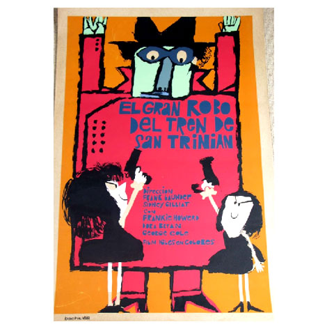
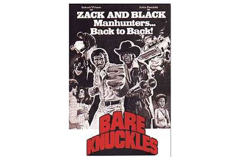
Bare Knuckles poster circa 1977

Last night a few of us went down to the Parkway theater in Oakland to check out the classic blaxploitation film Bare Knuckles. The film stars Robert Viharo as Bounty Hunter Zachary Kane who’s on the hunt for a motorcycle riding, masked serial killer ninja! It doesn’t get any better then that!

Bare Knuckles is one of several films that inspired Quentin Tarantino’s GrindHouse flick. Tarantino loaned his copy of Bare Knuckles to Will Viharo (son of Robert Viharo) for the viewing. Robert was in the audience last night and joined his son on stage after the film. It was awesome to see this guy in person after he just kicked two tons of serial killer ninja butt a few minutes before.

One of my favorite parts of the film is Zach’s training session. One minute he’s whaling on a punching bag and the next he’s in the lotus position playing the flute! Now thats Bad Ass!

Check the soundtrack for the film as well. It was reissued recently. Vic Caesar put together a gritty funk masterpiece.

also worth checking:
Nikkatsu Action Cinema

Technorati Tags: ,,

Malcolm Grear Designers advertisement

Malcolm Grear Designers advertisement

Beautiful advertisement for Arkwright-Interlaken, Inc designed by Malcolm Grear Designers. Dates back to the early 1960s.

1950s Eichler modern homes brochure

Eichler Homes brochure
Brochure for the Rancho San Miguel (Walnut Creek,CA) Eichler development c1950s

In honor of the upcoming Birth of Cool: Mid-Century Modern design in California exhibition, I thought it would be nice to post this Eichler brochure. I found the brochure several years ago at an estate sale in Lafayette, California. I love the photo. Most likely the photographer is Ernest (Ernie) Braun.

Mid-Century Modern design exhibition- Oakland Museum

Pierre koening case study house
Julius Shulman, photograph of Case Study House #21 (Pierre Koenig, architect)

Birth of the Cool: California Art, Design, and Culture at Midcentury—opening May 17 at the Oakland Museum of California—looks at the painting, architecture, furniture design, decorative and graphic arts, film, and music that launched mid-century modernism in the United States, and established Los Angeles as a major American cultural center. The exhibition continues through August 17, 2008.

Birth of the Cool is accompanied by a 300-page illustrated book (published with Prestel Publishers, 2007), which provides a thorough reassessment of the era.

Bookmark Tomorrow

tomorrow partners promotional bookmark

Many thanks to the good people at Tomorrow for stopping by last week, and for the gift of this beautiful bookmark. The bookmark is part of a promotional piece marking their recent contribution to “Trees for the Future“.

Read the rest of this entry »

Cuban film posters blog

Cuban film posters blog

El Gran Robo Del Tren De San Trinian – c1968

I recently received an email for this great new blog that focuses on Cuban posters. The site is a wonderful resource for posters produced by ICAIC, OSPAAAL, COR, Casa de las Americas and other cultural, political and social agencies in Cuba.

Mar Hernández

Mar Hernandez

Mar Hernández aka Malota aka really cool designer living and working in Valencia, Spain, offers an extremely fun and inspiring collection of work for our viewing pleasure. Mar’s style is really bold and graphic, but very detailed and complex at the same time. She has a nice range of work — from very flat, computer drawn images, to a sketchier, looser, hand drawn style.

Check out the video entitled “Greenville.” Very cool motion graphics.

Poster by Swiss graphic designer Donald Brun

Donald Brun- Swiss graphic designer
Poster for Salon auto geneve – march 14-24 1963

Easily in my top ten favorite posters.

Salon Auto Geneve (Salon International de l’Auto) is an annual auto show held in March in the Swiss city of Geneva. I admire Brun’s decision to represent the event in an a very abstract way. The white circles used as automobile headlamps look like they are derived from a compositional exercise in one of Armin Hofmann’s classes. This would make sense since Donald Brun taught at the Allgemeine Gewerbeschule (Basel School of Design) along side Hofmann.

also worth checking out:
Poster by Swiss designer Hans Neuburg