Mid Century modern stamp and label group
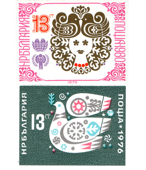
bulgarian_stamps-design.jpg

Grain Edit is proud to introduce the Mid Century Modern Sticker, Label and Stamp club.

This group features Stickers, Labels and Stamps from the mid 1950s to the mid 1970s.

This would include: vintage matchbox labels, buvards / blotters, luggage Labels, airline labels and stickers, first day covers and stamps.

We are particularly interested in Eastern European match box labels ( czech republic, hungary, yugoslavia, russia etc.) Airline labels + stickers from Swiss Air, Boac, Braniff, Air France, Air India, SAS, CSA , Sabena and Varig and French Buvards ( especially ones by Herve Morvan, Raymond Savignac and Lefor Openo).

Special thanks go out to David McFarline for submitting the stamps shown above.

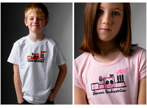
New House Industries kids t shirts

house_industries-t-shirts.jpg

From the makers of Neutra Face, the Alexander Girard Alphabet blocks and the upcoming Tim Biskup fonts comes the kid friendly House Industries factory t-shirt. Click the link to the left to get some of this goodness.

Otl Aicher design on Flickr

otl-aicher-olympics-2.jpg
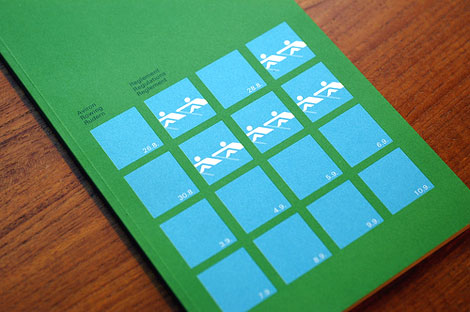
1972 Olympics rowing regulations booklet

Tons of great work in the Otl Aicher design group on Flickr. Includes posters, brochures, books, stamps, packaging, corporate reports, even a wooden version of Waldi the 1972 Munich Olympics mascot. Projects include the 1972 Olympics identity, Lufthansa and work from his days at HFG Ulm.

Clean, minimal, modern.. I love it. I could look at this stuff all day.
Many thanks to Adam for passing this link along.

Side note – got some cornbread today. Man I love this stuff. Is it even bread? Its like muffin cake.

Finnish graphic design : annual report

finnish graphic design corporate annual report

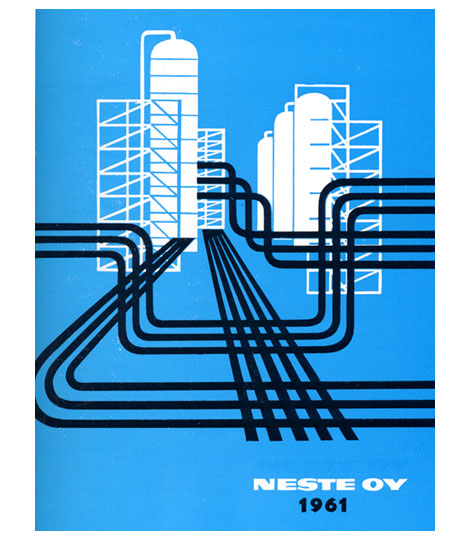
1961 Neste Oy Corporate annual report designed by Olli Stelander. Great use of limited color.  This was when drilling for oil was hip, the indie rock (Get your shale on!)  of the energy industries. This annual probably doubled as their tour poster.

For more design work from Finland check my post on Finnish book design.

Deberny & Peignot type specimens

[pictobrowser 10159078@N03 72157603653386438]

Deberny & Peignot – Types from Paris c1960s?

Deberny and Peignot Type specimen booklet imported and distrubuted by Amsterdam Continental.

Includes:
Peignot – created by A.M. Cassandre and Charles Peignot, issued in 1937 for the Paris International Exhibition.

Meridien – Introduced in Europe in 1958-1959, created by Swiss type designer Adrian Frutiger.

Cristal – Designed by Remy Peignot, issued in Europe in 1957.

Jacno – Issued in Europe in 1952, designed by Marcel Jacno.

Ondine – By Adrian Frutiger, issued in 1957.

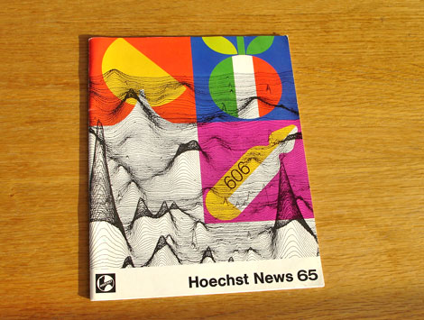
Rudolf Schucht cover design for Hoechst

rudolf_schucht-design.jpg

Cool cover by Rudolf Schucht for Hoechst News 65. I believe Hoechst News 65 was the in house magazine for the German life science company Hoechst AG (now Sanofi-Aventis). For the cover design Rudolf pulled elements from the articles contained within the magazine. The top two icons refer to Italian cuisine. The item below is an ampule of Salvarsan used in clinical testing against Syphilis. The background graph refers to work by Dr. Walter Seifried.

I couldn’t find much information on the graphic design work of Rudolf Schucht. If anyone knows anything about him, please send me an email or leave a comment.

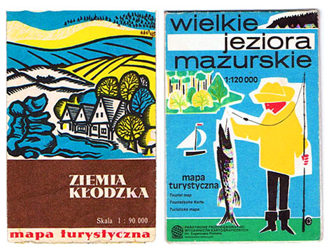
Modern Polish maps and sharp stinkin teeth

czechoslovakia and Polish mid century modern maps.jpg

Just found this great polish blog called pantuniestal. They put together a small collection of polish maps from the 1950s, 60s and 70s. You can see a preview above. Check out the fish that guy in the yellow rain suit caught. That thing has some crazy sharp triangle teeth. Do they have Piranha in Poland or something?

Besides the maps they have some great examples of mid century modern ephemera. Browsing the site I found Czech matchbox labels, vintage cameras, hotel luggage labels etc. In addition to the Polish, there is an English version of the site so you can follow the conversation. Tons of eye candy here.

(via FFFFound!)

New year, Old cigarette poster design

cigarette-posters.jpg

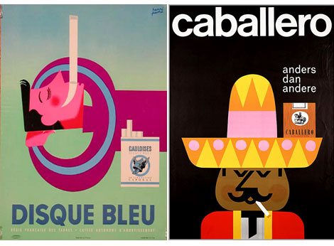
(L) Disque Bleu by Henri Favre c1950s (R) Caballero by Pedro Vargas c1960s

It’s the beginning of a brand new year, which means its time to compile the latest list of New Year’s resolutions. For some of you this might include a pledge to quit smoking (again). To kick the habit in style how about a farewell stroll down cigarette poster lane? Flickr user lamade has posted a kick butt (no pun intended) gallery of Tobacco related posters. Lamarde’s blog also features a ton of tobacco related advertising and design.

Ringing in the new years with a hairy stamp

belgium stamp 1970s.jpg

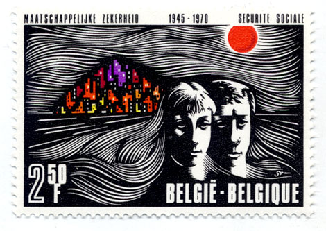
Belgium stamp – 1970s – Lots of hair!

Happy New Years!
I hope everyone had a good time last night. Unfortunately, it was a chill night at home for myself, since I picked up a cold over the weekend.

We have some exciting new interviews and features that we will be posting over the next few weeks and months. Stay Tuned!