Julia Guther

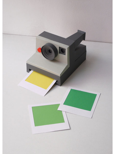
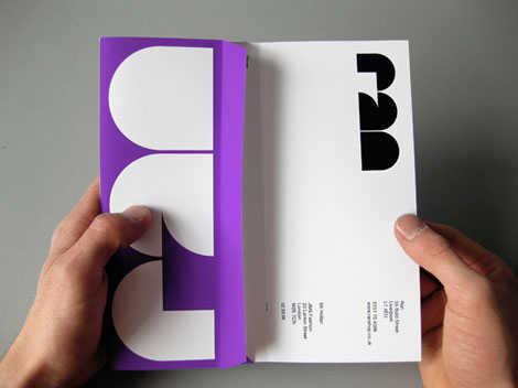
Love these cutout illustrations and typography from Germany-based Julia Guther. Her work is minimal, colorful, and she uses a wide (and interesting) range of media.


Love these cutout illustrations and typography from Germany-based Julia Guther. Her work is minimal, colorful, and she uses a wide (and interesting) range of media.
If your a fan of vintage matchbox labels you will appreciate Czech illustrator & designer Pavel Fuksa’s latest project. Pavel created 178 matchbox covers for the Navigators “My Place” video, many of which contain lyrics from the song. See the full video here

Matt Keers, the UK-based designer responsible for the above design, has a portfolio full of the same: bold, colorful, and compelling.
Architectuur werk van leden poster c1959
Wim Crouwel fans rejoice!
The Het Geheugen van Nederland (The Memory of the Netherlands) is a dutch website that contains an extensive collection of illustrations, photographs, texts, film and audio fragments, all of Dutch making. They have an impressive archive of work by Wim Crouwel. Over 500 original designs by Wim and his partners at Total Design lay in wait for your perusing pleasure. Enjoy!
Huge thanks to Antonio at Aisleone for sharing this gem.
Berlin based illustrator and designer, Cristóbal Schmal, has an impressive collection of work under his moniker Nomono. This particular piece, created for INOPOLIS’s guided tour for the 90th anniversary of Bauhaus, celebrates Berlin as the modern city. The color palette is limited and the imagery is quite striking. I really love the rough textures and geometrical figures in this illustration, especially the red ray emanating from the foreseeing eye.

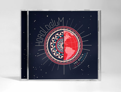
Great work from New York based designer Nikolay Saveliev. The album art shown above in one of my favorites from Nikolay’s portfolio; I love how the intricate patterns work with the map and space imagery. The graphics are fresh, but also speak to the genre and style of music.
Portland based illustrators, Aaron Piland and Ayumi Kajikawa Piland, are the dynamic husband-wife duo behind APAK. This particular work, created for Tinlark’s 3rd Anniversary Show, nicely juxtaposes a geometric structure against the lush organic blue and green forms. Their work is very much a fantasy, with mythical creatures and animals coexisting in a dreamy imaginative world.
Danish Giftparcels | Denmark |
Some of you might remember when World of Logotypes made the rounds on the design blog circuit last year. If you missed out, Amy over at the excellent Aqua-Velvet blog has highlighted a few of her favorite logos from the book. View Part 1, Part 2, Part 3.
Design work for Hagar -1969
Robert Sessler was born in the Swiss city of Bern in 1914. Robert first began experimenting with design during his late 20s at the Zurich School of Arts where he was trained under the Bauhaus instructor, Johannes Itten. In 1942 he left school to open his own studio and become a member of the Swiss Werkbund. He maintained his studio until 1953 when he was offered a position as the head of the graphic design department at the Saarbrucken School of Art in Germany. He continued to teach at Saarbrucken and later at the University of Saarland until his retirement in 1979.
London designer and illustrator Emily Alston, better known by her moniker Emily Forgot, takes us on quite the journey in this illustration for Design Week.
She features a cascade of chairs, lamps, and other household accessories layered upon each other to create a surreal environment. The colors in this piece play with light, with its soft tints of cyan and salmon juxtaposed against a dark chocolate background. The really sparse patterns hidden intermittently within the shapes are a real treat too!