Studio 8
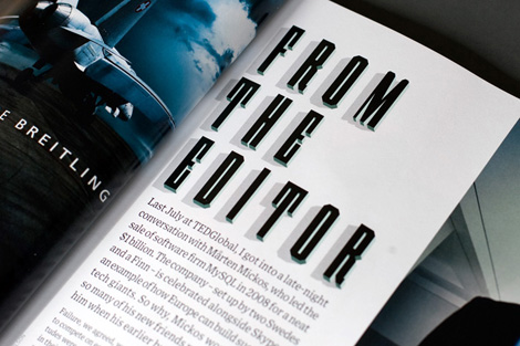
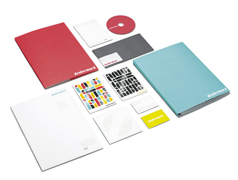
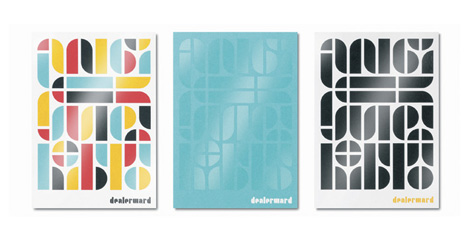
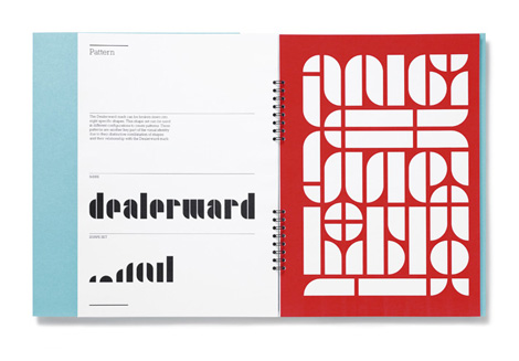
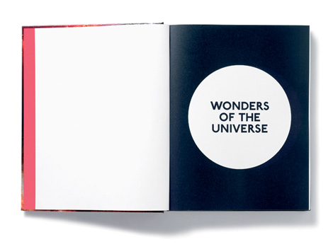
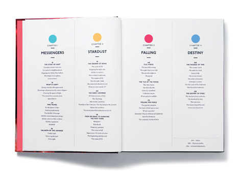
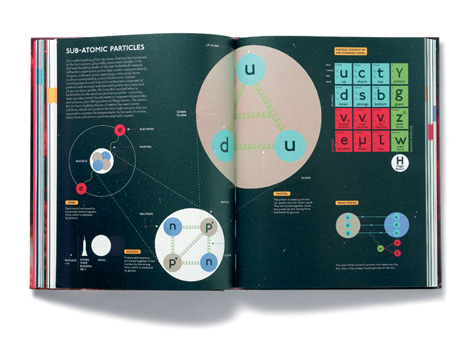
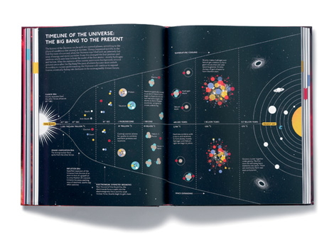
I stumbled across the fantastic work of Studio 8 earlier today, and after looking through their portfolio I was a little surprised that I hadn’t heard of them before. The quality and consistency of their work is quite good, and they’ve notched projects for clients large and small. (The above C is part of a typeface designed for Wired Magazine.)
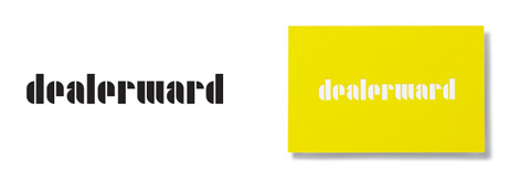
There’s a very specific feeling you get when coming across quality work from a quality studio. I love when a studio goes beyond just making eye-catching design, and creates something smart and functional. Due to the nature of our blog format, I’m only able to show a fraction of Studio 8’s work. Please visit their site to see the breadth of work.
——————–
Also worth viewing:
Timba Smits
Herb Lubalin Archives
Mike Davis Interview
Not signed up for the Grain Edit RSS Feed yet? Give it a try. Its free and yummy.
——————–
Tagscontemporary, Design, Illustration, type-design, Typography, UK
09.21.11 in Found design by Ethan
Share on Facebook


