Louis Swart — Dutch Packaging
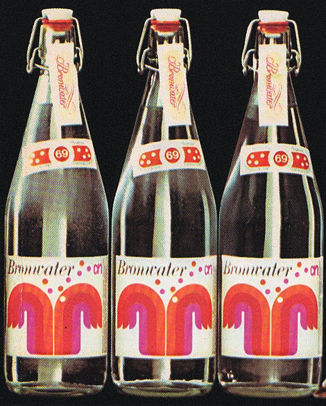
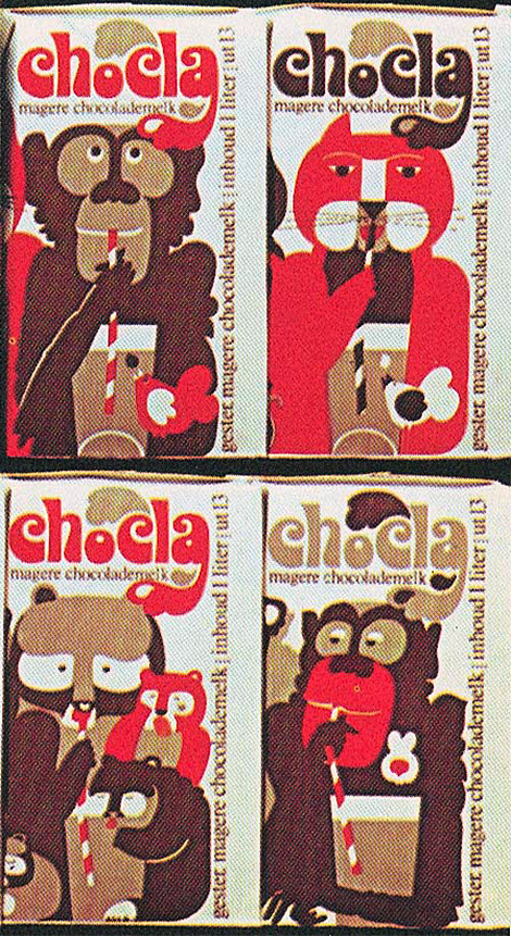
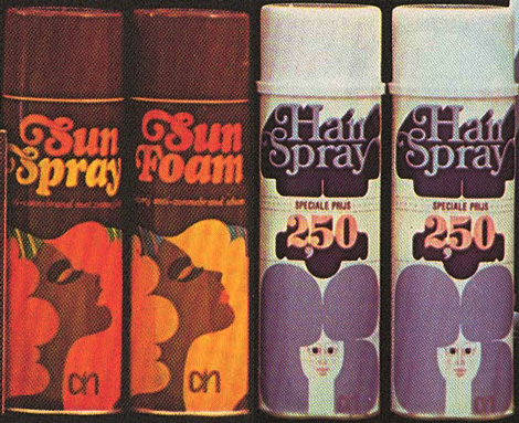
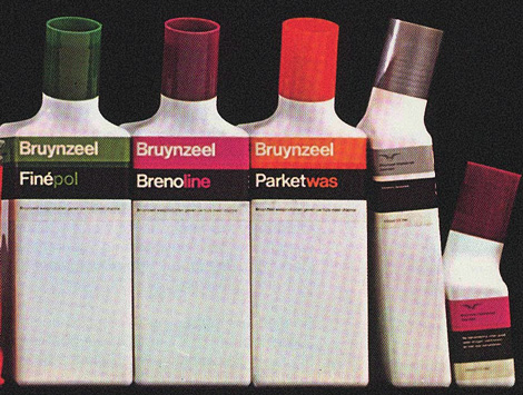
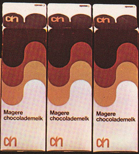
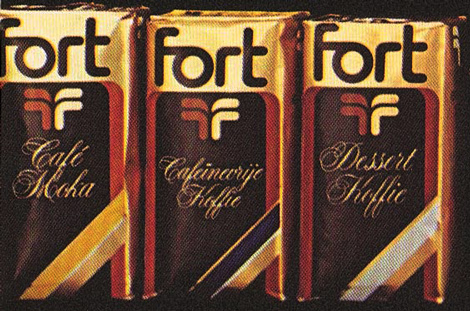
Louis Swart was a packaging Designer in the Netherlands in the 1960s and 70s. Working in the design industry between the young ages of 13 and 40, Swart greatly paved the way for the future of Dutch package design. You can read more about the life and work of Louis Swart as well as view more of his great work at the Graphic Design Museum Blog.


Also for your viewing pleasure:
Book Gems from the South of France
Harry Murphy & Friends
Like what you see?
Sign up for our Grain Edit RSS feed. It’s free and yummy!
Tags1960s, 1970s, Desing, dutch, Louis Swart, netherlands, packaging
07.12.11 in Seen Elsewhere by liam
Share This Share on Facebook


14 comments
Comments feed for this article
Trackback link
http://grainedit.com/2011/07/12/louis-swart-%e2%80%94-dutch-packaging/trackback/
08.01.11 at 1:17 pm
Pingback from Dutch Packaging » ISO50 Blog – The Blog of Scott Hansen (Tycho / ISO50)
12.06.11 at 2:13 am
Pingback from grain edit · Tony Dispigna
01.12.12 at 3:27 am
Pingback from grain edit · Herb Lubalin for PBS
08.02.12 at 11:05 am
Pingback from Inspiration: Coral & Tangerine Set the Scene | Christa Alexandra Designs | Graphic Designer in Vermont | Customized Social & Wedding Stationery | Vintage Letterpress Invitations & Stationery
04.03.13 at 1:40 am
Pingback from 14 Examples Of Fantastic Packaging Design From The ’60s And ’70s | CfpDir.com
04.03.13 at 3:28 am
Pingback from 14 Examples Of Fantastic Packaging Design From The ’60s And ’70s | シ最愛遲到.!
04.03.13 at 4:12 am
Pingback from 14 Examples Of Fantastic Packaging Design From The '60s And '70s | YO Status ->YO Status ->
05.23.13 at 11:45 am
Pingback from Packaging from the past: 10 awesome vintage packages | Uber Patrol - The Definitive Cool Guide
Hello,
Very nice post, I like your blogging techniques and have bookmarked this blog as found it very informative. Keep it up.
07.12.11 |
Magento Themes |
Seen Elsewhere |
Good information, thanks for sharing. Good environs make good life!
07.12.11 |
Bangalore Architecture |
Seen Elsewhere |
These are great examples of 70’s packaging design. The use of flat, high-contrast colour coupled with the tonal mix make them unmistakeably from this era. My favourite element though is the typography. It is amazing to see what great letterforms could be created without the use of modern desktop publishing software.
07.13.11 |
Kim Ruddock |
Seen Elsewhere |
Liam…my mind has officially been blown for the day. Great post!
07.13.11 |
Grace |
Seen Elsewhere |
my favorite colors. calendar inspiration! woohoo.
07.22.11 |
seesaw |
Seen Elsewhere |
Nice designs for inspiration. Thanks
08.01.11 |
Mainual |
Seen Elsewhere |