Amsterdam (Formerly N. Tetterode) Type Catalog

amsterdam fonts

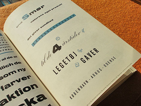
Schriftenkatalog der n.v. Lettergieterij Amsterdam voorheen N. Tetterode

I rarely find cool type catalogs, but this one is a real goldmine. The catalog seen above was produced by the Amsterdam Foundry (formerly N. Tetterode) and appears to date back to the mid-1960s. It’s filled with beautiful specimens including Nobel, Mercator and Aigrette all lovingly laid out in a simple yet elegant manner. If this sparks your interest, I suggest taking a quick glance at the Vette Annonce type specimen sheet we posted back in 2008 as well.

Read the rest of this entry »

Ingela P Arrhenius Illustration

Ingela P Arrhenius, illustration, Sweden

This illustration from Sweden based illustrator, Ingela P Arrhenius, is a real hoot! It features a earthy colored owl with a geometrically patterned body against the cool colored tree and background. The composition is neat and symmetrical and it makes me feel like hiding in a tree for the day. Who’s in?

Read the rest of this entry »

The Silent Giants

silent giants / grain edit

The Silent Giants, a two-man Michigan-based studio cooks up some sweet silent awesomeness. Although, given the fact that most of their work is music related, the name is more than a little ironic. If you’re like me, you’ve seen the Giants’ work before and not known it — in the form of the popular and stylish Ra Ra Riot album cover.

Read the rest of this entry »

Vinyl Documentary: To Have & To Hold

To Have & To Hold is a new documentary from Jony Lyle that celebrates and explores the phenomenon of collecting Vinyl. The documetary includes interviews with well known collectors like Bobbito Garcia, ?uestlove, Chuck D, Andre Torres (From Wax Poetics), Amir (of Kon & Amir) and Bruce Ludvall, the owner of Bluenote. Based on the trailer the film seems to be heavily focused on collectors in or around New York.

You can learn more about the film at the official Facebook page. Also there’s an interview with the director over at Mat Dolphin’s blog.

I’d love to hear from other record collectors out there. What are some of your favorite pieces of vinyl in your collection?

(via Dylan over at the excellent Hard Feelings blog.)

Read the rest of this entry »

Mark Shaw Photography

mark shaw

Photo for Chevrolet/”New Yorker” magazine c1960

Svenska Mobler has a beautiful collection of photos from famed photographer Mark Shaw. Mark is best known for his photographs of Jacqueline and John F. Kennedy and his work in capturing couture fashion from the middle of the century.  During the 1950s and early 1960s Mark shot the European fashion collections for LIFE magazine. It’s interesting to note that he was one of the first photographers to shoot fashion on the runways and backstage at shows.

Read the rest of this entry »

Aske/Sicksystems Design

sicksystems, graphic design, aske, russia

Typographics is where it’s at!

This illustration, designed for Computer Arts Projects, is by Moscow based artist Aske. Created for his personal art project titled Sicksystems, Aske playfully shows the various levels of typography…literally! He has a real knack for using interesting forms, bright colors, and celestial details in his work.

Read the rest of this entry »

Partisan Memorials in Former Yugoslavia

Makedonium

Makedonium monument in Krusevo

I recently stumbled upon a slideshow of modern memorials in former Yugoslavia over at Robert Burghardt’s FZZ Fanzine. The memorials date back to the early 1960s following Yugoslavia’s emancipation from the Soviet Union. In the preface to the slide show Robert mentions, “These monuments belong to the most important witnesses of Yugoslav memorial culture and stem from the most active period of Yugoslav modern art which has been described as socialist modernism or socialist aestheticism.  As War-monuments they are unique: They do not express the fighting and death, but life, resistance and the energy by which they were carried. They are directed forward while they mark the starting point for a new society, whose products they are.”

Read the rest of this entry »

Rabbit Print by Leandro Castelao

leandro castelao

This week we’re excited to feature this Rabbit print by Leandro Castelao as our poster pick. Castelao is based in Buenos Aires and has previously been featured on grain edit. Rabbit is presented in Castelao’s signature style and I must say that I am once again blown away. The lines look like wires creating some sort of robo bunny with a CD drive on steroids. Good stuff. You can pick up a Rabbit print here.

Read the rest of this entry »

Ty Wilkins Illustration

ty wilkins, illustratiaon, logo design

Kansas based illustrator and designer, Ty Wilkins, has a keen eye for illustrating animals in a neat and refreshing way. This fox, one of the first in a series of animals, uses minimal geometrical shapes and rich hand painted textures. As a nod to his typographic interests, each illustration incorporates an asterisk, which adds visual charm. I wish I had this little guy as a pet!

Read the rest of this entry »