Paul Ibou: Logos, Posters & Calendars
Calendar for Antwerp-tax designed by Paul Ibou
Iconofgraphics has a great post on the work of Belgian designer Paul Vermeersch (a.k.a. Paul Ibou).
05.13.10 | Dave | Found design |  8 comments


Calendar for Antwerp-tax designed by Paul Ibou
Iconofgraphics has a great post on the work of Belgian designer Paul Vermeersch (a.k.a. Paul Ibou).
05.13.10 | Dave | Found design |  8 comments
As a kid, watching Sesame Street and 3-2-1 Contact was a daily ritual. Of course, there were particular animations from those shows that I could watch endlessly, such as three rocks squabbling about how cross a lake. With the advent of YouTube, these animations have resurfaced and offer a trip back to simpler times of wonder and discovery. But who made them?
Introducing Al Jarnow, the mastermind behind the short films embedded into our collective memory. Celestial Navigations: The Short Films of Al Jarnow compiles a retrospective of Jarnow’s familiar animations from CTW along with his more obscure shorts. Jarnow experiments with geometric shapes, color, scale, and proportion in his films, creating everlasting works that communicate changes through time and space to both young and old.
05.12.10 | Grace Danico | Product Reviews |  4 comments
Production recently started on The Sign Painter. The new documentary on sign painting will include interviews with several of the artists that still practice this age-old craft. The directors, Sam Macon & Faythe Levine, were recently in San Francisco to capture footage of Jeff Canham, Bob Dewherst, New Bohemia Signs, and Jimmie “the saint” Collier. You can find more info on the film at the website and official Facebook fan page.
05.10.10 | Dave | Found design |  15 comments

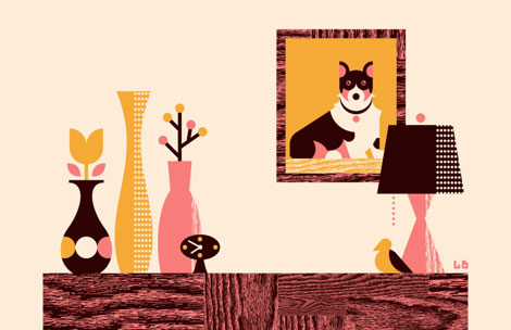
Fun work from Kansas-based designer/illustrator, Luke Bott. (And a cool last name!) Luke’s work has a playful/whimsical feel to it, as well as solid composition, typography and color choices.
05.07.10 | Ethan | Found design |  5 comments

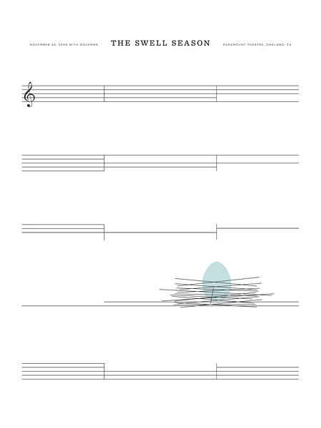
The Swell Season Concert Poster by The Small Stakes
This week’s poster pick was created by Jason Munn of The Small Stakes. It’s incredibly simple and yet so clever. I like how Jason used the the bars from the sheet music to form a bird’s nest. If you’re interested in purchasing this poster, you can pick up a copy here.
05.06.10 | Dave | Poster Picks |  5 comments

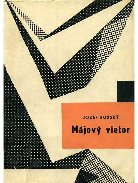
Wow! Great collection of European book covers from A Journey Round My Skull. So fun to look through. I love the balance of naiveté and compositional sophistication throughout these jackets. It’s amazing the depth that is achieved through simple illustrations and good color choices.
05.05.10 | Ethan | Found design |  12 comments
The latest installment to the Grain Edit interview series takes us to Seattle, birthplace of grunge music and home to illustrator and designer, Sasha Barr. I was first introduced to Sasha’s work a few years ago when I stumbled upon his website, positively titled “This is the New Year.” His work often employs rough textures, intricately drawn patterns featuring elements from nature and little creatures, and cool color palettes.
In this interview, Sasha discusses how he made the trek from Tennessee to Seattle, his influences and creative process, how he landed an awesome gig working at Sub Pop Records, and also shares incredible views of his awesome home.
Let’s dive on in!
05.04.10 | Grace Danico | Features |  26 comments
Chronicle books recently released a book on concert posters designed by Jason Munn of The Small Stakes. We’re working on an interview with Jason in regards to the book and we thought we would open up the questions to our readers.
Please send us any questions you might have about Jason’s work or his new book. Use the contact form on our site to email us your question by 2pm Friday, May 7th. After we receive all the questions, Jason will go through the emails and select a handful of questions to answer. We’ll post his answers the following week.
05.03.10 | Dave | Found design
Share on Facebook
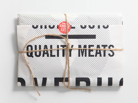
Great work from ilovedust, a UK-based design studio. The above work is a promo, which (I believe) references the fact one of their offices is located in a former butcher shop. (It sounds like they have the two coolest work spaces in all of graphic design.)
04.30.10 | Ethan | Found design |  2 comments
Wonderful illustration from Barcelona and Warsaw based designer Jan Feliks Kallwejt. The piece was created for a Polish daily newspaper that is devoted to business and economic issues. The white buildings form a jumping gazelle. I’m not sure how the newspaper used the illustration. Could some of our Polish readers fill us in? Can’t say I would want to live near the rear end, it would bring new meaning to living in the “ass end ” of town.
04.29.10 | Dave | Found design |  11 comments