Perky Bros

Perky Bros

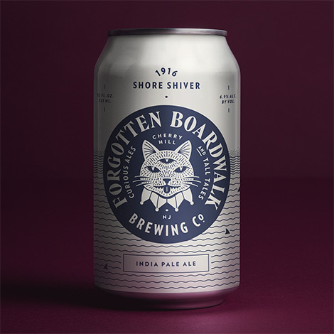
Perky Bros crafted a quirky identity system for Forgotten Boardwalk Brewing. Inspired by beachside folklore, the beer’s packaging illustrates legends of pickpocketing magicians, the invention of the funnel cake, and more. Hidden within the imagery are humorous details and cryptic messages that are a joy to discover as you sip the contents of each can. Sitting front and center is the brand’s mascot; a mystifying three-eyed cat that serves as an ode to the notorious feral felines that lived under New Jersey’s piers.

Read the rest of this entry »

Raffinerie

Raffinerie

Raffinerie is an award-winning design studio based in Zürich. A favorite project of mine is their collaboration with the Solothurner Film Festival. Building from an established visual language, the studio developed a flexible identity system that they adapt each year. For this year’s event, they created a comprehensive campaign that included posters, invitations, and a program booklet. The promotional pieces highlight the festival’s energetic atmosphere and simultaneously promote its diverse collection of motion pictures. Prominently featured in the materials is a rectangular “O” which represents the screens the movies are projected on. This “O” is manipulated and morphed into a series of dynamic speech bubbles that interact with the film stills featured throughout the system.

Read the rest of this entry »

Anna Hurley

Anna Hurley

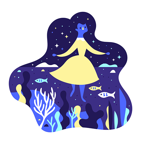
I am smitten with Anna Hurley’s illustrations. Utilizing simple forms and limited color palettes, she crafts playful scenes full of charming characters. I’m especially fond of her illustration “Celestial Hair”. Here, she depicts a woman with a flowing mane that contains a bustling coral reef and a starlit sky. This enchanting piece encompasses the wit and whimsicality often found in her work.

Read the rest of this entry »

Erik Kirtley

Erik Kirtley

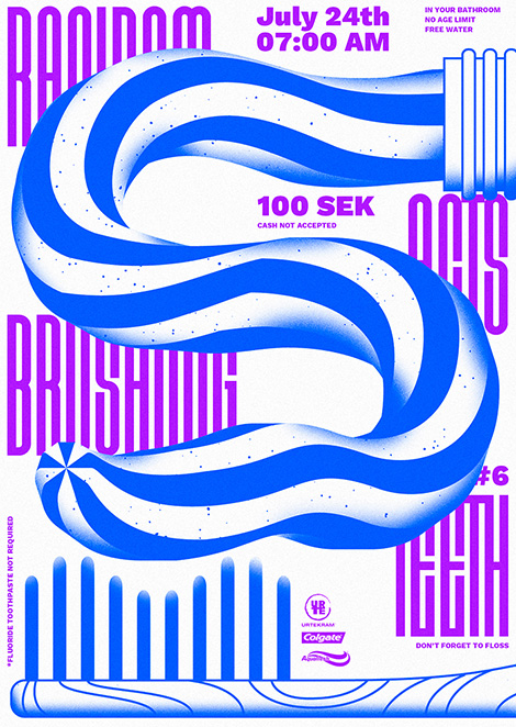
Erik Kirtley is a Stockholm-based designer with a passion for typography and illustration. He beautifully displays his skills through a poster series titled Random Acts in which he documents everyday activities. With subjects such as “brushing teeth” to the more abstract, each poster has its own unique style, but still retains its connection to the larger theme.

Read the rest of this entry »

Joohee Yoon Update

Joohee Yoon

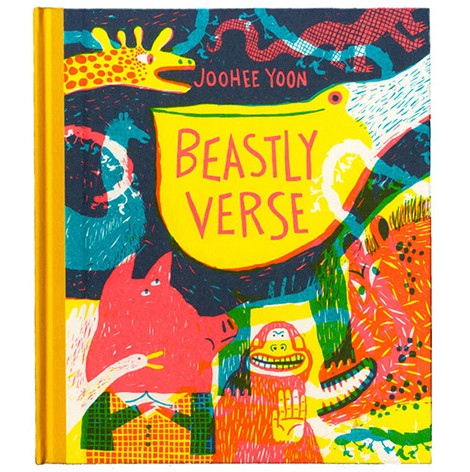
Printmaker, JooHee Yoon, has continued to craft whimsical illustrations and prints that vibrate with color and personality. With Enchanted Lion Books she’s published two charming picture books, The Steadfast Tin Soldier and Beastly Verse, both printed with just three colors. She’s also done much editorial work, regularly illustrating for The New York Times, Plansponsor Magazine, and other prominent publications. To keep up with her work and to buy some of her pieces, make sure to follow her on Instagram and to check out her shop.

Read the rest of this entry »

The Rodina

The Rodina

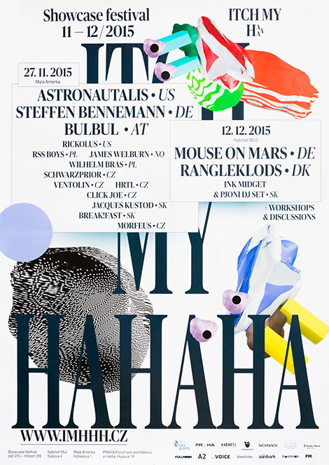
The Rodina is the independent practice of Tereza and Vit Ruller. Interested in the connections between culture, aesthetic, and technology, the duo explores these subjects through a wide range of medias. Their work is often experimental and utilizes whimsical elements such as neon colors, playful textures, and even the occasional emoji. This quirky nature is especially evident in their identity for the music festival, Itch My HaHaHa. Blending colorful patterns with 3D “blobs”, they crafted animal-like characters that represent the ever-mutating creature that is pop culture. The critters roam through every piece of the campaign as their unique patterns and bright hues represent the different types of music performed at the event.

Read the rest of this entry »

Amber Vittoria

Amber Vittoria

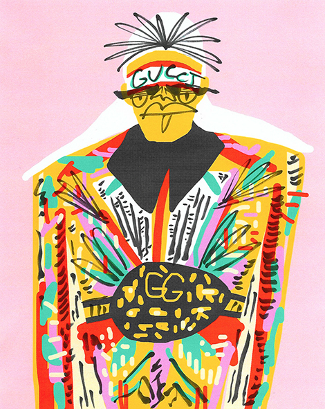
Amber Vittoria is an illustrator living and working in New York City. She often employs round organic shapes and loose brushstrokes to illustrate the collections of high-end fashion brands. Hoping to empower the female form, she features the outfits on a variety of body types. She also challenges society’s standards of beauty by highlighting her figures’ disproportionate physiques and thick dark body hair. The juxtaposition of these elements highlight the grandiose and inventive nature of high-fashion while simultaneously defying the physical ideals the industry promotes. Her compelling pieces have graced the pages of prominent publications such as The New York TimesTeen Vogue, and Man Repeller.

Read the rest of this entry »

XYZ Type

XYZ Type

XYZ Type is a new independent type foundry established by Ben Kiel and Jesse Ragan. They currently offer three beautiful typefaces – Cortado, Aglet Slab, and Export. I am especially impressed with Cortado, an elegant script inspired by the lettering of illustrator Cecilia Carlstedt. Designed to look as much like handwriting as possible, the typeface’s OpenType programming subtly changes the shapes of repeated letters and ends words with organic brushstrokes.

Read the rest of this entry »

Recently Received

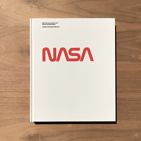
The NASA Graphics Standards Manual

We’ve received some awesome titles from Nobrow Press, PIE International, Rizzoli, Standards Manual, and more. Also included are rad bandanas designed by Hitch, gorgeous linen journals from House Industries, and a collection of architecturally-inspired rubber stamps by Aurelien Debat. Check them all out after the jump.

Read the rest of this entry »

Büro 146

Buro 146

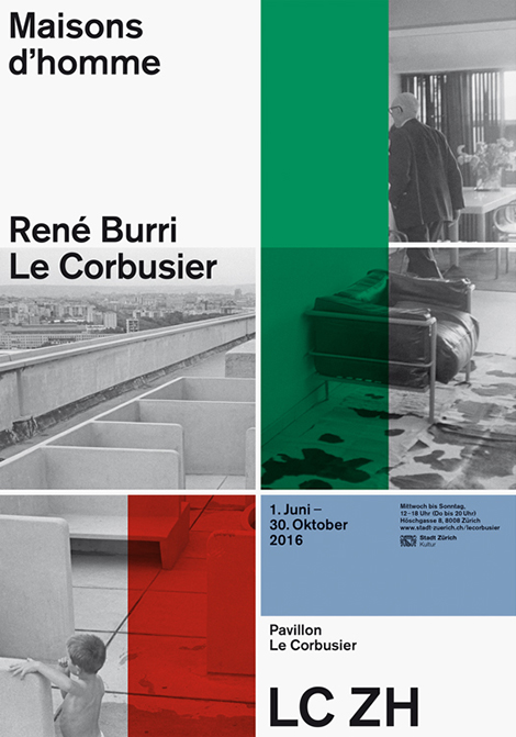
Büro 146 is an accomplished design studio that collaborates with theaters, schools, and other cultural associations throughout Switzerland. Especially impressive is their work for the Pavillon Le Corbusier, a museum dedicated to the famed Swiss architect. Over the past three years, Büro has crafted promotional materials that beautifully display the institution’s collection. Pulling from the gallery’s iconic multicolored walls, the studio developed a lush tapestry of posters and brochures that highlight the eccentric nature of Le Corbusier’s structures.

Read the rest of this entry »