Giant albino bird gets stuck on the Toronto Needle

mod_bird_illustration_Bundesgartenschau_stuttgart.jpg
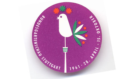
Sticker for Bundesgartenschau Stuttgart – 1961

The post earlier today was inspired by a sticker (seen above) I found over the weekend. I wasn’t sure what to make of this sticker when I first saw it. It looks like a giant albino bird sitting on top of the Toronto Needle. After researching the event (Bundesgartenschau) I now believe its an illustration of a weathervane. Since Bundesgartenschau is a garden/ landscaping show it would make sense that the bird’s tail feathers are flowers.

Visit the previous post (Get your Bundesgartenschau on!) for more information regarding this garden show and the graphics behind it.

Get your Bundesgartenschau on!

bundesgartenschau-logo_design_trees.jpg
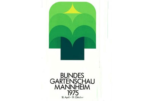
Bundesgartenschau is a biannual Federal horticulture show in Germany. It has been in existence since 1951. Every 2 years they switch locations within Germany. So far the event has been held in Hamburg, Koln and Hannover amongst other cities. The logo above was created for the 1975 exhibition in Mannheim.

The DBG website contains photos and information of all the Bundesgatrenschau shows. Highlights include the Hamburg 1973 poster (Man with a slinky as a beard riding a tugboat across a sea of flowers..say what?) and the 1957 show poster designed by Herbert Leupin.

J.A. Grose : Designer

j_a_grose-standard_elektrik_lorenz_design-1.jpg
j_a_grose-standard_elektrik_lorenz_design-2.jpg
j_a_grose-standard_elektrik_lorenz_design-3.jpg
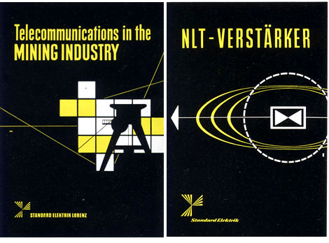
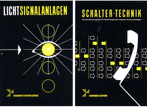
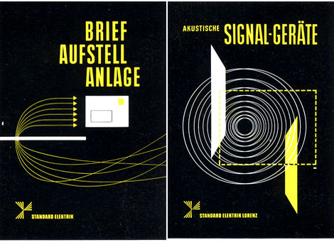
German designer J.A. Grose for Standard Elektrik Lorenz 1959

Ladislav Sutnar exhibition

ladislav_sutnar_exhibtion-1.jpg

The Czech center in New York is currently running an exhibition entitled, LADISLAV SUTNAR: MODERN, NATIONAL, INTERNATIONAL. The Exhibition feature’s 25 of Sutnar’s works and will run through Jan 8, 2008. For more information please visit the Czech Center’s website

Plakat Schriften – type specimens

[pictobrowser 10159078@N03 72157603235585141]
Plakat Schriften – Type specimen catalog -produced by by D stempel AG. foundry Frankfurt, Germany. This is one of the better catalogs I’ve come across. Huge Specimen samples and Bold color. Includes examples of Helvetica, Sistina, Schmalfette Binder style, Enge Fette Plak, Schmalfette Memphis, Kraftige Balzac, Halbfette Elan and Ziffern. Theres not date listed but it must be around the early 60s since Helvetica was created in 1957.

La Rinascente poster 1974

la_rinascente_poster.gif
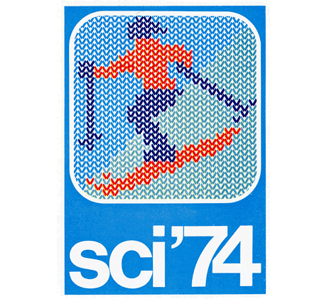
Super rad skiing poster by E. Mariani for La Rinascente. Hundreds of colored vertical arrows make up the image.Year of creation 1974. Everytime I see this poster it makes me think of the White Stripes video with the legos.

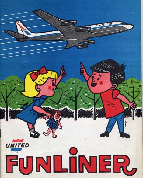
Screw the train, I’m taking the funliner!

funliner_airline_ephemera_1960s.jpg

What did they feed these kids in the 60s? Their HUGE! They have no chance of riding the funliner considering their heads are bigger then the whole plane. I don’t think they want to ride in it though, I think they want to eat it.

Cool kids activity book from 1964 produced for United Airlines. Illustrations by Dick Flor. Includes a tragic tale of some campers getting their precious hamburger buns stolen by some juvenile chipmunks. Great stuff!

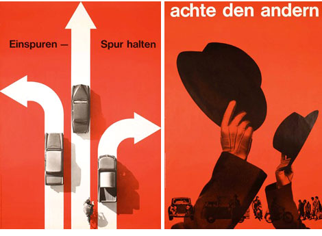
Hats off to Hans Hartmann

hans_hartmann_posters1.jpg
hans_hartmann_book-3.jpg
hans_hartmann_book-2.jpg

Update 11.21.07
I’d like to thank Felix of design book stories and Thierry Blancpain for tracking down some additional information on Hans Hartmann.

– He was born in 1913. Died in 1991.

– He originally came from the canton of Argovia, next to Zurich and studied at the Kunstgewerbeschule Zürich. He then went to Bern and among other things designed the (still in use) logo of the national train company SBB. In addition, he designed a fair amount of post stamps.

– The Hans Hartmann estate seems to be in the communal library in berne.

– Lastly, here is a short bio on Hans Hartmann (In german).

—————————————————————————————————————
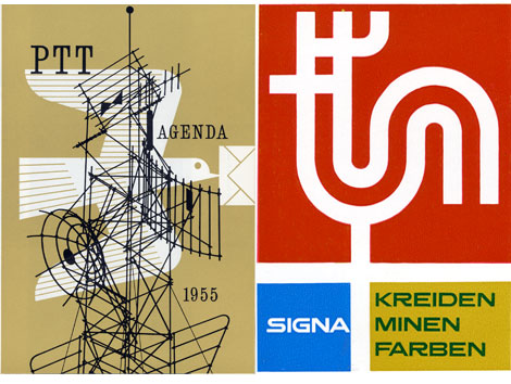
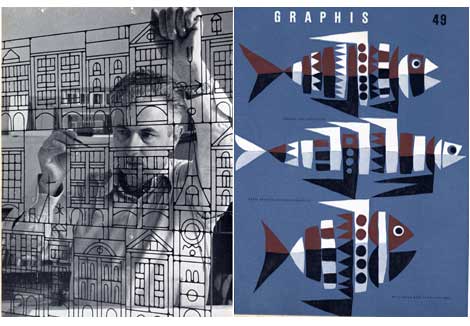
Hans Hartmann is one of the lesser known designers that lived in Switzerland during the 1950s. A google search of his name brings up almost nothing. Outside of his native country his work seems to be lost in obscurity. The only information I have on him comes from a small monograph produced in 1958.

Most of his work centered around companies that were in or around Bern, Switzerland. This included designs for PTT, F. Gygi + Co. and Teppichhaus Bossart & Co. Most likely his contemporaries (Armin Hofmann, Emil Ruder in Basel , Josef Muller Brockann in Zurich) located to the North of Bern would of been aware of his work. However, I was unable to find any information that suggested any collaborations with these other designers.

If anyone has any information related to Hans or his design work, please contact me. It would be great if we could build a more complete resource on this talented designer. Thanks to the poster connection for the top 2 images.

Top 50 graphic design blogs

Designer David Airey has posted a list of the top 50 graphic design blogs. The top positions were determined by Google page rank (PR). Were glad to say we made the list!