Color wheels and information design
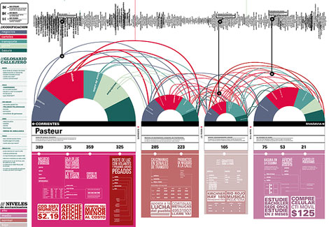
I found this great example of information design in ilusiones_design’s flickr photostream. Can anyone translate the text?
01.22.08 | Dave | Found design |  15 comments


I found this great example of information design in ilusiones_design’s flickr photostream. Can anyone translate the text?
01.22.08 | Dave | Found design |  15 comments
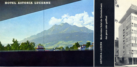
Hotel Astoria Lucerne was located in Luzern, Switzerland. As they claim in their promotional material, they were the “most modern Hotel of Central Switzerland”. After looking at this I brochure, I believe them. I’m not sure if the hotel still exists. I was able to find some information on a Hotel Astoria Lucerne designed by Herzog & De Meuron but, I’m not sure if bears any relation. I realize Herzog & De Meuron are modern day architects, but possibly they renovated the existing structure? Anyone have any info on this?
01.21.08 | Dave | Off Our Bookshelves |  2 comments
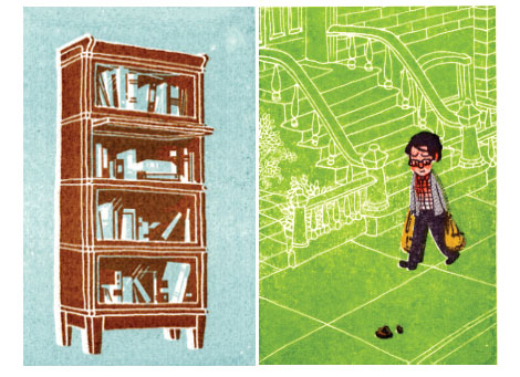
I love when people send me packages, especially when they contain cool design work. Comic artist and designer Jonathan Bennett recently sent me a fat package of goodies including not one, but TWO Gocco prints! In addition, he included several magazines that feature his cartoons. I enjoyed his work, I just wish he had a website so I could see more.
MOME Winter 2006 features one of Jon’s cartoons. You can pick up a copy at Fantagraphics Books.
01.18.08 | Dave | Off Our Bookshelves |  12 comments
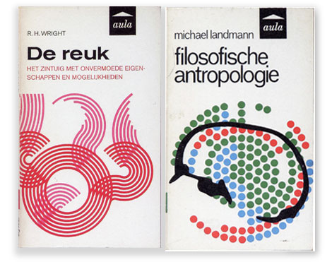
(L) designer: unknown ©1966 (R) designer: J. Venema ©1966
Published by Aula-Boeken in the Netherlands
The recent excitement over Penguin covers has resulted in a renewed interest in paperback book cover design. I’m starting to see discussion groups popping up as well as new books being published on the subject. Several titles come immediately to mind; Seven Hundred Penguins and World Paperback design. In future posts I’ll discuss both of these books as well the as the book covers of dutch designer Dick Bruna. For now enjoy the pieces above.
For further viewing on the subject I Highly recommend:
Ace Jet 170 : Loads of great material here and one of my favorite blogs
The Old timey paperback book covers group on Flickr
(pictures via) world paperback design
01.17.08 | Dave | Found design |  1 comment
We just started a Paul Rand fan group on Flickr. As of this writing we only have 12 members. Surely there are more then 12 people who appreciate one of the greatest graphic designers of all time! Its good wholesome fun! Bring your whole family. Show all the little ones why Mommy keeps stealing their copy of Sparkle and Spin.
Join now.. Paul needs you and our little egos need affirmation that people like our Flickr groups.
Click here and let the nerdery begin
(Thanks go to Bureau L’Imprimante for the pic)
01.17.08 | Dave | Grain Edit News |  4 comments
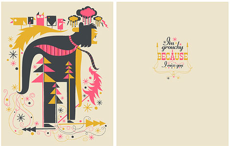
In this card designed by mr.mannun, business ties are flying in the wind as this beast rips down a small patch of Christmas trees all while holding a flock of fudgesicle shaped birds. This is great! One of my favorite finds on Flickr. My top pick in the genre of groucy card design.
You can browse the rest of mr.mannun’s design / illustration work on Flickr. He also has a few poster samples on Gig posters.com
01.16.08 | Dave | Uncategorized |  2 comments

In this card designed by mr.mannun, business ties are flying in the wind as this beast rips down a small patch of Christmas trees all while holding a flock of fudgesicle shaped birds. This is great! One of my favorite finds on Flickr. My top pick in the genre of groucy card design.
You can browse the rest of mr.mannun’s design / illustration work on Flickr. He also has a few poster samples on Gig posters.com
01.16.08 | Dave | Found design |  2 comments
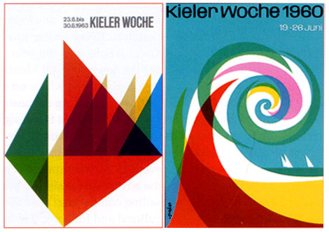
Kieler Woche is a festival that takes place each year in Kiel, Germany. The festival includes nautical competitions as well as cultural events. Each year 5 designers are invited to submit 3 sketches for the event’s poster. The rules are simple. The text on the poster must be limited to only Kieler Woche and the year. The type for Kieler Woche must be set in Adrian Frutiger’s Univers. Lastly the the image must give equal weight to the sailing competition as to the cultural aspects of the festival.
Designers that have contributed to this event include: Wim Crouwel, Michael Engelmann, Celestino Piatti, Anton Stankowski, Waldemar Swierzy, Otto Treumann, Hans Schweiss, Jean Widmer, Ruedi Baur, Ben Bos, Siegfried Odermatt and Rosemarie Tissi. For those interested, I uploaded the Otto Treumann poster to the grain edit flickr account.
( via Etapes)
01.15.08 | Dave | Found design |  Comments closed
[pictobrowser 10159078@N03 72157603707692202]
What? Why? How? Essential Product Information – Sweet’s Catalogue Service
©1942 Design by Ladislav Sutnar
Sweet’s Catalog Service provided catalogs of building and plumbing supplies to architects and contractors. Ladislav along with Knud Lönberg-Holm were responsible for presenting the information within these catalogs in a clear, concise manner.
The promotional, folded sheet above explains the need for easily accessible product information especially during times of war (this was written in the midst of World War 2). As Sweets maintained, providing essential product information in an effecient way could eliminate waste and speed production:
The increasing need for speed in war production is reflected in increasing demand for product information.
In order to be useful such product information should be comprehensive, concise, coordinated
Prefiling of catalogs has been developed as a means for controlling the flow of essential product information
Beautiful layout, far ahead of its time.
For further reading, I suggest Steven Heller’s article Ladislav Sutnar and Knud Lönberg-Holm
01.14.08 | Dave | Off Our Bookshelves |  4 comments
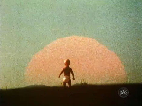
Eames demetrios, grandson of Charles and Ray Eames presents a rare glimpse of the Solar Film produced by graphic designer Saul Bass. The film was commissioned in 1980 by Robert Redford. If you listen at the end of the film you can hear Saul Bass speak for a few seconds. He mentions something about pumping hot water to the house.
I’m not sure if the illustrations/ animations in the film were created by Saul Bass or Art Goodman. The film credits Goodman, but it is unclear if he was just involved in the animation process or if he created the illustrations as well.
Cool film and as one person mentions in the later half “If you stop and think about it, the Sun doesn’t send you a bill each month”. So true my friend.
Can’t get enough of Saul?
check these out:
Henri’s Walk to Paris – children’s book illustrated by Saul Bass
San Francisco International Film Festival poster
Saul Bass’s Case study house
01.11.08 | Dave | Seen Elsewhere |  4 comments