Evan Hecox Paris Sketch print

evan hecox prints

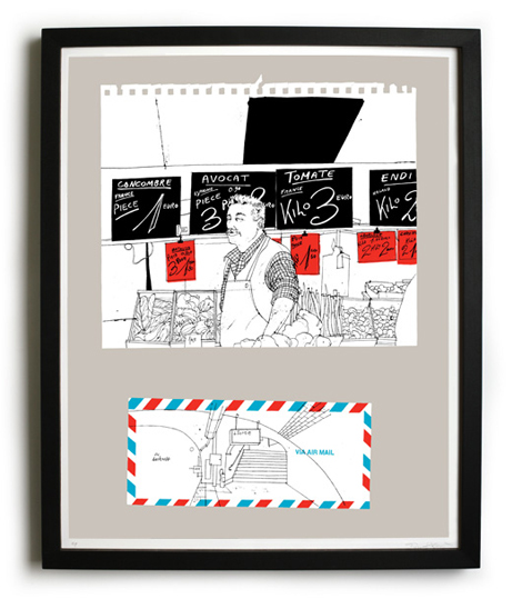
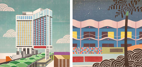
I’m big fan of Evan Hecox’s work. I have the two Tokyo Fishmarket prints hanging in my office. I love how he’s able to capture the subtle and beautiful moments in everyday life. The latest addition to his body of work is inspired by his travels in Paris. He was particulary fond of the hand lettering found on the signs of the street vendors.

The Paris Sketch Print drops in April, but is available for preorder now.

(more…)

Svetoslav Simov

Svetoslav Simov

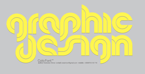
Fontfabric is an awesome independent type foundry run by Svetoslav Simov. All of the faces have great concepts and personality to them. I like the balance between experimentation with dimension and geometry and the playfulness of the faces. Each one is so unique and specific, they seem to be the perfect fit for that “one project.”

(more…)

50+ Designers on Twitter: Our favorites to follow.

Grain Edit / Designers on Twitter

Alright, so Twitter is the hot thing right now. Somewhere in-between blogging and instant messaging, it’s a super addicting way to see what the design community is up to. Frank Chimero just ate a muffin? It’s crepe day at Chronicle Books? @gogograce just blipped The Style Council? I’m in!

(more…)

Ad for Jupp Ernst Chair by Helmut Lortz

helmut lortz

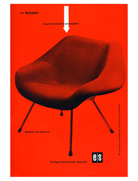
I want this chair! It was designed by Jupp Ernst and manufactured by Polstermobelfabrik Eugen Schmidt Gmbh during the 1950s. If the chair wasn’t cool enough, Helmut Lortz nailed it on the design of the AD. Someone needs to buy me this chair along with a Robin Day Form Unit Sofa. Please?

(more…)

Andrew Holder Interview

andrew holder

We’ve mentioned Andrew Holder on grain edit before, but I just got word of a cool interview with him over at Defgrip. In the interview he discusses some of his recent work for arkitip. He also shares some of his favorite artists. I was suprised to see David Weidman on the list.

After you read the interview, check out the rest of Defgrip. It’s a great site that covers BMX culture, photography, art and design.

Not signed up for the Grain Edit RSS yet? Give it a try. Its free and yummy.

Jorg Hamburger

jorg Hamburger

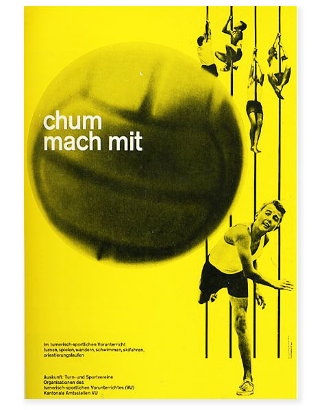
Chum mach mit 1962 poster designed by Jorg (jurg) Hamburger / Photograpphy by Hans Peter Muhlemann for Eidg Drucksachen und Materialzentrale – Bern Swirzerland

Beautiful poster by Jorg Hamburger. Swiss minialism at it’s finest. I love the kids climbing in the background and how the poles make for a perfect natural grid.

(more…)

Steve Mehallo / Jeanne Modern typeface

Steve Mehallo - Jeanne Modern typeface

Steve Mehallo - Jeanne Modern typeface

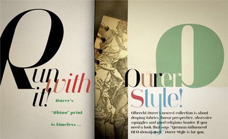
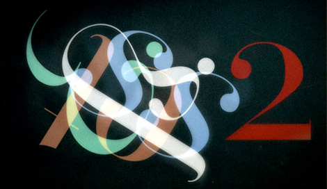
I’m really excited to show this new typeface from long time Grain Edit friend and design-champ Steve Mehallo. Jeanno Moderno consists of nine faces, and bridges over two centuries of type history. Plus, it has some of the spiciest italics you’ve ever seen.

MyFonts is having a great sale on the family right now: For a limited time, save 25% on any single font from the Jeanne Moderno family. This is going on until April 19th. (Perfect idea for my birthday on the 14th). Or you can pick up the entire family for $99.

Get more details here

(more…)

Objectified Film Poster Designed by Build

objectified poster

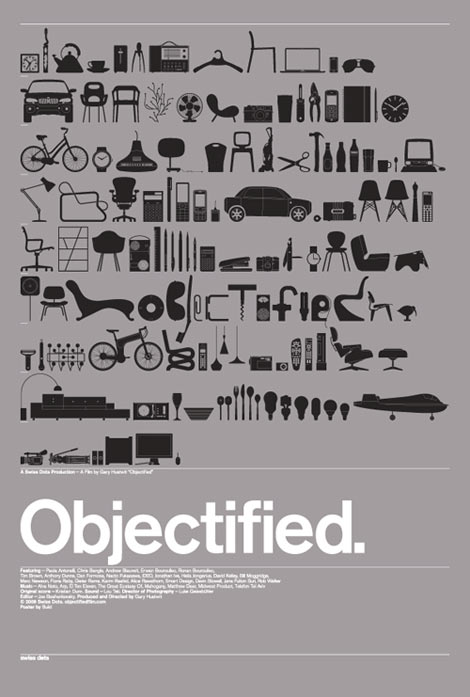
Objectified Movie poster 27″ x 39″, metallic silver and black, lithograph.

Beautiful poster design from Michael C. Place and his studiomates at Build for the upcoming Objectified documentary. The poster features drawings of dozens of objects from designers in the film and more. I like how the word “objectified” is subtly placed within the contents of the objects.  Clean, minimal and modern. I love it. Should be available in the shop soon.

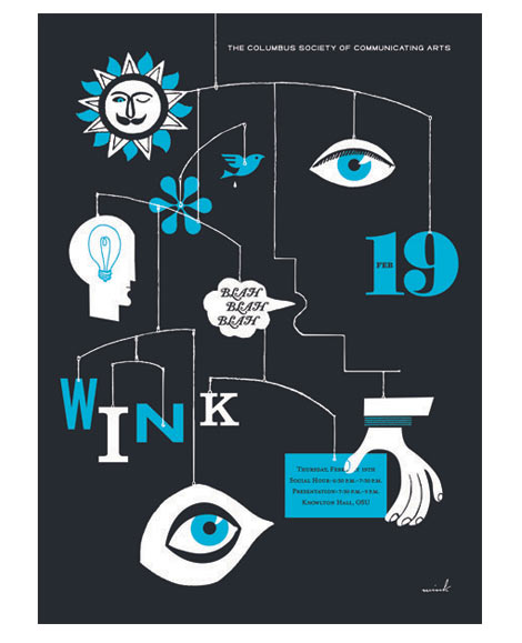
Wink lecture poster for CSCA

wink poster

I knew the sun had a mustache! Great new work from the guys at Wink for a recent lecture with the Columbus Society of Communicating Arts. If they ever recreated this mobile in real life it would be interesting to see if the bird poop gets its own string.

You can hear excerpts from the lecture here.

On a side note I love their signature. Wink script sometime soon?

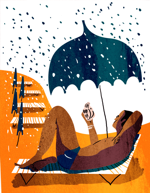
Sanna Paananen: Illustration

Although it is raining, I’d love to join this golden man for a relaxing tranquil time at the beach. Finnish illustrator, Sanna Paananen, has a real knack for using rich saturated complementary colors and thoughtful line work. In this pleasingly orchestrated composition, we see a nice contrast between the golden sands of the beach and the blue details of the rain, umbrellas, and man’s speedo. Paananen plays with the positive and negative space, concentration, and shape of the rain drops, creating a rhythmically soothing effect to the piece. I especially like the simplistic details in the shell’s line work. (more…)