Carson Ellis

Carson Ellis

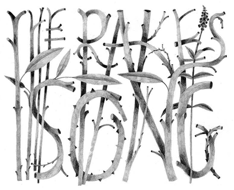
You’ve probably seen the work of Carson Ellis on street posts and at record stores everywhere, as she has been the artist representing The Decemberists for the past several years. Her illustration has that magical quality of making you want to pick up a pencil and draw something beautiful, even if you have no drawing ability whatsoever. Her charming work interestingly seems to capture the greys and faded quality of her surroundings in Portland, giving everything a calm and quiet tone. Carson has just recently released a book called “Wildwood Chronicles” with Colin Meloy (of the Decemberists), so be sure to pick that up!

(more…)

Thereza Rowe

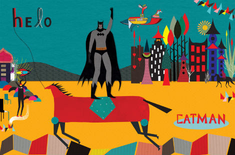
Thereza Rowe is a London based illustrator and graphic designer with an eclectic style that pairs eye-catching colors and geometric shapes with an array of textures and patterns.  Her work has an endearing quality with images of woodland creatures such as foxes, deer, and birds playfully interacting with people in a imaginative magical realm.

(more…)

Studio 8

studio 8

I stumbled across the fantastic work of Studio 8 earlier today, and after looking through their portfolio I was a little surprised that I hadn’t heard of them before. The quality and consistency of their work is quite good, and they’ve notched projects for clients large and small. (The above C is part of a typeface designed for Wired Magazine.)

(more…)

PLOC Magazine

ploc magazine

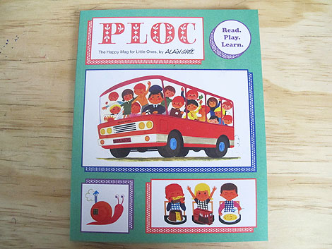
Fans of Alain Gree rejoice! Our friends from Anorak have teamed up with Mr. Gree for a new magazine entitled PLOC.  The inaugural issue features stories, games, coloring pages and activities all illustrated in Alain’s unique style. Pick up a copy here.

(more…)

Niessen & de Vries

Niessen de Vries
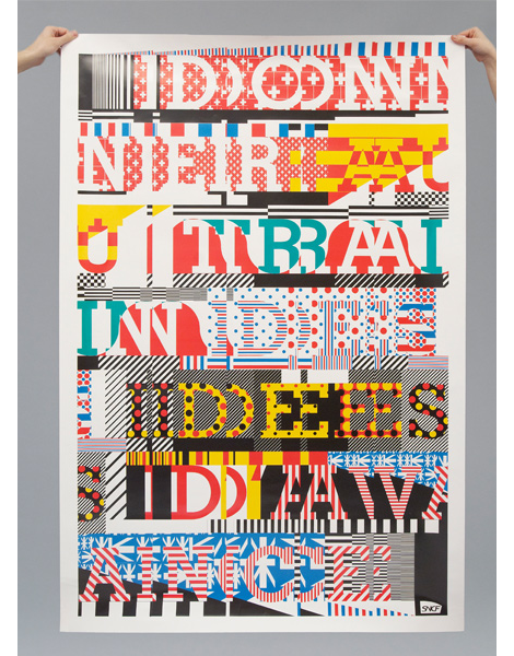
Niessen & de Vries, the Dutch graphic design duo of Richard Niessen & Esther de Vries, have put together a portfolio that captures a strange but wonderful sense of composition using type. Their style focuses on the art of print and the techniques that draw the attention of graphic designers the world over, like overprinting, patterns, off-registration, large scale posters and (of course) amazing typography. While Niessen & de Vries have a very fresh feel to their work, there’s also a great sense of post-modernism by exploring the page purely for arts’ sake.
(more…)

Patrick Macomber

Patrick Macomber

The work of Patrick Macomber (aka South Yall) is pretty dang terrific. I’m always drawn to those designers that operate within a more minimal framework — it’s exciting to see someone arrive at a solution with the fewest moves possible.

(more…)

Flydende Lava

Flydende Lava
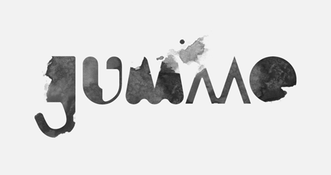
I recently stumbled upon the really cool work of Flydende Lava, the nom de plume of Daniel Siim, a student at The Danish Design School. I especially like Daniel’s bold and confident take on how to create letters. It’s really great to see the experiments and of an extremely excited fledgling designer, you never know what you’re going to see next.

(more…)

Radio

Made by Radio, Capetown

Made by Radio, Capetown

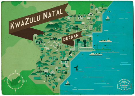
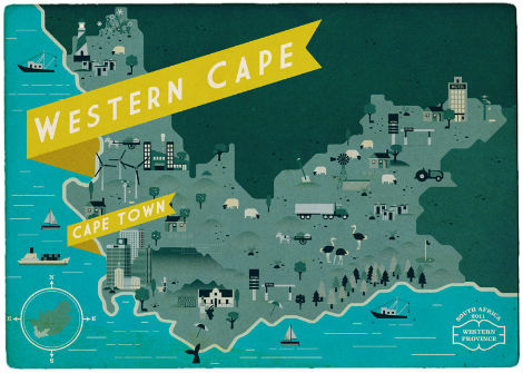
I’m a sucker for maps and all things travel related, so it’s no wonder that these postcards by Cape Town’s Radio are so appealing. Each postcard features a map of one of the nine provinces in South Africa, and is chock full of buildings, landmarks, animals, and agriculture representative of each region. Currently a work in progress, the completion of this postcard series will provide a most excellent pictorial view of the entire country.

(more…)

Alex Trochut

Alex Trochut

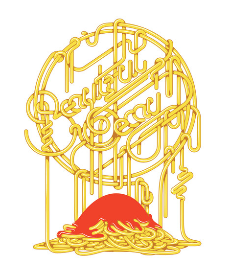
If you’re someone who is excited about type, the name Alex Trochut should be a name often on the tip of your tongue. But if you haven’t seen that name before today: Alex is an amazing young letterer out of Barcelona. With an extensive heritage in the type world (his grandfather was a printmaker and typographic designer), Alex shows his talent through endless experimentations that push the limits of type to the extreme. A couple of months ago Alex published his first book, More is More, which looks to be a great compilation of his work, so be sure to check that out if you what to experience more of this lettering master.

(more…)

Peak 21

Peak 21 hails from the south-west of Poland, in Wrocław. Keeping in the Polish tradition, they do some very nice work. I’m a fan of their bold, geometric and minimal style.

(more…)