Ted Parker

Ted Parker, Illustration

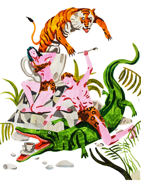
Ted Parker is an international man of mystery, whose work exhibits extreme joy in the most strange and comical of situations. This illustration, titled Jungle Coffee, was created to promote The Village Coffee and Music in Utrecht, Netherlands. Regardless of the subject matter, whether it be dogs smoking, lions dancing, or people and animals engaging in pure rowdiness together, one thing is for sure – Ted’s work is sure to put a big smile on your face.

(more…)

Justin Mezzell

The Florida-based illustrator and designer, Justin Mezzell, has a nice collection of work up on his site. I really dig his flat, straight-forward layouts working together with bright colors and warm textures. That topo-style map ampersand up there is pretty rad.

(more…)

Jude Landry

jude landry

Jude Landry, the Mississippi-based designer and educator, has a nice collection of work. Rather than a specific style often repeated, Jude’s work feels more conceptually driven. The thoughtfulness and detail is evident in each project. At the core, though, it’s very approachable and readable.

(more…)

Hannah K. Lee

Hannah K. Lee, illustration

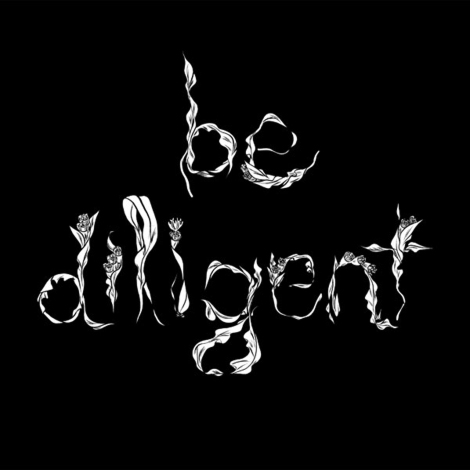
San Francisco based illustrator Hannah K. Lee offers some sage advice through beautiful hand-drawn type, taken from her zine Issues #1: Lessons of Adulthood. Not only does her portfolio boast wonderful lettering, but it also features an impressive collection of portraits done in a loose gestural style with bold line work and intricate mark making that’s hard to ignore.
(more…)

Herb Lubalin for PBS

herb lubalin

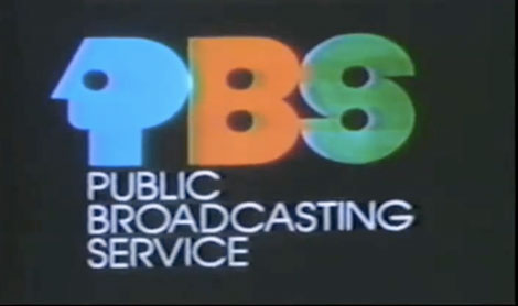
Here is a gem of a video documenting the trials behind the design of the great PBS logo by Herb Lubalin. The vintage motion graphics are perfectly imperfect and glowing, and its great to see all of the early iterations of the logo, which are documented within this post.

(more…)

Swissted

swissted

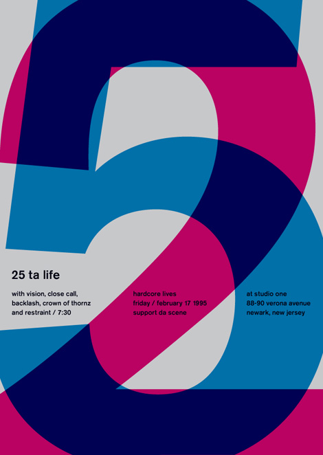
Swissted is the project of one, Mike Joyce (the NYC-based designer, not The Smiths’ drummer). This project is fantastic — redoing flyers for classic hardcore punk and indie shows in the swiss modernist style. Lots of angular layouts, grids, transparency and scale. And he’s done so many! Take a gander, it’s fun to look through.

(more…)

McBess

mcbess

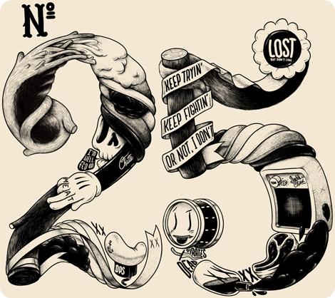
The work of McBess has been a source of illustrated inspiration for many new artists over the course of his half-decade-long career. A signature part of style that sets him apart with his natural ability to bring out shadows and highlights predominantly using thin tipped felt pens, a very big feat when working monochromatically. I love the use of lettering to give his illustrations more context, and the flowing, style gives another layer to already unique and intricate pieces.

(more…)

Jing Wei

Jing Wei Illustration

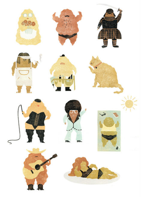
Jing Wei is a Brooklyn based illustrator with a simple and playful aesthetic that I can’t get enough of. She creates her illustrations through woodblock printing and has a meticulous hand and eye for details. This illustration, created for Lucky Peach Magazine, displays the many varieties of miso and their characteristics such as “miso pale” and “miso funky.” The concept for this piece is well thought out and nicely executed, as is the rest of Jing’s portfolio.

(more…)

Telegramme Studio

telegramme studio

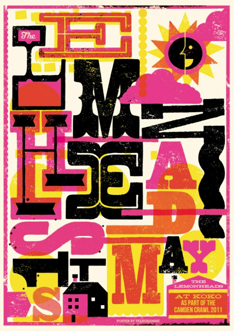
Interesting concept behind Telegramme Studio, this fantastic UK-based studio. It started as a collab between two designer/illustrators sending work and things back and forth in the post. Eventually this mutual love for design and mail sprang up a fully-functional studio, which we now enjoy here.

(more…)

Anton Pearson

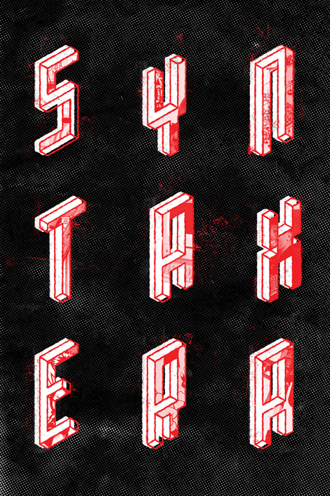
Really cool work coming out of Minneapolis by Anton Pearson, a senior at Minneapolis College of Art. Anton creates work that is especially fresh feeling, with innovative type treatments and painterly techniques. I really love his use of color and most of all, how consistent his portfolio of work is—I’m excited to see where Anton takes his work after he graduates and beyond.

(more…)