Dirk Fowler / F2 Design
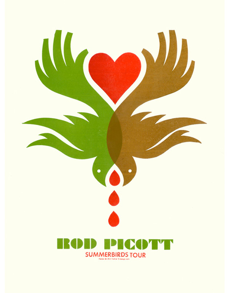
Like many, gig-posters provided my first introduction to graphic design. The images seemed to perfectly articulate the ideas and spirit of the bands I was so obsessed with. During a recent “Best of the Best of Poster Designers” conversation, I was reminded of Dirk Fowler‘s work and it’s solid place in design history.
With the speed and ease of the Internet it’s easy to see design trendiness proliferate and to focus on the latest and greatest. In a time of gig-poster saturation, it can be nice to take a step back and see where a lot of current work gets it’s roots and inspirations.
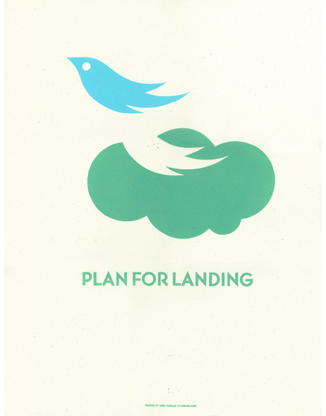
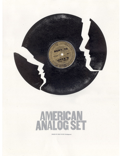
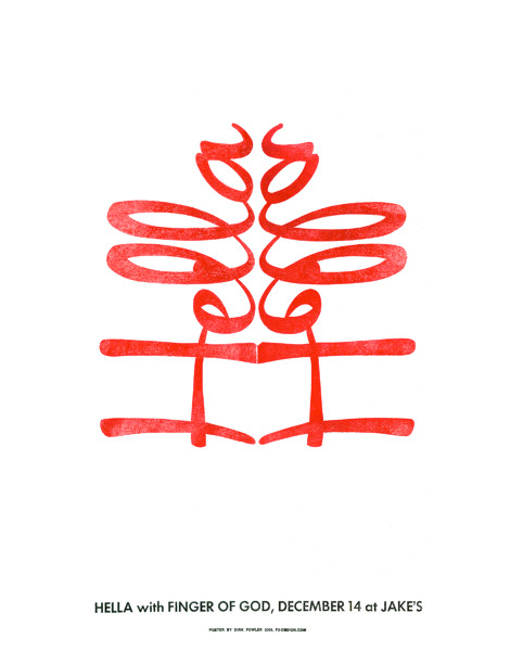
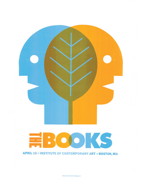
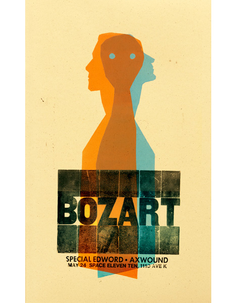
Dirk’s work is striking because it mixes simple yet elegant forms with visual twists and concepts. The posters are active, and void of gimmicks. The work adheres strongly to the design adage, “Maximum meaning, minimum means.” (Especially that Hella poster.)
Check F2 Design, and their GigPosters.com page.
Tagscontemporary, Designers, graphic-design, Illustration, posters, Typography, USA
07.03.09 in Found design by Ethan
Share on Facebook


