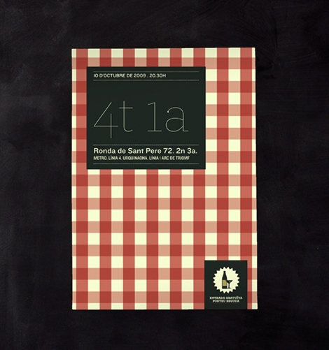
Esteve Padilla
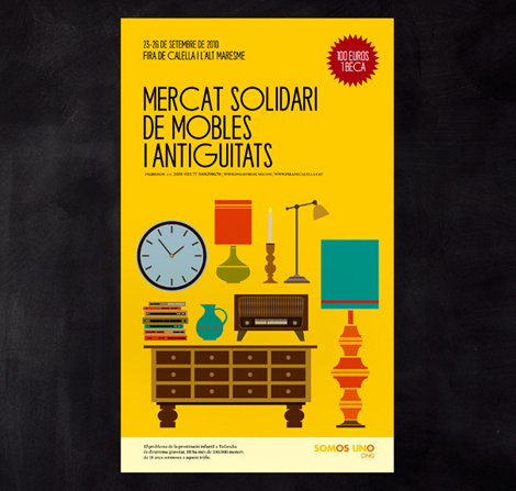
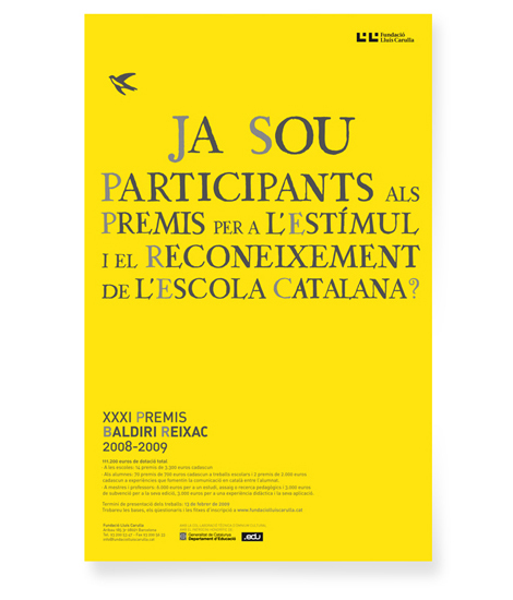
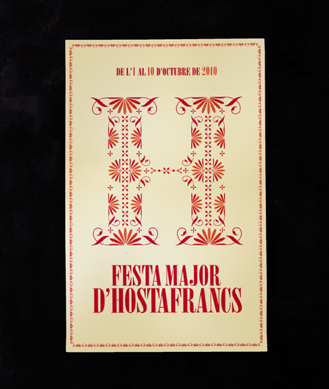
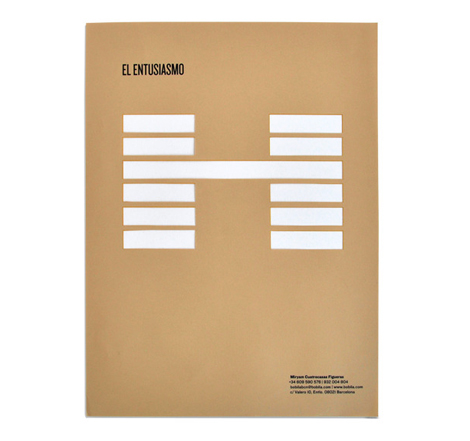
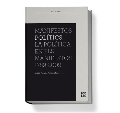
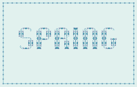
I was recently introduced to Esteve Padilla’s work and am really impressed with his ability to create interesting grids, while maintaining readable and clear type. Usually, I gravitate towards some crazy and/or experimental typography, but I have a very soft spot in my heart for a designer who knows how to use traditional typography to create beautiful layouts and publications. While Esteve seems to have conquered the difficult task of forming grids, his newest work (a font called “Nowadays”) has a touch of a old-style sign painting aesthetic.
I’m really interested to see where Esteve takes his work, he definitely seems to be a designer to watch for in the future.
Criterion Collection DVD Covers
Simmelkiaer Grotesk Type Specimen
Daily Drop Cap
Tagsgrid, modern, Typography
12.17.10 in Found design, Typography by Liz Meyer
Share on Facebook


