February 2008

You are currently browsing the monthly archive for February 2008.

Jesse Kaczmarek

Jesse Kaczmarek

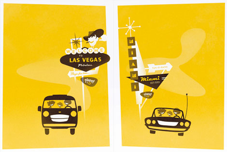
Jesse Kaczmarek is a one-man, super-clean design shop located in NYC. His clients include BMW, Sony, Pepsi, HBO, and on and on. The work remains consistently clean, sophisticated and fun — all at once! Just look at those happy families in their Hertz rental cars!

Also, bonus points for a super slick website.

Jacques Nathan Garamond Telefunken poster

Jacques Nathan Garamond Telefunken poster
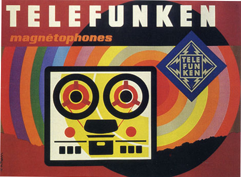
Poster for Telefunken c1965

The piece above is one of a series of posters that paris based designer Jacques Nathan Garamond produced for Telefunken. I just wish I could cut out that Telefunken logo. It kind of kills the vibe of this poster. You have all these round edges on the type and the reel to reel player and theres this crazy sharp edge ninja star with lightning bolts.

During the 1950-1960s Garamond began deconstructing objects into geometric shapes. This is evident in the print above as well as his poster work for Air France. I’ll try to scan in some of the Air France posters when I get a chance.

Wyeth Hansen – T shirts, posters and print

Wyeth hansen graphic design print
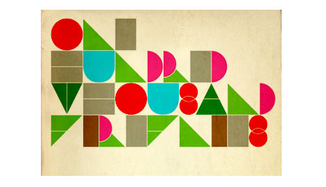
Silkscreen Print for a Drama magazine sponsored show at Nonesuch Gallery

Cool design work from Wyeth Hansen (Casual Aesthetics). His website includes t-shirts, posters, type faces as well some motion design. I’m loving the type work above.

(Via Wrong distance)

Hans Kleefeld book cover design

Hans Kleefeld book cover design
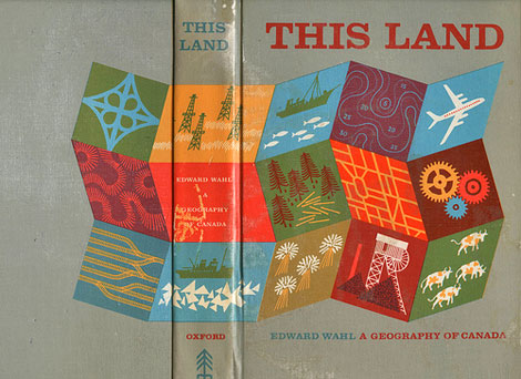
This Land – A Geography of Canada by Edward Wahl c1961
Hans Kleefeld cover designer

Great book discovery by Rosemary Travale.
Hans also designed the original logo for the Toronto Zoo.

Charles Harper Illustrations – Giant Golden Book of Biology

[pictobrowser 10159078@N03 72157603987034781]
Giant Golden Book of Biology – An Introduction to the Science of Life c1961
Text by Gerald Ames and Rose Wyler – Illustrated by Charley Harper

It doesn’t get much better then this. This is Charley in his prime.

“In a style he called “minimal realism”, Charley Harper captured the essence of his subjects with the fewest possible visual elements. When asked to describe his unique visual style, Charley responded:

When I look at a wildlife or nature subject, I don’t see the feathers in the wings, I just count the wings. I see exciting shapes, color combinations, patterns, textures, fascinating behavior and endless possibilities for making interesting pictures. I regard the picture as an ecosystem in which all the elements are interrelated, interdependent, perfectly balanced, without trimming or unutilized parts; and herein lies the lure of painting; in a world of chaos, the picture is one small rectangle in which the artist can create an ordered universe.[cite this quote]

He contrasted his nature-oriented artwork with the realism of John James Audubon, drawing influence from Cubism, Minimalism, Einsteinian physics and countless other developments in Modern art and science. His style distilled and simplified complex organisms and natural subjects, yet they are often arranged in a complex fashion. On the subject of his simplified forms, Harper noted:

I don’t think there was much resistance to the way I simplified things. I think everybody understood that. Some people liked it and others didn’t care for it. There’s some who want to count all the feathers in the wings and then others who never think about counting the feathers, like me.”

– Wikipedia

Read the rest of this entry »

Luke Williams

Luke Williams

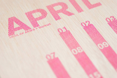
Luke Williams is a third year graphic design student at the Maryland Institute College of Art. While making sweet calendar-meets-packaging cubes, he is also working for Abbott Miller/Pentagram in Baltimore. From magazine and book layouts to posters and self-initiated work, Luke’s work is fresh. It’s nice to see a large body of work with this much variety, attention to detail, and experimentation with other mediums.

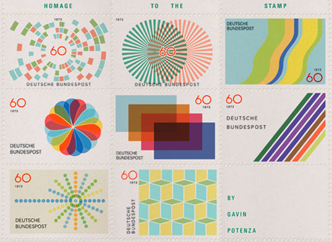
Gavin Potenza – Homage to the stamp

Gavin Potenza homage to the stamp- Otl Aicher

Portland based designer Gavin Potenza (Exploratory Design) has cooked up a series of sweet stamps. The series which was inspired by the work of Otl Aicher is entitled Homage to the Stamp.

Alexander Girard alphabet blocks

[pictobrowser 10159078@N03 72157603948664997]
Alexander Girard alphabet blocks designed and produced by House Industries

Many thanks to the guys at House Industries for sending over a box of goodies. Included in the box was a set of Alexander Girard alphabet blocks. These blocks were the result of a collaboration with the estate of mid-century designer Alexander Girard, the 28 wood blocks feature alphabets based on the forthcoming Alexander Girard font collection and a cleverly-adapted House Industries factory logo puzzle. I have been jocking these blocks since day 1. They have been on my want list for a while. My wife and I don’t have kids yet, but when we do, I can tell you one thing for sure. There is no way the kids are going to touch these! ha! These are daddy’s blocks!

Read the rest of this entry »

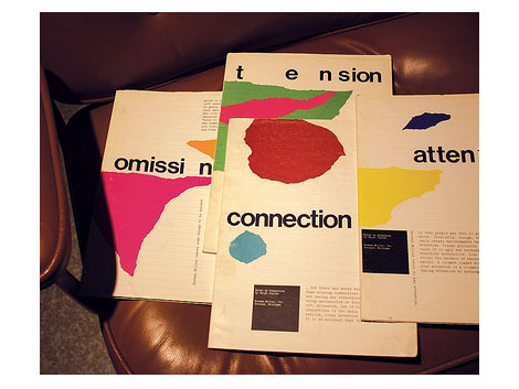
Ralph Caplan design notes for Herman Miller

Ralph Caplan design notes and booklets for Herman Miller

BarryBlog has posted a rare glimpse of some in-house publications for Herman Miller. They were produced in conjunction with the great design thinker Ralph Caplan, and designed by John Massey of Container Corporation of America fame. I’m drooling! I’d love to read these. Maybe we can get the good people at Barry Blog to make photo copies.

Enjoy!

Vintage Dutch Arnhem Map

[pictobrowser 10159078@N03 72157603933481213]
Map of the Battlefields of Arrnhem and Oosterbeek

The battlefields of Arnhem and Oosterbeek in the Netherlands never looked so good as they do in Pink and Teal. The battles were part of Operation Market Garden. It was here that the famous “First Airborne Divison” consisting of more then 8000 men, under the command of Major-General Urquhart, glided down to earth on the morning of Sunday September 17, 1944.

The scaley, snake looking trail in the lower half of the map represents the Rhine River. The battlefields can be seen as the solid patches of brown. I really appreciate how the map designer cut away the airplane and parachute icons from that mass of brown. Simple, effective and creates some interesting shapes within the negative space.

You can read more about Operation Market Garden at wikipedia.

On a sidenote, watched “King of Kong” this weekend. Great flick. Definitely biased in its presentation but none the less Billy still comes off like a really sorry bob. After all the talk of competitive gaming and playing in front of people, I was surprised that he didn’t step up to the challenge at the Guinness event in Florida. Thoughts?

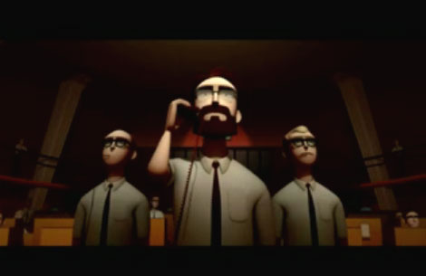
Zoudov – animated film

zoudov - french animated film short

Many thanks to Laurent for sending me this animated short. After watching it, I couldn’t believe that it’s a student film. It looks like something straight out of PIXAR. Laurent mentioned that films, cartoons and design from the 1960s were the inspiration for the project. Excellent animation and great use of James Bond soundtracks to set the atmosphere.

View Zoudov on Youtube or check it out on the official Zoudov website.

Have a great weekend everyone!
Speaking of which, after getting a tip from my friend Wes I decided to rent “King of Kong”. Thats on the playlist for the weekend. Anyone else seen this?

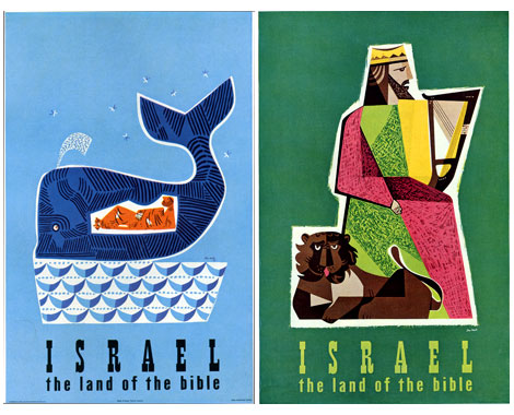
Jean David – vintage travel posters from Israel

Posters of Jean David graphic designer from Israel
Israel -the land of the Bible Tourism posters by Jean David (L) c1954 (r) 195?
produced for the State of Israel Tourist Centre

My Knowledge of Jean David (Sometimes referred to as Jan David) is limited. However, what work I’ve seen from him has been nothing less that stellar. Just look at the posters above. I could easily see someone slanging these at a Flatstock poster convention. Dang, I totally nerd out when I see this stuff. Its just so good.

Looks like the whale is riding a boat of waves. Meanwhile, Jonah is relaxing after downing a keg of Vitamen C. Just look at all that orange!

Hatch Design SF – Promotional bird mobile

[pictobrowser 10159078@N03 72157603902558589]

Many thanks to Eszter at Hatch Design in San Francisco for sending over this promotional piece for the firm. The birds are letterpressed and screenprinted onto egg carton material. The wife and I (and the cat too) had a great time putting this together.

We are gathering items for our new series on promotional goods from designers and design firms. This is the first part in an ongoing series. If you would like to contribute, please email me.

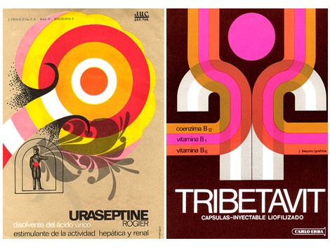
Spanish modern graphic design

spanish mid century modern graphic design

Flickr user ex.novo has posted some amazing examples of spanish modern design in advertising from the 1950s, 60s and 70s. The ads are taken from magazines/ journals titled “Clínica Rural” and “Glosa”. Anyone know anything about these journals? Most of the advertisements seem to be related to pharmaceutical products so it’s a great follow up to my previous post on Swiss modern design in the chemical industry.

Big ups to Mike from Burlesque for dropping this gem on me.

Swiss modern graphic design – chemical industry

[pictobrowser 10159078@N03 72157603890143837]
Publicity and graphic design in the chemical industry – Hans Neuburg 1967
(Chemie Werbung und Grafik)
Contributions by Josef Muller Brockmann

Clap your hands if you love swiss design.

This has to be one of the best books on graphic design in the chemical industry. Ha! this is probably the only book on graphic design in the chemical industry. Most of the design work in the book is for pharmaceutical companies like J R Geigy and Ciba Aktiengesellschaft, both located in Basel, Switzerland.

The index in the back reads like the who’s who of Swiss design. Designers include: Karl Gerstner, Herbert Leupin, Siegfried Odermatt, Hans Erni, Max Schmid, Fred Troller and Kurt Wirth amongst others.

Just look at the pictures above, the work is incredible. Anyone have any nominations for pharmaceutical/ chemical companies that have great design? Maybe we should put together a top 5 list. For example, the always fun top 5 favorite poisonous gas logos.

Also of interest, this Hans Neuburg poster design.

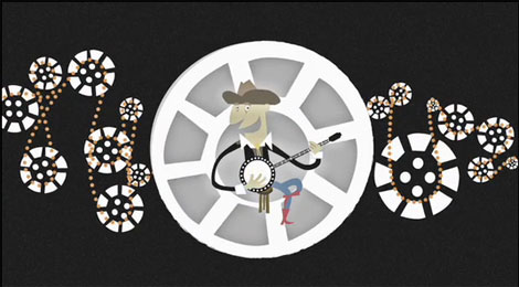
Superfad documentary animation

superfad Justin Leibow documentary animation
“Documentary” directed by Justin Leibow for Superfad

It’s friday and what better way to celebrate then by watching a good ole animated short.

grain edit reader and rad guy Justin Leibow sent in this animated film he directed for the Seattle Film Festival. Nude skydiving wee hoo!!

Have a great weekend everyone!

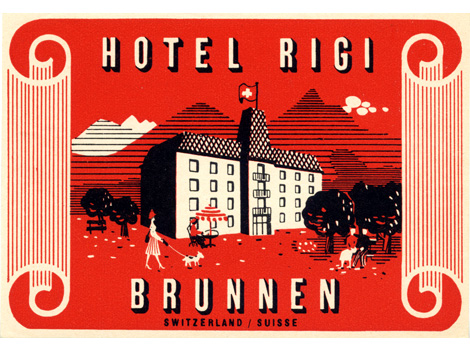
Modern Swiss luggage label – Hotel Rigi

Swiss Modern luggage label - Hotel Rigi  Brunnen Switzerland
Hotel Rigi – Brunnen, Switzerland

Dynamite vintage label design from the Swiss.

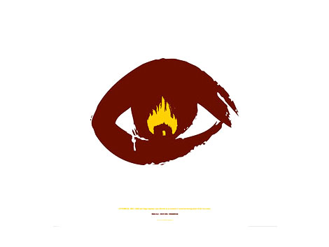
So-Cal Fire Poster Project

so-cal fire poster project John foster
Poster by John Foster / fuszion

Great posters for a better cause.

Donated by designers and artists around the globe, posters sold at the So-Cal Fire Poster Project raise funds for victims of the wildfires that devastated Los Angeles, Orange, Riverside, and San Diego Counties. All proceeds will be given to the Salvation Army, for the 2007 California Wildfire fund.

Posters by: Paul Frank / Park La Fun, Hatch Design,Wink, Modern Dog, Micah Smith, John Foster / fuszion, Josh Higgins / Mike Carnevale, Robert Palmer, Barretto & Co., Frank Chimero, Buchanan Design, Lanny Sommese, Jason Gomez, Madeleine, Ryan Russell Design, Chaz Russo/The Graphic Soul, Nick McPherson, MiresBall, Bernie Tiano and Shepard Fairey.

Get some here

Westvaco Inspirations – Design by Bradbury Thompson

[pictobrowser 10159078@N03 72157603846571086]
Westvaco Inspirations #210 c1958

Westvaco Inspirations was a promotional journal produced by the Westvaco Corporation, formerly known as the West Virginia Pulp and Paper Company. The purpose of the journal was to highlight the printing processes and quality of paper achieved by the Westvaco paper Mills. Bradbury Thompson (1911-1995) served as designer and editor for over fifty issues of this publication including the issue featured above.

Christopher David Ryan : Prints Pillows and Books

Christopher David Ryan

Christopher David Ryan is a “Brooklyn-based graphic artist, daydreamer, pseudo-scientist, wanna-be astronaut and untrained intellectual.” His work shows a similar range of experimentation — photography, collage, illustration, found images, etc. Why! He even makes pillows! On his personal website, Ryan is posting at least one image of his work per day for every day of the year. Busy, busy.

Page 1 of 198123...Last »